Right now, during the 2026 NBA Finals, every courtside banner at Madison Square Garden carries the same mark Michael Doret drew in 1992. Every jersey, every broadcast lower-third, every piece of licensed merchandise shows the same inverted triangle, the same extruded block letters, the same orange #F58426 basketball with blue seams.
The New York Knicks lead the San Antonio Spurs 2-1 in the series, chasing their first championship since 1973, and they are doing it under a logo that has not fundamentally changed in 34 years. In a league where franchises rebrand at the first sign of a losing streak, that fact demands an explanation. The same instinct shapes good logo design across every category: every element has to earn its place.
The explanation starts in 1946.
1946 to 1964: Father Knickerbocker
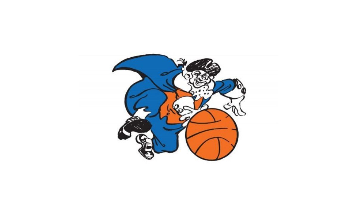
The franchise's first logo was a caricature, a big man in a tri-corner hat rendered in blue and orange, suit tails billowing behind him as he reached out to catch a basketball. The figure drew directly from Father Knickerbocker, the Dutch-colonial character long used as a symbol for New York City itself.
According to the Knicks franchise history, this was one of only three primary logos the team has ever used. It was lively and specific in the way only illustrated mascots can be. It also lasted nearly 20 years, which suggested the franchise had no particular desire to chase trends.
1964 to 1979: The Roundball Arrives
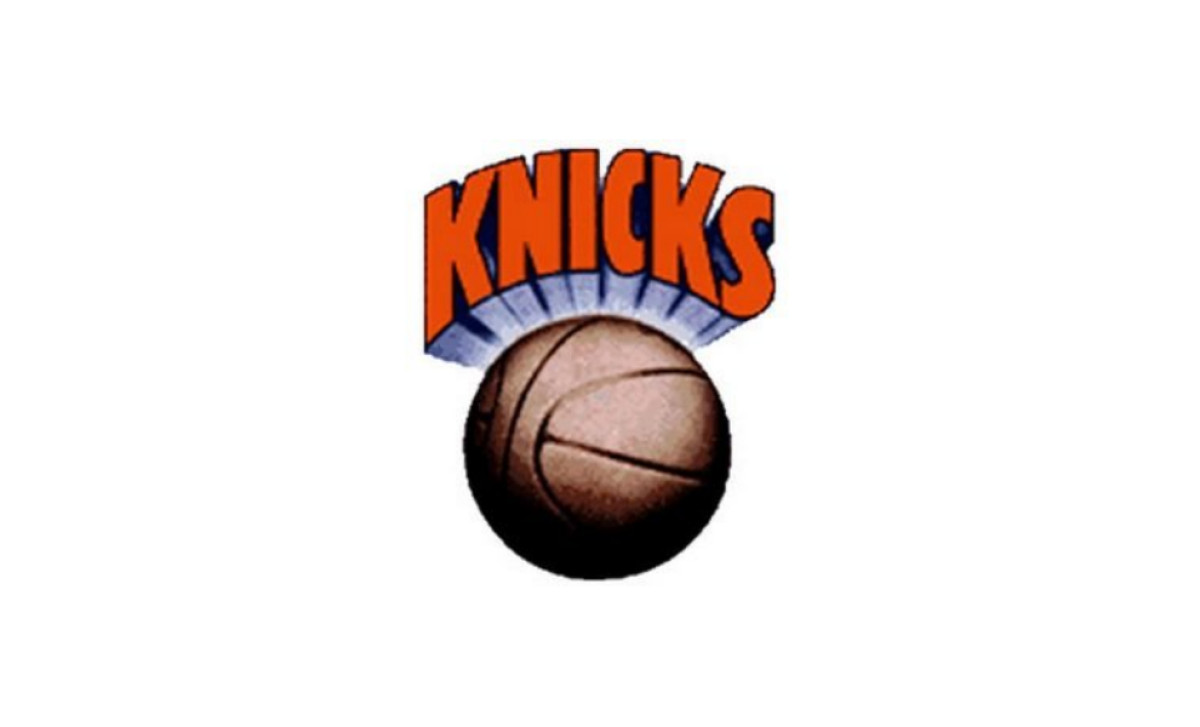
When the caricature retired, designer Bud Freeman of J.C. Bull advertising introduced a wordmark-over-ball format that set the template for everything that followed. A brown basketball sat at center, and the word "KNICKS" arched above it in massive, close-set orange letters with a dark outline, bold geometric sans-serif shapes pressed flush against each other. A blue-and-white starburst radiated out from behind the ball, framing the wordmark.
It was a cleaner, more scalable mark suited to the growing merchandise and broadcast demands of professional sports, the same pressures that reshaped sports branding across the best sports and leisure logos. Under this logo the franchise won its only two NBA championships, in 1970 and 1973.
1979 to 1983: Burgundy and Double Outlines
The 1979 revision sharpened what Freeman had established. The basketball turned orange and gained a blue outline, bringing the color system into closer alignment with the team's uniforms.
The lettering shifted to burgundy-red and picked up a double outline, white inside, blue outside, with a matching shadow treatment. The effect was heavier and more structured than the previous version, though the roundball-plus-wordmark architecture stayed intact.
1983 to 1989: The Wordmark Takes Over
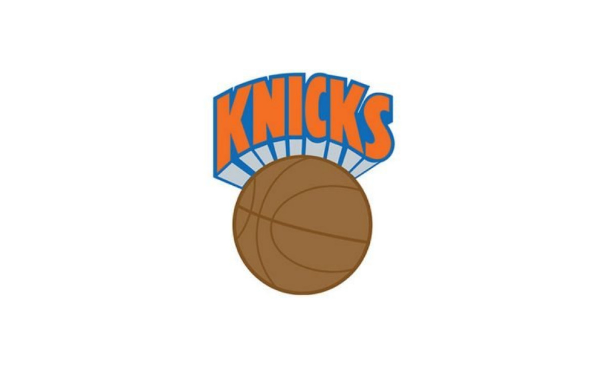
The 1983 version pulled the basketball back toward a muted, light brown with darker brown seams, dialing down the saturation of the previous mark.
In trade, the wordmark became the visual anchor: "KNICKS" executed in bright orange with blue detailing, the letters demanding more attention than the ball beneath them. The composition held the same proportions, but the tonal balance between the two elements had shifted.
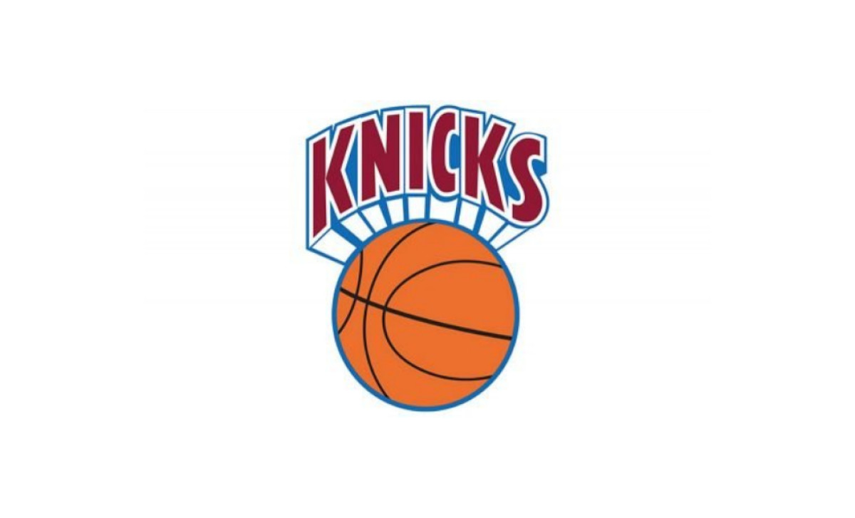
1989 to 1992: Two Colors, One System
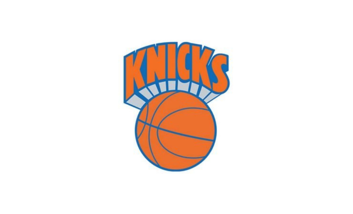
By 1989, the color system unified. Both the basketball and the letterforms shared the same orange and blue palette, bringing the mark into a coherent two-color scheme for the first time.
The lettering's shadow rendered in a lighter sky blue, which separated it from the ball below and gave the composition air. It was the most harmonious version of the roundball era, and it lasted only three years before the whole concept was replaced.
1992 to 1995: Doret Builds the Triangle
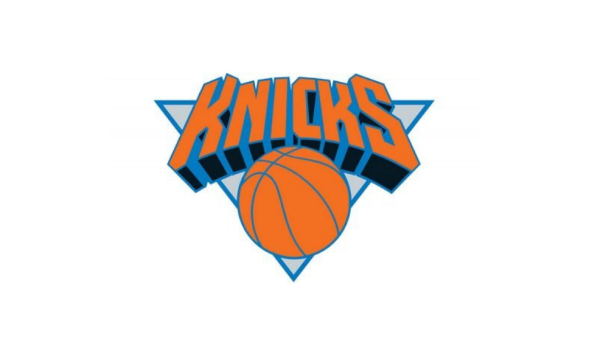
In 1992, Michael Doret built the current logo from scratch. The NBA approached him in spring 1991, and he did nearly all the work by hand rather than on a computer. The basketball moved below the wordmark and now sat on a downward-pointing light blue triangle.
The wordmark itself was entirely new: "KNICKS" in a custom typeface with pronounced three-dimensional perspective, each letter angled as if viewed from below street level, rising toward the viewer. The shapes were square and progressive with straight angles, nothing curved, nothing casual.
The inverted triangle was an unusual structural choice for a sports logo; it creates visual instability in a way that reads as tension and energy rather than imbalance. "New York" did not yet appear above the wordmark in this version.
1995 to 2011: "New York" Joins the Mark
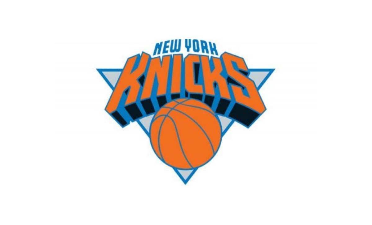
Three years later, "NEW YORK" arrived above the composition in small blue capital letters, set in a custom sans-serif that balanced the weight of the triangular frame and the basketball's detail lines.
Doret was asked to design and integrate the line a few years after the original was adopted. The addition gave the mark its complete, familiar form, the version most people picture when they think of the Knicks. It ran for 16 years without structural change, the longest continuous iteration in franchise history.
2011 to Present: Same Geometry, Lighter Palette
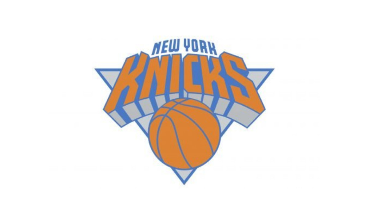
The 2011 update changed nothing except the color palette. Orange and blue stayed as the main colors, lightened to brighter, fresher shades. The geometry, the extruded letterforms, the inverted triangle, the basketball sitting below the wordmark, was untouched. It remains untouched today.
What's in the Current New York Knicks Logo
Good logo design makes every element justify its existence. The 1992 mark passes that test, partly because the franchise spent 28 years refining a single idea before Doret was handed the brief.
Look at what made the cut:
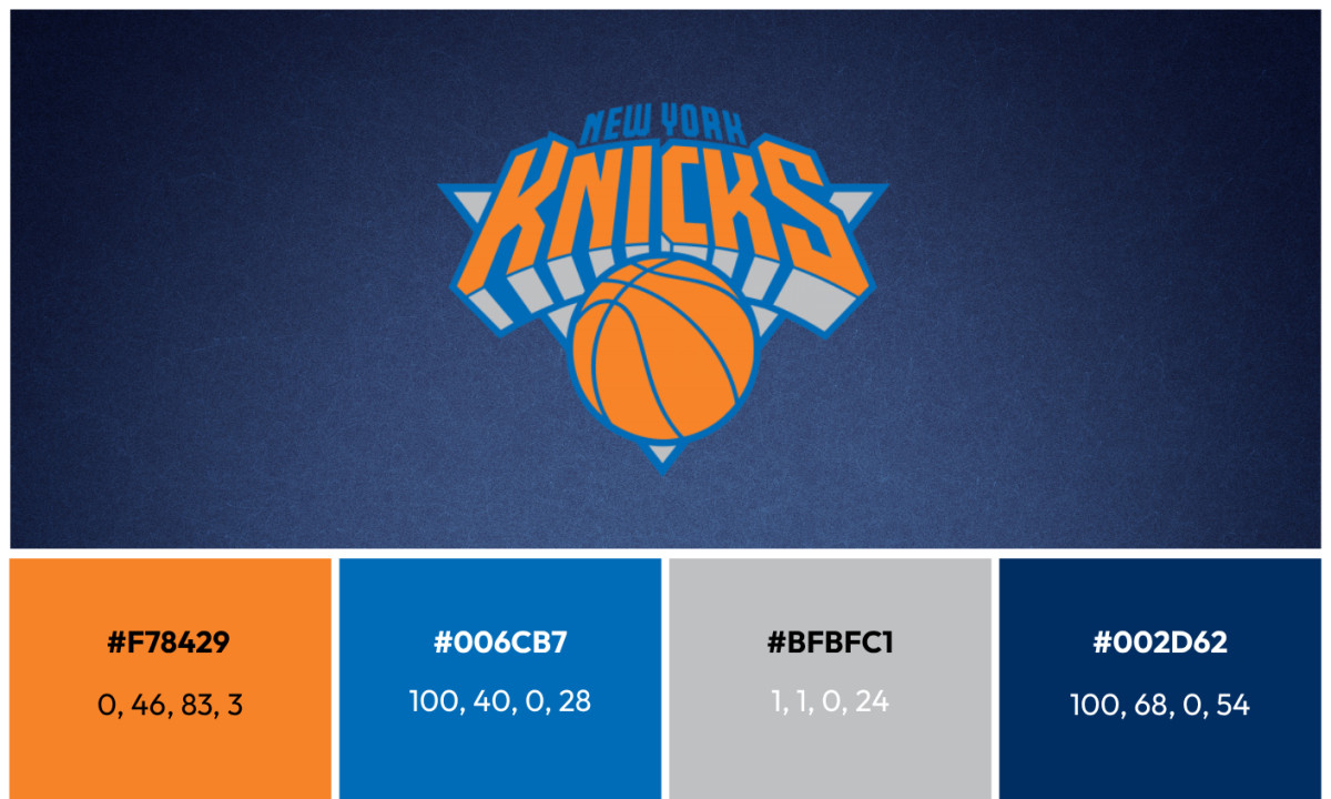
Orange basketball: the only element that has appeared in every Knicks logo since 1964. The color changed, brown to orange to burgundy and back, but the ball never left.
Inverted triangle: the structural decision that separates this mark from every other team in the league. Most sports logos stack elements upward. This one points down. The tension that creates is intentional. It is a logo that leans into you.
Custom 3D wordmark: no commercial font comes close to these letters. The perspective cut, the extrusion angle, the square terminals, all drawn specifically for this franchise. Doret, whose résumé also includes covers for KISS and five Time magazine covers in the Smithsonian, told NY1 it may be the biggest job he ever had. He has described the letters as evoking the feeling of looking up at midtown Manhattan, neck craned, building faces rising overhead.
Royal blue: the same blue carried forward from the 1964 roundball era and the championship teams of 1970 and 1973. The ring that watched Willis Reed limp onto the court is the same color framing the basketball today.
Palette: royal blue, orange, silver, and white. The colors of the New York City flag, worn on an NBA court since the franchise's first season.
What this logo really is, when you look closely, is a correction that became permanent. The 1989 version had the color system right. The 1979 version had the structure right. Doret in 1992 did not invent something new. He resolved what the previous eight designers had been working toward, locked it into geometry sharp enough to survive broadcast compression, merchandise printing, and 34 years of league rebrands, and then left it alone.
Doret himself argues that good design is timeless by nature and cannot be forced. The Knicks logo proves the point. It belongs in the same conversation as the NBA's own Jerry West silhouette and the Chicago Bulls mark, designs that got it right early and never needed fixing, unlike the Golden State Warriors, who spent decades cycling through identities before settling down.
Tonight the series is 2-1 with Game 4 at Madison Square Garden. The logo on the floor, the banners, the jerseys is the same one drawn 34 years ago. Most NBA marks designed in that era are gone. This one is still standing.
Looking to apply the same approach to your growing market? We can connect you with the right creative partners.
Browse our Agency Directory to find the most capable agency that can help elevate your brand:
And if you’re curious for more inspiration, don’t miss our other features on standout logo designs in sports.