Standout Features:
- Bespoke monospaced typeface
- Clean, versatile visual identity
- Focus on Italian craftsmanship
The rebranding of Castil by HONDO delivers a refined and thoughtful visual identity that pays homage to the brand’s Italian roots and engineering prowess in metal furniture design.
Known for its innovative seating and outdoor collections, Castil needed a brand evolution that not only reflected its heritage but also projected its adaptability in a contemporary design landscape.
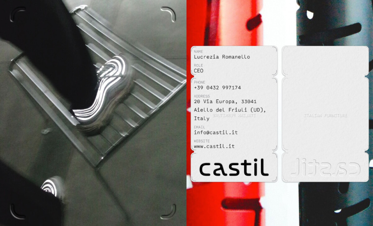
The highlight of this logo redesign is the bespoke monospaced typeface, Castil Mono, developed in collaboration with designer Ignacio Casco. This custom font is as functional as it is aesthetic, lending the identity a grounded sense of precision that mirrors Castil’s expertise in steel craftsmanship.
The decision to prioritize clarity in the typography aligns with industry best practices — 51% of designers make legibility a priority when selecting a font, recognizing that if people can’t read it, the design fails.
The modern logo itself is a subtle yet powerful expression of form and flexibility. With its soft, geometric curves and even spacing, it embodies the brand’s approach to customizable, design-forward metalwork.
The restrained, all-lowercase styling keeps the visual tone approachable and understated while maintaining contemporary elegance.
Color and materiality also play a key role.
The earthy brown boxes against the clean white logo are a subtle nod to Castil’s connection to natural outdoor environments and its material-driven practice.
The overall layout is clean and modular, reinforcing a sense of order and clarity.
With all these features, HONDO’s rebranding of Castil is beyond a visual update; it’s a strategic design into a cohesive and inspiring identity system.
From the custom typeface to the adaptability across different mediums, it’s a brand evolution that invites both designers and customers into a space where thoughtful design meets refined utility.
HONDO’s rebrand of Castil is a masterclass in precision and restraint — anchored by a custom monospaced typeface that reflects the brand’s Italian craftsmanship and contemporary edge.
From earthy tones to modular layouts, every element supports a visual identity that’s as refined as the furniture it represents.
That’s why brands turn to expert partners, and our team has ranked the best agencies worldwide to make finding them simple.
Visit our Agency Directory for the Top Logo Design Companies, as well as:
We also recognize design work that balances simplicity with precision. Visit our Awards section to explore the best & latest in logo designs.

-preview.jpg)


