Last Updated: 07/03/2024
Have you ever felt that subtle assurance when seeing a familiar symbol, promising stability and quality? The Chevron logo is one such emblem, commanding attention with its military-inspired design. Its bold arrows pointing downward mirror the patches seen on a military uniform while the carefully chosen colors are a subtle hint to the origin of the company.
But why does this logo exude such authority and what helps him stay in your memory? Let’s find an answer to this question as we explore this logo’s evolution, design, symbolism, and significance.
Chevron's Iconic Logo Origins
The history of Chevron’s visual identity spans over a century, beginning with the foundation of The Pacific Coast Oil Company in 1879. The very first has diagonally arched white lettering with a black outline and shadow, set against a light background. This wordmark embodied the graphic traditions of American manufacturers.
During the 1920s and 1930s, after the merger with Standard, the logo was redesigned. The company started using its iconic blue, white, and red arrows resembling a chevron and has placed “Standard” lettering, executed in blue, above it.
In 1948, the logo underwent another redesign. The "Standard” lettering switched from blue to white and was placed together with the “Basoline” tagline in the blue rectangle with a triangular bottom. Also, the sidelines holding the three V marks together were removed.
That same year saw the debut of Chevron's initial emblem. It was incorporated into a circular design featuring three interconnected Vs with right-side shadows, aligning with the mid-20th-century trend of rounded patterns. This new design included a fire element on the V.
In 1968, Chevron streamlined its logo to feature just blue and red triangular segments within a vertical rectangle with rounded corners and a subtle black outline. The logotype adopted a bold sans-serif typeface, marking a modern aesthetic shift for the brand.
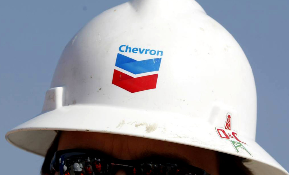
The current Chevron logo, redesigned in 2005, builds upon its predecessor with lighter gradient shades and a removal of framing. The lettering now features a sky-blue color and employs a bold sans-serif typeface. The result of this update is a cohesive and authoritative logo that effectively represents Chevron's brand identity.
Chevron’s Logo Design Merges Traditional Heraldry and Patriotic Colors To Display the Company’s Reliability and Rich History
Chevron Corporation is one of the world’s largest oil companies. It produces, transports, refines, and distributes natural gas, crude oil, fuels, and energy products. The company first included “Chevron” in its name in 1977, when it merged six gas and oil companies into one — Chevron U.S.A Inc. Chevron’s core focus is “achieving increasingly higher levels of safety, operational and environmental excellence.”
The insignia is in the shape of a shield. The ‘V’ pattern represents a Chevron or a V-shaped mark, that coincides with the company name. Chevron pattern usage can be traced back to 1800 B.C. when archaeologists recovered pottery designs palace of Knossos on Crete in modern-day Greece. Expert logo design companies often opt for elements such as this one, a new take on traditional heraldry to represent safety, reliability, and rich history.
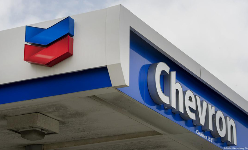
Red and blue chevrons pop out on the white background, symbolizing patriotism and the country where Chevron Corporation conducts most of its business — the USA. The red and blue are gorgeous shades that perfectly complement each other in a dance of harmony, not too bright nor too dark. This logo is an eye candy with ravishing and memorable colors.
The spacing between the two chevrons is perfectly proportionate, symbolizing balance and trust. We see the Chevron text hovering above the chevron insignias, with the first and last letter aligned with the sides of the badge. The font closely resembles Myriad Pro-Bold, one of the favorite typefaces of many accomplished branding agencies.
Energy sources on our planet are becoming increasingly difficult to scour and harvest. New efforts and experimentation can result in chaos. Completely aware of this situation and the anxiety it brings, Chevron embraced the logo that will put consumers' minds at ease.
Its shield, or chevron insignias, remind us that this brand will provide protection, stability, reliability, and responsibility in new energy solutions for years to come. Additionally, the combination of colors, historical symbolism, and proportion, make this logo a sparkling eye-catching emblem that will stand the test of time.


-preview.jpg)
