Few automotive icons blend classic British style and modern flair like the Mini Cooper logo. Known for its compact size, spirited performance, and cultural presence since the 1960s, Mini has grown into a globally recognized marque. Its logo has played a crucial role in shaping the Mini Cooper identity: a symbol of innovation rooted in tradition.
Each evolution of the Mini Cooper logo tells a story, from its early days under Morris Motors to its sleek, contemporary form today. Let’s explore the visual legacy of this emblem and how it has transformed alongside one of the most distinctive cars in the world.
Mini Cooper Logo Design Details
The most distinctive feature of the Mini Cooper logo is its winged design, signifying agility and freedom. The wings stretch out horizontally from a central badge, symbolizing the car’s nimble performance and sporty spirit. This design nods to the vehicle’s rally roots and its reputation as a car that punches well above its weight.
Modern iterations of the Mini logo use refined sans-serif or geometric fonts. The clean typeface enhances legibility and evokes a contemporary, sophisticated look while keeping the "MINI" name front and center. The choice of typography reflects the brand's transition from retro charm to modern luxury.
The current Mini logo design strips away gradients and shadows in favor of flat, monochromatic tones. This minimalist approach aligns with digital-first branding trends and offers excellent versatility across print, web, and product applications. The stark contrast between black and white also underscores the brand's confidence and timelessness.
Mini Cooper Logo History
The Mini Cooper emblem has gone through several notable transformations, reflecting shifts in ownership, design direction, and cultural relevance.
1959 – 1962: Morris Badge with Ox and River
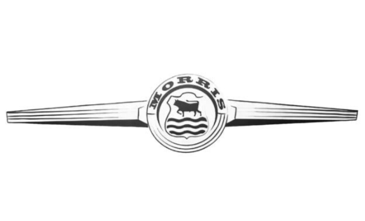
The earliest version of the Mini Cooper logo appeared on the Morris Mini-Minor, produced at the Morris Motors plant in Cowley, which had historical ties to aircraft manufacturing. Reflecting this aviation heritage, the Mini Cooper emblem adopted a propeller-like design.
At its center sat a double-lined circular badge, housing the Morris coat of arms is a black bull standing above three wavy lines, symbolizing Oxford’s river and the city's strength. The word “MORRIS” arched across the top in bold, serif lettering. This aviation-inspired Mini Cooper symbol laid the groundwork for the winged themes that would define future designs.
1962 – 1968: Laurel Wreath and Racing Identity
In the early 1960s, Mini began its partnership with racing legend and engineer John Cooper, leading to the birth of the high-performance Mini Cooper. With this launch came a bold redesign of the Mini Cooper emblem.
At its core, the new Mini Cooper logo featured the model name in red uppercase letters, placed within a circular badge surrounded by a green laurel wreath, a nod to motorsport victory. The typography was split stylistically: “Mini” appeared in a serif typeface, while “Cooper” used a cleaner sans-serif style.
Extending outward from the circle were four horizontal bars on each side, visually merging elements of a car’s front grille with the outline of aircraft wings, an intentional design meant to evoke both speed and engineering precision.
1968: Bold Serif Typography and Shield Emblem
In 1968, Mini introduced a more stripped-down, black-and-white version of its emblem. While the core circular layout was preserved, the design was noticeably pared back. The wordmark was shortened to simply “Mini,” presented in white on a dark center field.
The laurel wreath that previously surrounded the text was removed, and the triple border was reduced to just two contrasting outlines. This minimalist update gave the logo a sharper, more modern edge while maintaining its recognizable form.
1969 – 2001: The Hexagonal Shield Era
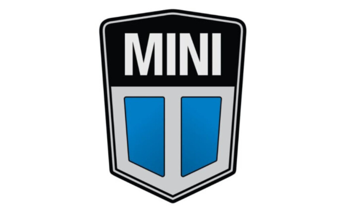
When Mini became part of Leyland Motors, later under the Rover Group, the brand underwent both a name update and a visual overhaul. The compact car series was now officially branded as MINI, in all caps.
Reflecting this transition, the Mini Cooper logo adopted a new geometric format: a hexagonal shield split horizontally. The upper section featured a deep black background with the word “MINI” in bold white lettering, reinforcing the brand’s refreshed identity.
Below, two diagonally-cut sky-blue panels were set against a silver-gray base, bordered by thick vertical lines. This version of the Mini Cooper emblem stood out with its sharp symmetry and offered a distinct break from the circular, winged Mini Cooper symbols that came before and after.
Discover standout logo redesigns and learn how top brands evolve their look
2001– 2018: BMW's Revival of the Iconic Wings
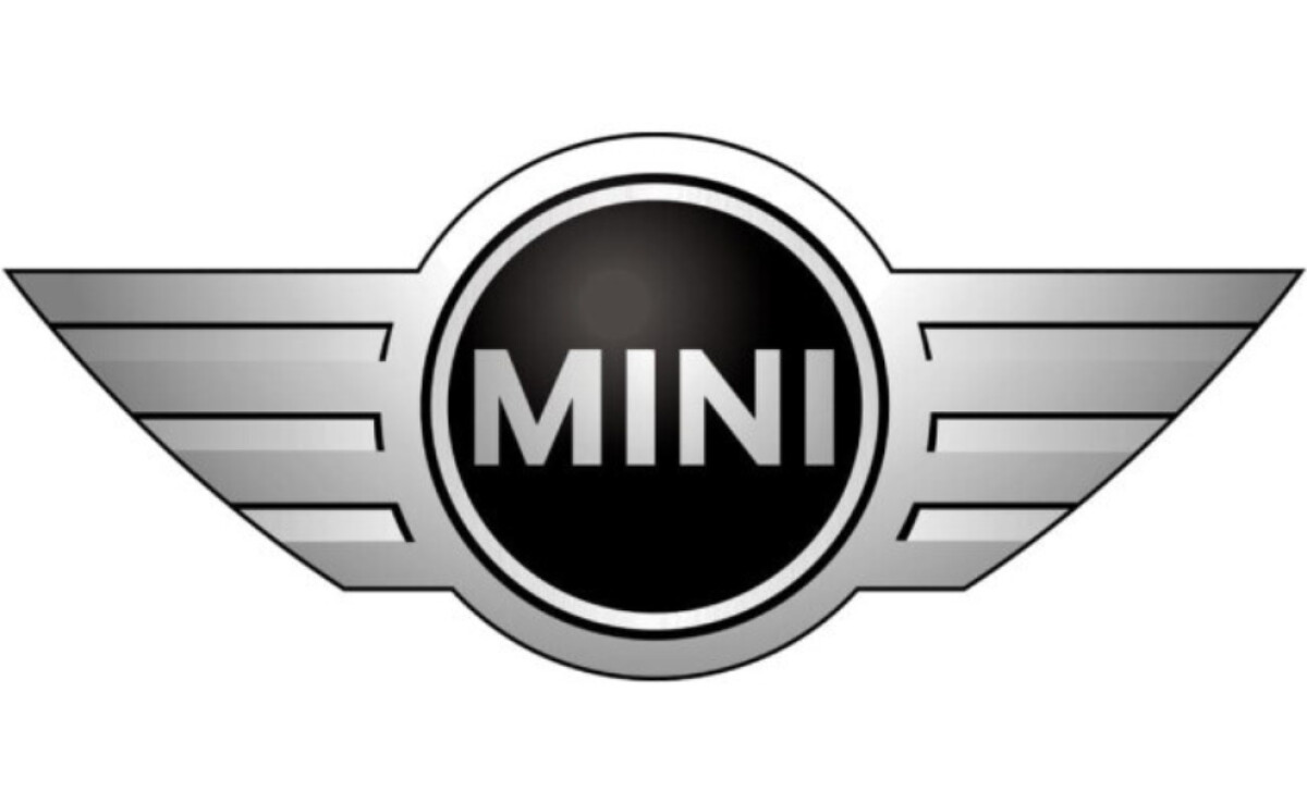
With BMW’s acquisition of the brand in the early 2000s, the Mini Cooper logo returned to its most iconic form (wings flanking a central circle) but with a refined, contemporary execution.
The redesigned Mini Cooper emblem featured a bold black roundel at its core, outlined in a polished chrome ring. Extending from either side were stylized silver wings with angular lines and solid fills between the segments, giving the Mini Cooper symbol a dynamic, aerodynamic feel.
The brand name “MINI” was placed at the center in a clean, sans-serif typeface, lending the design a balanced mix of modern precision and timeless appeal. This version projected confidence and sophistication while honoring the car’s spirited heritage.
2018 – Present: Streamlined for a Digital World
The latest Mini Cooper logo reflects a shift toward clarity and versatility in modern branding. Redesigned in 2018, this version eliminates the metallic textures and gradients of its predecessor in favor of a clean, two-dimensional format.
Rendered entirely in black and white, the updated Mini Cooper emblem retains its signature circular badge and winged design, but with sharper lines and reduced detail.
This minimalist approach enhances its adaptability across all platforms, whether as a badge on a vehicle, a registered trademark, or a visual element in digital marketing. By emphasizing the Mini Cooper symbol’s bold typography and winged silhouette, the brand reinforces its iconic presence with refined simplicity.
Browse the most influential automotive logos and the design choices behind them.
Mini Cooper Logo: A Symbol of Agility and Iconic Design
The Mini Cooper logo has consistently captured the essence of the brand: compact, bold, and unmistakably British. From its aviation-inspired roots to its modern, flat-lined silhouette, every iteration of the Mini Cooper emblem reinforces the car’s agility, confidence, and timeless appeal.
The winged Mini Cooper symbol stands not just as a badge on the bonnet, but as a visual representation of movement, innovation, and enduring legacy. As the brand continues to evolve in the era of electric mobility and digital design, the current logo’s minimalism keeps Mini recognizable across generations — proving that smart, intentional design always drives impact.