Green and yellow are popular colors, signifying nature, warmth, and optimism. Combined, they create a vibrant, dynamic palette often used by brands focused on the environment, health, or well-being. Also, there are other cases where these hues are implemented to present companies as refreshing and energetic.
Let’s explore the best green and yellow logo designs crafted by some of the most innovative and creative logo designers today.
1. Shelter Belt by Fat Bird Creative
Standout Features:
- Submark representing blades
- Strip removed through the center
- Bold typography
Logo design agency Fat Bird Creative designed a logo for Shelter Belt, a shelterbelt trimming and hedge-cutting company. Although very subtle, the "e" submark represents the brand's services as it is reminiscent of the blades of the shelter belt trimming machine.
As for the color, Fat Bird Creative used black to pair with green and yellow, giving it an authoritative yet sophisticated touch. The bold typography has the tops of the letters "h," "l," and "b" angled for a subtle difference.
2. Subway by Dick Pilchen

Standout Features:
- Harmonizing yellow and green
- Bold, sans-serif typeface
- Arrow extensions on letters "S" and "Y"
The Subway logo features the company name in bold, half-yellow and half-green, sans-serif font. The first and last letters of this simple lettering are enriched with arrows as a cheeky reference to the brand name and its connection to signage.
Yellow, covering the first three letters "SUB" represents the freshness of Subway’s products, with its vibrant and bright hue. On the other hand, the last three letters "WAY" are painted in a softer and muted green that conveys health and naturalness. These two colors are fused in a timeless symbol that comes to mind of many people when they think of yellow and green logos.
3. The Horti House by Begin Studio
Standout Features:
- Simple logo design
- Combination of different images
- Sans-serif typography
Begin Studio created this logo design for The Horti House. This modern logo is perfect for a brand that sells wholesale plants and flowers.
The agency combined images of a house, plant, and forward arrow to reflect The Horti House's core values. The chosen brand colors ensure consistency across all marketing materials. Clean and minimal, the logo encapsulated what The Horti House is about and what it stands for.
4. Vantage Project Solutions by David Atanasovski
Standout Features:
- V and checkmark hybrid
- Cool green
- Unique monogram logo design
For Vantage Project Solutions, logo designer David Atanasovski showcased a unique take on monogram logos. He turned the letter "V" into a relevant symbol for the brand.
The final logo design showcases the letter "V" with an extended arm, doubling as a checkmark. The checkmark symbolizes growth, success, and the company's proficiency in producing successful projects.
The brand's visual identity is further enhanced with a color palette featuring blue and cool green shades. Aside from reliability and success, adding blue to the logo adds a touch of loyalty and trust. And the cherry on top? The logo design's modern typography! It exudes professionalism and attention to detail, assuring customers that the brand is an authority in project management solutions.
5. Avocado by ElpidaGraphicDesign
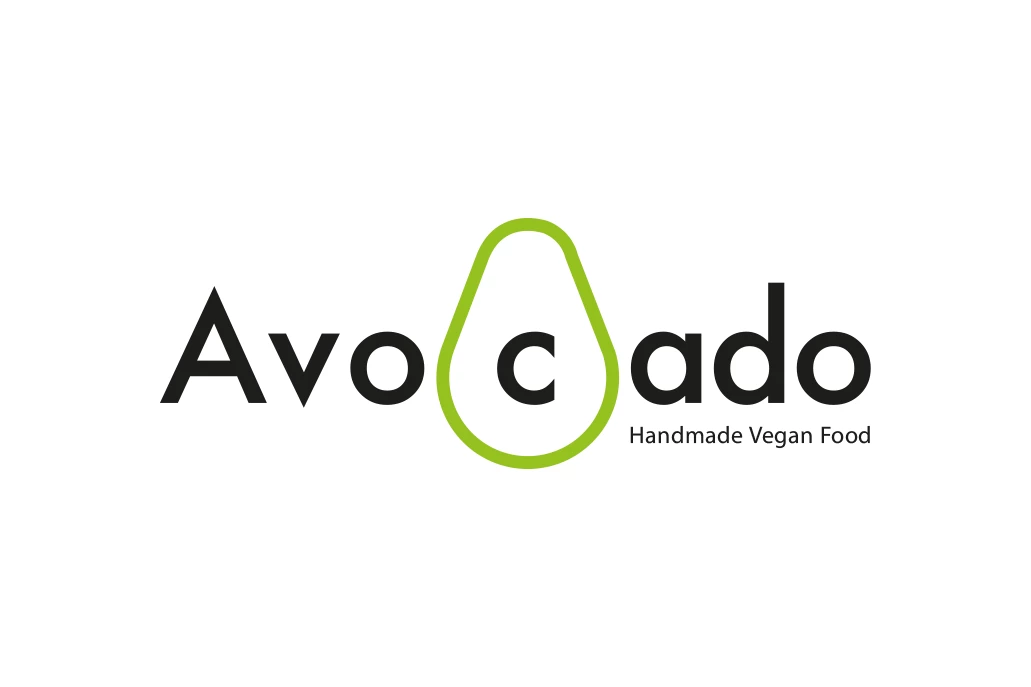
Standout Features:
- Smart and evocative
- Clean, sans-serif typography
- "c" as Avocado seed
Avocado, a brand suggestion for a company of fresh organic products delivered at home, aims to merge the nature of its produce with an innovative, modern, and easy-to-digest online experience.
The Avocado logo design, masterfully ideated by ElpidaGraphicDesign, combines simplicity and uniqueness seamlessly (and tastefully. Its implied symmetry emanates natural balance, while its center "c", whether on purpose or not, makes you "see" the vegan way of life from a different perspective.
6. Green Light Great Night by Ivan Koval
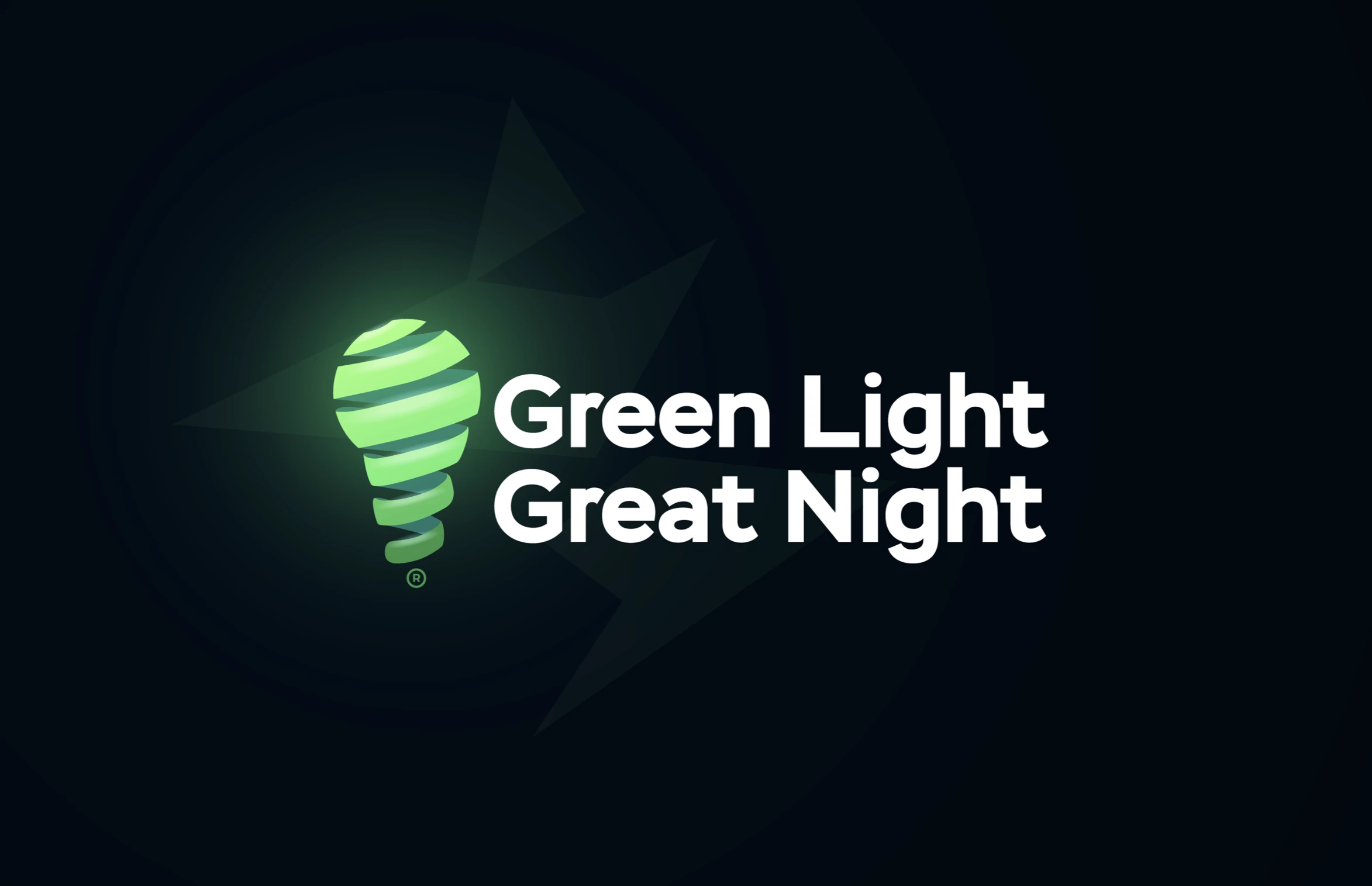
Standout Features:
- Green light bulb
- Spiral cuts on the light bulb
- Gradient effect
Logo designer Ivan Koval took the words "Get the green light" to heart and turned them into a creative logo design for Green Light Great Night.
The bulb's spiral effect is reminiscent of traditional filament designs. It adds depth and suggests energy, elevating the logo's sophistication. Further enhancing its allure, the gradient effect symbolizes enlightenment and ideas, positioning the logo as a beacon of inspiration. Overall, the design is aesthetically pleasing and rich in symbolism.
If you’re looking for more inspiration in the same vein, explore the best gradient logo designs.
7. Zelf by Nouchka
Standout Features:
- Logo reminiscent of building blocks
- Bold typography
- Simple yet impactful
ZELF's logo design by Nouchka proves that less is more when it comes to logo design. One of the standout features of the logo is the brand name spelled out in letters that look like building blocks. This encapsulates the essence of construction and resonates with ZELF's core values of guidance and support in the building process.
The logo's bold typography exudes authority and confidence, making the brand distinct and memorable. Its simple yet impactful design aptly conveys ZELF's vision, blending visual appeal with deep symbolism.
8. Rolex Logo by Wilsdorf and Davis
Standout Features:
- Distinctive green color
- Golden crown
- Serif typography
The Rolex logo is one of the most iconic and recognizable green and yellow logos in the world. It features the brand name in a distinctive green color, along with a golden crown symbol above it.
The green color covering the serif typography exudes wealth and exclusivity. This specific shade, associated with prosperity and quality, aligns perfectly with Rolex's brand image as a producer of high-end, reliable timepieces.
The golden crown on top of the name, as a symbol of royalty and excellence, creates a luxurious atmosphere, representing the brand's aspiration to be the 'king' of deluxe watches.
9. Upkeep & Co by Design by Ching
Standout Features:
- Simple
- Passes the piccolino test
- Bold typography
Design by Ching's logo design for Upkeep & Co is a minimal yet impactful logo design, taking inspiration from a trident. As Poseidon’s prized weapon, we can associate a trident with water, a vital cleaning element. The stylized trident also creates a unique monogram logo, adding a fun touch to the design.
Another highlight of Upkeep & Co's logo is that it passes the piccolino test, ensuring the logo is still visibly accurate even at a small size. Aside from its deep green color, the logo comes in black and white, making it versatile.
10. Evergreen Security Solutions by Spotlight Graphic Design
Standout Features:
- Crest with pine tree
- Cursive typography
- Mix of font styles
The Spotlight Graphic Design team unleashed its creativity for Evergreen Security Solutions' logo design. And the result? A logo that directly communicates the brand identity.
The logo features an evergreen tree that symbolizes year-round functionality and longevity, an ideal choice for a security company. Lastly, the agency mixes cursive and block lettering, providing a dynamic contrast to the design while ensuring readability and depth.
Check out some of the best websites with green elements here.
11. The Farmyard Florist by Evie Francesca
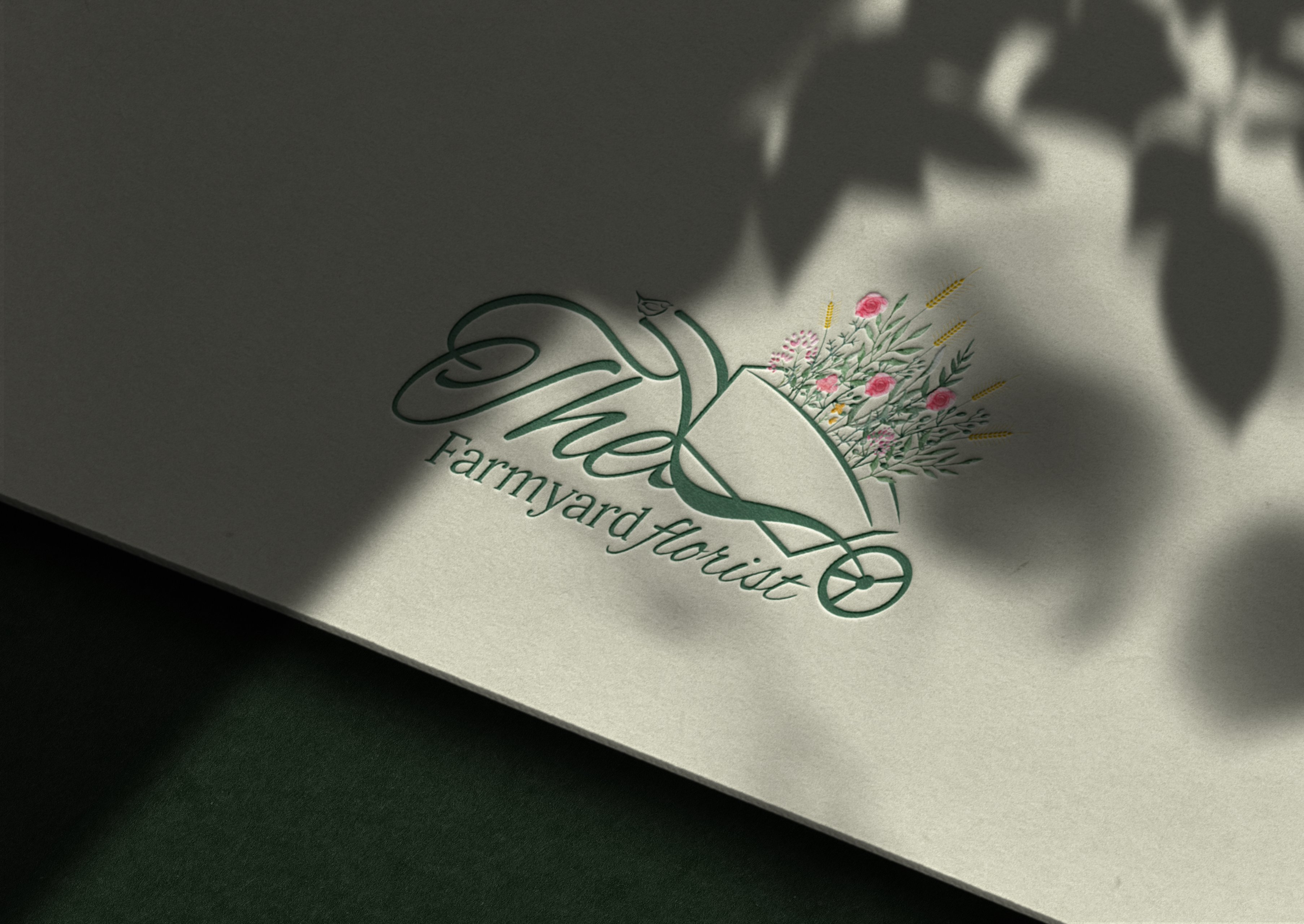
Standout Features:
- Cursive font
- Deep green color
- Cart with flowers
The Farmyard Florist logo, designed by Evie Francesca, is an excellent example of a green and yellow logo design. Feminine and elegant, a notable feature of this logo is the cursive font that blends with the cart’s structure. This seamless fusion adds a whimsical touch and emphasizes the brand's floral theme.
The colorful flowers, with a few bright yellow wall barleys sticking out of it, add a touch of joy, breaking the monotony of the deep green color. Together, these elements create a charming logo representing the brand's essence.
12. Kalamullah Academy Logo by Calligraphy Bangladesh
Standout Features:
- Blend of modern and traditional
- Rounded and curved elements
- Green and yellow gradient
The Kalamullah Academy's logo, designed by Calligraphy Bangladesh, combines modern and traditional features. It flaunts an elegant illustration reminiscent of most mosques, with rounded and curved elements.
The green and yellow gradient is meaningful since green represents nature, wisdom, and vitality in Islam. The blend of these elements results in an expressive and creative example of yellow and green logos.
13. Potato Corner by Grace Marci
Standout Features:
- Warm yellow and cool green
- Sans-serif typography with rounded borders
- Smiling potato icon
Potato Corner recently underwent a brand refresh and updated their logo design. The new logo aims for a cleaner and more modern look compared to their previous playful logo designed in 2014.
The first thing people see in their iconic yellow and green logo is the cheerful, smiling potato icon. This evocative symbol conveys the message that customers can expect to feel just as happy and satisfied after tasting the company’s products. Yellow sans-serif typeface with sharp edges adorned with rounded green border enhances the calm and joy of the overall design.
14. Greenergy by Campusano
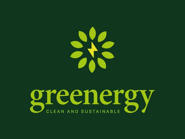
Standout Features:
- Lightning bolt
- Green leaves
- Yellow-green letters
Greenergy's emblem by Campusano shows how perfect green and yellow logos are for the power market, demonstrated by the lightning bolt as the focal point of this design.
The logo design features a yellow lightning bolt, symbolizing electricity, surrounded by green leaves showing the connections in renewable energy. This sends a message perfect for the company, and the yellow-green letters show collaboration between the two elements.
15. Smart Friends by Motif Brands
Standout Features:
- Green color story
- Atom-inspired design
- Bold sans-serif font
The Smart Friends logo design by Motif Brands is a geek's dream come true, with the perfect execution of the atom symbol as the design's primary focus.
The atom is the perfect icon to demonstrate how science plays a huge role in the company, and the green color story aligns with their commitment to saving the Earth. The bold sans-serif font gives the brand a sense of security and trust.
Explore some of the best minimal logo designs.
16. Green Basics by Bluestream Software Solutions
Standout Features:
- Leaves on the Es and I
- Black and green colors
- Bold and thin sans-serif fonts
Leaves and ferns form part of the letters for the Green Basics' logo design by Bluestream Software Solutions.
Instead of the usual letters, the design agency used leaves to complete the Es while replacing the letter I with a fern stem. They also used black and green as the primary colors, which is a nice touch. The bold and thin font styles add depth and character to the design while keeping it professional.
17. The Clean Cannabis Company by Great Big Graphics
Standout Features:
- Cannabis line drawing
- Lime green color
- Emphasis on CLEAN
Design agency Great Big Graphics showcased their creativity in designing a logo for The Clean Cannabis Company, using a cannabis line drawing to promote the brand effectively.
The cannabis drawing is clean and crisp, perfectly aligning with the brand. They also emphasized the CLEAN part of the brand, showing the people that their brand differs from the harmful weed associated with recreational and medicinal marijuana. Forever.
Make sure to check out our article on the best weed logo designs.
18. Sprite by Lowe and Partners (now MullenLowe)
Standout Features:
- Splash illustration
- Custom sans-serif typeface
- Lemon instead of dot on "i"
The 1994 Sprite logo redesign by Lowe and Partners featured a dynamic splash illustration symbolizing the drink's refreshing burst of flavor. The iconic "Sprite" wordmark was rendered in a bold, custom sans-serif typeface with a slight tilt, suggesting movement and excitement.
A playful and thematic touch to the design is the use of a lemon instead of the dot on the "i". The lemon dot not only adds an element of fun but also visually ties the logo to the product's refreshing citrus taste.
Overall, the Sprite logo combined various design elements, creating a lively and memorable brand identity. All these features work together to convey the nature of Sprite, helping it stand out as one of the best yellow and green logos of all time.
19. Cercle Brugge by Jelle Inghels
Standout Features:
- Unique soccer ball
- English-style crown
- Black and green colors
Logo designer Jelle Inghels gave an incredibly unique spin on this Belgian soccer team's logo design, earning a spot in our best green and yellow logos list.
Take a look at some of the best abstract logo designs.
Cercle Bruges' logo design features a uniquely drawn soccer ball with an English-style crown atop the ball, denoting how influential and legendary the soccer team is. This design's primary colors are black and green, giving the logo a more futuristic and dynamic approach.
20. John Deere by Todd True
Standout Features:
- Jumping deer
- Vibrant color scheme
- Rounded-edged square logo
The John Deere logo redesign by Todd True in 2000 did feature a jumping deer, correcting the previous misconception that the deer was landing.
The deer is now clearly shown leaping forward, symbolizing the company's unwavering drive to move ahead and embrace new challenges. This dynamic pose embodies the agility and power of John Deere's machinery.
The design incorporates a vibrant yellow and green color palette, with each hue strategically utilized. Yellow symbolizes quality, optimism, and energy, while green represents the company's strong connection to agriculture and sustainability.
Green and Yellow Logo Designs FAQs
What makes a good yellow and green logo?
Good yellow and green logos leverage the natural synergy of these colors. The contrast between yellow's brightness and green's tranquility produces the logo that is both eye-catching and memorable. This balance also fosters a sense of reliability and dynamism, key attributes for building brand trust and recognition.
A well-crafted yellow and green logo also communicates the brand's values effectively. These colors can subtly convey messages that align with sustainability, innovation, or wellness, depending on the context.
What do green and yellow mean in a logo?
Yellow symbolizes innovation, creativity, and warmth, making it ideal for brands that want to appear dynamic and forward-thinking. Green often represents sustainability, health, and nature, which is perfect for brands emphasizing environmental consciousness or well-being. By strategically blending these colors, designers can create logos that capture attention and tell a story about the brand's ethos.
What are some famous green and yellow logos?
The combination of green and yellow is a powerful choice, and many recognizable brands have utilized it effectively. Some famous examples include John Deere, whose green and yellow logo represent his agricultural roots and connection to the land.
Subway's vibrant green and yellow combination evokes freshness and health, aligning with their focus on fast-food salads and sandwiches.
Sprite also uses this combination to evoke freshness and vitality, aligning with their product's refreshing nature.
Our design experts recognize the most innovative and creative designs from across the globe. Visit Design Awards to see the:
- Best Logo Designs
- Best Website Designs
- Best Video Designs
- Best Print Designs
- Best Packaging Designs
- Best App Designs
Our team also ranks agencies worldwide to help you find a qualified agency partner. Visit our Agency Directory for the top Logo Design Companies, as well as:
- Top Web Design Agencies
- Top Video Production Companies
- Top Print Design Companies
- Top Packaging Design Companies
- Top Mobile App Development Companies


