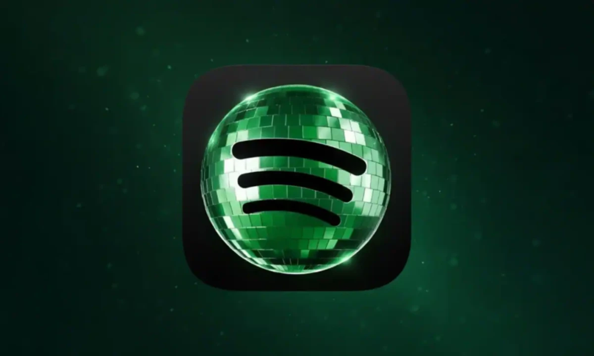
For about ninety-six hours in May, Spotify's app icon looked broken.
The familiar flat-green circle had been swapped for a glittering disco ball — same three soundwave lines, completely different vibe — and users were furious.
They called it "pixelated,""AI-generated," and said it looked "perpetually downloading."
Within four days, Spotify confirmed the original icon would return.
That should have been the end of it.
Instead, the design the internet tried to kill became the design the internet couldn't stop making.
A Costume, Not a Redesign
View this post on Instagram
The first thing to clear up: this was never a rebrand.
Spotify's senior director of global brand, Lauren Solomon, told the company's own newsroom in April that Spotify periodically lets its logo "become an expression of culture" at key moments. Wrapped season is the most familiar example.
The 20th anniversary disco ball followed the same playbook, scaled up.
The core three-line soundwave mark stayed intact. Only the texture changed — flat green became reflective green.
Calling it a redesign overstates what happened. It was a costume, a temporary one tied to the in-app "Spotify 20: Your Party of the Year(s)" retrospective, which let users revisit two decades of listening history.
The icon was the campaign's smallest visual element. It just happened to sit on 751 million home screens.
Spotify Disco Ball: The Bug That Was the Feature
The disco ball was, by most accounts, a bad app icon.
Marketing consultant Jack Appleby flagged "huge readability & brand issues", criticizing the darker green palette and a mirror-tile texture that pixelated at small sizes.
This is one of those design / marketing moments where I just scratch my head.
— Jack Appleby (@jappleby) May 16, 2026
There are huge readability & brand issues.
- Different color green
- The green is too dark against the black
- disco ball texture looks pixelated
on a tiny phone screen
A kinda dumb mistake. pic.twitter.com/KuxZSphPgC
Users said the shading made the app look like it was mid-update.
Reddit threads filled with the same complaint reworded a dozen ways. But the failure was specific.
"It's horrible! Every time I look at it I think the app is busy updating."
The icon flopped at the thing app icons should do — sit quietly on a home screen and get recognized without thought — and excelled at the thing app icons almost never do, which is start an argument.
Every screenshot posted in outrage was another impression. The scalability problem doubled as the visibility engine.
A perfectly executed anniversary icon would have earned a nod from maybe four design Twitter accounts and disappeared by Monday.
This one generated a week of design discourse and pulled in coverage from Variety, Fast Company, and Creative Bloq.
App icons live in a strange psychological space — branding, habit, and muscle memory layered on top of each other.
Mess with that visual cue and people notice immediately. Spotify counted on the noticing, and the outrage was the volume knob.
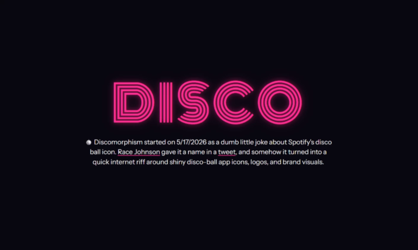
How "Discomorphism" Took Over
This is the part most coverage buried.
While users demanded the old logo back, designers and brand accounts did the opposite.
They turned their own logos into disco-ball versions, and within seventy-two hours, the aesthetic had a name.
Designer Race Johnson labeled a post simply "discomorphism," a mashup of disco and skeuomorphism (the old design philosophy of making digital things look like physical objects), and the term stuck.
The post pulled in nearly two million views and spawned its own site at discomorphism.com.
Then the brands jumped in. ChatGPT's official Instagram uploaded a mirror-tiled version of its own logo with the caption "What do you guys think?" — OpenAI's account replied "Everyone is going to love this." The post collected more than 180,000 likes in two days.
View this post on Instagram
Notion followed with its own disco version. MoonPay joked about "balloonmorphism vs. discomorphism," while Uniswap and Appwrite showed up in the replies.
Someone even built a whole tool called Discomorphism that applies the effect to any logo on demand.
Designer Szymon shared a workflow on X using ChatGPT's image-generation tools. Upload Spotify's icon as a reference, then tell the AI to preserve a target logo's geometry while swapping its materials for reflective mirror tiles.
The trend was, fittingly, powered by the same AI tools the participating companies were building.
So the aesthetic the internet claimed to hate had already spawned its own micro-trend before Spotify rolled the change back.
The backlash didn't slow the design language down. It spread it.
The Ending Was Always Scheduled
Not everyone joined the pile-on. Michael J. Miraflor, global EVP at WPP's EssenceMediacom, posted what may end up being the most-quoted reaction of the whole episode:
Look what you’ve done, dorks. You’ve bullied Spotify into reversing something fun and different (and temporary to begin with) for their 20th Anniversary.
— Michael J. Miraflor (@michaelmiraflor) May 17, 2026
We don’t deserve nice things. https://t.co/e2J8LFO2C9
The line landed because it pointed at something angry users hadn't quite registered. The logo was always leaving.
Spotify's own reply to the loudest complaint, posted via @Spotify on X on May 17, read like a punchline: "Alright, we know glitter is not for everyone. Our temp glow up ends soon. Your regularly scheduled Spotify icon returns next week."
The "victory" the internet claimed was on the calendar before the first complaint got filed.
Spotify got its anniversary moment, and the discourse did all the distribution work for free.
The brand walked away with a clean story arc (controversy, acknowledgment, resolution) that money can't reliably buy, and most campaigns spend millions failing to manufacture.
What the Spotify Disco Ball Actually Proved
The interesting thing about the disco ball isn't that it failed as an app icon. Plenty of icons fail.
What's worth paying attention to is the gap between failure at its stated purpose and success at a larger one.
Design doesn't always die when the internet rejects it. Sometimes rejection is the loudest form of attention you can get.
The disco ball was bad at being a Spotify icon and great at being a cultural object, and the second outcome turned out to matter more than the first.
The aesthetic survived the rollback. Discomorphism is now a real, if probably short-lived, design vocabulary that exists because people tried to make it go away.
The lesson for brands isn't to ship ugly logos. It's that the metrics of a campaign aren't always the same as the metrics of the artifact.
Spotify's icon was rated badly on every dimension app icons get judged on.
By any measure of attention or cultural footprint, though, it became one of the most successful pieces of branding the company has shipped in years.
Our team ranks agencies worldwide to help you find a qualified partner. Visit our Agency Directory for the Top Logo Design Companies as well as:


