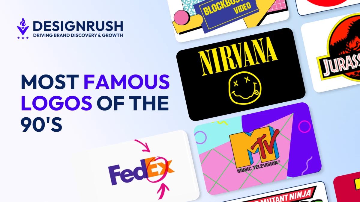
The 90s were the last decade of mass media confidence. A logo needed to work on a billboard, a TV spot, and a shopping bag — that was the brief.
Nobody was asking how it would render at 60x60 pixels on a glass rectangle, because that rectangle didn't exist yet.
Designers in this window made choices under a completely different set of pressures, not better or worse, just fundamentally different from what the job requires today.
What makes this era worth studying is the stress test. Every logo here was designed, unknowingly, to survive a world its creators couldn't have imagined: app icons, dark mode, social sharing, favicons, phone screens.
Some passed. Some didn't. The ones that made it through reveal what durability actually looks like in visual identity.
1. Nike Swoosh (1995)
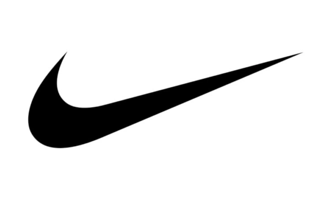
By 1995, Nike removed its own name from the mark, declaring the swoosh sufficient on its own. That single shape reads as motion, speed, a wing, and a checkmark all at once, without requiring you to commit to any one reading.
It scales to any size, works in any colorway, and holds at favicon dimensions without losing meaning.
That kind of range only pays off when the symbol has already saturated public consciousness, and by '95, it had.
Decades of sport sponsorship and TV did that work. The design just had to be structurally capable of carrying it.
Verdict: Accidentally future-proof.
2. FedEx (1994)
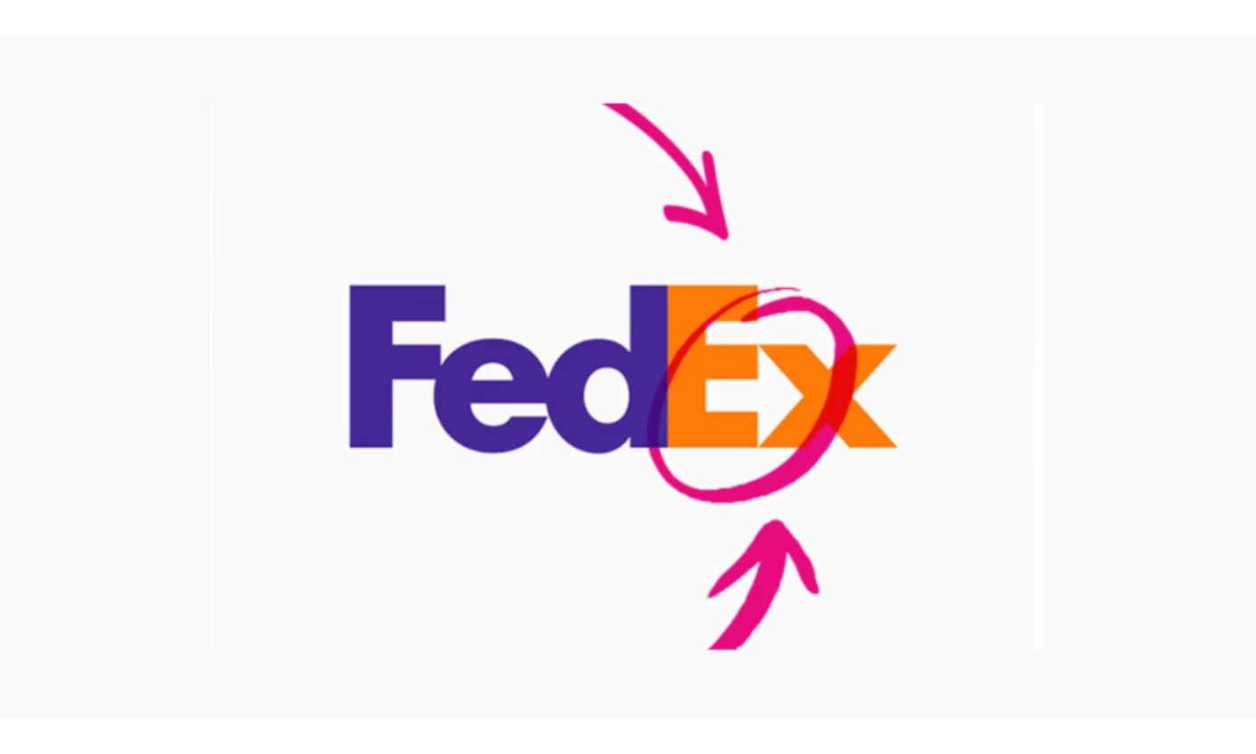
Designer Lindon Leader tested over 400 versions before Univers 67 and Futura Bold produced a negative space arrow between the "E" and lowercase "x."
The arrow wasn't planned — it emerged from the letterforms themselves. Pointing right, it suggests forward motion and precision, and has held unchanged for over 30 years.
What makes it durable is structural. The arrow lives in the negative space rather than as an applied graphic, so it survives at any size without degrading.
You can compress the logo down to a tiny lockup and the arrow is still there, doing its job.
Verdict: Compression can't touch what's baked into the geometry.
3. PlayStation (1994)
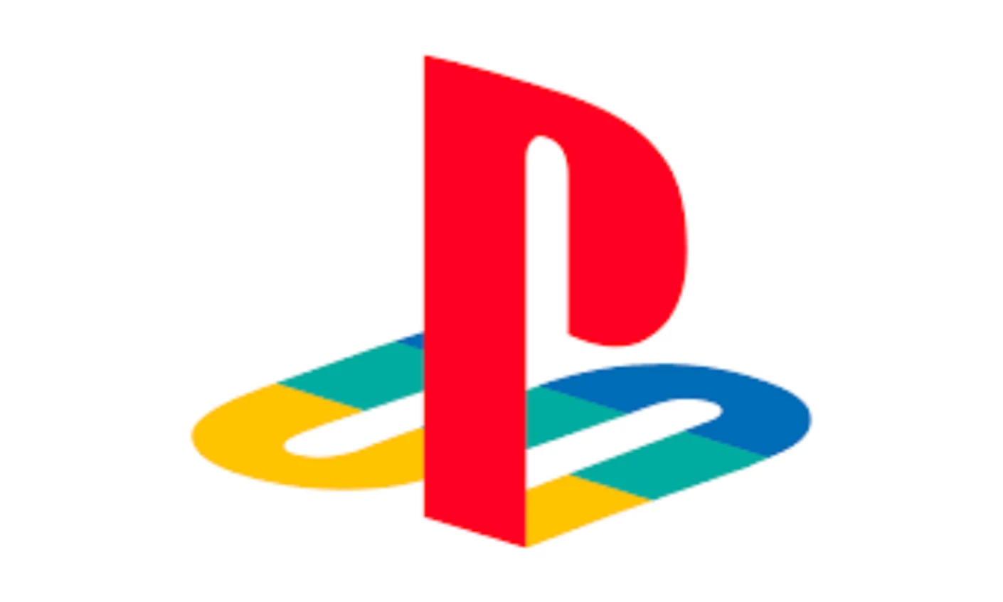
The bold red "P" and twisting "S" in yellow, blue, and green create a 3D depth effect that was the visual language of the decade. Designed for television and point-of-sale, PlayStation’s logo was built for high resolution and large format.
By every reasonable measure, it should have failed the app icon test.
It didn't, because the depth lives in the letterform geometry rather than applied as surface texture. Strip it down to 60 pixels and the dimensionality survives.
A generation grew up with that mark too, and that kind of cultural weight carries design choices that might otherwise read as dated.
Verdict: Built for the wrong world, survived anyway.
4. Nirvana Smiley Face (1991)
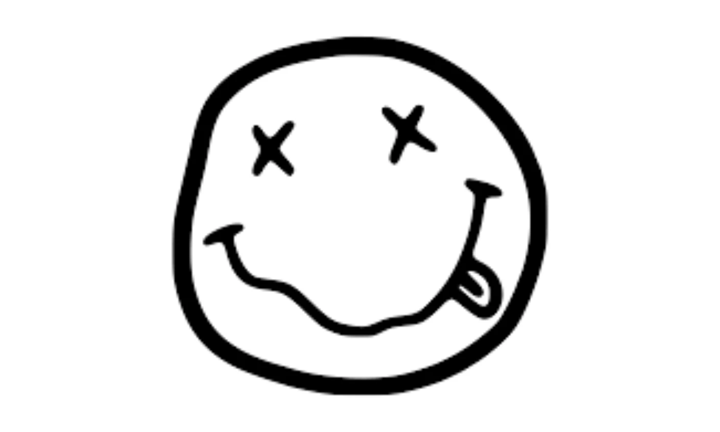
Kurt Cobain adapted the distorted smiling face from a strip club sign in Seattle, giving it X eyes and a lopsided grin designed to look wrong on purpose. It was a visual rejection of the commercial logo conventions it was parodying.
The irony is that it worked too well: a mark built to mock mass culture became one of its most reproduced images, now appearing on T-shirts worn by people who've never heard the albums.
The face itself is simple enough to sketch from memory, distinctive enough to own a category, and legible at any size. That's a rare combination regardless of intent.
Verdict: Designed to resist the culture it now defines.
5. Cartoon Network (1992)
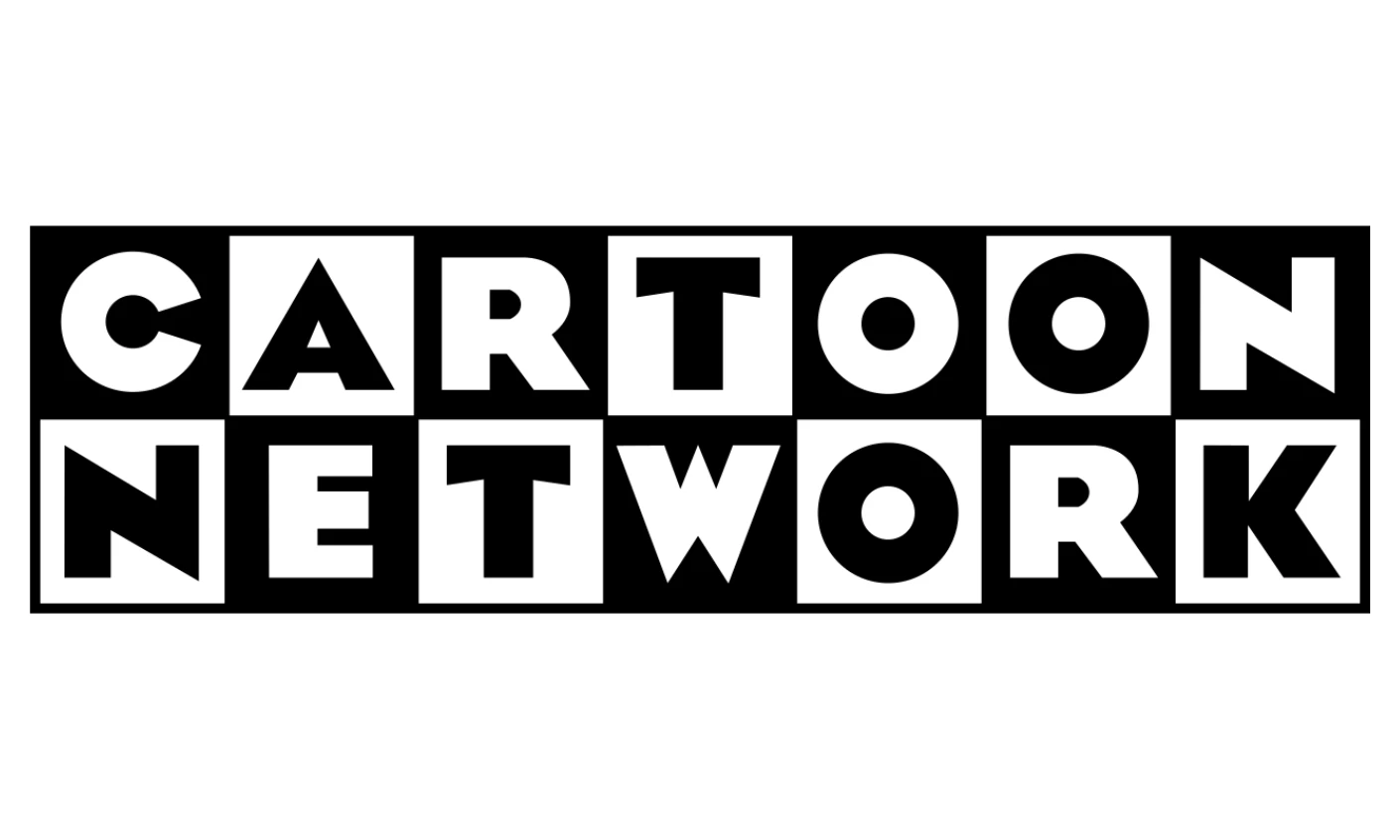
The checkerboard wordmark fills bold, sans-serif letters with alternating black and white squares.
No illustration, no character, no gradient.
For a children's animation network, that was a genuinely odd choice in 1992, and the oddness was the point: rejecting the visual language of the content it was branding gave it an identity nothing else on TV shared.
The geometry is scalable and color-agnostic, so it held on early web graphics and holds on app icons today. The network has tested updates over the years, but none have stuck.
Verdict: Abstraction made it medium-agnostic.
6. Jurassic Park (1993)
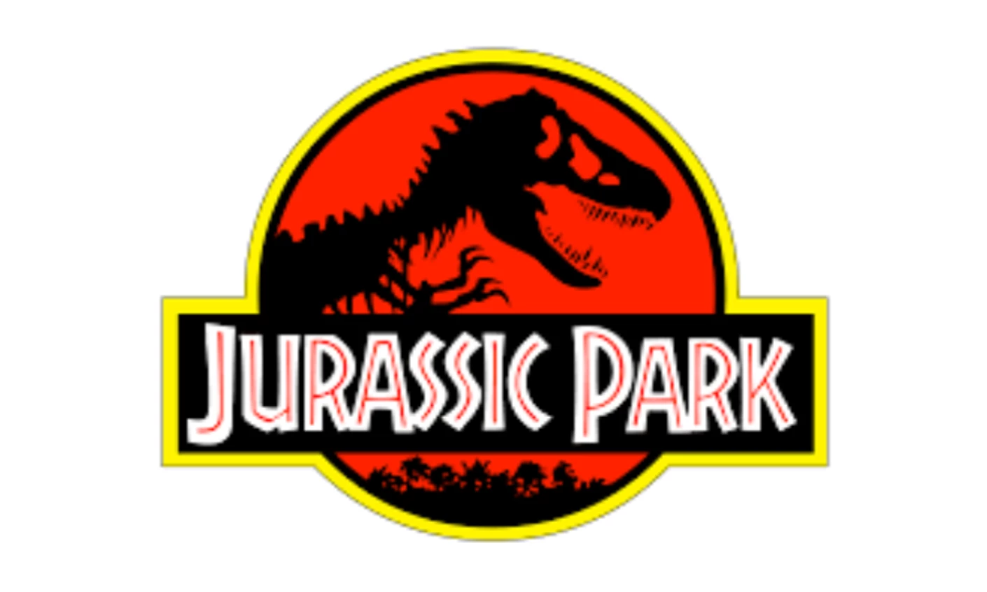
The T-Rex skeleton silhouette inside a circular starburst, rendered in red, black, and gold, reads in a single glance: prehistoric, powerful, institutional.
Using a skeleton rather than an illustrated dinosaur was the key call.
Illustrations age. Silhouettes don't.
Thirty years on, the franchise still uses variations of the same mark, each sequel's adjustments never straying far from the original starburst geometry.
Verdict: The silhouette saved it.
7. MTV (1981, dominant through the 90s)
![]()
The block "M" with "TV" spray-painted onto it was designed to look vandalized and anti-corporate. The mark changed colors, patterns, and finishes constantly while the letterform stayed fixed.
This was the structural insight: the "M" functions as a container. It can hold anything.
The brand separated what must be consistent, the shape, from what can change, the surface. That is the same architecture every platform-native brand now uses.
Verdict: The template for every platform-native brand that followed.
8. Friends (1994)
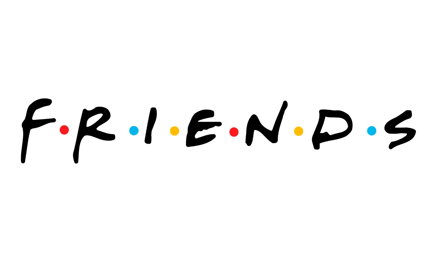
The multicolor dot typography, each letter in a different warm tone, communicates approachability without trying too hard.
Rounded, lowercase, relaxed.
The mark has survived largely because the show never left the cultural conversation — streaming gave it a second generation of viewers, and the multicolor system reproduces on merchandise without requiring exact color matching at any scale.
Verdict: The logo lives because the show does.
9. Premier League (1992)
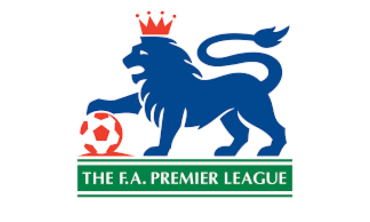
The original logo featured a lion holding a football in detailed heraldic illustration, designed for broadcast graphics and printed programs.
The lion was the right symbol. The illustration was the wrong execution.
The 2016 rebrand abstracted the lion into a geometric mark that reads at social media profile dimensions.
It is a useful case study in a logo that was not future-proof and knew it.
The instinct to keep the lion was correct. The willingness to simplify was the design maturity the original lacked.
Verdict: Right symbol, wrong execution — good bones survived the surgery.
10. Windows 95 (1995)
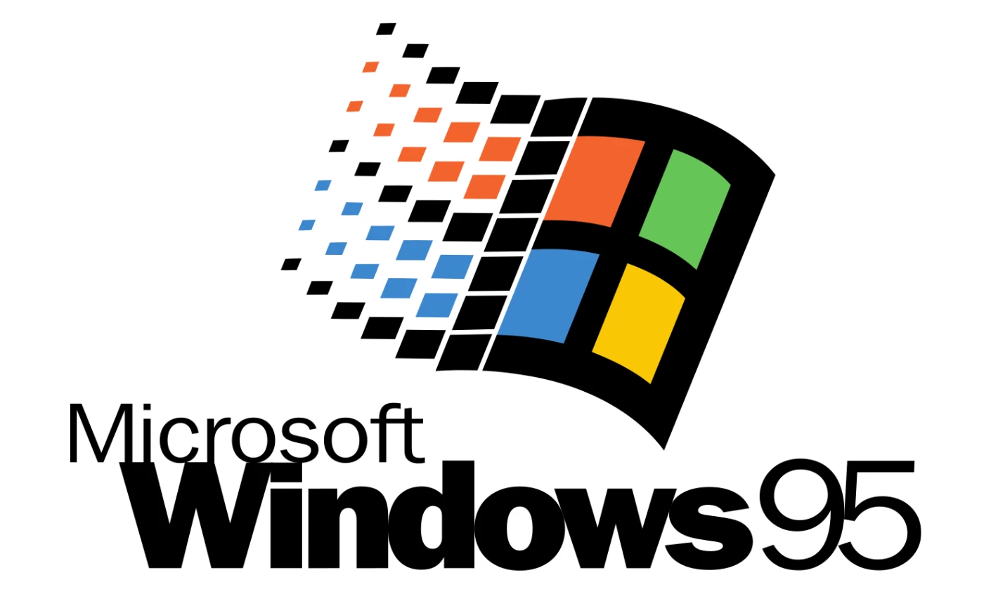
The Windows 95 logo, a waving four-color flag with gradient depth, was built to signal technological progress at a specific moment.
The 3D shading, the chrome feel, the sense of dimensional motion: all of it communicated "the future" in 1995.
The problem is that visual language ages in a way pure geometry doesn't.
Microsoft recognized this early and progressively stripped the mark toward the flat, four-pane grid it uses today.
The underlying idea, four colored quadrants representing distinct elements of a system, held up. The 90s rendering of it didn't.
Verdict: Designed to impress. Required redesigning to last.
11. Teenage Mutant Ninja Turtles (1987, dominant through the 90s)
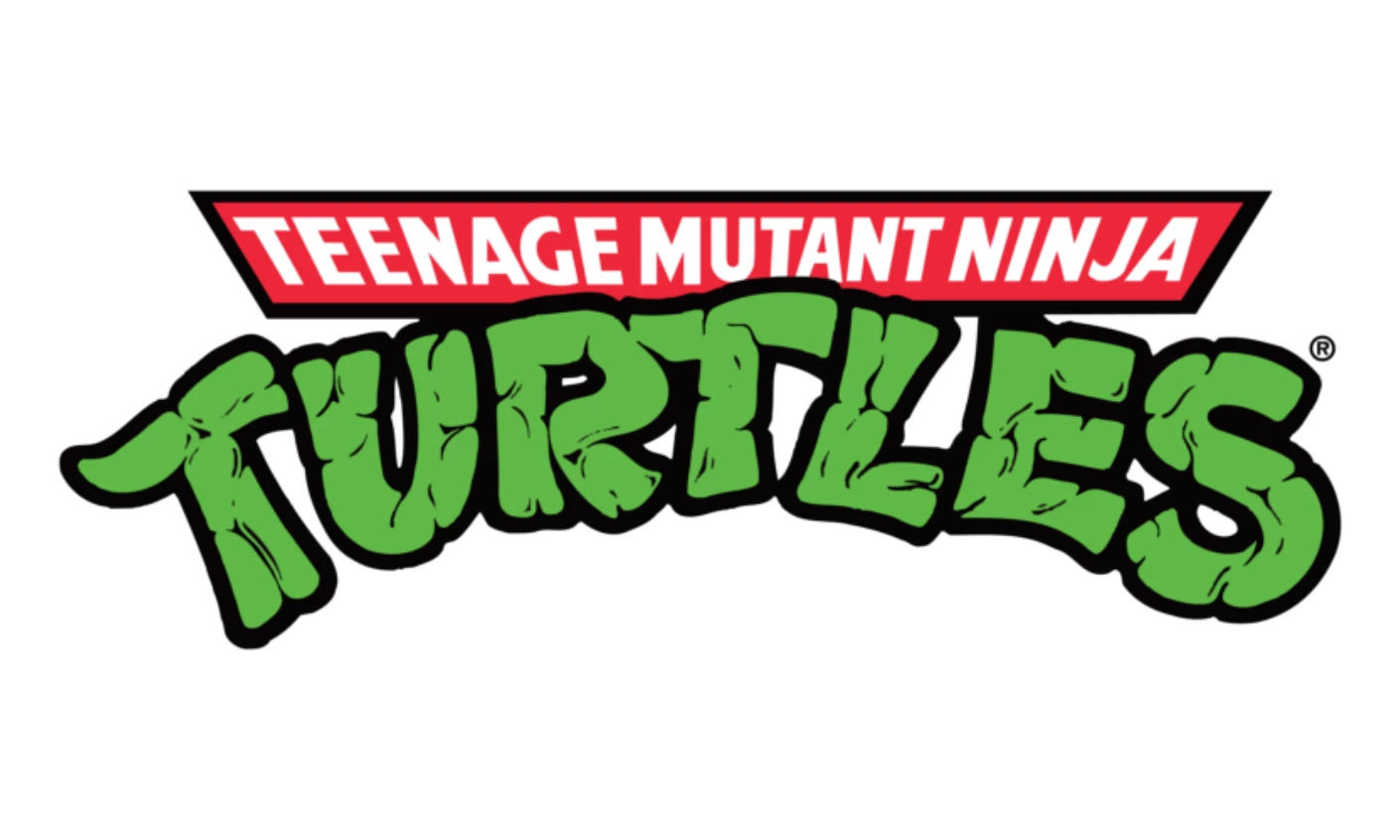
The impact-weight letterforms with strong drop shadows were built for toy packaging and Saturday morning TV: high contrast, legible from across a living room.
What kept the mark viable through multiple reboots is that the typography is simple enough to update without abandoning the system.
Each new version adjusts weight and shadow treatment while keeping the basic stacked letterform logic intact.
Verdict: Never clever enough to become dated.
12. Blockbuster (1994)
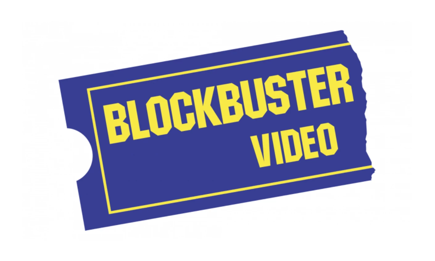
The blue ticket stub and yellow all-caps wordmark were retail signage built to be seen from a car window.
The brand's visual identity was built entirely around the physical store experience: the blue-and-yellow palette, the ticket motif, the promise of a destination.
When the destination disappeared, the logo had nothing to carry. That's what happens when a mark is built on a business model rather than a visual idea that can travel.
At its peak, Blockbuster operated over 9,000 stores worldwide. Today there's one, in Bend, Oregon.
The logo is now pop culture nostalgia, which is its own form of survival — just not the kind anyone planned for.
Verdict: The design wasn't weak — the world it was built for ceased to exist.
13. Starbucks (1992)
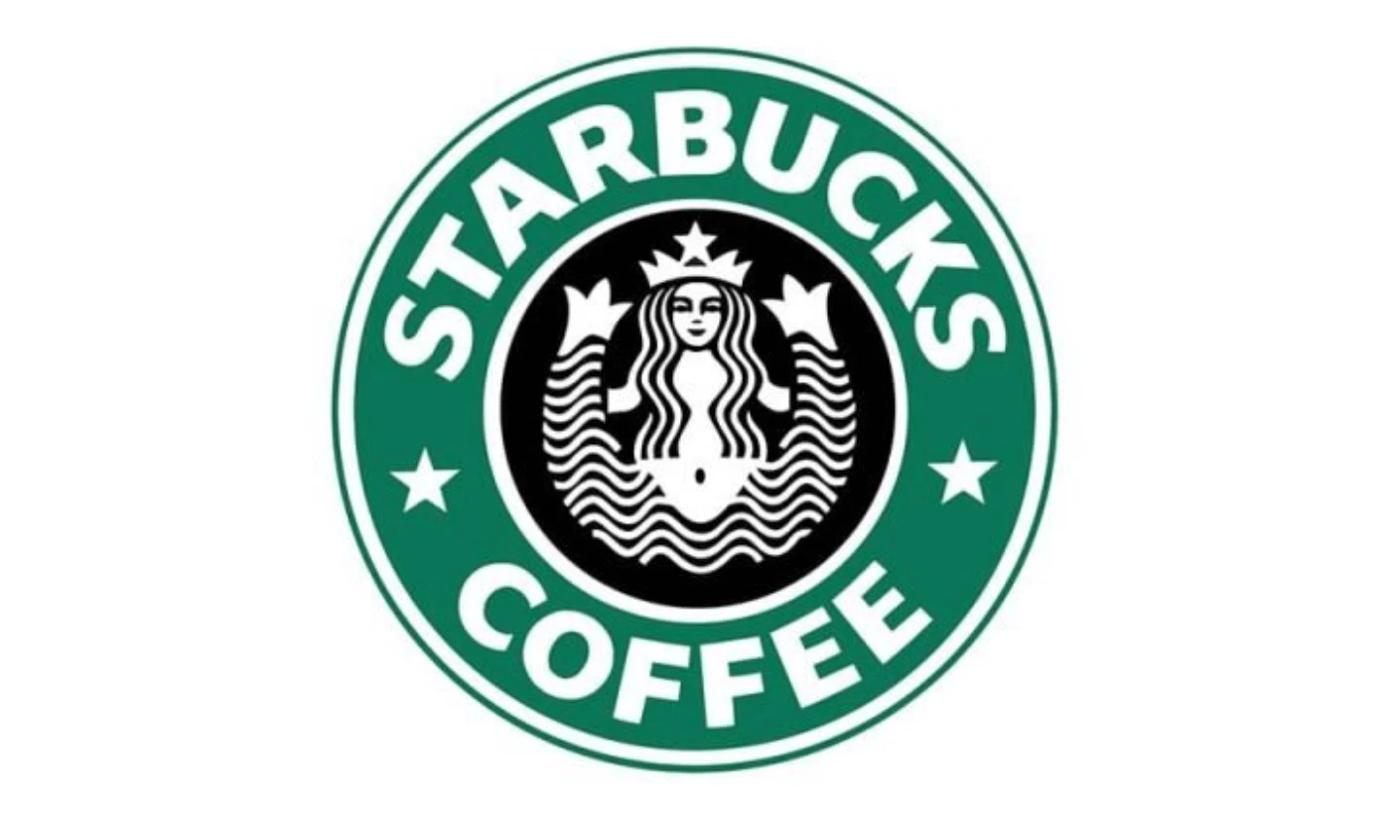
The 1992 redesign enlarged the twin-tailed siren until her face filled the circular frame, swapping brown for green and white. Concentrating detail in the face made the mark more legible at small sizes.
In 2011, Starbucks dropped its name entirely, the same move Nike made in 1995, because 40 years of global recognition made the siren sufficient on her own.
Verdict: Every redesign was a structural decision made with scale in mind.
14. Mastercard (1990 and 1996)
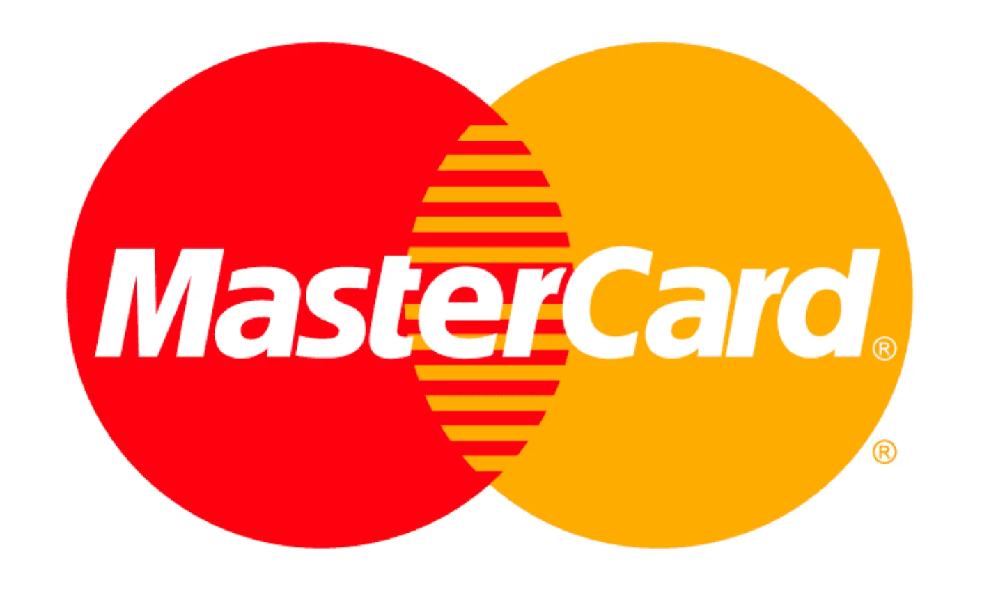
Two overlapping circles, one red, one yellow, with an orange intersection. The origin was functional: a Venn diagram representing banks and consumers meeting in the middle.
Pure geometry needs no modification across any medium.
Over 90% of participants in global recognition studies identified Mastercard by the circles alone, and in 2019 the company removed its name from the primary mark entirely.
Verdict: A functional Venn diagram turned out to be perfect geometry.
15. The Nanny (1993)
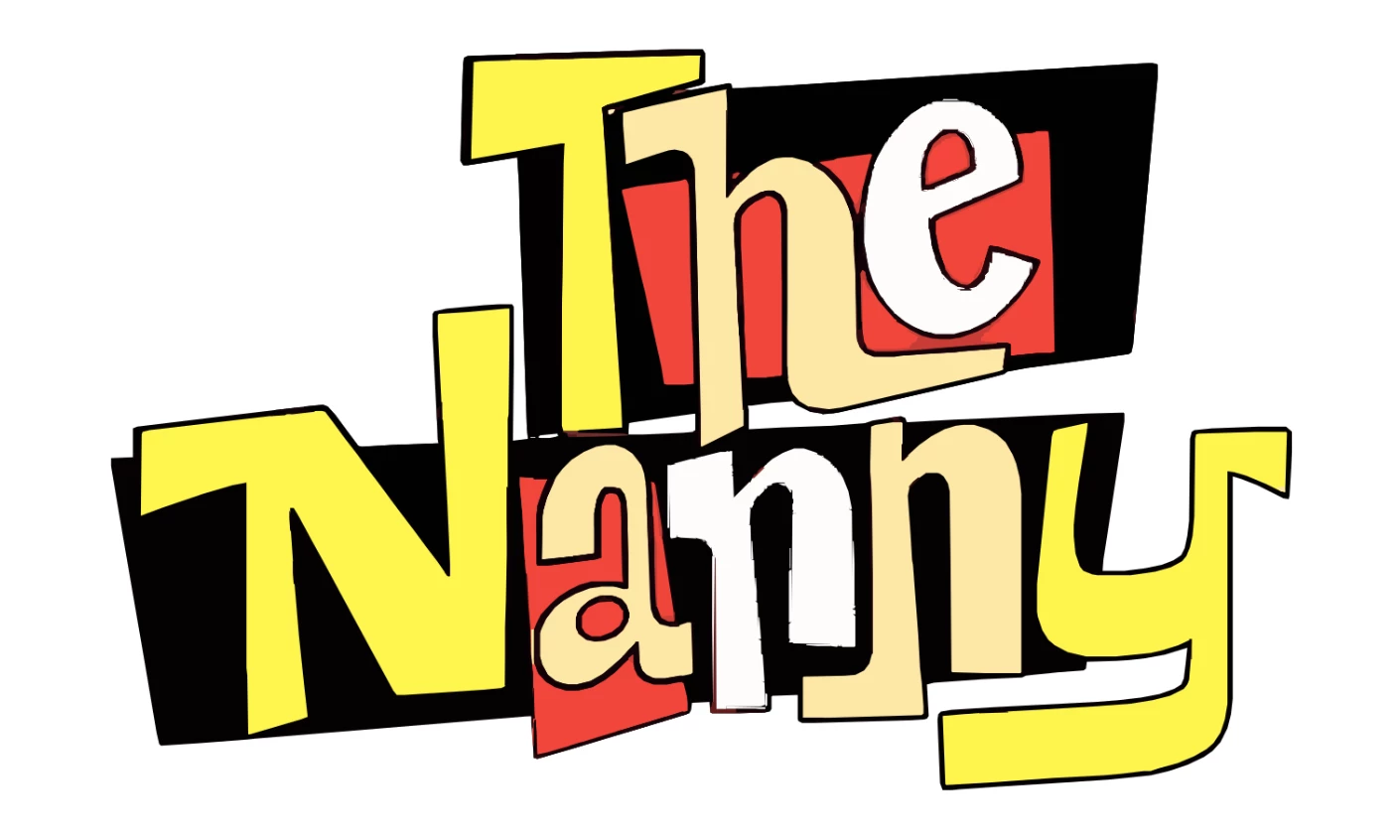
The fashion-inflected serif wordmark with decorative flourishes communicated New York glamour and aspirational domesticity, optimized for its broadcast context: the opening sequence, promotional materials, the title card.
Unlike most entries here, it was never designed to travel. A title treatment built for one specific cultural moment can be exactly right without being portable.
Verdict: A mark designed for one moment doesn't fail when that moment ends.
What the List Actually Proves
The 90s logos that survived share one structural property: their core logic is independent of the medium they were designed for.
The swoosh is a shape. The FedEx arrow lives in negative space. The Mastercard circles are pure geometry. The Nirvana face is a silhouette.
None of them require resolution, color accuracy, or a particular display size to communicate.
The ones that didn't survive were built around medium-specific assumptions.
The Windows 95 wave assumed dimensionality read as sophistication. The Blockbuster frame assumed there was a destination to frame. Remove the context, and there's nothing left to say.
Durability in logo design comes from structural simplicity, not stylistic confidence.
The marks that survived weren't the most ambitious designs of their decade. They were the ones whose underlying geometry was strong enough to outlast every assumption their designers made about the future.
Our team ranks agencies worldwide to help you find a qualified partner. Visit our Agency Directory for the Top Logo Design Companies as well as:


