We love talking about wine -- especially considering all the dazzling and intuitive wine bottle logos and branding labels that line grocery store shelves lately. But in this roundup, we won’t be talking too much about the bouquet, finish, acidity, ripeness or notes, instead of focusing on how wine labels and bottle designs celebrate these brands' overall identity.
To start, let’s see what wine sales and consumption industry statistics look like to better understand the industry.
Did you know that the US was the 4th major wine manufacturer in 2016, with an output of 632 million gallons? According to Statista, there are around 10 thousand wineries in the US, of which nearly half of them are located in California alone. The United States is exporting around 110 million liters of wine per year.
But Americans are definitely leading with wine consumption – with more than 950 million gallons of wine consumed each year.
It’s interesting to point out that the United States now accounts for 36 percent of the global wine market, and that many Americans are switching from beer drinking to wine consumption. The total retail value of wine sales reaches 62.2 billion US dollars. That's a lot of wine, which means these brands need to infuse some excitingly creative elements to stand out -- especially when 82 percent of wine drinkers end up choosing their wine based on aesthetics anyway.
Without further ado, these are some of the creative wine logos design in the industry! Cheers!
The 10 Best Wine Logo Designs For Branding Inspiration
1. 7 Deadly Zins
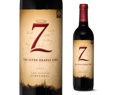
With a clever play on words, this sinfully tasty wine comes with an equally attention-grabbing label. Hailing from Lodi, USA, this wine is manufactured by two brothers, Michael and David. They certainly know what they're doing, since they've been doing it for six generations. The wine itself is made from a Zinfandel grape variety and paying homage to it in the form of its name is a smart tactic.
The bottle on its own is a regular wine bottle and brings nothing new when it comes to design. The lettermark symbol of 7 and a line create a Z for Zinfandel, embossed with a crimson red in gradient and seductive lines. On top sits a modest, shiny halo. This angel and devil play is nicely embedded in the wine label typography as well.
To the everyday wine consumer, the label might look simply attractive, but there are hidden signs that uncover the taste behind it, with just a wine label design. The lines are solid enough to reflect the red shine, but the overall feel they provide is neat, sharp, zesty even -- like the Zinfandel grape variety.
The label displays wine notes – like the tastes of soft oak and a cigar box - and that's seen through the label which looks like an old manuscript. Adding to that appeal, we also have burnt ends (hellfires, perhaps?), that could also shed light on the wine’s full body, rich with tobacco.
2. Miraval Rosé
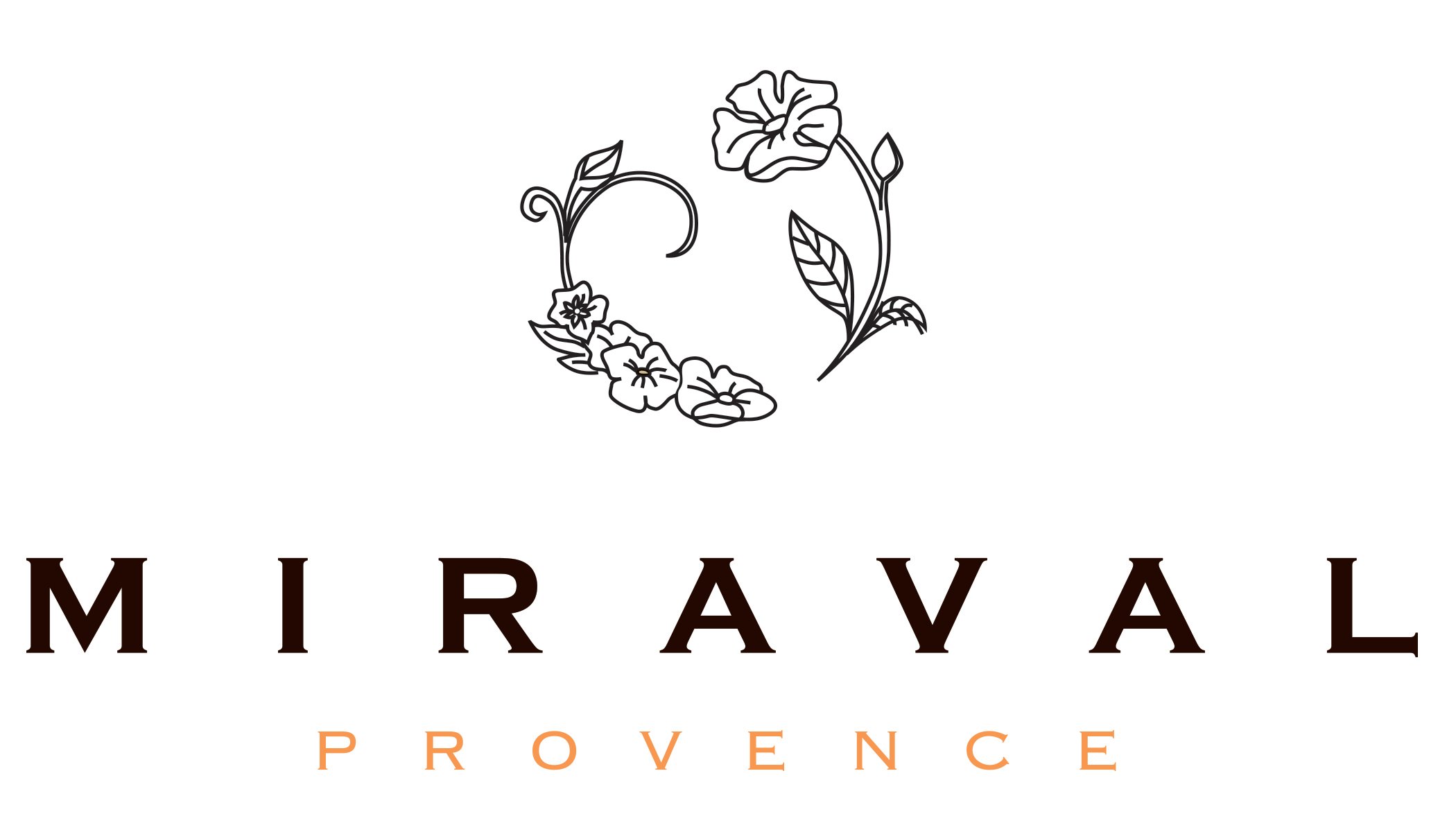
This beautiful wine logo scores a well-deserved spot on our list. It’s the number one Rosé wine on the Wine Spectator’s list, but also, it’s the only celebrity-made wine that made the list at all! The couple behind Miraval is none other than Brad Pitt and Angelina Jolie, but the beauty of the label and packaging is the main reason we're featuring it.
It’s a smart way to use the lovely wine bottle design, letting the bottle’s liquid really come through. When it comes to Miraval, the risen bottom acts as a pedestal on which the logo sits atop and rules the glass enclosure. The design embodies luxury, finesse, style and lightness. Here we can see how the absence of large bottle label design can work really well with rosé wine, and how the wine bottle can be a negative space on its own.
The logo is simple and delicate and shows soft white flowers (embodied in the wine’s essence and light aroma) like they're protecting a pearl. On the company’s stationery design, that “pearl” is lost and we can only see the flowers forming an unfinished circle. The Miraval typography even resembles Roman letters, with thick, bold font and light dashes on top of the letters. There’s a very nice contrast of white letters and logo on the matte black label at play. The whole label is encircled with gold, embroidered hues.
Even though the wine exudes richness and luxury, the price per bottle is around $20-$30, depending on the retailer. The Wine Enthusiast gave it a score of 91/100 this May, but we give it a pure 100 for a magnificent wine bottle and wine label design.
3. Chateau Latour, Pauillac
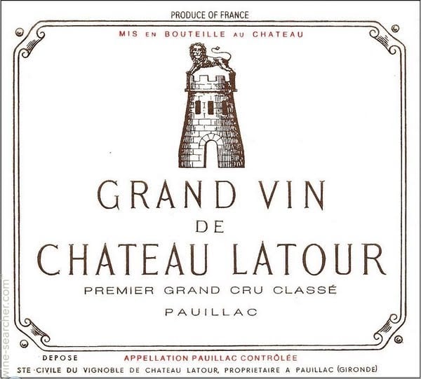
This is one of the most expensive wines on our list, so we simply had to analyze the label and wine packaging behind it.
A bottle of Chateau Latour, Pauillac can go for $2000, depending on the vintage.
This is a top wine brand with a long history – Chateau Latour wine was first created all the way back in the 14th century. They have three wines, depending on the age of the vines on the estate – the wine made from the oldest wines immediately surrounding the chateaux is the Grand Vin, the second is Les Forts de Latour, and the third is Pauillac de Latour, produced by the young vines on the estate. When it comes to taste, body and fragrance, Grand Vin from Chateau Latour is featured as one of the Top 15 Red Wines and belongs to the top 1 percent of all wines in the world!
Looking at the simplistic label, it’s evident that this wine takes a lot of pride in its heritage and history. The famous tower displayed on the label doesn’t exist anymore, but it was built around 1620, as a pigeon roost. Perched on top of it is the prowling lion, the sigil of the house at a time. The whole label is encased in the typical frame used at the time. The typography is also standard for that time, elongated, thin and blended with the rest of the printed color.
There's a lot of white negative space, but that’s simply because, at the time, people didn’t have the skills to print something more refined. Les Forts de Latour wine form the Chateau Latour winery comes with a bit more of a modern but classy label. That's expected, of course, considering how recent this offering is.
This is a great example of a well-known wine that doesn’t have to dazzle new consumers with a label in order to stand out.
4. Mommy’s Time Out
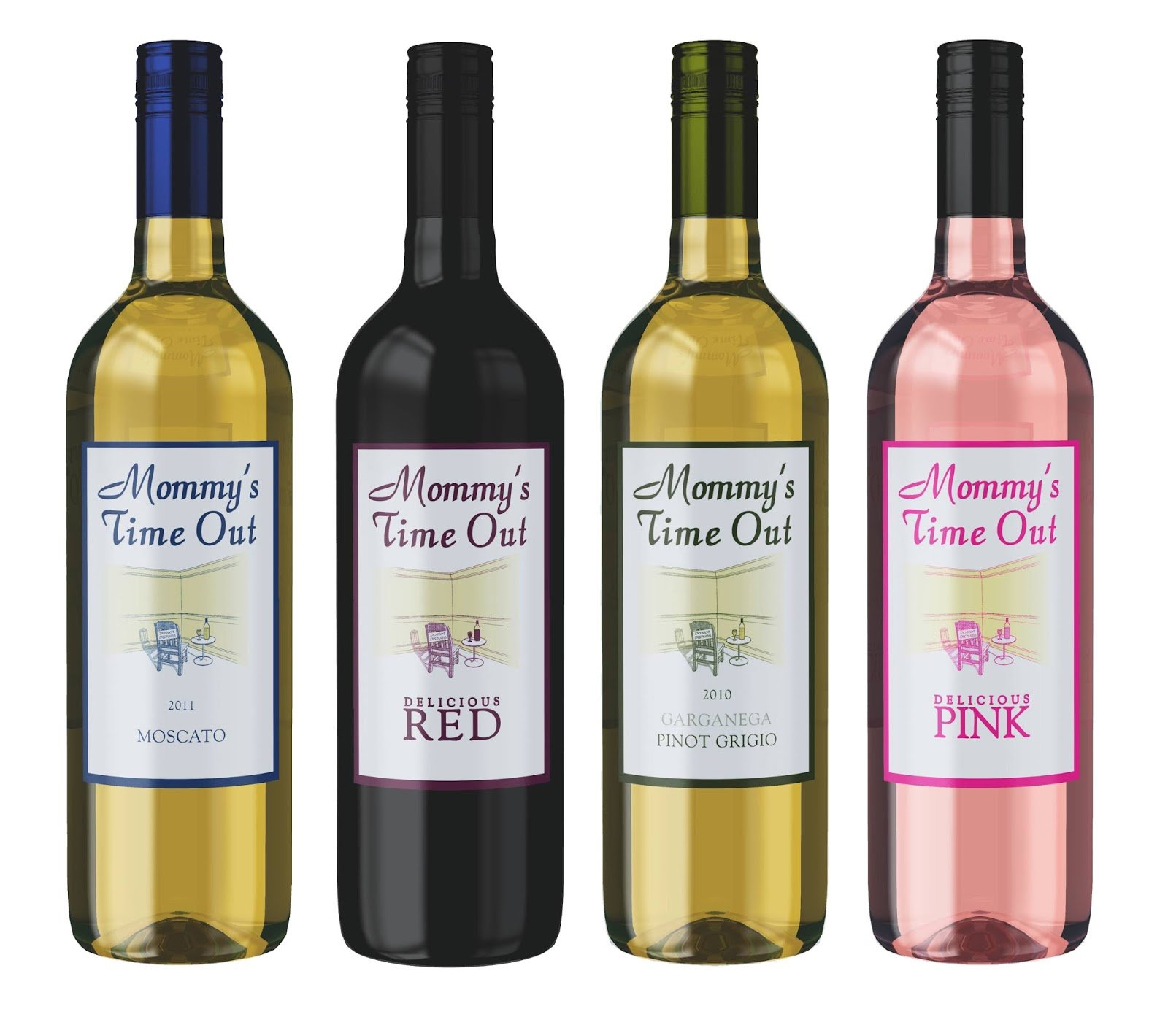
New brands have to make ripples in order to be noticed. When launching this $10 wine, manufacturers had the exact type of audience in mind. Mothers all around the world deserve a timeout, and this is exactly the message this brand is trying to convey – relax, unwind and have a glass of Mommy’s Time Out wine. Striking a relatable chord, the same winery also launched Daddy’s Day Off Fruity Red Chianti.
The packaging is simple and is reflected in the wine’s price, but the label tells a story to every mom out there. It’s simple, colorful and on-brand. The label depicts the perfect image – we can see a mom, relaxing, holding a glass of wine with her feet up. There’s a "Do Not Disturb" sign hanging on her chair, and the walls around her are covered in children’s etchings.
This is a good example of how a brand can use scenery in a label to convey a powerful message - every mom needs a moment of silence and a time-out when things get tough.
The wine is fruity, with lemon essence, and made from Italian grapevines. However, the brand knows it can't compete with more expensive wines on the market, so all it can offer is a memorable label, low price and extra serving sizes (coming in 1.5-liter bottles as well) – perfect for showers and mommy gatherings.
5. Tais Macedonian Wine

This European wine has a deep taste and light finish that persists and builds. Its packed in small bottles of 0.375 liters and sports aromas of dry fig and sour cherry. It’s zesty and powerful in taste, but also in its packaging and wine label design.
With a selling price of under 10 dollars, this isn’t a wine you would serve at a fancy dinner. The label on its own aims to capture restless and young spirits, especially drawing people in their late 20s and 30s. The label color blends perfectly with the matte colored wine bottle, so you don’t know where the label ends and the wine begins.
This is contrasted by a cat lying down and placed sideways – even here the brand tries to emphasize their difference and out-of-the-ordinary approach. The cat is obviously playful, with pink-painted lips in a satisfied smile. The tribal-like carvings on the silver cat are modernly designed, while the cat’s tail discloses the alcohol percentage and other useful information about the wine.
The typography, as well as the bottle design, are elongated, bolded and very modern. The whole packaging is very contemporary and the color palette is perfectly accentuating the darkness of the label, making sure everything stands out as it should.
6. Cotes de Provence Rosé
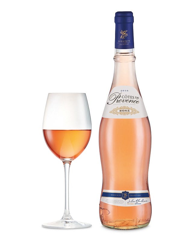
This is a great example how an eight dollar bottle of rosé wine can conquer America and be named as one of the best rosé wines under 10 dollars across the country. At a blind tasting event, judges choose Cotes de Provence as one of the best wines in the world, awarding it a silver medal at the main International Wine Challenge.
But what about the packaging? It should definitely win the award on its own merits. The label is made up of two parts, the top and bottom, playing nicely with the bottle’s curvature. It’s hard to assess what it most resembles, the elegant line of a man’s body in a well-tailored suit, perfect for the fancy dinner party, or perhaps the lines are more resembling a woman’s waist? It’s a great design that plays with people’s perception, showing off exactly what they want to see, and what appeals to them.
The label also has gold hues that perfectly accentuate the wine’s beautiful rosé color. The upper label sports a lovely and elegant filigree work and the typography exudes class and style, which is seen in the italicized brand wordmark. Apart from gold hues, this label also uses lovely royal blue colors that looks amazing with the gold contrasts.
The bottle cap in blue -- with a golden filigree sigil -- takes on the symbol of a crowning jewel.
It’s really hard to fathom how such an amazing design, perfect blend of colors and wine bottle shape can really hold an 8-dollar wine when it looks like it should be worth hundreds.
But Aldo understands that in order to attract customers with a brand new rosé wine on the market, the label and packaging should be inviting regardless of it price being budget-friendly.
7. Porto Valduro Ruby Port

Porto Valduro is a fortified dessert wine with a sweet taste, rich red color, and fruity aromas. Such a rich and potent wine deserves equal packaging, and once you lay eyes on the wine bottle design, that’s the exact feeling you'll get.
Strong and powerful, with a kick. The wine bottle is intentionally plump – resembling the wine’s high alcohol percentage – Porto Valduro has 19 percent alcohol content!
It almost looks like something pirates would drink, or something from the age of prohibition -- simple, powerful, and kept hidden. The packaging is very dark, along with the label, which blends in with the bottle’s color. The typography is bold and thick, and even a bit rounded. It also resembles the typical typography stamped on the liquor wooden crates of old.
The only contrasting colors on the black negative space are off-white (even dirty at the edges), and crimson red. This port wine is definitely intended for the “troublemakers”, rebels and all those who wish to feel that way. When it comes to wine quality, this wine belongs to the top five percent of wines in the world.
8. Yellow Tail
Yellow Tail’s success as a brand is mainly due to the brand’s marketing efforts.
Trying to penetrate the American market, the manufacturer realized it couldn't compete with European wines and their traditions (perhaps even their quality).
It is generally hard to target the same wine connoisseurs who are so used to European and Italian wines from the finest wineries, and new brands can rarely parry successfully with their branding based on heritage. So, once again, we have a story of how branding and label design positioned this wine brand in a positive light.
Their whole marketing strategy is purely brilliant. Yellow Tail employed the so-called “Blue Ocean” marketing approach. This strategy comprises avoiding the overcrowded market and competitors and creating its own niche, own market – a very own blue ocean where the person in charge creates the demand. This was done quite successfully for the Yellow Tail wine brand.
Yellow Tail targeted younger people and wine enthusiasts who just like enjoying the taste, without having the need to show any particular knowledge about the body, bouquet, aging qualities or any other wine distinctions. It was as simple as that – offer a new product that was fun, adventurous, and decently priced.
But most of all, the brand offered an ease of selection through a few, distinct offerings. They just claim their wine tastes good – and what’s wrong with that?
Appealing to the 85 percent of people in the US who don’t drink wine, and offering them a wine that doesn’t taste like wine was a bold and brilliant move. Choosing to go the route of a boutique winery also has similar advantages.
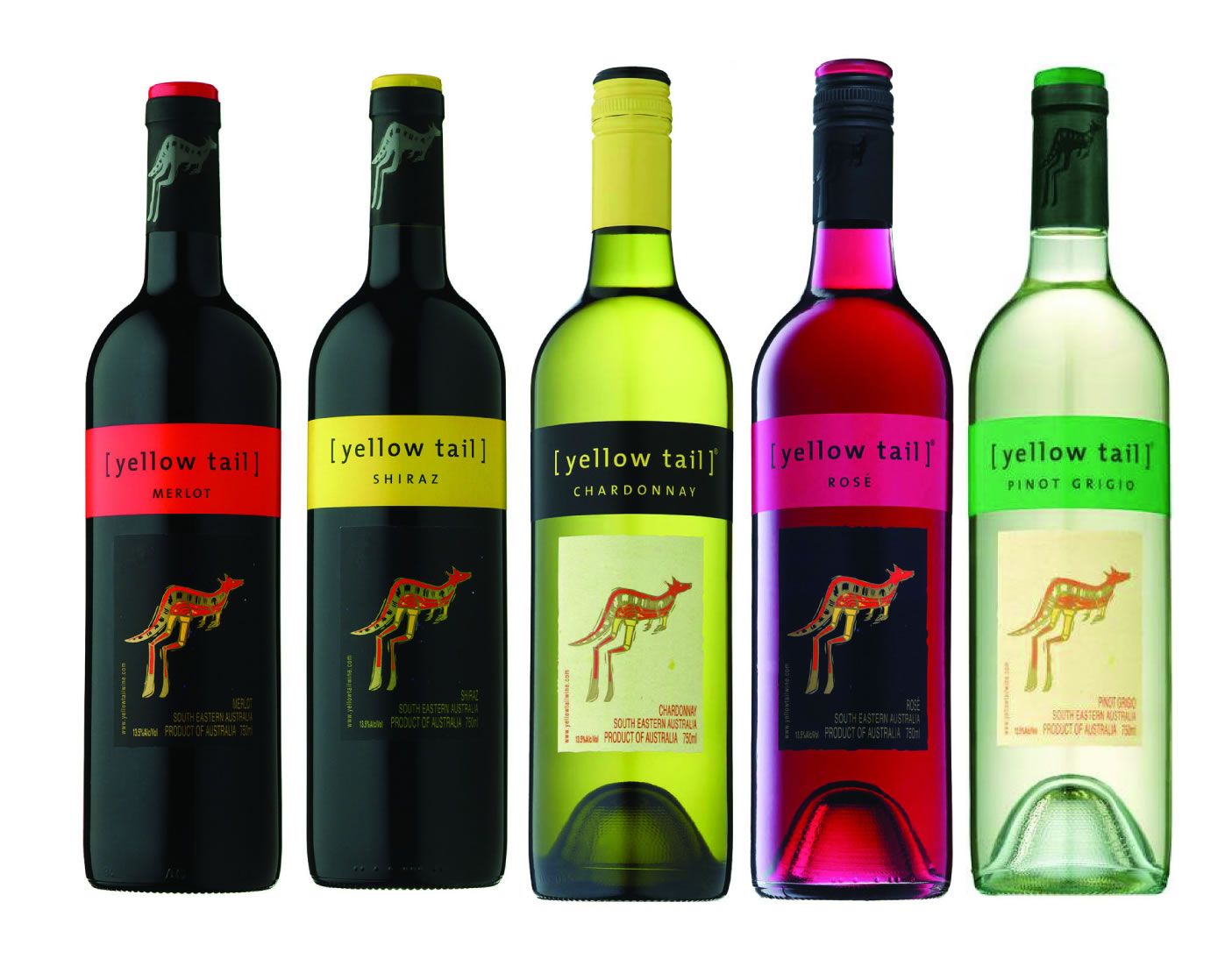
Label designs embody all these qualities and the entire marketing strategy. The label doesn’t promote elitist wine terminology, and Yellow Tail doesn’t boast prestigious vines or the wine complexity.
The label is very simple, with a single Yellow Kangaroo, same for both reds and whites, and only the upper part of label color changes according to the grape variety used. Vibrant colors attract enough attention, creating a unified experience.
9. Toro Albalá Don PX Convento Selección
Toro Albalá’s Don PX Convento Selección wine belongs to the top 1 percent of all the wines worldwide. It is a dessert wine that pairs nicely with blue cheese. Connoisseurs describe it as well layered, thick like honey, everlasting with tense, sweet aromas. This is a highly prestigious wine as the bottles are usually aged 80 to 100 years old.
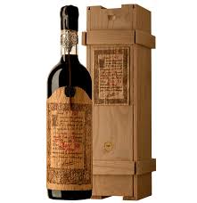
Wine used to be delivered encased in wood, with a “label” that was engraved by hand. Theis wine’s label mimics wood elements and the old, handwritten typography. It definitely pays homage to its heritage and the history of the area. The same production process as of old makes even their 2014 vintage a historic wine that preserves all the artisan trade secrets. And the inside of the wooden crate that holds this wine contains more information about the selection.
The label is strong, without much negative space. It really looks like it was handwritten and signed by the manufacturer. Each bottle comes with a wax seal, and the whole bottle cap looks like it was captured in glass.
10. Carles Sala Casanovas
Sala Casanovas is a relatively new player on the market of dessert wines so there isn’t much history about this winery -- but they make up for it with their label design.
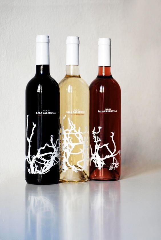
Actually no, it’s not a wine label design at all since these wines don’t have conventional labels -- all information is colored on the bottle. Speaking of information on the bottle, you can only find what is absolutely necessary and required by the law, other than that, the packaging is very simplistic and minimal.
The idea behind it is great – the brans is letting the wine sell the wine. The red rose and white wines provide the perfect backdrop for the artistic representation of the vineyard and entwining branches. It is amazing how such a simple shape inspired the product’s nature can speak lengths about the brand.
And that shape, while being recognizable, is still different for each type of wine. If you look closely, all three bottles have a unified look that helps with brand recognition, but each bottle has vines that go in separate directions. The branches are displayed without the grapes because all the good ones can be found inside the bottle. Subtle and clever.
Using the high contrasting and almost glowing white color for each type of wine and surrounding it with endless negative space, this design is a smart way to attract attention with utterly simplistic and minimal design.
Great Wine Packaging & Label Designs That Stand Out
All this wine talk made us thirsty! But, what can we learn from these 10 best wine design labels? It's simple. If we're talking about wines with a story and history, it's good to display that tradition on the wine label.
Heritage can only be an advantage. However, new brands cannot compete with heritage, so the popular thing to do (and it feels like it’s almost the only choice) is to use marketing strategies and wine label design to attract attention and stand out from the hundreds of other bottles on the wine racks.
New wine brands have the opportunity to play with their branding and use the modern approach that could range from colorful and simplistic, to completely minimalistic. We have also seen a couple of $10 bottles that could stand proudly next to the bottles that cost hundreds or thousands of dollars. That’s another pointer which new brands could learn and use to their advantage.
If you want to dazzle your customers, price plays a large role, but you can stand out with the design as well.
Miraval and Cotes de Provence Rosé have absolutely taken the right approach – their label design and packaging look so well that you won’t be the least bit worried to buy a bottle and bring it as a gift to a fancy dinner party, and both cost less than $10.
But the lines, the color palette, the emblems, and labels are so classy and refined that they will immediately demand consumers’ attention -- which is the main goal of every package design.

Our design experts recognize the most innovative and creative designs from across the globe. Visit Design Awards to see the:
- Best Logo Designs
- Best Website Designs
- Best Video Designs
- Best Print Designs
- Best Packaging Designs
- Best App Designs
Our team also ranks agencies worldwide to help you find a qualified agency partner. Visit our Agency Directory for the top Logo Design Companies, as well as:
- Top Web Design Agencies
- Top Video Production Companies
- Top Print Design Companies
- Top Packaging Design Companies
- Top Mobile App Development Companies
-details.jpg)

-preview.jpg)

-preview.jpg)


-preview.jpg)