Team Behind the Design
Packaging Design Analysis
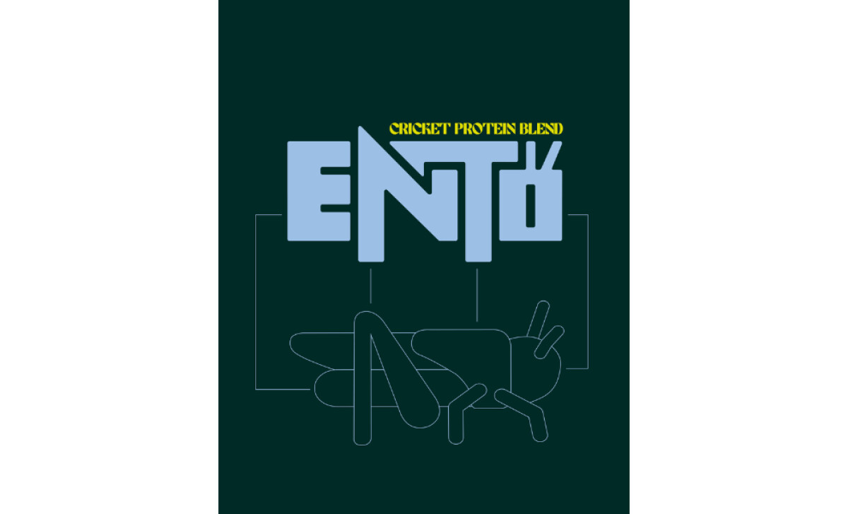
Packaging in the food and beverage space often succeeds when it delivers clarity, distinction, and an emotional spark.
When I review work in this category, I look for designs that can communicate purpose at a glance while holding enough personality to stand out in a crowded environment. This identity achieves that balance through expressive typography and a confident visual attitude.
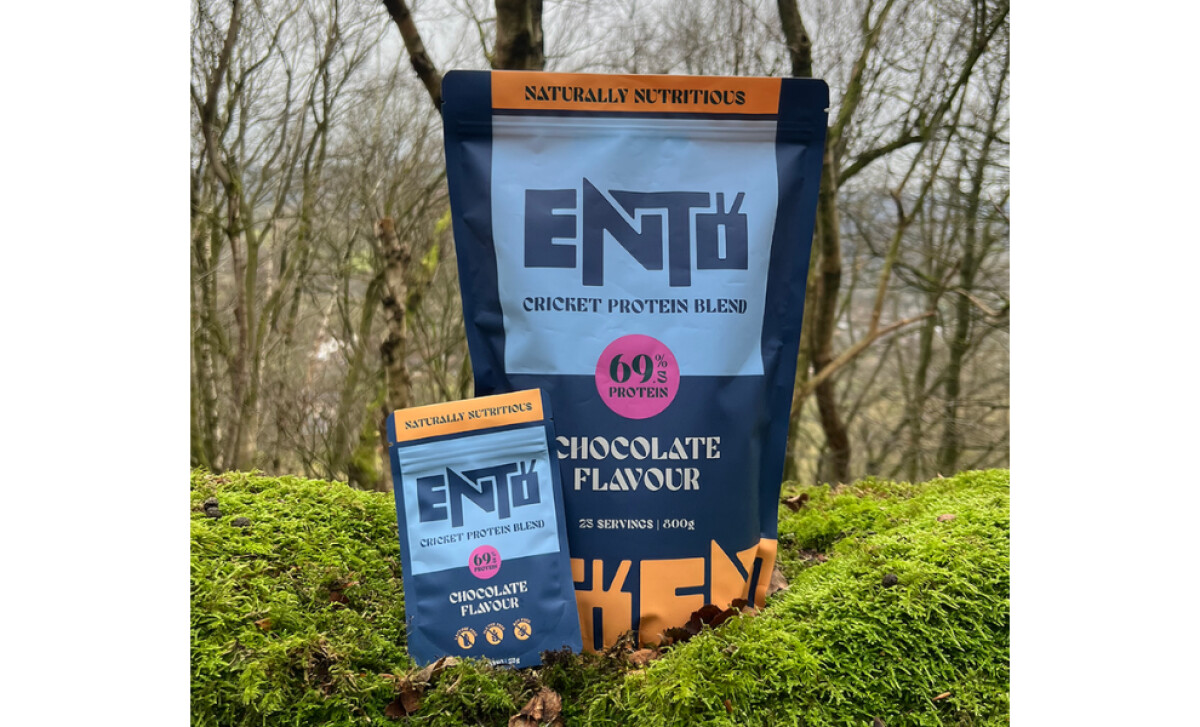
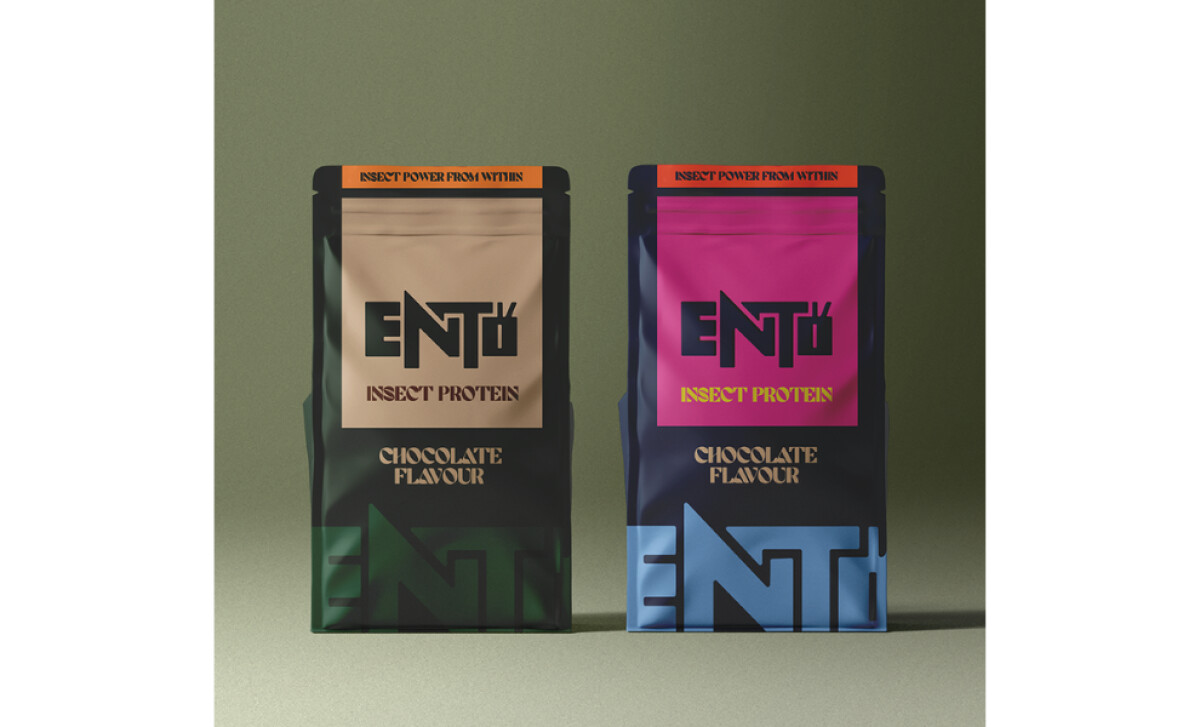
- Structure: I see packaging built around a strong central mark that organizes the visual hierarchy. The blocky letterforms carry weight and create an instant focal point, which helps the product stand out both on shelves and in outdoor lifestyle settings.
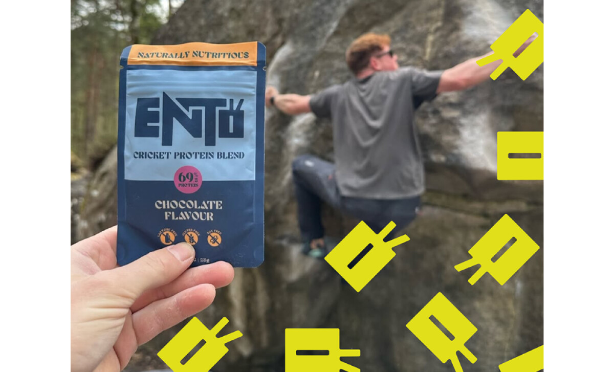
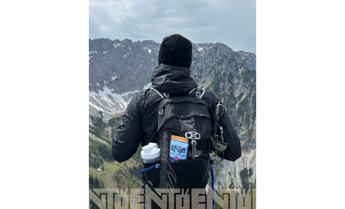
- Shelf Impact: The oversized logotype and contrasting colors give the pack a punchy presence. The decision to lean into bold shapes rather than traditional health-language signals adds freshness and confidence, which can help engage younger, adventure-oriented consumers.
- Information Hierarchy: Key product messages, like protein percentage and flavor, are placed with clarity. I appreciate how the design keeps the hierarchy simple. It supports fast recognition during active shopping moments, especially in a category where claims need to be direct.
- Sustainability Cue: The subtle connection to cricket anatomy within the logo offers a clever nod to the product’s origin. It avoids being too literal, which can help broaden the appeal for consumers still warming up to insect-based nutrition.
Client Testimonial
"I cannot recommend Anna enough. She quickly created an amazing identity for my brand."— Alex Cheung, Founder, Ento
What Brands & Agencies Can Learn from Ento
Ento’s packaging shows how a food and beverage product can stand out with confidence while still communicating purpose. It proves that bold form, clear messaging, and thoughtful symbolism can work together to create both interest and trust.
1. Lead with a Strong Visual Anchor
The oversized logotype becomes the center of attention. This creates instant recognition on shelves and gives the brand a distinctive stance that separates it from traditional health-forward packaging.
2. Let Color and Contrast Carry the Energy
The bright, punchy color choices help the product pop in busy retail spaces. This visual boldness communicates confidence and appeals to consumers drawn to adventure and novelty.
3. Use Subtle Symbolism to Build Curiosity
The quiet reference to cricket anatomy within the logo adds meaning without overwhelming the design. It nods to sustainability in a way that feels clever, not confrontational.
About DesignRush Featured Designs
At DesignRush, we review hundreds of agency projects each month. The featured designs stand out for creativity, relevance, and execution.
Many go on to be recognized as winners of our Monthly Design Awards.
Explore more creative work here:
- Best Packaging Designs
- Best Website Designs
- Best App Designs
- Best Logo Designs
- Best Print Designs
- Best Video Designs
For a full list of design agencies and related services, see our Agency Directory.

-preview.jpg)
-preview.jpg)