
Don’t swallow that butterfly. These “pills” are actually an invitation to an art exhibit featuring Damien Hirst. His work often focuses on the contrasts of life and death. By using this unique packaging, Hirst was able to capture the attention of receivers with his invitations.
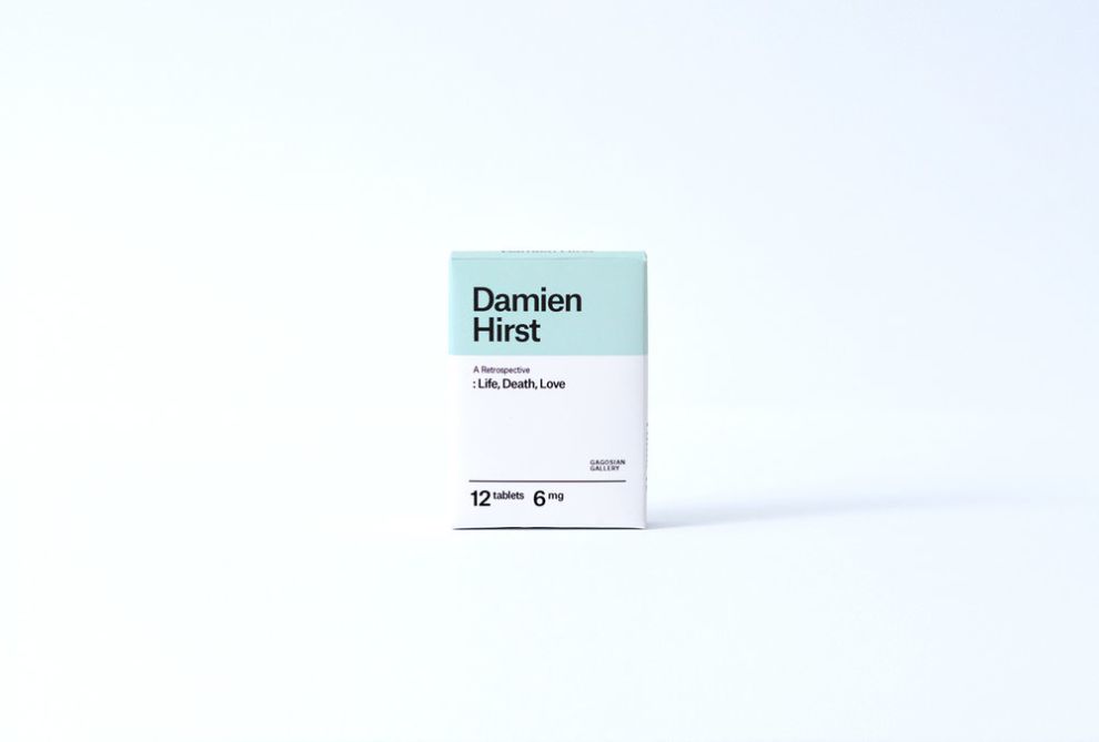
The packaging has a very “medical” feel to it. The light blue color is reminiscent of a hospital room, and the entire design is meant to emulate the appearance of a prescription drug package. The typography is minimalistic and simple. If it wasn’t for the artist name and the name of the exhibit, then there would be no differentiating this from actual medication.

Popping the “pills” out of their bubble packaging reveals the important details of the show, including location, date, and time. Hirst is using a very interesting design choice. The format of the invitation actually requires the invitee to interact with the package in order to find out the details of the event. It’s not often you see packaging or invitations that encourage interaction. This one does both.
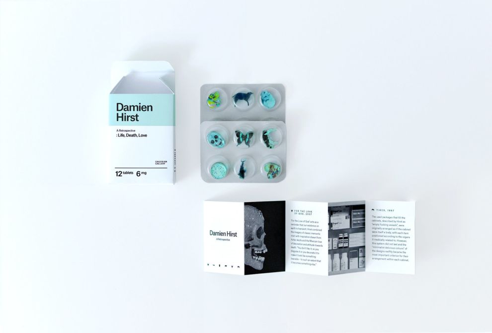
Standing out as an artist is important. For Damien Hirst, standing out begins as soon as people hold his invitation in their hand. The design relates to the themes that Damien addresses in his work, and it certainly encourages discussion among recipients. For that reason, this design is one of the best invitations we have ever seen.
Artist Invitation - Damien Hirst is a creative packaging design in the Arts & Recreation industry.


-preview.jpg)
