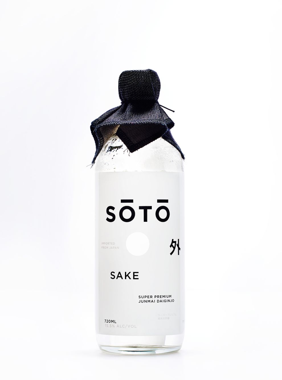
The contrasting design of Soto Sake’s bottle will immediately grab your eye. Sake is a traditional Japanese alcohol with deep roots in Japanese culture. Soto Sake has managed to put a modern spin on such a classic beverage.
The white-and-black label is clean and modern. This is in stark contrast to the material that hugs the lid of the bottle. The fabric looks a lot like raw denim, which the Japanese are known for. The window in the label is also a nice touch—like a small break in the opaque printed design, through which people can see the clean, clear sake inside.
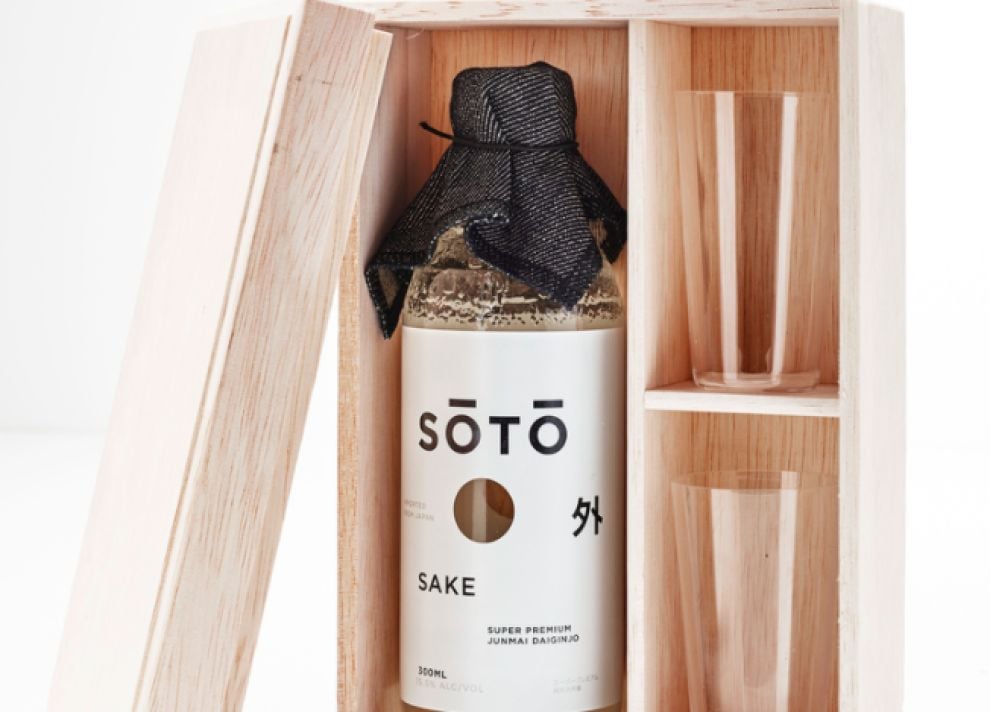
The wooden box that contains individual bottles of Soto Sake also adds a touch of traditionalism, while still maintaining the minimalist feel of the bottle. Inside the box, alongside the bottle, are two sake glasses. This extra touch makes Soto Sake stand out. Consumers will be proud to grab this box out of their liquor cabinet, open it, and share Soto Sake with their good friends or family. The packaging design isn’t just a box for storage; it creates an experience.
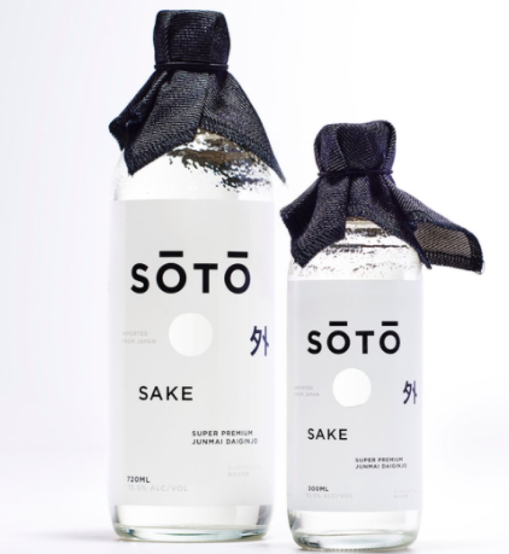
This minimalist design, accented by the fabric at the top of the bottle, makes Soto Sake capture your eye immediately. Right away, users know something is different about this brand. They stay true to the history of the Japanese beverage, while adding their own unique modern spin. It’s the perfect combination of old and new that’s meant to be enjoyed with those closest to you.
Soto Sake is an awesome packaging design in the Food & Beverage industry.


-preview.jpg)