This article delves into some of the best brand designs of the year and discusses their distinctive properties. Join us and get inspired as we list and analyze the exceptional work of some of the best branding agencies worldwide!
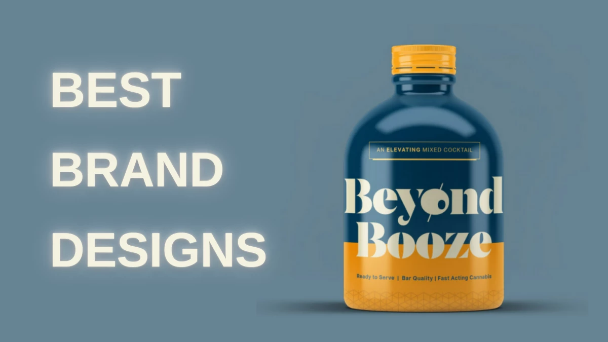
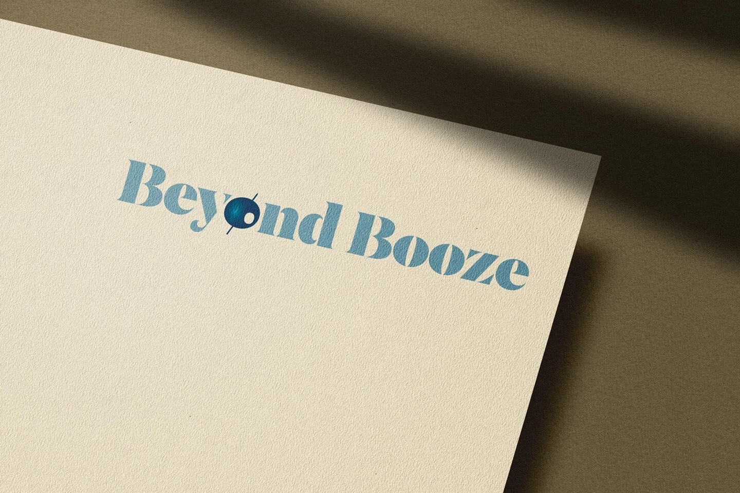
1. Beyond Booze by Santoro Design
Standout Features:
- Sophisticated, Art Deco-inspired
- Inviting the curious, experimental audience
- Upbeat colors and quirky font styles
We’re opening our best brand designs list with Santoro Design’s creative solution for Beyond Booze. The startup flaunts a charming character and a stylish image that stands out.
The elegant geometric patterns and motifs in soft pastel colors bring a sophisticated appeal, prompting the customers to have a sip of the product. The upbeat yet gentle coloring is an ingenious background for the circular visuals and quirky font styles.
Overall, Beyond Booze’s brand design invites the curious, experimental audience to unwind through its fresh, hangover-free canna beverages!
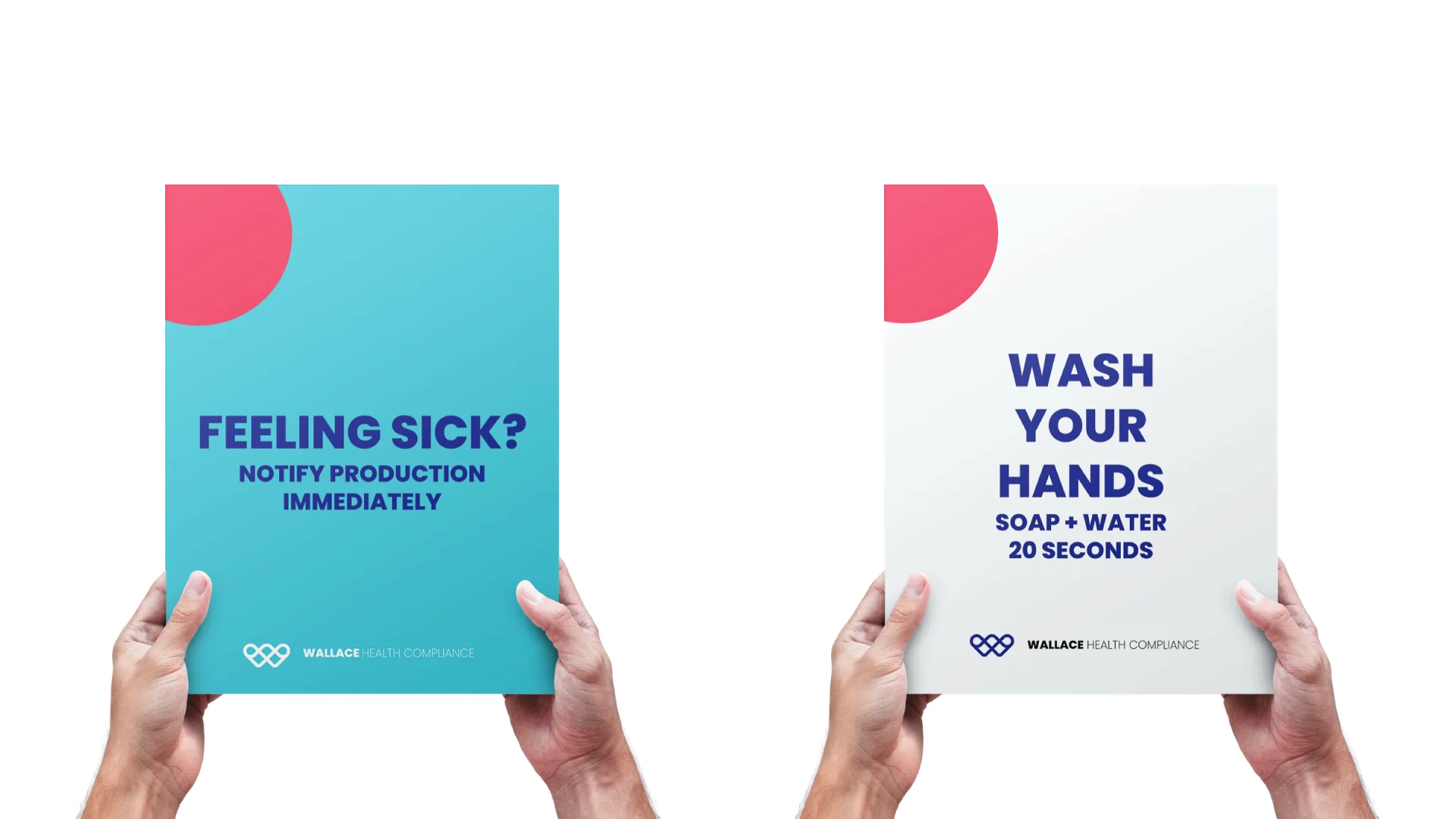
2. Wallace health compliance by GLYPH Marketing
Standout Features:
- Circular visual elements
- A prominent color palette
- An empowering logo design
Our next best brand design features Wallace Health compliance, a project developed by GLYPH Marketing. The founder and the agency worked closely together to deliver care and connectedness through design.
This vision served as a foundation for everything related to the branding and logo. The emblem blends the initial letter with a heart and an infinity sign to present itself as an empowering symbol at the forefront of the brand’s marketing collaterals.
The prominent color palette encompasses eight hues, with four vivid primary colors that present an atypical look for a medical company, steering clear from the usual sterile appearances. Then, the print designs or signages combine two or more core colors with circular visuals that promote energy and concise communication.
Discover more intriguing healthcare designs.
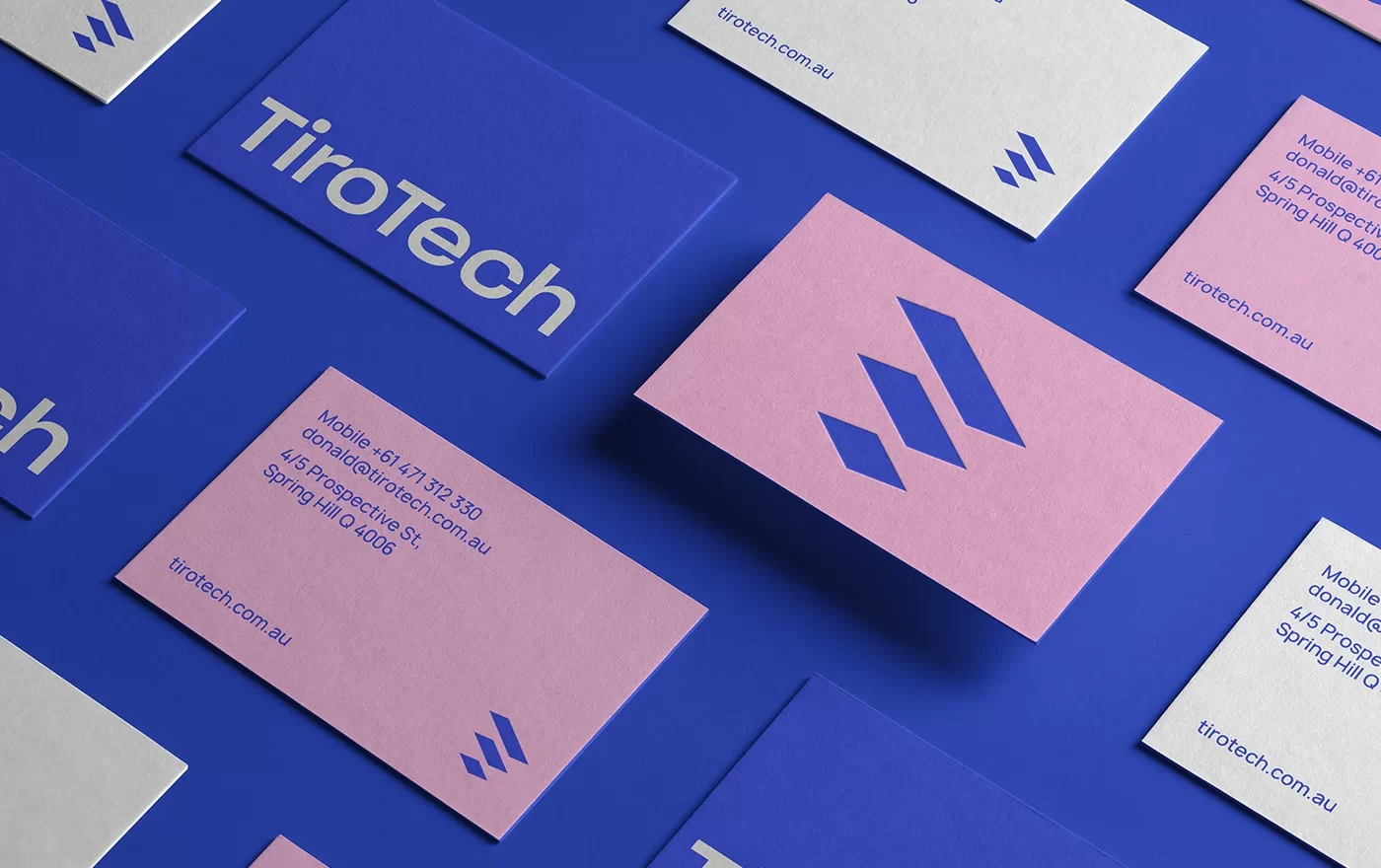
3. TiroTech by Studeo
Standout Features:
- Modern and expressive
- Inspiring confidence
- Depicting the educational ripple effect
Our next pick for the best brand designs is delivered by Studeo for TiroTech. The brand aims to provide an educational platform for standardized tech learning.
The modern and expressive brand design relies on a narrow, three-color palette to convey multiple emotions. Blue communicates well with the tech-savvy audience, black inspires confidence by portraying stability and structure, and pink reflects the passion for learning and technology.
While the palette is employed across a multifaceted marketing approach, it mostly serves as a supporting background element to the distinctive emblem.
The agency created a logo by connecting three blue rectangles with positive space, effectively showcasing a learner's movement and progress in education.
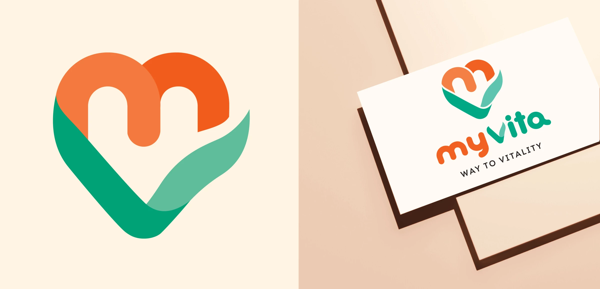
4. MyVita by PND Futura
Standout Features:
- Stabilized image consistency
- Showing love toward nature
- Inspiring kindness
MyVita is a family company that supplies dietary supplements in Poland’s rising biological eco market. PND Futura helped the brand develop a more stable image in the market through its coherent branding solution.
The rebranding was based on a flagship emblem encompassing four complementary pastel colors forming an unfinished heart. With two warm shades depicting the arches, two cool hues build the stem. The combination also communicates the natural greenery that blooms into lush flowers.
The logo’s symbolism inspires kindness and interconnectedness, further developed through pale concentric lines accompanying it across the packaging designs and merchandise.
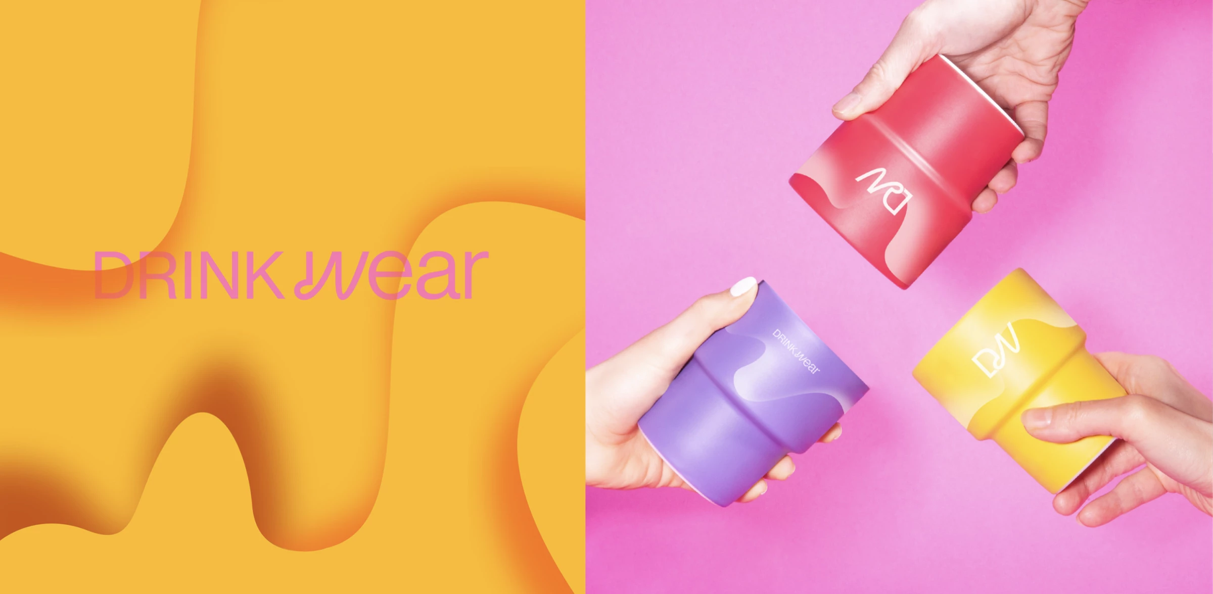
5. DRINKWEAR by mood agency
Standout Features:
- A playful monogram logo design
- Strong color contrasts
- Industry-related shape fluidity
This next-best brand design comes from Maxim Ceramics, a manufacturer of Polish glass, porcelain and metal. Mood agency helped the brand position its new sub-brand, DRINKWEAR, as another industry leader through a “show, don't tell” branding process.
Everything in this approach, from the logo design to the product visuals, lets the audience know what the brand excels in. The elegant craft is portrayed by printing contrasting colors next to one another to show the fluidity of pre-hardened materials on the end products.
The playful monogram logo design delivers stability in the “D” glyph and fluidity in the “W” glyph. Overall, the brand design finds intriguing ways to inform the audience about the colorful process of shaping raw materials into fine craftwork.
6. Pastificio San Vigilio by Studio Puls
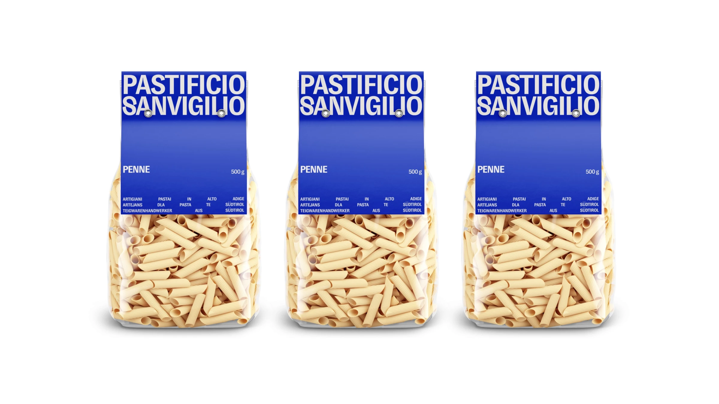
Standout Features:
- Modern display typography
- A stable corporate color palette
- A clever text justification
Pastificio San Vigilio collaborated with Studio Puls to construct a complete branding design that showcases the mouthwatering pasta landscape in its full glow.
The logotype illustrated in a modern display font is the leading visual element and the spice that adds flavor to this pasta company’s branding. You can see it on the packaging's top cardboard cover, where it's hard to miss.
The stable corporate palette features blue backgrounds with a white typeface, adding a masterful and professional image to the brand design. While the uncooked pasta glimmers through a transparent bag, the content bit on the packaging is cleverly justified in a way that mimics the raw goods.
7. Fosplan by Curo Design
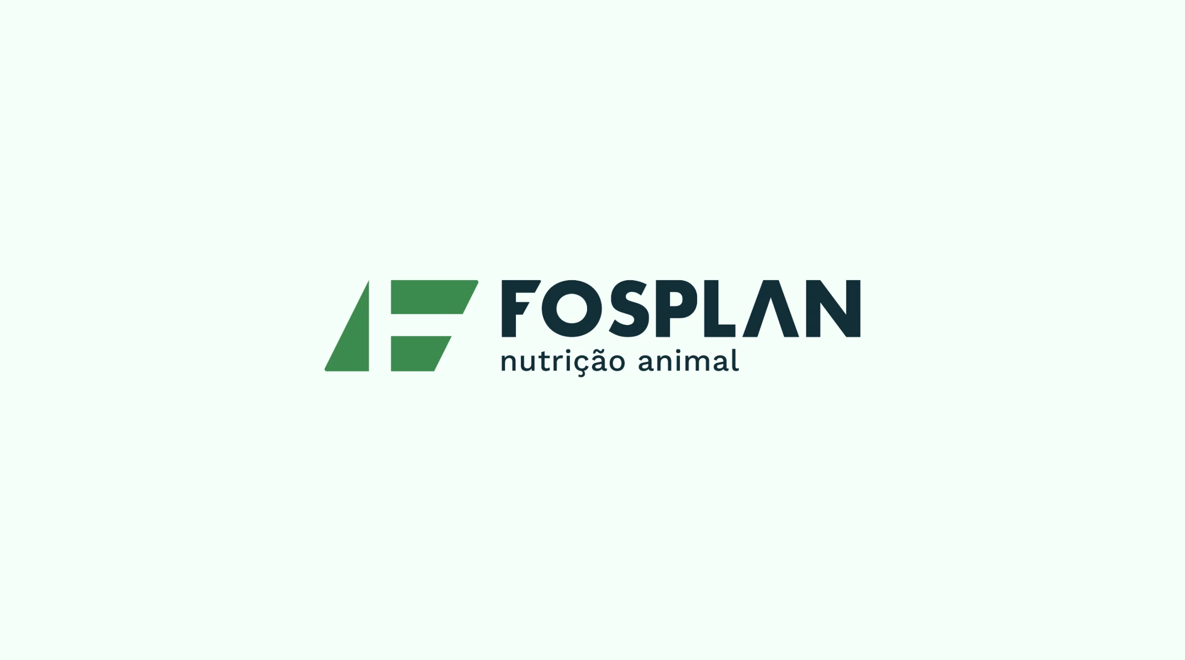
Standout Features:
- Versatile and dynamic
- Modernizing the old brand
- Enriching the color palette
Our next best brand design has a long and successful history in agriculture. Curo Design helped reposition Fosplan in the market after 40 years of being in the business.
This redesign doesn’t abandon the old branding but builds on and modernizes it. The previous single-color logo was replaced by a more contemporary design with two colors: green for the new icon and blue for the logotype centered below it.
The brand design produces a more versatile and dynamic image with the new, scalable logo design, improved typography, and enriched color palette.
8. Heymil by Firstrein
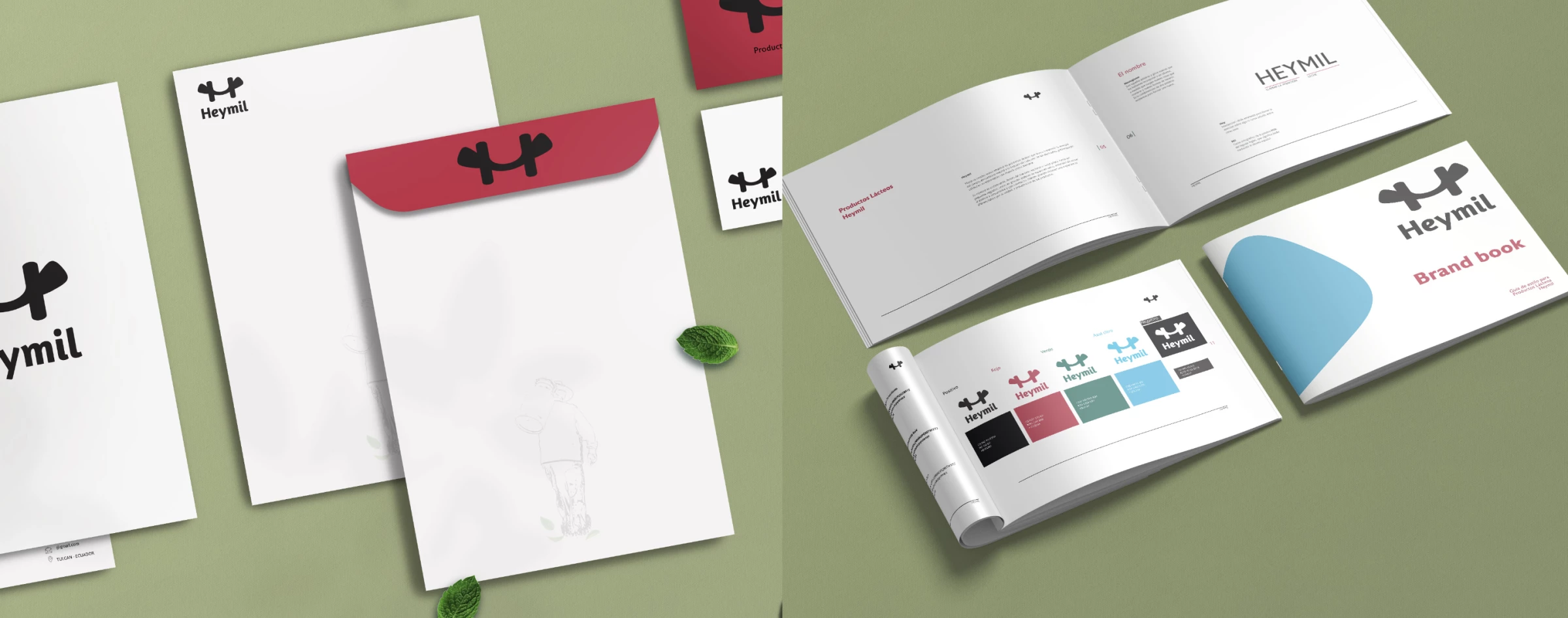
Standout Features:
- Countryside imagery
- Modern and simple
- Emphasized logo
Heymil is a dairy product company that asked Firstrein to craft a brand design to stand out. The result is a beautiful branding solution that highlights the logo design.
The marketing collaterals are modern and clear, with a scaled-up, multifaceted emblem as the sole element referring to the brand.
The packaging design, while retaining cleanliness, entails a bit more. The front panel portrays a minimal, tranquilizing illustration of a farmer walking across his fields. The imagery evokes an emotional response and prompts the customers to daydream about the peaceful countryside life as they enjoy the products.
Do you like exploring the creative potential in the dairy industry? Check out these amazing dairy product packaging designs!
9. Toskaia by Bungalow Creative
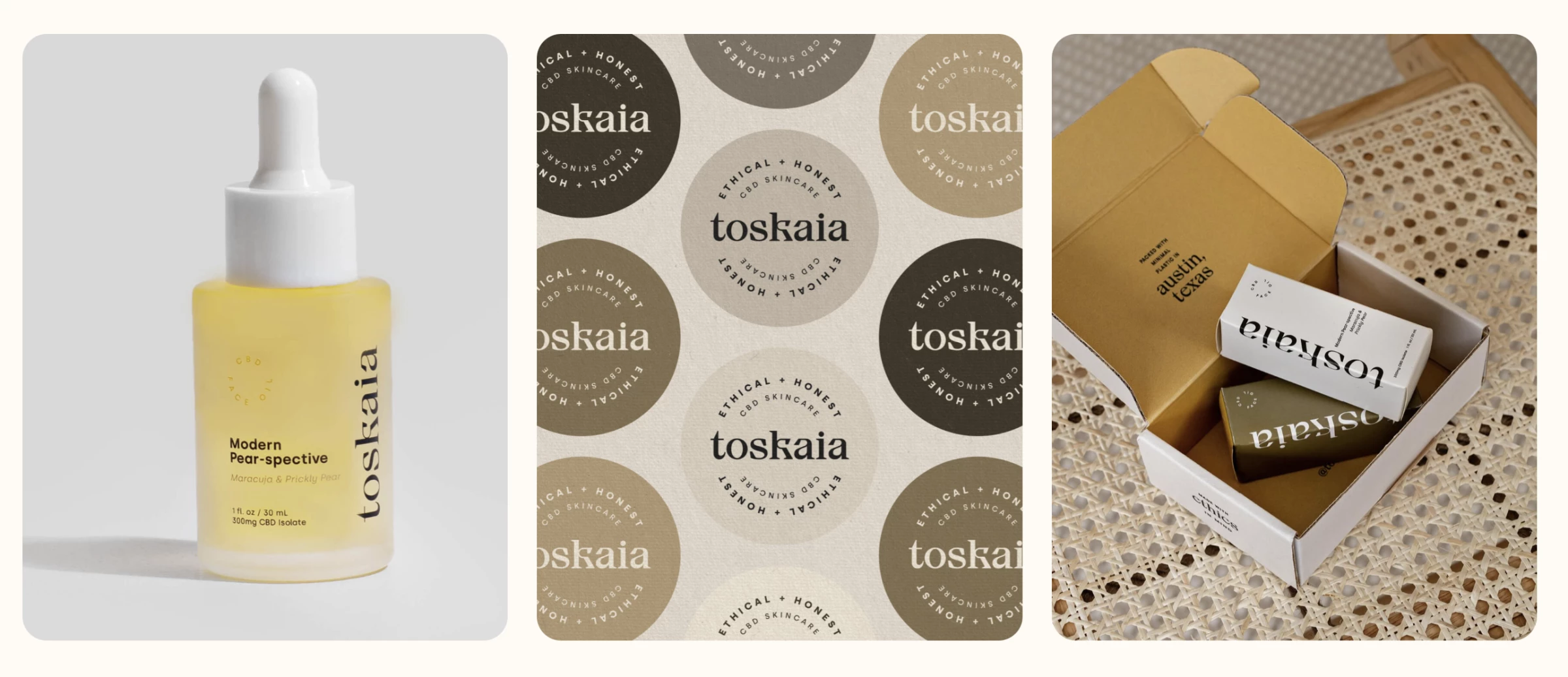
Standout Features:
- Nature-inspired color story
- Simple yet sophisticated
- Eco-conscious
Toskaia collaborated with Bungalow Creative to position itself as a leader for positive change in the skincare industry through brand design. The agency created a stunning identity showcasing the brand's dedication to providing sustainable products.
That’s why this branding process entails many visual reminders of Toskaia’s eco-conscious goals, primarily in its packaging design. The box is made of easily recyclable materials and painted in natural colors. Its side panels politely ask the customers to recycle.
Complementing the simple design is the sophisticated typography that overflows between the panel’s edges, elevating its appeal.
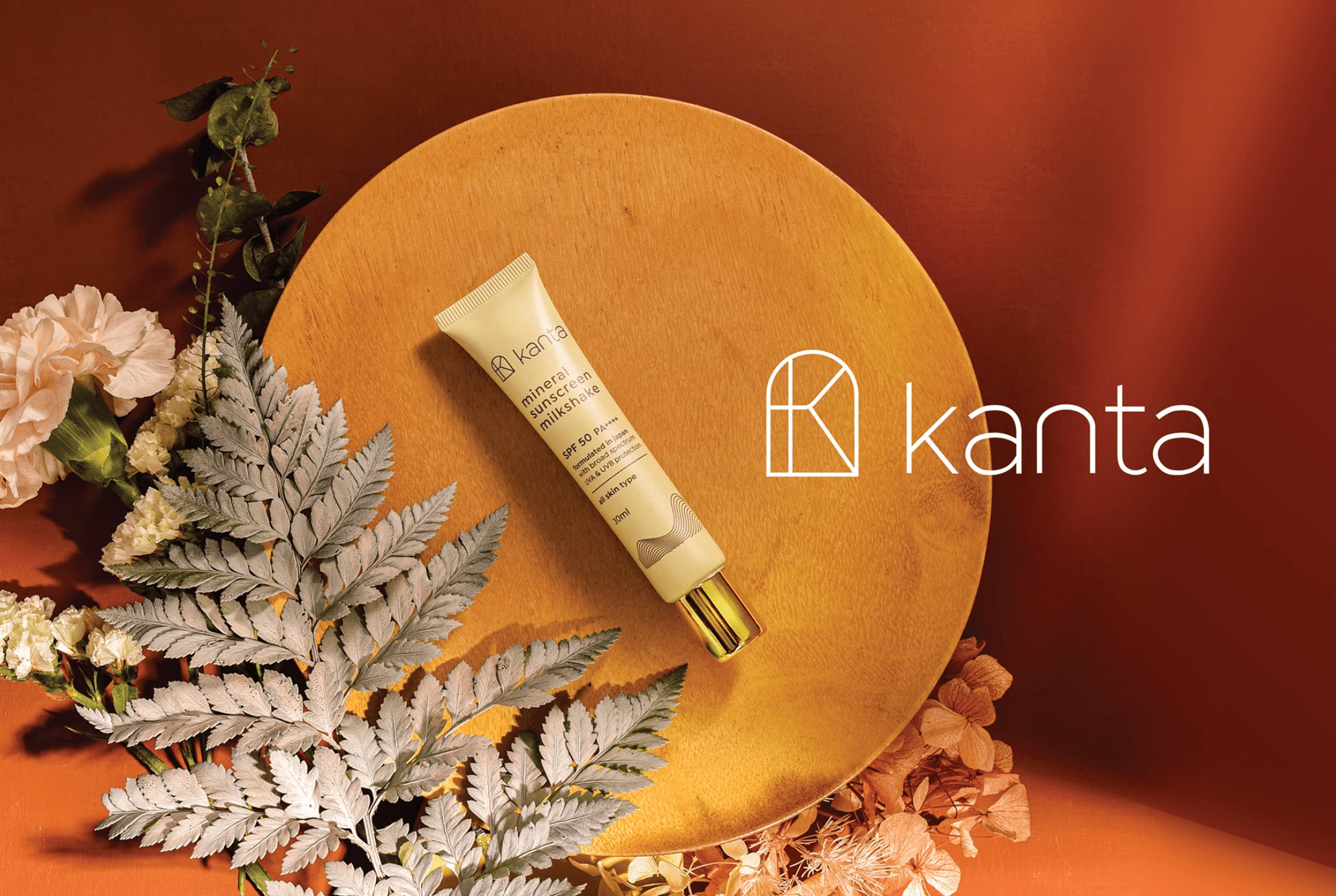
10. Kanta by Ricksdesign
Standout Features:
- A highly responsive logo design
- Minimal and clean
- Sand dune visual
The next item on our list is Kanta’s beautiful brand design created by Ricksdesign.
It’s led by an intriguing logomark that can stand on its own or next to the brand name. The symbol represents the customized “K” embraced by an outline resembling a windowpane. The base is flat and rounded into an arch surrounding the focused letter. Its visual properties allow the logo design to be adjusted according to the brand’s needs.
The logo previews the packaging designs and branding identity: minimal and clean, with tan skin colors and sparse typography. The packaging design also features a remarkable sand dune visual near the bottom crafted through slim concentric lines that light up the aesthetics.
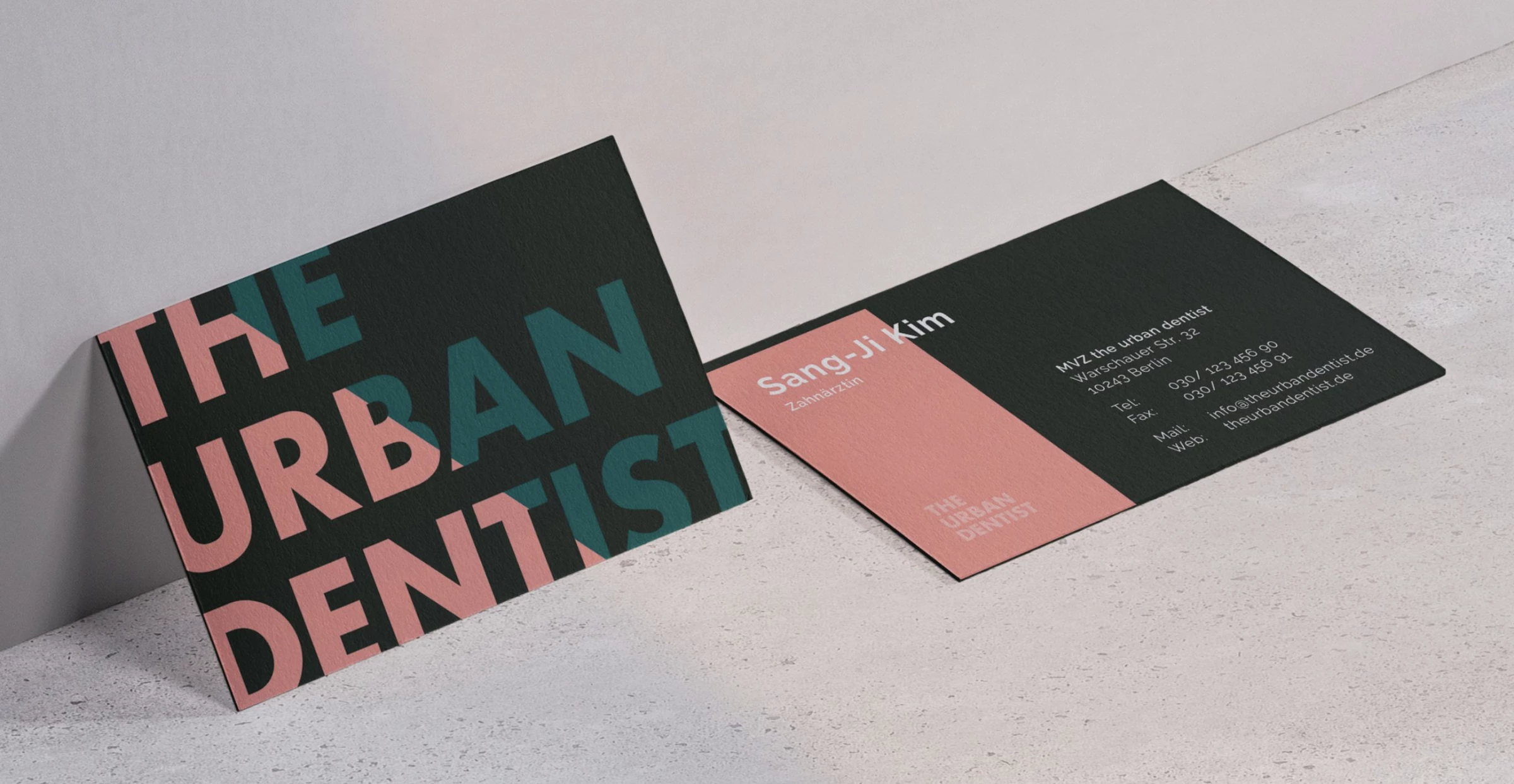
11. The Urban Dentist by StudioKil
Standout Features:
- Atypical material choice
- Contrasting pastel hues
- Reflects Berlin’s distinctive properties
The Urban Dentist embraces modernity in practice and style. StudioKil ensured that no one misses out on this notion thanks to the agency’s exciting brand design.
Inspired by Berlin’s distinctive properties that enable the city to gather and represent multiple co-existing sub-cultures, this dental office opted to do something similar. The agency chose stunning materials: primarily concrete and steel.
However, these rigid materials were used as a canvas for contrasting pastel hues, like pink, blue, and green, ultimately giving the brand and its customers a unique dental experience they’ll remember.
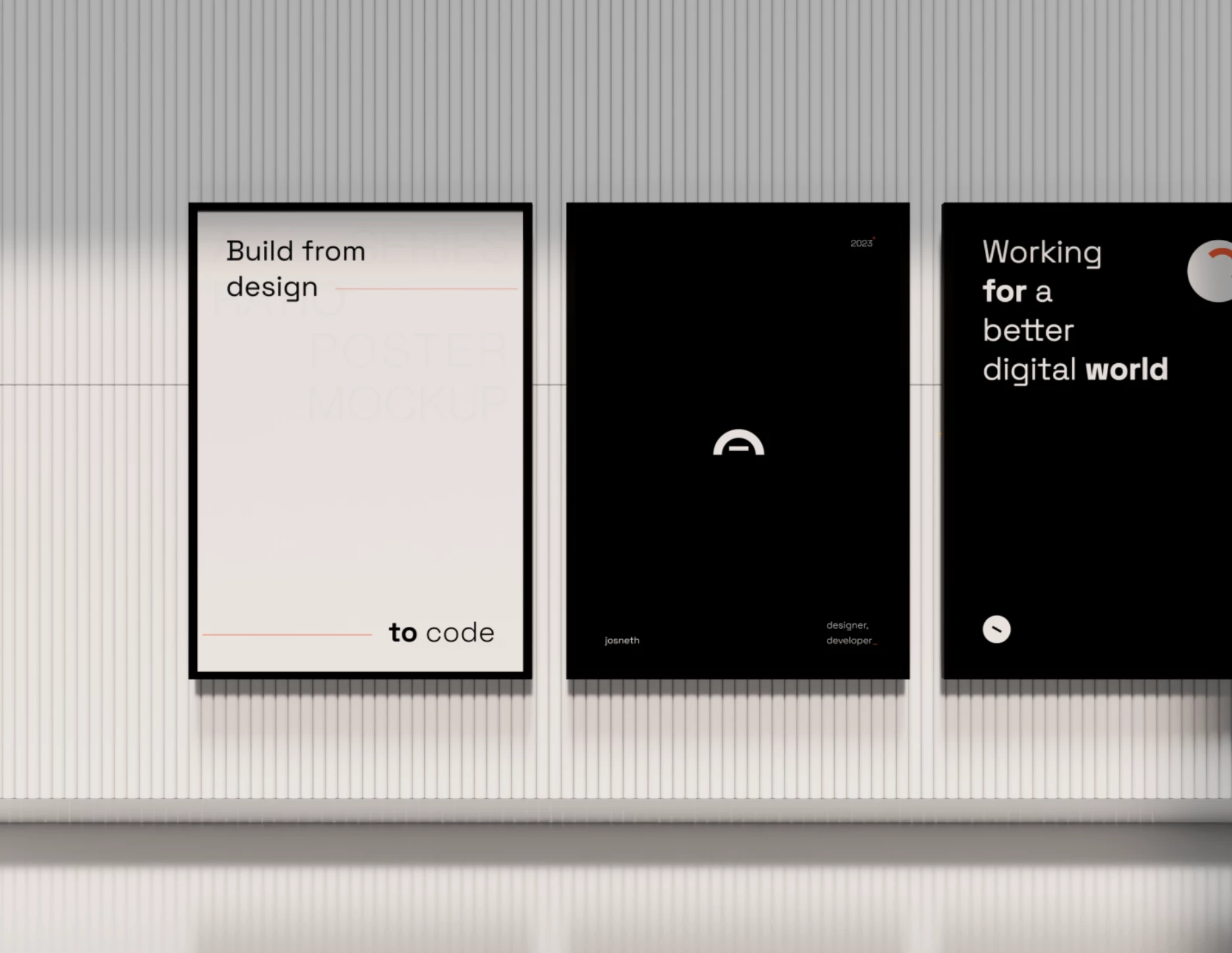
12. Josneth Moreno
Standout Features:
- A digital problem-solver
- Modern, futuristic typography
- Fresh and simple
Josneth Moreno is a digital designer and developer who created a refreshing and minimalist brand for himself. He focuses on providing simple yet effective solutions and takes pride in offering an exquisite user experience, and his branding efforts reflect it perfectly.
This digital problem-solver blends a smiley face and ski goggles into a distinctive digital art logo design, instantly showcasing his creative mind at work. The visuals are mostly monochromatic, except for an orange hue that adds style and energy to the mix.
The fresh and simple graphics convey Moreno’s multifaceted portfolio. He also uses modern, futuristic typography to hint at his fashionable workstyle.
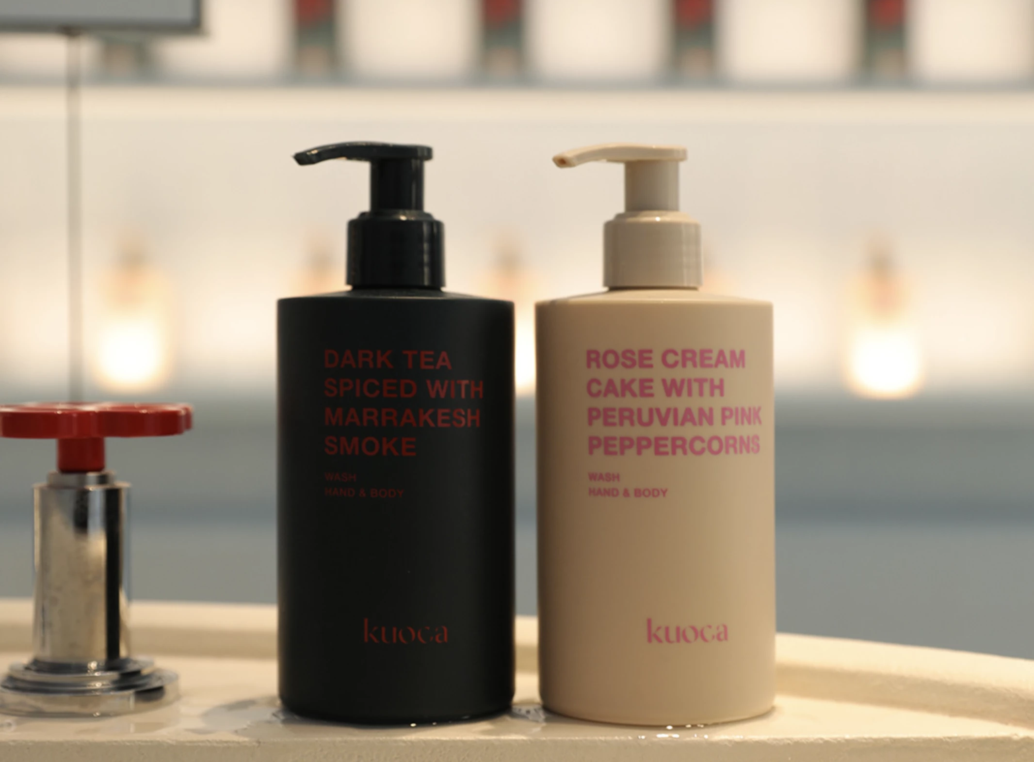
13. Kuoca by Studio Brick
Standout Features:
- Intercepted lettering
- Inspired by fine dining
- Creative product placement
Studio Brick’s branding for Kuoca is nothing short of delicious. This brand believes that quality skincare should exceed touch and satisfy all senses.
Inspired by fine dining, Kuoca’s branding provides creative product placement, clean packaging designs, and heavy contrasting typography. The messages highlight the clever wordplay that uses cuisine vocabulary to promote skincare products unconventionally.
The logo design is subtle but striking, with the brand name spelled out through intercepted lettering that complements the innovative approach to branding.
14. Superbakery by Penser Creative
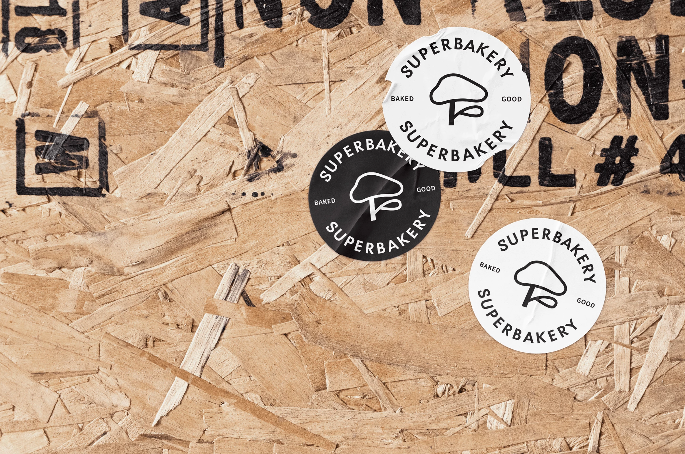
Standout Features:
- An iteration of the local attraction
- Modern and simple
- Monochrome with heavy lines
The next best brand design on our list is Penser Creative’s work for Superbakery. This Chinese pastry seller builds its branding around Huangshan’s iconic Welcoming Pine Tree.
The logo design represents a contemporary, playful, minimal iteration of the famous attraction, presenting the tree through a thick, mushroom-like outline against negative or positive space.
The modern, clean branding focuses heavily on the cute emblem, accompanied only by the logotype. The design is neat and free from other visuals, letting you enjoy the sheer simplicity behind high-quality pastry.
15. Yindrops by Ann Esce
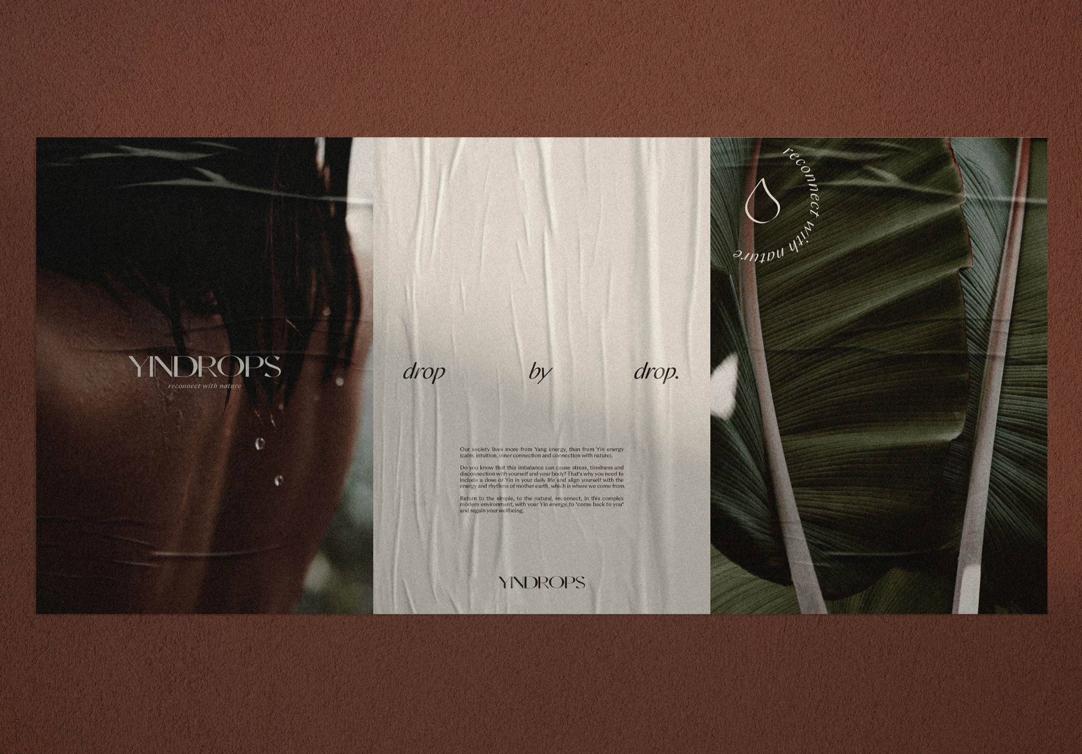
Standout Features:
- Cohesive branding story
- Droplet visuals
- Emphasizing the Sublunar elements
Ann Esce found inspiration behind Yindrops’ name and story, setting a foundation for this best brand design. Recognizing that modern society relies heavily on the Yang (action and intensity) and lacks the Yin energy (calmness, intuition, connection with nature), the concept emphasizes the overlooked balance.
We are taken through a cohesive branding story through cute droplet visuals. Each droplet contains a symbol related to one of the four Sublunar elements: fire, water, earth, and air. These elements are delicately portrayed through decorative lines inside the droplet’s outline.
The visuals are supplemented by a color palette reflecting the hues we find on a hike or at a beach, highlighting the brand’s wish to reconnect with nature.
16. Stone Oak by Craft & Wild
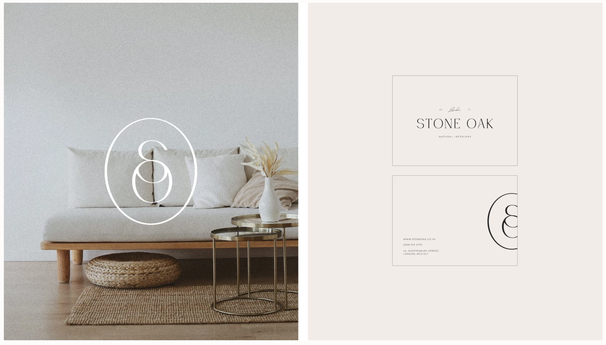
Standout Features:
- A stylish monogram
- Contemporary and chic
- Ultra-minimalist
Making it to our list of best brand designs is Stone Oak's branding by Craft & Wild.
The brand’s confidence in the quality of its products is depicted through its ultra-minimalistic branding. The soft color palette used on the materials is supported by the logo and the brand’s name printed in a sophisticated font style with increased letter spacing.
The emblem resembles a seal. It’s built from a stylish monogram embraced by a full circle. The connects the letters S and O. The central curve in S aligns with the top arch of the letter O, giving it a chic, contemporary appeal. If you are a fan of this clever logo, you’ll love these cool monogram logo designs.
17. Nature's Puff by Brandemist Design Studios
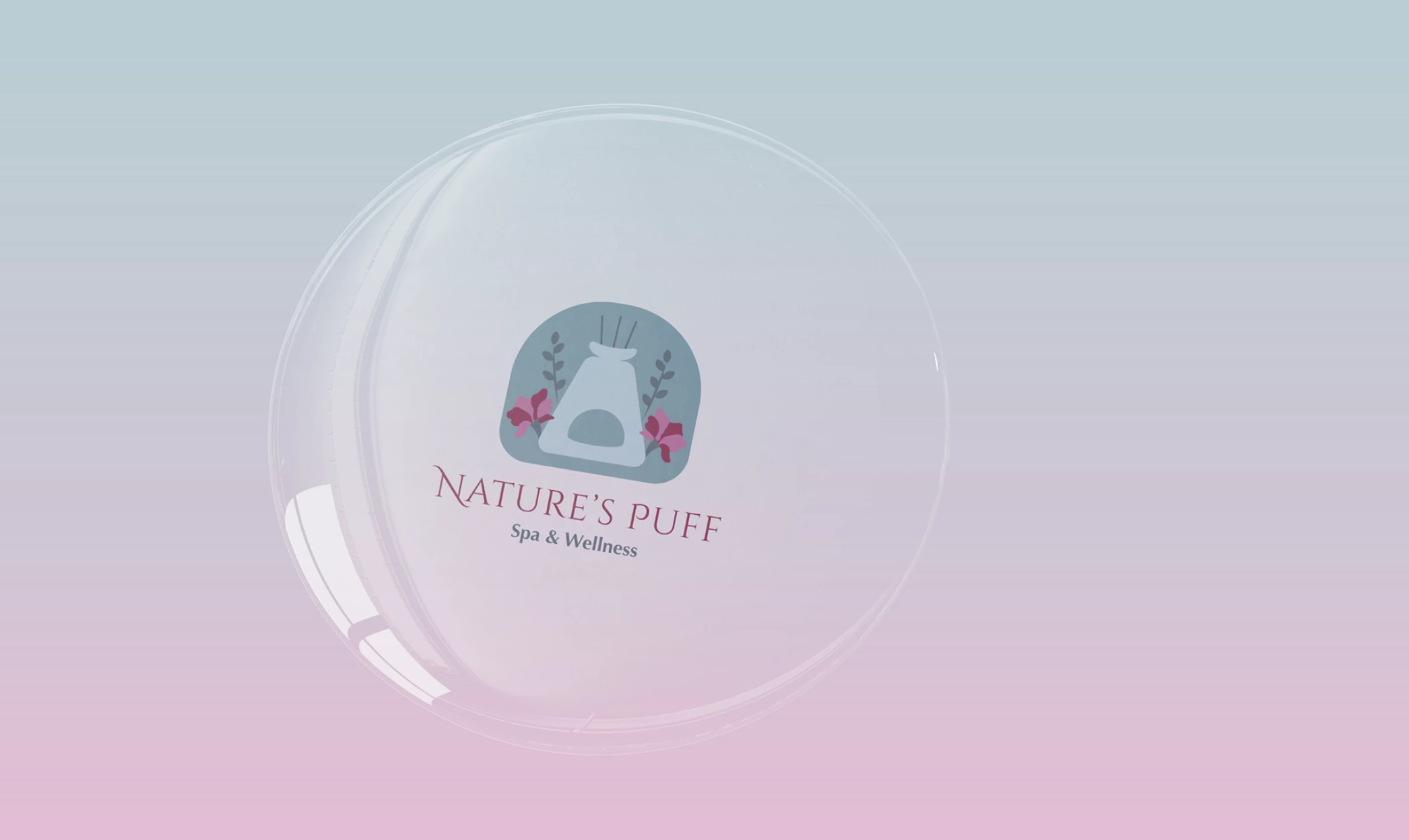
Standout Features:
- Reflecting nature
- Soothing and nurturing
- An inviting logo design
Nature’s Puff’s branding is the work of Brandemist Design Studios. The agency highlighted the spa’s state-of-the-art premises and relaxing atmosphere that customers enjoy.
Its attractive logo design reflects the brand’s wide range of services. Built out of items associated with the spa and natural remedies, it encompasses several elements that blend into a uniquely balanced emblem.
The soothing and nurturing vibe behind the logo helps reflect nature in all its beauty through a soft, gentle color palette. The decorative primary font style mimics the blooming flowers, further emphasizing the closeness to the peaceful wilderness.
18. Magnet Media by Osman Assem
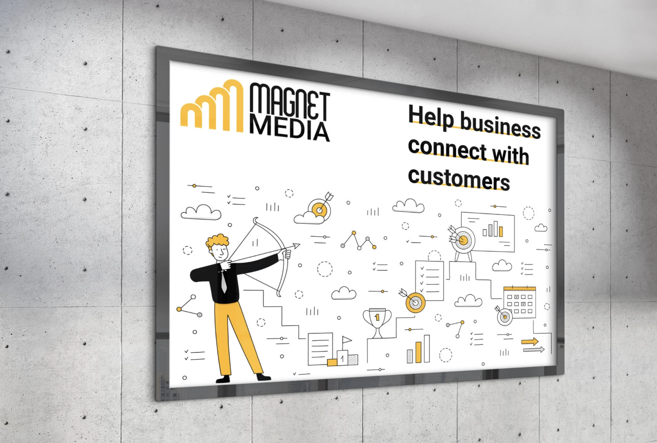
Standout Features:
- An intriguing, multifaceted emblem
- Minimal icons
- Friendly illustrations
Our next pick for the list of best brand designs is Magnet Media by Osman Assem. The designer created an on-brand visual representation using a black and yellow combination, complementing the logo.
The color story effectively communicates the brand identity: yellow invites joyful energy and urgency, and black indicates stability and high-quality services.
The logo design depicts a series of four interconnected yellow arches placed next to the brand name written in a funky typeface. Apart from representing the initials, the arches also refer to the magnetic force, growth charts, stepping up, and much more!
Lastly, minimal iconography is used to decorate the friendly illustrations and bring the overall design to life.

Our design experts recognize the most innovative and creative designs from across the globe. Visit Design Awards to see the:
- Best Logo Designs
- Best Website Designs
- Best Video Designs
- Best Print Designs
- Best Packaging Designs
- Best App Designs
Our team also ranks agencies worldwide to help you find a qualified agency partner. Visit our Agency Directory for the top Logo Design Companies, as well as:
- Top Web Design Agencies
- Top Video Production Companies
- Top Print Design Companies
- Top Packaging Design Companies
- Top Mobile App Development Companies