With fonts that jump out at you, designs that amaze, and labels that pull you in, we present to you some of the best beer logo in the past year. They’re fun and full of personality – everything you want in a beer, whether it’s a local craft brew or a well-known brand.
Intricate detailing and quippy concepts make these beer bottles true legends – at least, visually. They make you want to pop off that bottle cap, settle in and enjoy.
That’s why the logo design matters. It affects how consumers think (and feel!) about a product, convincing them to buy or walk away. Now, let’s take a look at the best logo designs of this year and see what makes each of them so special.
1. Flying Dog
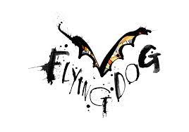
Flying Dog’s beer logo design is edgy, creative and fun. The brewery decided to stick with a design that was modern and familiar, using a simple pair of wings followed by the wordmark “Flying Dog.”
The image is sketched out in graffiti-style, giving it an overall grungy and underground feel.
This beer logo gives the brand, and the beer itself, a personality that draws people in. And when consumers see these beer bottles lining store shelves, they can’t help but stop and give them a look.
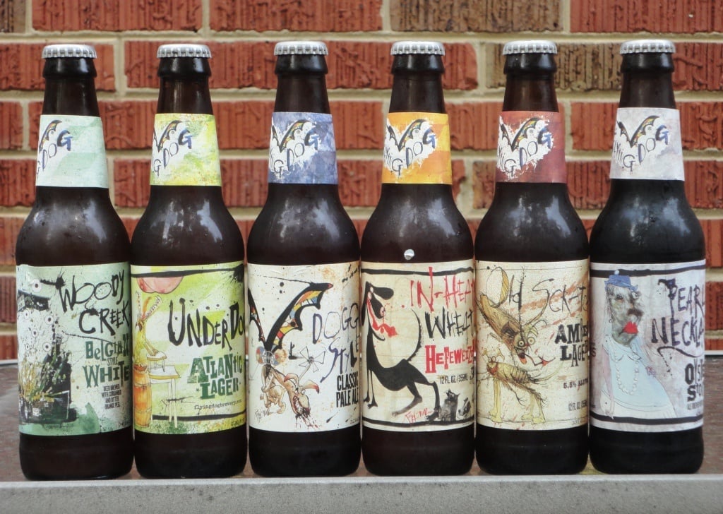
The bottle designs include an array of watercolor backgrounds, the color depending on the type of beer. And this street art vibe continues all over the label.
At the top of the bottle, you see the logo. And at the base, you see a number of different drawings — some bottles have dogs sketched on them, some have crickets, and so on.
These beer bottle logo designs are reminiscent of graffiti you’d see on your way to a new, hipster club in Williamsburg. And they definitely make you want to try them!
2. 21st Amendment

21st Amendment Brewery captures the essence of the Revolutionary War in its logo and in its packaging.
Designed like a banner, the name of the brewery is written out in a font reminiscent of 18th-century street signs. It’s regal. It’s authoritative. It’s revolutionary.
The 21st amendment repealed the 18th amendment, effectively ending prohibition, so it’s fitting the brand took on this name to remember this triumphant day in alcohol’s history.
You can feel the history and the power of this logo design.
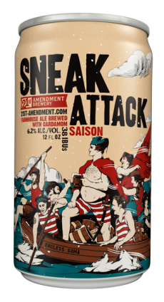
Their package design carries on this similar theme, with each can depicting some moment in American history — from revolutionary battles to presidential speeches.
These designs are sharp, comical and really tell a story.
Regardless of whether you like lagers or IPAs, you’re going to want to try this beer just to see if you can get some of that old-world sophistication coursing through your veins.
3. Magic Hat
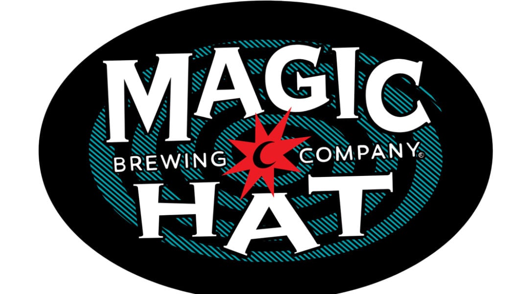
The Magic Hat logo is fun and quirky — capturing the feel of an old-school magic show with its capitalized font and whimsical, aquamarine swirl.
It’s bold, in your face and captures your attention almost instantly. It’s a winner in our book because it’s simple but effective.
And the logo itself provides an idea of what the beer will taste like. It’s sure to take you on a magical ride — whether it will be Disney magic or Willy Wonka magic is up for debtate!

The beer bottles themselves are equally enchanting and captivating, using hypnotizing swirls, colors that remind you of wizard's potions and mysterious images.
You’re not quite sure what you’re getting yourself into with these beers, but you know you want to be a part of the journey.
4. SouthNorte Beer Co.
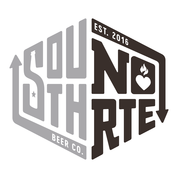
Rustic, free-spirited and laid back are three ways SouthNorte describes itself — and its logo design emphasizes these chill vibes.
The shape of the logo is created by the name itself and the way the letters weave themselves together is nothing short of artistic excellence.
The logo makes you want to relax under the sun with a cold one. The logo has an authenticity to it as well. It’s got spirit, class and ambition.
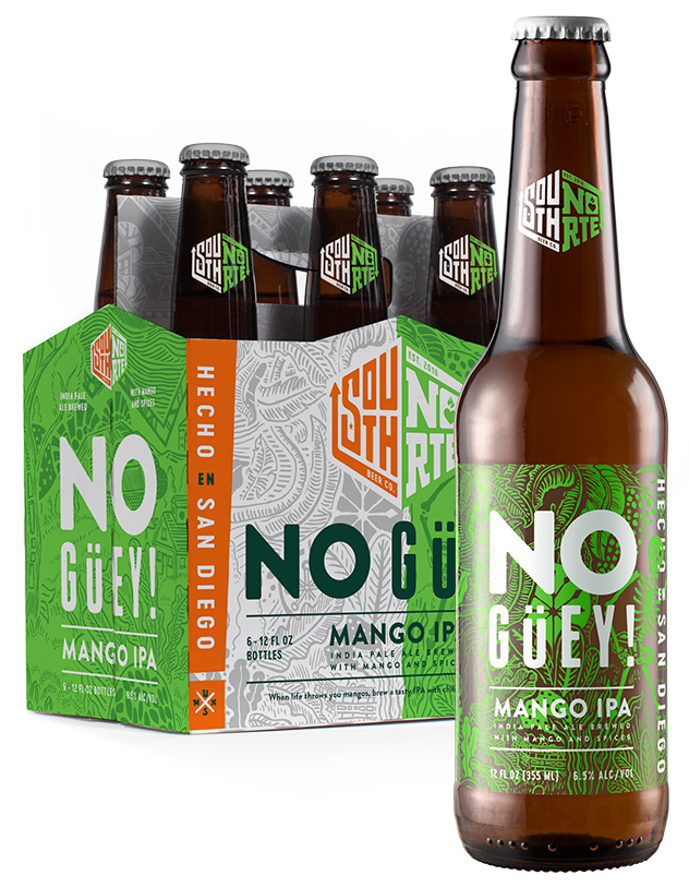
The beer brand holds onto its Mexican roots and shows them off proudly in its beer bottle designs. Their label designs are bright, bold and brazen.
Whether emulating the wild greenery or untamable sees, these label designs are pure art. And because of how intricate this background detailing is, the words themselves stand out with their simplicity.
They are funny, engaging and entertaining. These designs make it clear that these are not beers you want to pass up.
5. RedHook
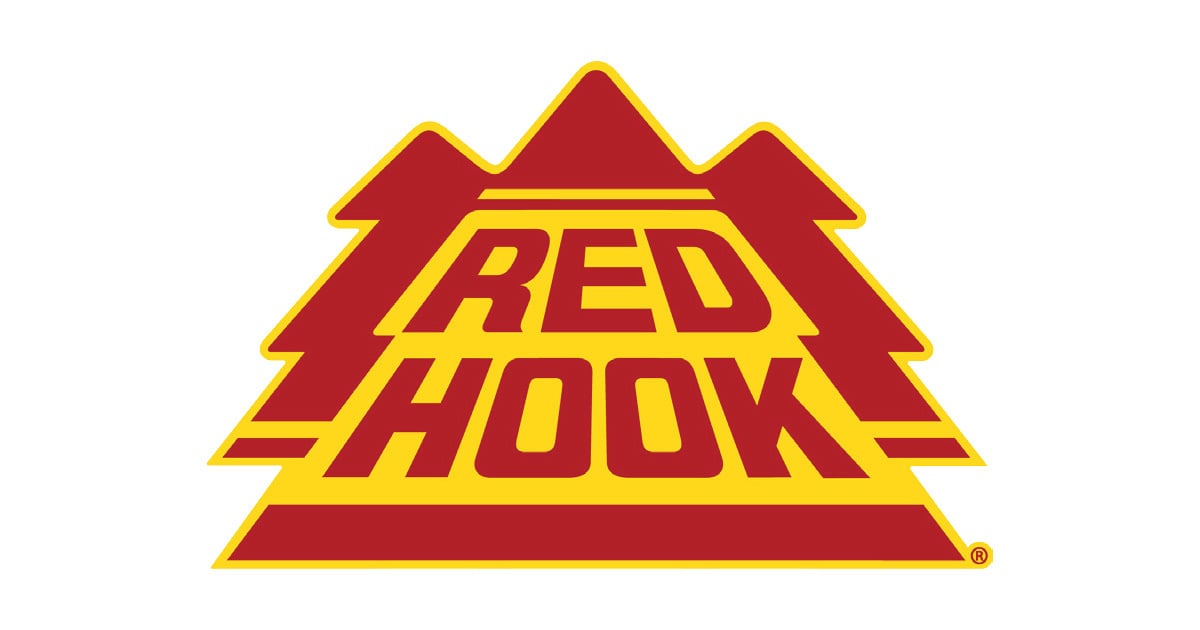
Bright, bold and in your face — the Red Hook Brewery logo design is not one that can be ignored.
At first look, it almost seems that the mustard yellow and the deep red shouldn’t fit right together — but the longer you look, the more you feel ready to have a sip.
The logo design itself is creative and simple, with a touch of familiarity. In the shape of three trees, the Red Hook beer logo design holds on to its humble Seattle beginnings.
It’s not sacrificing where it came from for where it wants to go. It’s unwavering. It’s resolute. It’s determined.
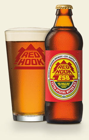
Whether you choose to stick with an original flavor or try your hand at something seasonal, the bottles and packaging are sure to catch your eye. The short, thick bottles make you think of lumberjacks hacking away in the middle of the woods.
The designs are strong and to the point, but with just a hint of fun that makes you smile before cracking one open and taking a sip.
6. Vocation Brewery
Vocation Brewery’s logo is simple and elegant. Using big, bold and clear lettering — with a touch of whimsy with its ampersand, the logo draws you in thanks to its sheer excellence and regalness.
There’s no messing around with this logo — it’s straight, to the point and fun. And their packaging is no different.
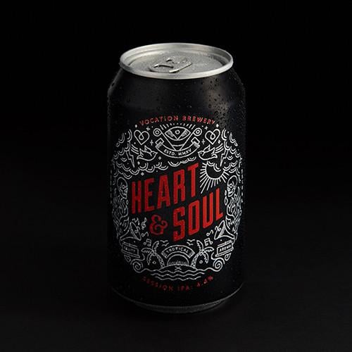
Their packaging has that same elegance and regalness with more of a modern and playful twist. Each beer has a powerful name — options including “Heart & Soul,” Naughty & Nice,” “Pride & Joy,” and so on.
They’re all tied together by that same, fanciful ampersand and a circle of tiny, creative and captivating drawings. These label designs are intricate and exciting, giving consumers a feel for the personality behind each beer.
7. Scrappy Punk
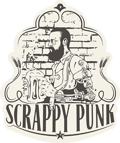
Ah, yes. The quintessential, bearded hipster. You might think the trope has been overused and overplayed, but Scrappy Punk knows how to work what it’s got — and this robotic twist on the classic certainly works in its favor.
Combining old-school, traditional elements that pull us back into the Wild West with modern and futuristic elements like the robotic arm and eye really give this craft beer a vibe that can’t be beaten.
The washed-out, off-white background color and elegant script are design elements that remind us of a simpler time, but this robotic hipster is not one that will be forgotten anytime soon.
Unfortunately, Scrappy Punk hasn’t branched out and started selling bottled or canned brews yet, but we can’t wait to see how they play with this theme of cowboys vs. robots.
8. Maine Beer Company

Less is more and Maine Beer Company really plays with minimalism and elegance with its logo design.
The brand name, followed by a clean and simple drawing of a piece of barley and the tagline, make up this tasteful and sophisticated craft brewery logo.
They aren’t messing around — just doing what they do best — which is brew good, local beer.
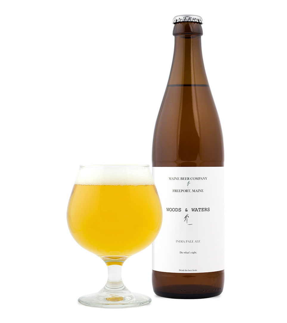
The beer label designs follow much of the same themes. Simple. Sophisticated. Tasteful.
There’s just enough creativity to pull you in — a crafty little image in the middle of the label — with just enough to let your imagination run wild.
We're not sure what this beer will taste like, but we want to know. We need to know. And because of this captivating, minimalist design, you should find out.
9. Night Shift Brewing
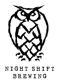
Who doesn’t love a cute little hand-drawn owl? Seriously. Who?
Get it? Yeah, we tried.
Anyway, the logo design for Night Shift Brewery is none other than a cute, little nocturnal owl — talk about taking a theme and running with it.
And it works! It’s creative. It’s eye-catching. It’s cute. It perfectly encapsulates the brand and gives audiences the perfect symbol to associate with their beer.
Elegant in its simplicity yet daring in its use of such a common animal, this logo it recognizable and familiar — but most of all, it’s fun.
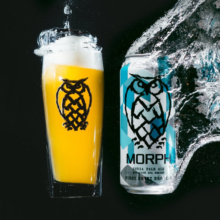
On the packaging, the logo takes center stage, with little else decorating the label other than the name of the beer itself. But it works.
And each can has a fun, exciting geometric rainbow of colors on it to distinguish it from other flavors. It’s both traditional and modern. We love this design, and you should too.
10. Little Machine Beer
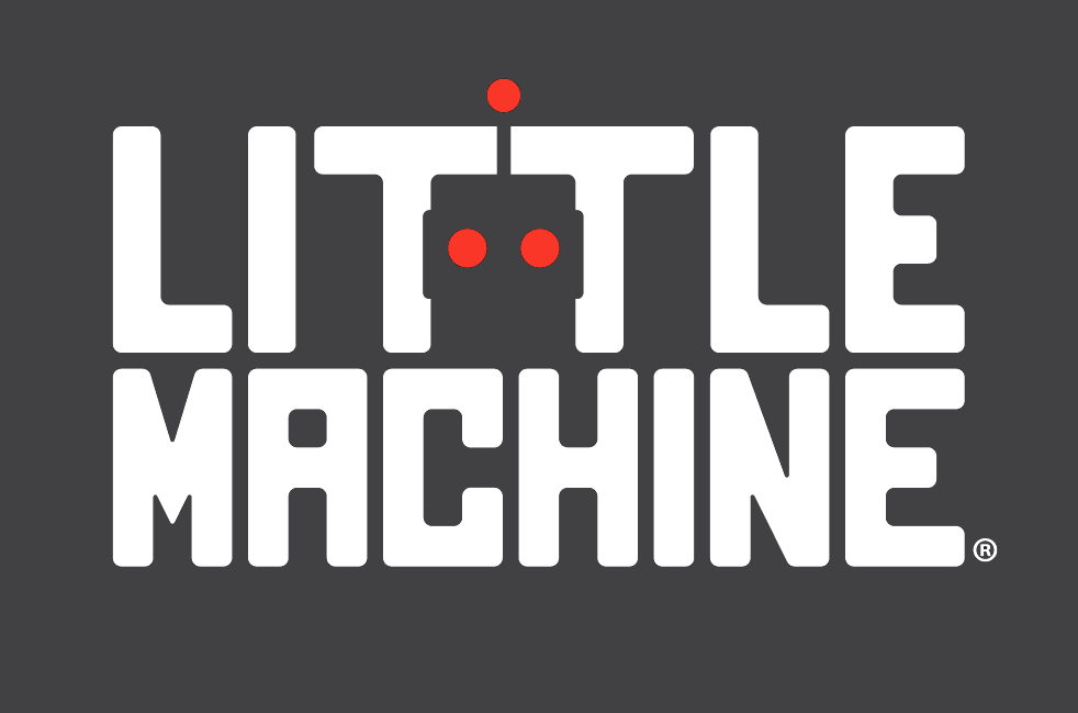
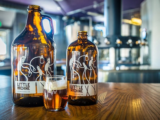
Who would have thought we’d have two craft beer logos with a robot theme? We sure didn’t. But this logo really does capture the essence of the beer, with its gray background, bold, white and robotic font, and the hidden robot in the center.
It’s futuristic and fun and full of cool character. Right off the bat, we don’t know that it’s a logo for beer, but we're intrigued.
This is another brand that isn’t selling packaged goods yet, but you can see the robot theme spills over into its growlers and online presence.
Are these not the cutest little beer-drinking robots you’ve ever seen? The design is fluid and fun. It’s happy and exciting and ready to have a good time.
11. Deschutes Brewery
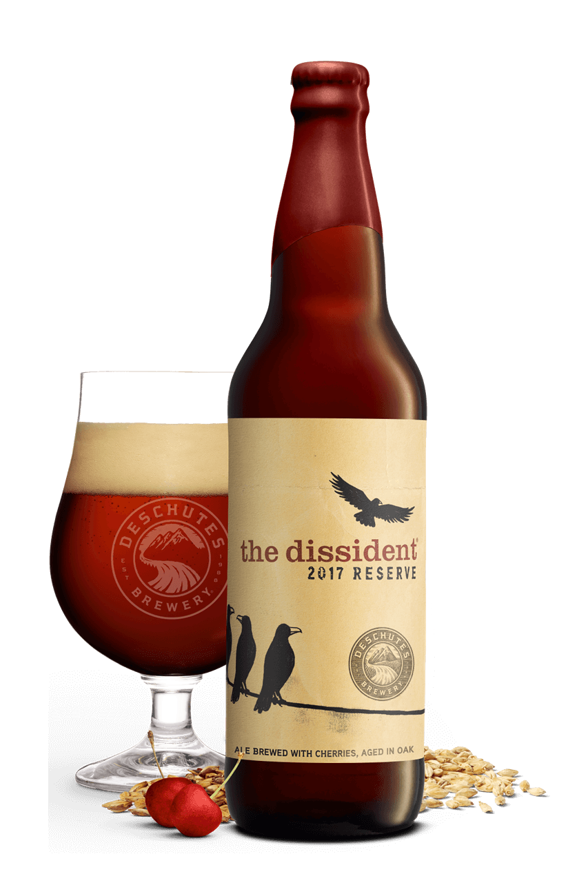
This Deschutes Brewery beer packaging and are classics in our book — there’s no denying the prestige and the power that comes from this dirtied and experienced-looking design.
The label wraps around the bottle in an old, yellowing brown that adds age and sophistication that comes from years of practice.
The perched and flying birds add elegance and a regal quality that is stunning and eye-catching. But it is simple and refined, adding a modern and minimal touch that is instantly engaging.
The logo sits as a stamp or badge of honor. It’s a circular design with the brewery name in the outer circle and the image of a mountain range and flowing river within. This design is natural, clean and old-world.
It’s a beautiful design that makes use of little color and an aged, quaintness that shows its strength and authority upon impact.
12. Krone
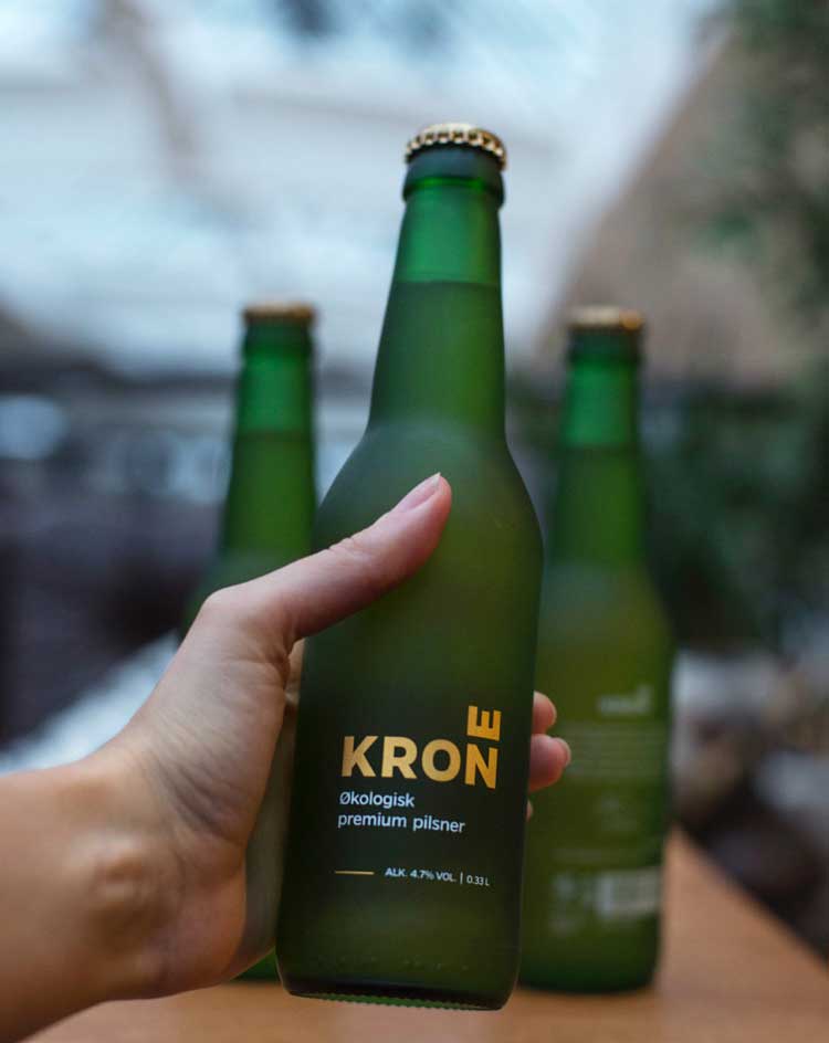
This Krone beer design is modern, geometric and clean. It’s a very futuristic concept that uses a plethora of clever design elements to jump from the shelves.
The bottles and cans are made up of a matte coloring — in green, purple and brown. And there’s a color gradient quality to these bottles and cans, with the colors fading as they move up the bottle.
The matte quality adds a texture that makes you want to reach out and grab it — and then crack one open for your enjoyment.
But it’s the logo that really steals the show against this smooth design. The Krone wordmark is written in a capitalized, sans-serif and gold font. It’s the innovative shaping that is stunning and captivating.
In this logo, the E sits on top of the E facing upwards, giving it a quirky and cool feel. It’s a creative logo that emphasizes simplicity. But it works, and it grabs your attention instantly.
13. Baderbrau Brewing & Lyft
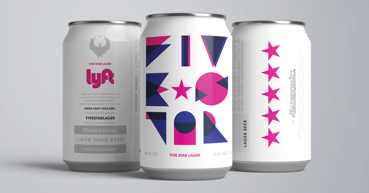
Baderbrau Brewing teamed up with Lyft to create stunning beers for the Five Star Lager brew. And these cans are colorful examples of creativity in action.
These cans are wrapped in bright, white and clean packaging. They are sophisticated and superb, with colors and shapes taking center stage.
There’s a mixture of branding here — the brewery's own logo and design in its wordmark and eagle emblem matched with Lyft’s signature pink coloring.
And this is responsiveness at its finest — simplifying the brand's usually regal and complex logo design down to an elegant, gray image.
Overlapping pink and purple shapes make up the name of the brew, and the ride-sharing service's iconic stars take up the other side.
This beer packaging is a mix of two brands, but they both come together seamlessly to create a design that is captivating and impactful as soon as it's seen.
14. Commonwealth Brewing Company
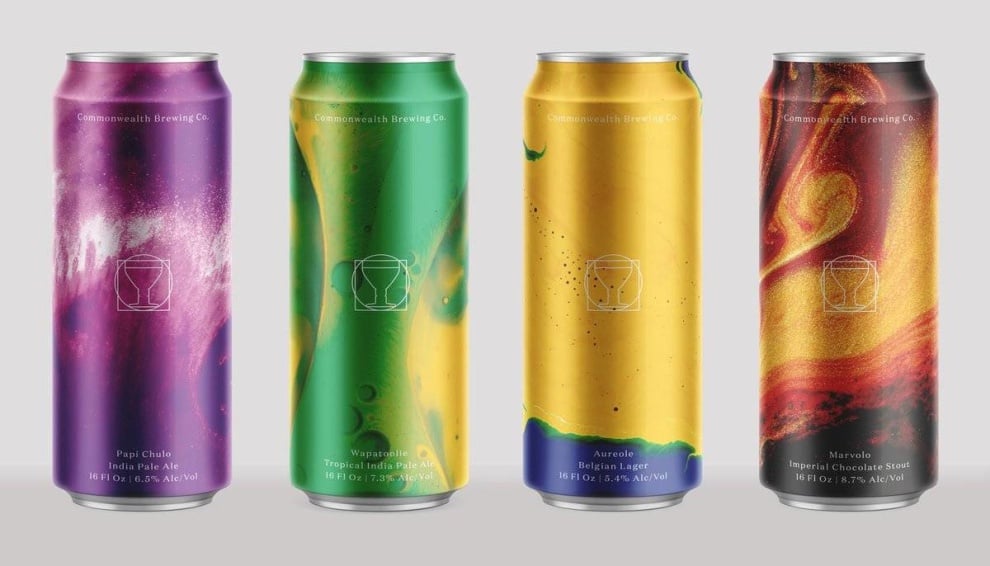
Commonwealth Brewing Company plays with color and psychedelic elements in their beer can designs. But the one thing that ties them all together is the simple, clean and minimal logo design.
This is a logo that goes with symbols over words.
The logo is made up of a beer chalice surrounded by a circle and encased in a square. The lines are thin and clean. They are white and bright. And they stand out no matter the color they are sitting on.
The packaging is equally engaging, with fluid and flowing colors and shapes — like lava, water, fire and water. These cans look like a mix of all the elements, creating a peaceful vibe that entices consumers as soon as they see them.
15. Drygate Brewing Company
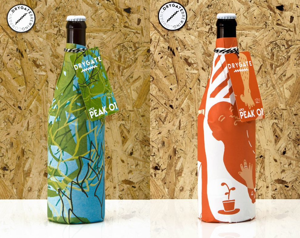
Drygate Brewing Company wrapped their beer bottles in paper packaging. And each bottle comes with its own design and illustration that gives it a unique personality and characterization.
The craft logo design stands out, however, even with the enigmatic imagery.
The Drygate logo is made up of a white, capitalized wordmark, underlined with a zig-zag that promotes playfulness and authority.
This logo is clean and simple, letting the rest of the package design shine through and letting users know that these beers tell a story, and it's one they should be interested in learning about.
These limited edition package designs are certainly worth putting on a shelf to admire until you’re ready to crack them open.
16. Bald Eagle Beer
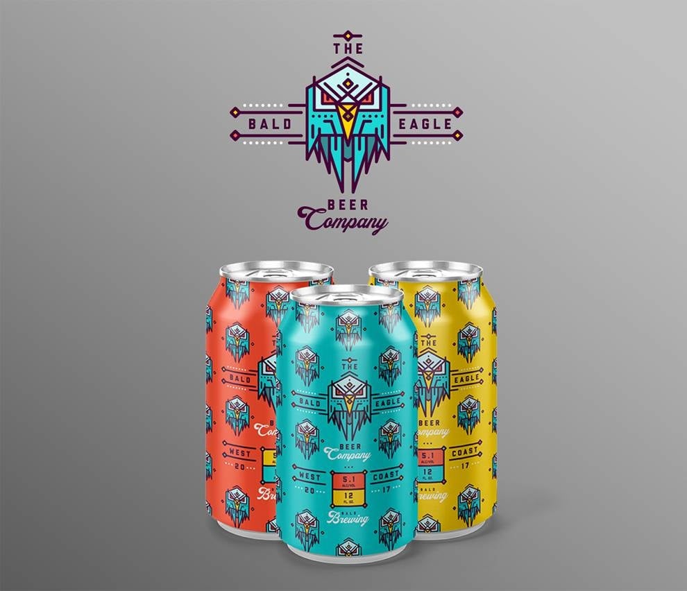
Bald Eagle Beer’s logo is exactly what you’d think it’d be — a bald eagle. But it’s not just a picture of a bald eagle, nor is it a minimal illustration of the bird.
Instead, the brand went with a very futuristic and geometric bird with a light in its eyes. It’s bold, daring and in-your-face.
And this logo symbol lines the can packaging — up, down and around the can.
Each beer flavor gets its own coloring — yellow, blue, red and more. But each can design is made up of the logo to further drive the brand identity home to the beer drinker.
It’s a playful design and it hits hard. Branding is important, and this company knows that.
Creating Your Own Brewery Logo? Here’s What You Need To Know
Now that you’ve seen all these beer logo examples, are you feeling inspired to give it a try and create a logo for your own craft brewery?
Keep this in mind: For a craft beer logo to succeed – because it doesn’t have a legacy to lean on like Budweiser or Heineken – it needs:
- A dash of personality
- Style and originality
- Custom design
- A clear message
- Captivating images
- An attractive story
In other words, don’t be afraid to experiment with vivid colors, funny wordplay, artistic emblems or retro styles until you create a design that will make your consumers feel immediately attracted to your beer.
If you’re not sure you could do it alone, here’s a list of the top-performing logo design companies around the world to help you find the best designers to work on your brewery logo.
The Best Beer Logos: Key Takeaways
The craft beer market is growing and new breweries are emerging around the world. If your brand is among them, we hope that our list of the best beer logo designs has inspired you to create your new logo or refresh and redesign the existing one.
Either way, don’t forget to keep it in line with your brand style, personality and visual identity.
To make a real impact on the market, be stylish and original, play with fonts and colors, add custom illustrations and tell your business story visually.
Note: These logo design principles apply to many industries, so you can use them even if you run a business in the makeup, chocolate or fashion industry.
But we’re talking about beer here.
So, remember this: A great beer logo design has a personality. It has style and charm. And it makes people pick up a bottle and say “Wow! I want to drink this one right now!”

-preview.jpg)

-preview.jpg)


-preview.jpg)