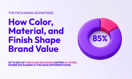
The best food visuals communicate your brand’s vision and compel customers to make a purchase, embodying the essence of a successful food branding strategy.
Straight from the best branding agencies in the market, these best food visuals have significantly contributed to each featured brand’s revenue growth through their evocative and compelling designs.
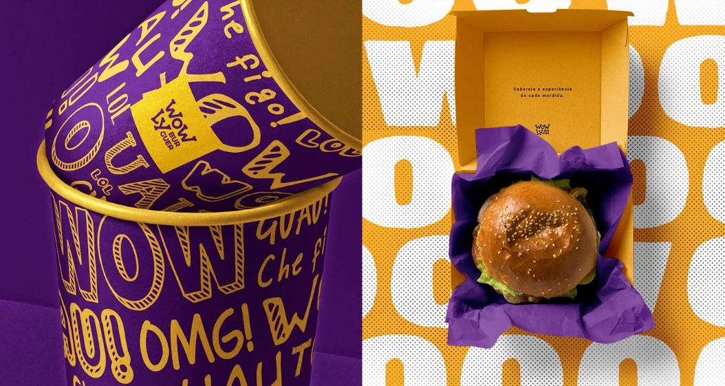
1. Wowly Burger by Caio Costa
Standout Features:
- Varied lettering styles
- Purple and yellow color palette
- Fun and energized vibe
Wowly Burger, first established in Fortaleza, Ceará State, is a food joint passionate about creating handmade burgers. And aside from their hefty burgers, they make sure to give a delightful experience to their customers, too.
With the help of Caio Costa, a design agency based in Brazil, the brand successfully communicated this goal through its branding design.
Since the overall message should be cheerful, casual, and unique, the agency embraced a bold color palette of purple and yellow. While purple is not the most appetizing color on the wheel, it signifies uniqueness and boldness – characteristics that the brand proudly upholds.
The branding visuals also made use of varied font styles on their packaging, resembling a mini graffiti wall. These different styles, combined with the vibrant palette, create a strong and memorable impression for the food brand.
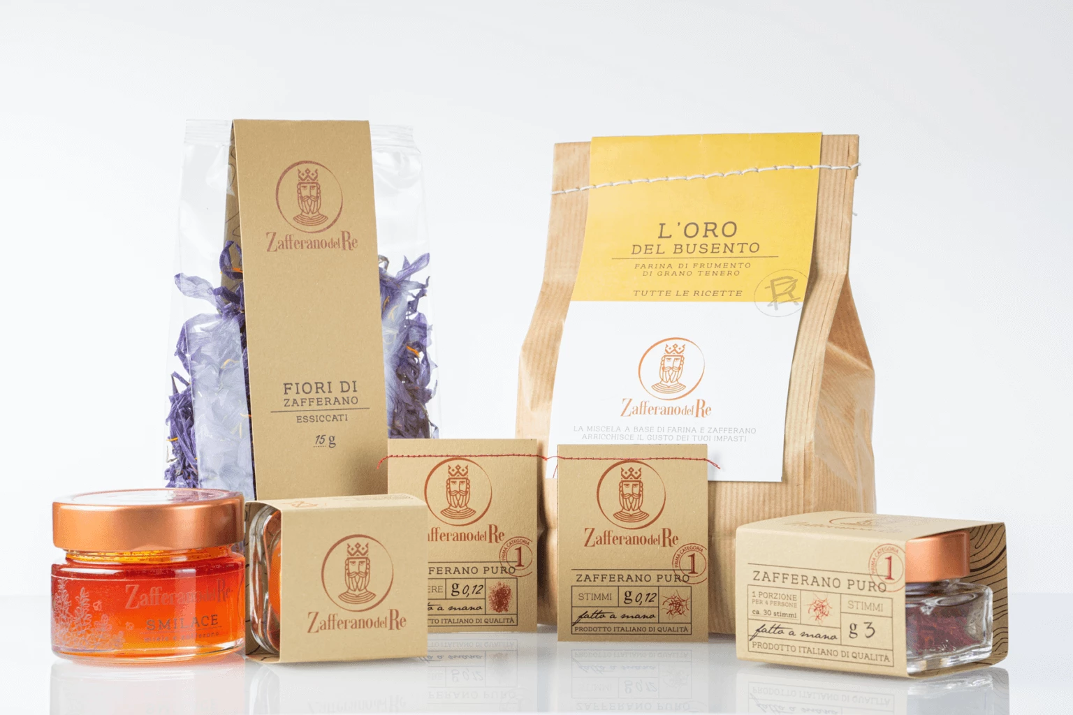
2. Zafferano del Re by Studio La Regina
Standout Features:
- Natural materials for packaging
- Minimalist logo
- Simple yet premium-looking
Zafferano del Re offers an array of high-quality handmade saffron-derived products. As the world’s most expensive spice, saffron needs a visual representation that is at par with its image. Studio La Regina design and marketing agency delivered exactly this for the brand's logo and packaging.
Using raw cardboard materials, the agency conceptualized a natural and eco-friendly packaging design to highlight the brand’s delicate products. For single products, they designed jar sleeve packaging that only covers a good part of the glass bottle. This style hits two birds with one stone: it cuts back on costs and acts as an instant marketing tool since the product remains slightly visible.
The paper bag variation is also unique. Most brands seal their food packaging with tape, a sticker, or staples. Studio La Regina stayed true to its environmentally friendly concept by sealing these bags with yarn stitches at the top, giving the overall design a distinctive personality.
The brand logo is a striking statement in itself. There’s no better symbol of luxury and prestige than royalty.
Combining their advocacy with their bold design statements and natural color palette, these visual designs leave a lasting image to their customers.
3. Knorr Acısso Hot Sauce by Orhan Irmak Tasarım
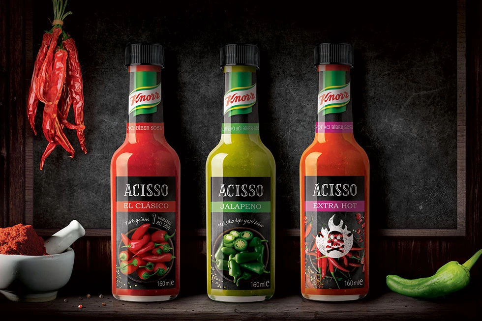
Standout Features:
- Artistic typeface
- Color and variant coordinated
- Realistic photography
Knorr is a household food and beverage company. The recently introduced Acisso Hot Sauce aims to tap into a niche market of spicy-loving food enthusiasts. With the expertise of design studio Orhan Irmak Tasarim, they created irresistible packaging designs that urge customers to buy.
Most mass-produced hot sauce brands opt for a more generic approach to packaging. However, the agency took a different path, steering the brand in a unique direction.
The colors and graphics feature the classic Knorr palette of green and yellow. This is matched with the Acisso variants El Clasico, Jalapeno, and Extra Hot, which use red, green, and purple respectively.
These stunning graphics are accompanied by photographs of different chili variants in high-quality detail. For the Extra Hot variant, there is a striking overlay of a flaming skull image that serves as a warning for buyers.
4. Savu Parrilla by Escandi
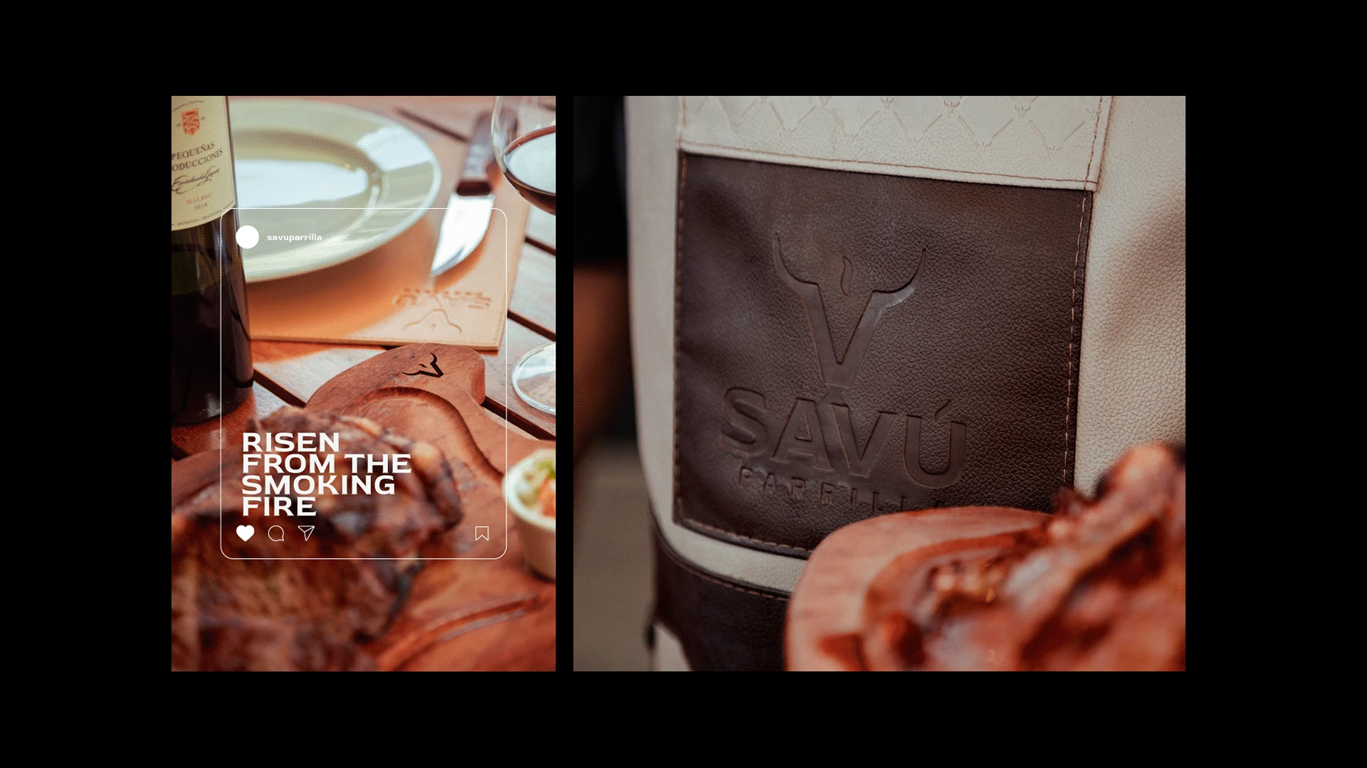
Standout Features:
- Eye-catching logo
- Authentic “smokiness” character
- Premium design accents
Brazilians love their meat, and Savu Parrilla brings the ultimate barbecue experience to locals through different branches spread throughout the nation. The brand prides itself in offering upscale red meats of the best quality. Check out our article on the best meat packaging designs.
They managed to bring their top-tier products to the forefront of the local restaurant industry by working together with Escandi, a visual identity firm focused on helping businesses generate more revenue through design.
There’s no question that the restaurant houses amazing food, but the agency puts these mouthwatering dishes at the epicenter of its visual branding. Their restaurant is decorated with authentic accents that represent the brand’s “smokiness”. Some examples of this are the flaming grill, customized wooden chopping board plates, and brown leather placemats with an engraved logo.
Combining all these small yet impactful design accents, the agency successfully highlighted the brand’s authenticity. This character is an important value for any food business out there; a relatable atmosphere brings in patrons despite the pricey menu. After all, customers are not just after good food, they crave a unique dining experience, too.
5. DARU by vbiasi
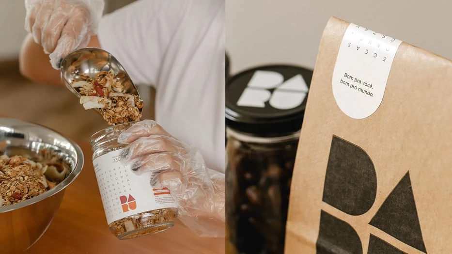
Standout Features:
- Interactive word puzzle
- Minimalist logo
- Sustainable packaging
DARU promotes ethical, sustainable, and tasty granola products at reasonable prices. The brand is born through a passion for healthy living. Its message is direct and simple: delicious healthy food can come with fair price tags, too.
With the help of vbiasi, a branding and design agency, this message is communicated well throughout the brand’s packaging. The agency implemented a minimalist approach, steering away from the usual food packaging designs that are cramped with loud images and texts.
This design has proven effective in maintaining consumer focus. By eliminating unnecessary graphics, the spotlight is concentrated on the product. They also added a genius way to engage with their customers through a word puzzle printed on the packaging. The puzzle hides words that tell more information about the product such as ingredients, benefits, and other claims.
All things considered, the design sparks high-quality and eye-appealing foundations that help the brand reach out to a broader market.
6. Kritsa Extra Virgin Olive Oil by Manos Siganos
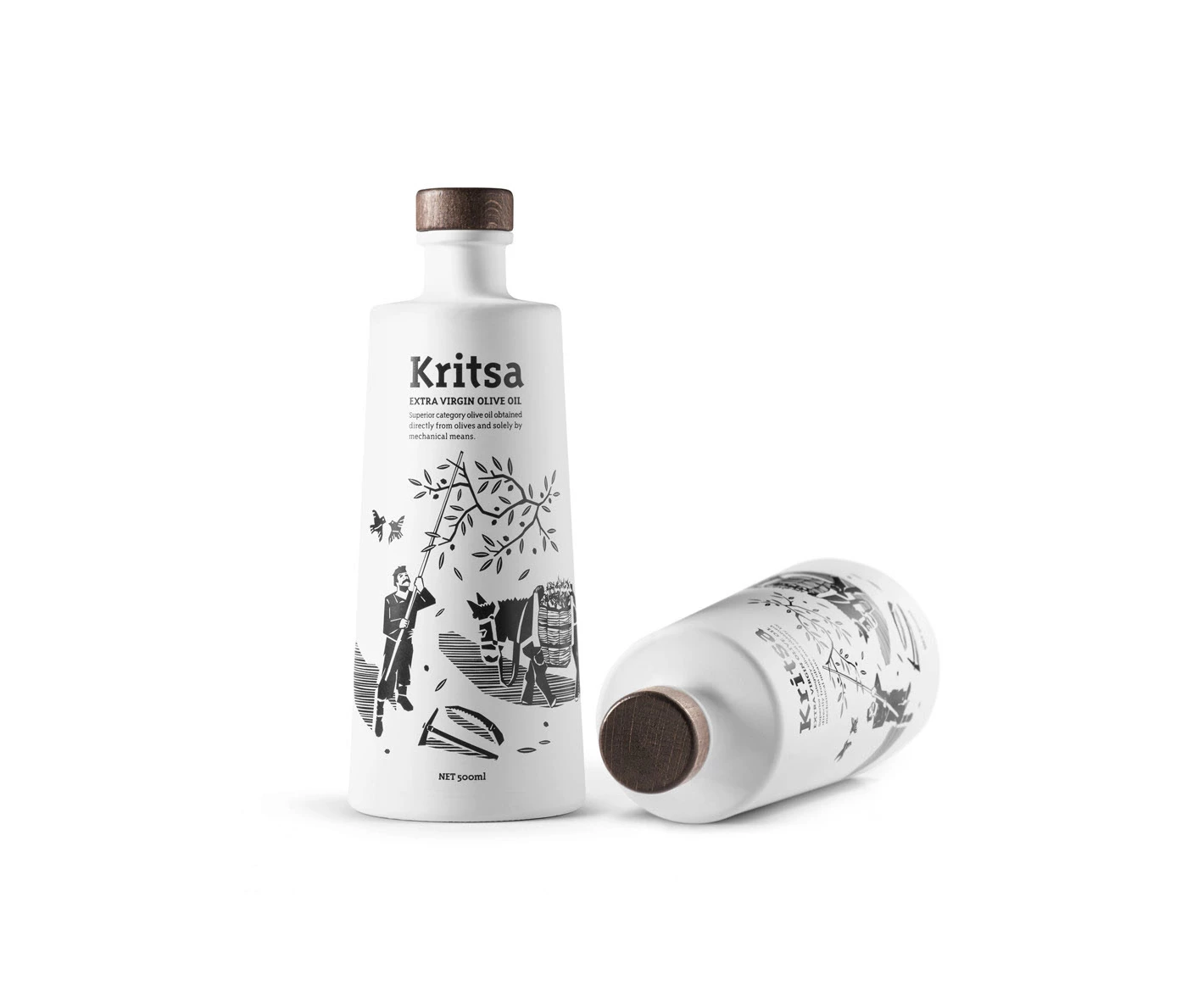
Standout Features:
- Monochromatic color scheme
- Appealing drawing art
- A modern approach to tradition
Kritsa is set to give the world the best olive oil you can buy. The brand started its story in 1927 and dedicated its efforts to introducing olive oil with low acidity and a peppery flavor. Since its inception, Krista’s olive oil has been recognized and awarded in many competitions.
The brand takes the next step and works with Manos Siganos, a design studio based in Greece, to improve its product packaging. The collaboration focused on creating modern designs that complement the traditional Cretan character. And in the end, producing a visual identity in a class of its own.
To make the story short, the finished packaging design goes beyond industry standards. The agency veered away from the usual olive oil packaging we’re accustomed to – a clear glass bottle decorated with a nature-inspired palette. Instead, the agency went after a black-and-white approach with creative illustrations drawn on the bottle. It also adopted a clean, non-text-heavy design focused only on delivering essential information to its customers.
Overall, the design complements the brand and its vision. With the right amount of character, functionality, and uniqueness, the agency proves to earn a spot in this list of best food visual designs.
7. Naturoco by STCKMN
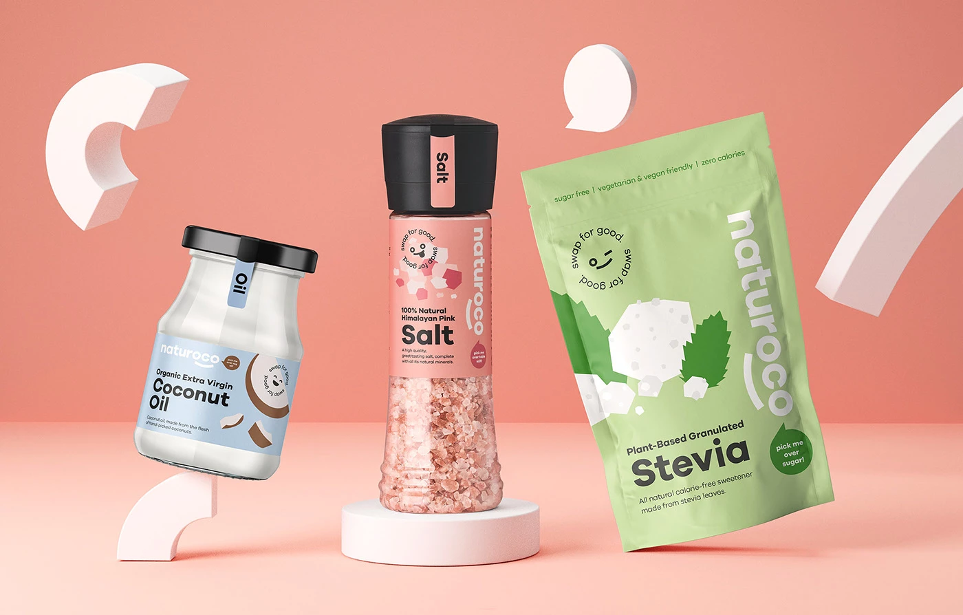
Standout Features:
- Cheerful branding through ‘Roco’ the mascot
- Pastel color palette
- Informative packaging design
Naturoco is on a mission to influence the world to adopt a happier and healthier lifestyle. With STCKMN on its side, a UK-based design agency, this vision is creatively put out in the open, starting with the brand’s identity all the way to packaging and campaign materials.
The agency worked on a pastel color palette, light and easy on the eyes, to make the texts pop in the design. This brand relies on educating its market, so the visual branding should rightfully complement the content.
One element that’s impossible to miss is “Roco”, the brand’s official mascot and brand ambassador. It’s a cheerful icon plastered on all the brand’s collaterals. Identified by the text, "Swap for good”, this icon subtly adds personality to the branding.
The content is legible and laid out well in the design, too. To top everything off, we see cute graphics of the product scattered around, providing a friendly and attractive personality that makes the product appeal to its consumers more.
8. Amber by tea for two
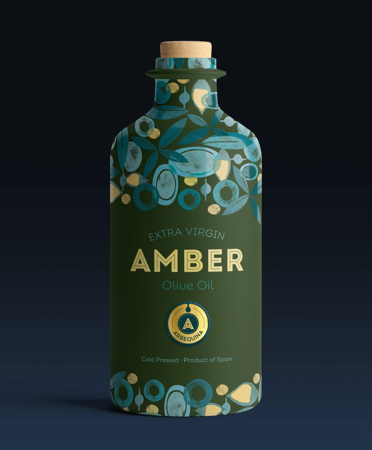
Standout Features:
- Moss green ceramic bottle
- Nature-inspired design elements
- A simple yet bold typeface family
Spain is home to flavorful sauces and condiments. And Amber is one of the brands utilizing this. The brand offers cold-pressed olive oil and an array of products that aim to level up your flavors of cooking.
This is where tea for two steps in, creating a one-of-a-kind packaging for the brand. They’re a graphic design agency dedicated to doing everything, literally, in their power to create a stunning visual identity for your brand — one that communicates your vision and matches your style.
One look at the product packaging and consumers will get a whiff of nature. The bottle is decorated with natural elements based on hand-carved stamps, creating a beautiful abstract design on the upper and lower parts of the container.
These accents follow the olive variants’ color palette as well; orange for the Cornicabra, blue for the Arbequina, and green for the Hojiblanca.
The main color, however, is moss or dark green. This color is prominent across all variations, depicting the nature of the product. The palette adds an element of contrast when matched with the typography. Everything comes together in a simple and detailed package with plenty of personalities.
9. Picos Del Guadiana by Superfluido
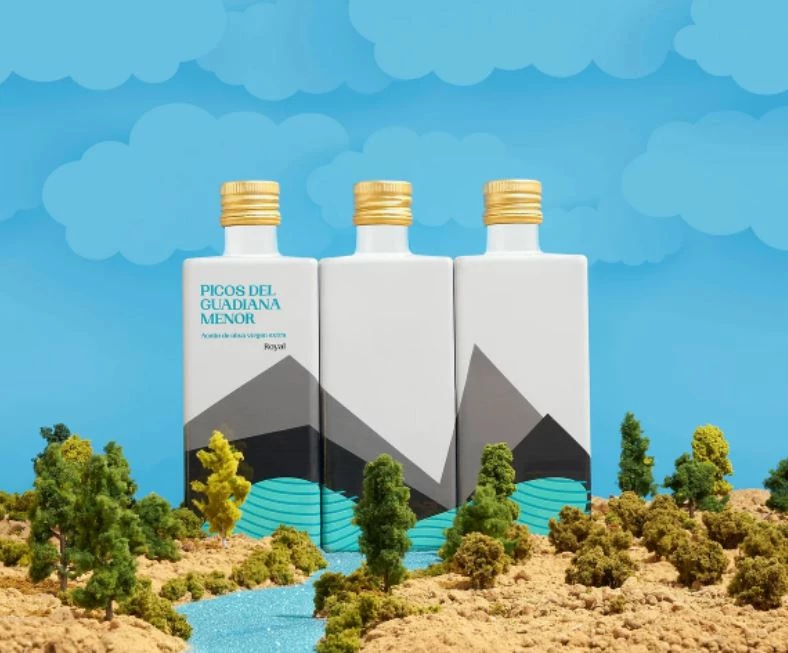
Standout Features:
- Gold-plated bottle caps
- Design elements inspired by land ranges
- Prominent usage of the color blue
Picos Del Guadiana is a Spain-based company that supplies extra virgin olive oil. The company worked with Superfluido to create packaging designs and labels that stand out among its competitors.
The design is heavily inspired by nature’s land ranges; from the beautiful crest of cliffs to the valleys rising in the Cazorla natural park. Overall, this design boasts a panoramic and attractive experience enough to captivate potential customers or at least get anyone curious.
The color palette also followed the shades of a semi-desert landscape with black and gray. Underneath those colors is a prominent shade of blue that represents the flowing river. Topping this all off is a gold-plated bottle cap that brings instant eye-catching quality to the design.
10. Desi Videsi by Plane Crazy
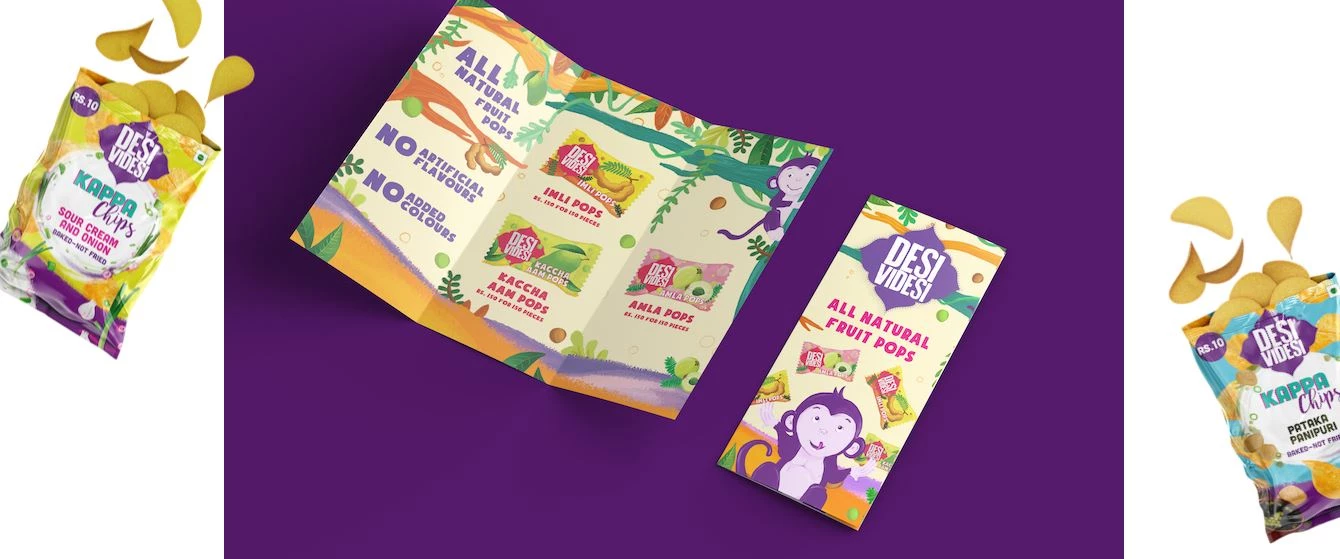
Standout Features:
- Bright colors that pop
- Playful graphics
- Quirky content in Hinglish
Healthy chips manufactured by S4S Technologies, a company that utilizes food processing machines using solar-powered dehydrators, are sold under the Indian brand Desi Videsi.
The process behind creating these snacks is vital information for the brand. But the challenge lies in the presentation because technical stuff doesn’t sound fun at all. Good thing Plane Crazy, a digital branding agency, has enough crazy ideas to pull it off.
At the back of the packaging, you’ll see quirky graphics depicting the advanced technology used to create the products. It also highlights the Indian women farmers who painstakingly pour their handcrafting talents to bring these products to life. This section allows the consumers to gain insight into who the brand is, which earns the trust and patronage of the market.
Also, the agency takes a playful approach without holding back from using loud and bright colors. We see matching striking colors and shapes complementing the flavors offered. This creates bold, lively, and modern visual elements that grab the attention easily.
Combining the lively graphics with a striking color palette definitely brings out the friendliness of the brand which ultimately positions them as an unmistakable product in the food space.
11. Deleite by Navorsky Studio
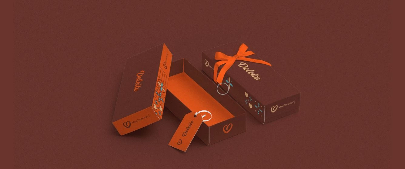
Standout Features:
- Dainty patterns
- Warm and muted colors
- Intimate and cozy vibe
Deleite Brownie is a staple coffee shop that lies in the city of Porto Velho, Rondonia. It’s a local brand known for its brownies and sweets. Its distinct flavors, desirable selection of sweets and consistency quickly turned it into an admired dessert stop in the city.
The brand wanted to revamp its visual identity while still preserving its homey and intimate image. Although a bit tricky, Navorsky Studio, a design and visual branding agency, hit the spot perfectly.
The agency utilized warm and muted colors in its overall visual design. Hues of brown, orange, and a bit of blue bring character to the visuals. There are also dainty patterns of florals and hearts laid out orderly on the design, adding a pleasant touch to all brand collaterals. Furthermore, the font used complements the colors and graphics well.
12. Lado Bueno by Dabrand
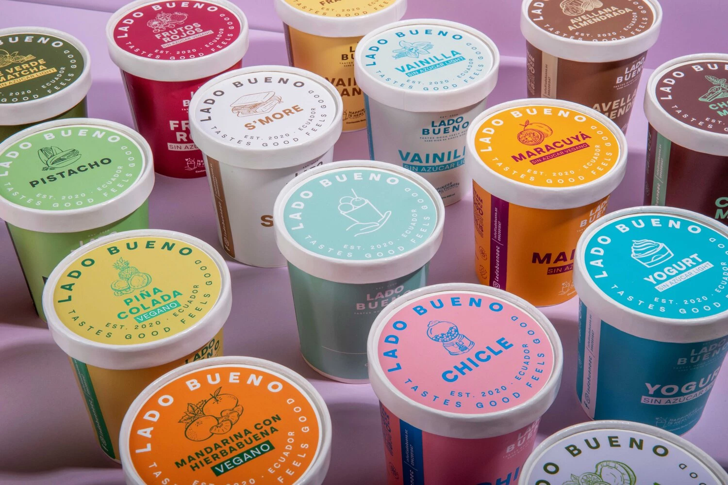
Standout Features:
- Cool color palette
- Pencil drawing touches
- Evocative branding identity
Lado Bueno is a groundbreaking Ecuadorian brand that offers premium artisan ice cream. It boasts high-quality and fresh ingredients day in and out, catering to all dietary needs. Whether you want vegan, non-dairy, or fat-free flavors, Lado Bueno has it.
Dabrand, a branding and digital agency, takes charge of the brand’s identity and packaging design. The agency positioned the ice cream company as an easy-going, fun, and bright brand. They used a variety of cool and pastel colors paired with pencil-style illustrations and a soft typeface family.
The packaging design complements the specific ice cream variety it contains by following the flavor’s colors. Each container also has custom graphics hand-drawn at the top of the lid, representing the product.
Because of its bright and feel-good design, it effortlessly attracts the attention of millennial and Gen Z customers.
Even without the use of crazy graphics, the agency has successfully communicated the brand’s tagline: taste good, feel good.
13. Pink Berry’s Mayozhni Ice Cream by Doping Creative Agency
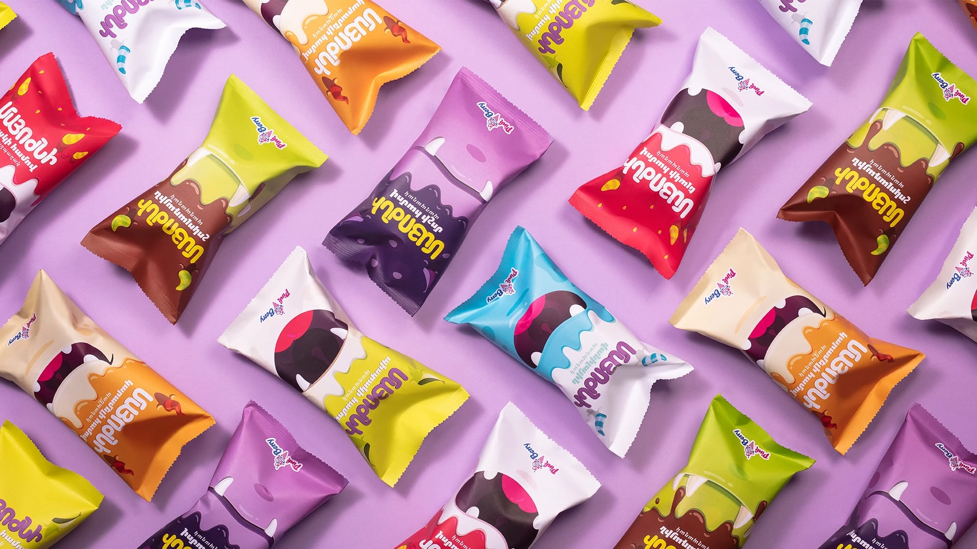
Standout Features:
- Wild and wacky monster graphics
- Wide variety of bright colors
- Designs popular for children
Mayozhni Ice Cream by Pink Berry aims to target a new audience bracket: kids!
They needed a fun and children-magnet packaging that could easily hook their market. With this, they partnered with Doping Creative Agency to bring out their unleashed cutesy side.
Together, they decided to name the entire product line “Mayozhini”, derived from the Armenian slang word, “Marozhini” meaning ice cream. Since children often mispronounce the word, replacing R with Y, the agency increased its appeal by adopting the kids’ invented word.
The overall branding identity is fun and lively — much like a little kid monster who has immense energy for playtime! The agency used vibrant colors and wacky monsters to represent the kids’ mischievous and naughty sides.
Also, each flavor is represented by a monster with its own features such as a cheerful smile, a set of goofy teeth or crazy horns. Meanwhile, flavors are identified through a series of color palettes, making the product more pleasing to the eyes of the audience.
14. La Favola by Holy Studio
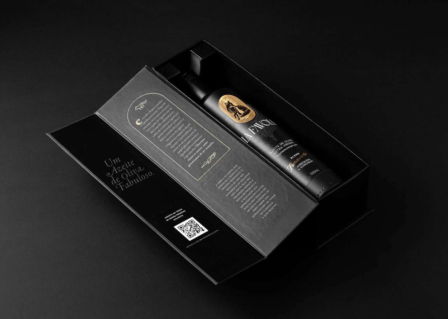
Standout Features:
- Matte black bottle
- Classy and luxurious aesthetics
- Distinct gold logo
With the aim to spark an irresistible desire to experience the product among its target market, La Favola seeks the branding and design expertise of Holy Studio. And in the end, they managed to produce a luxurious branding that solidifies the brand as a premium choice for extra virgin olive oil.
Unlike other olive oil packaging designs that always circle around nature, the agency focused on delivering a design that speaks more about the brand: classy and premium. Sporting a black bottle in a matte finish, this packaging instantly stands out when put alongside competitors.
Looking at the lower part of the packaging, you’ll notice a cement-like texture wrapped around the bottle. This is a nice touch that elevates the design, making it gift-ready for special occasions.
The slight touches of gold in this branding identity and packaging design scream luxury. It’s used to emphasize certain texts on the packaging and on the logo.
15. Anthema Cookies & Bars by Circus Design Studio
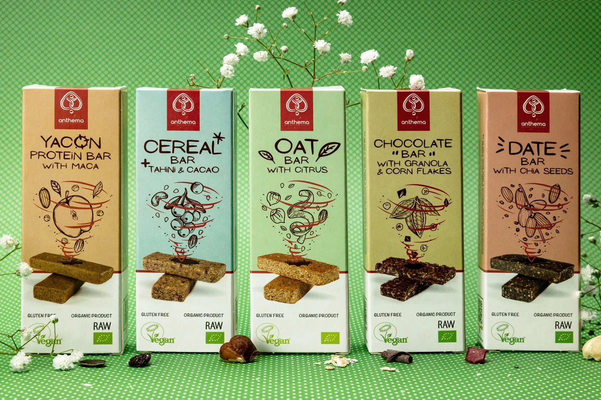
Standout Features:
- On-brand packaging seals
- Hand-drawn style graphics
- Subdued color palette
Committed to creating products with high nutritional value, Anthema Cookies & Bars processes raw materials and yield healthy snacks that are free from sugar and gluten. To effectively communicate to their target market and send their vision across clearly, they connected with Circus Design Studio.
Since the agency is an expert in graphic design, there’s no question that they delivered an attractive packaging design for the brand. They used pencil-style drawings to illustrate the product’s main ingredient. This illustration sits at the center of the packaging, an instant attention-grabber element especially when displayed alongside other products on the shelf.
To create a cohesive packaging design, the agency used a handwritten style typeface family to complement the drawings.
Lastly, the boxes come in subdued or pastel shades of blue, green, and pink. Then, a red tape seal containing the brand logo and name remains distinctive across all designs.
16. Willicroft by Kindly Made Studio
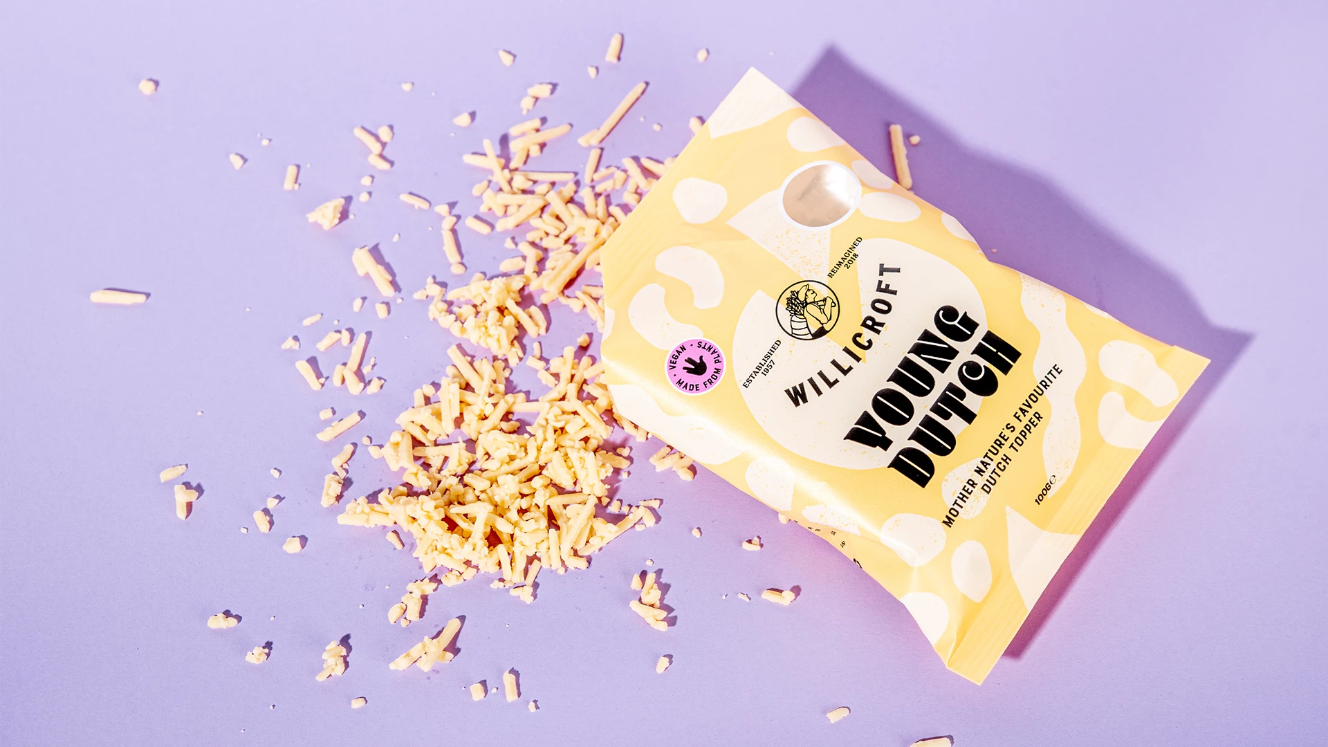
Standout Features:
- Funky shapes and illustrations
- Pastel color palette
- Creative stencil typeface
Willicroft dedicates its craft to making planet-proof and plant-based alternatives to dairy. They’re a vegan cheese brand based in Amsterdam advocating for an environment-conscious eating lifestyle.
With this commendable vision, they needed creative geniuses to translate it into a visual branding that would attract the market to their cause, too. Kindly Made Studio stepped up and took this challenge. They’re an agency that works with vegan and plant-based brands.
The agency revamped the previous branding into a more cohesive and simple design, slightly toning down the loud visuals and bright colors. This time, they used soft and pastel hues for a lighter image. Hand-drawn shapes and patterns of the product’s ingredients are also a great way to increase brand recognition.
One glaring change the agency made here is arranging a clear content hierarchy through sizes and font styles. Starting with the product name as the most noticeable text on the packaging, followed by the brand name situated at the top in a convex shape.
Lastly, the brand’s tagline is cleverly positioned under the product name, leaving a lasting impression on anyone who reads it.
17. Manea Brutarul Bakery by Logo Bigger
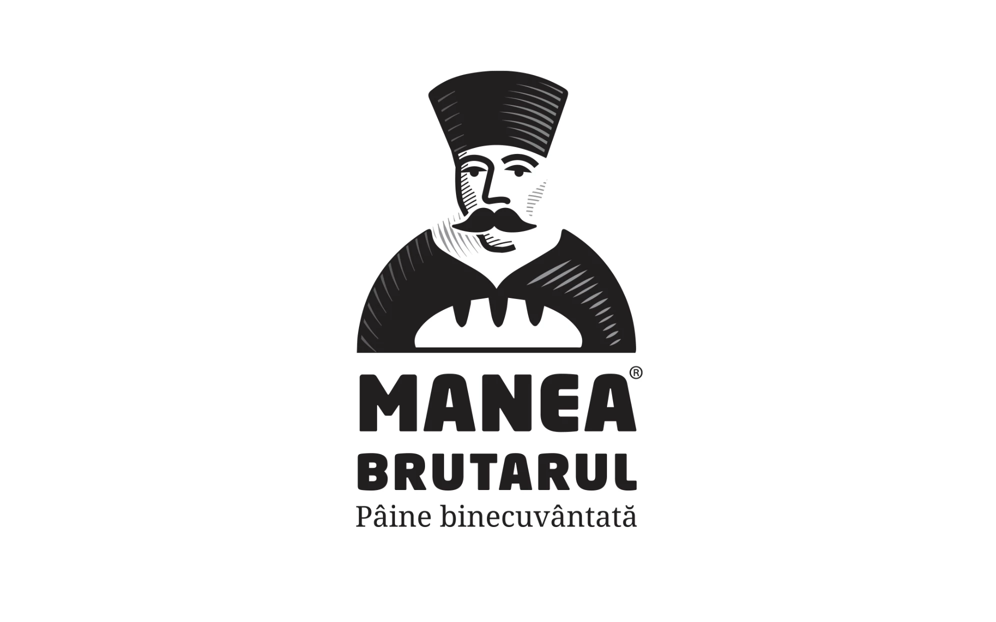
Standout Features:
- Blend of tradition and contemporary design
- Evocative of the brand's unique origin story
- Monochromatic logo, colorful packaging
When a local Romanian bread manufacturer wanted to promote their healthy recipes and tradition through premium bakery goodies, they wanted a brand identity and package design to match the new business focus. Enter Logo Bigger!
The agency dug deep into the brand's history. Manea Brutarul was the head of the bakers' guild in Southern Romania, in the 18th century. Renowned for his generosity, he founded a church in Bucharest, and later a street and a borough were named after him. But above all, Manea The Chief Baker fought to keep his bread clean and pure, which is exactly the basis for the brand's visuals.
Manea The Baker mascot stems from 18th-century iconography, with a contemporary twist. Strong, bold lines, inspired by medieval tapestries, symbolize the cleanliness of bread recipes: dough and water, without enhancers or additives. The visual approach appeals to both traditionalist consumers and discerning customers while keeping Manea's story alive.
The logo / visual symbol presents Manea's medieval portrait in a contemporary light, skipping all the unnecessary details: the high hat, specific to the Phanariot period, and the bread mark. The firm lines and the heavy font tell the story of tradition and grounded spirituality, with a nod to the inscription on the church founded by Manea in Bucharest, more than two centuries ago.