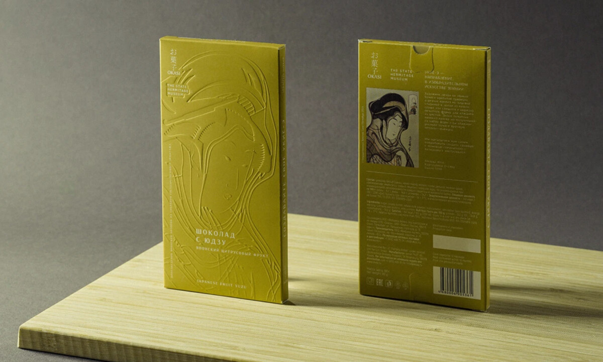
SEV/Studio designed Ukiyo-e Chocolate packaging as cultural interpretation, not decoration.
Each box references Japanese woodblock printing through embossed texture and a restrained color palette, turning limited-edition museum chocolate into an object worth keeping.
The system works because every material choice reinforces the same idea: craft techniques can carry cultural stories more effectively than surface imagery.
Ukiyo-e Chocolate Print Design: Key Findings
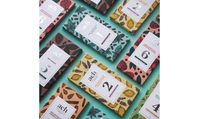
Industry Insight: The premium chocolate market is projected to grow from USD 42.30 billion in 2025 to USD 85.61 billion by 2033, with a 9.2% compound annual growth rate.
Within this expansion, packaging innovation plays a critical role.
According to a widely-cited report, 82% of consumers are willing to pay more for sustainable packaging, and tactile finishes like embossing create a premium sensory experience that studies show can lead to higher sales.
Deep Embossing Translates Woodblock Craft Into Texture
The defining feature of Ukiyo-e Chocolate packaging is its embossed surface. Instead of reproducing classic woodblock prints graphically, SEV/Studio referenced the carving process itself.
You can feel the ridges. The texture isn't decorative. It's a direct translation of one craft medium into another.
This approach respects the source material without copying it. The embossing works because it engages the same sensory pathway as the original woodblock prints: physical depth created through deliberate removal and emphasis. You experience the technique, not just the image.
Textured finishes like embossing and debossing have become a key premium packaging trend in recent years, creating what consumers perceive as luxury and quality. The physical engagement matters.
When people touch the box, they're already forming a judgment about what's inside.
Monochrome Palettes That Work Quietly
Yellow for citrus. Green for matcha. Purple for sweet potato. Gray for sesame. Each shade feels hand-mixed and archival. The color system selected uses muted, single-hue fields to indicate flavor.
The palette avoids the bright, saturated colors typical of mass-market confectionery. Instead, colors suggest rather than announce. This restraint taken by SEV/Studio positions the product as something curated, not commercialized.
The monochrome approach also solves a functional problem. With limited space and deep embossing taking visual priority, a complex color scheme would compete for attention.
By keeping each box to a single field, the embossing stays legible and the overall system remains coherent.
"It's great to see such considered design and curated colors. The packaging looks stunning and luxurious, and the embossing makes a huge difference. The story is different from ones I've seen, which would definitely pique my curiosity - I would pick this up.”
- Kitty Lai, Design Awards Jury
Uniform Structure That Strengthens Collectibility
Every box in the collection uses the same dimensions, same structural format, same typographic hierarchy. Variation comes only through embossed pattern and color.
This consistency is strategic. When a product line maintains tight visual and structural parameters, it encourages completion.
Collectors want the full set.
The uniformity makes gaps obvious and creates motivation to acquire what's missing.
The modular system also ensures that new flavors or seasonal editionscan be introducedwithout disrupting the established visual language.
Add a new color, add a new embossed pattern, maintain the structure. The collection expands without losing coherence.
Learn the five packaging truths that turn design into real brand value and shelf power.
Material Choices That Reinforce Museum Quality
The packaging uses substantial board stock with a matte or uncoated finish. This absorbs light rather than reflecting it, giving each box a tactile, non-commercial feel.
The choice to avoid gloss or metallic finishes aligns with the overall restraint strategy. These boxes feel like they belong in a gift shop at the Hermitage Museum, not a grocery checkout lane.
The material quality signals that the product inside has been treated with care and respect.
As the premium chocolate market continues its rapid growth, brands are finding that packaging innovations and multi-sensory experiences differentiate products in an increasingly crowded field.
Ukiyo-e Chocolate positions itself not as everyday indulgence but as limited-edition cultural experience.
What Brands and Agencies Can Learn from Ukiyo-e Chocolate
1. Let Craft Techniques Carry Cultural Storytelling
SEV/Studio didn't print images of woodblock art. They translated the carving process into embossing.
This creates authenticity through method rather than reference, which feels more respectful and engaging, especially for culturally rooted projects.
2. Use Restraint to Signal Collectibility
Limited palettes, minimal typography, and consistent structure help products feel curated rather than commercial.
When every element shows discipline, the overall effect is elevated. Restraint signals that someone made careful decisions, and careful decisions suggest value.
3. Design Packaging as an Object, Not a Billboard
When packaging invites touch and close inspection, it encourages slower engagement. People don't rush past it. They pick it up, turn it over, consider it.
This positions the product as something to be experienced, not consumed mindlessly. In premium categories, that shift in perception drives both purchase intent and brand loyalty.
About DesignRush Featured Designs
At DesignRush, we review hundreds of agency projects each month. The featured designs stand out for creativity, relevance, and execution.
Many go on to be recognized as winners of our Monthly Design Awards.
Explore more creative work here:
- Best Packaging Designs
- Best Website Designs
- Best App Designs
- Best Logo Designs
- Best Print Designs
- Best Video Designs
For a full list of design agencies and related services, see our Agency Directory.