OKAN treats print like infrastructure instead of decoration. Pang Brands built a tight visual system of symbolic illustration and earth-driven color that moves cleanly from posters to stationery to signage without losing meaning. Every piece reinforces the same idea: culture travels further when the design is disciplined enough to carry it.
OKAN Print Design: Key Findings
Industry Insight: A 2025 study shows that consumers areincreasingly selective about where digital works and where print performs better. When clarity, credibility, and permanence matter, print remains the preferred format.
For brands and publishers, this reinforces print’s continued role as a high-trust channel for storytelling, education, and essential communication.
Symbolic Illustration Creates Cultural Continuity
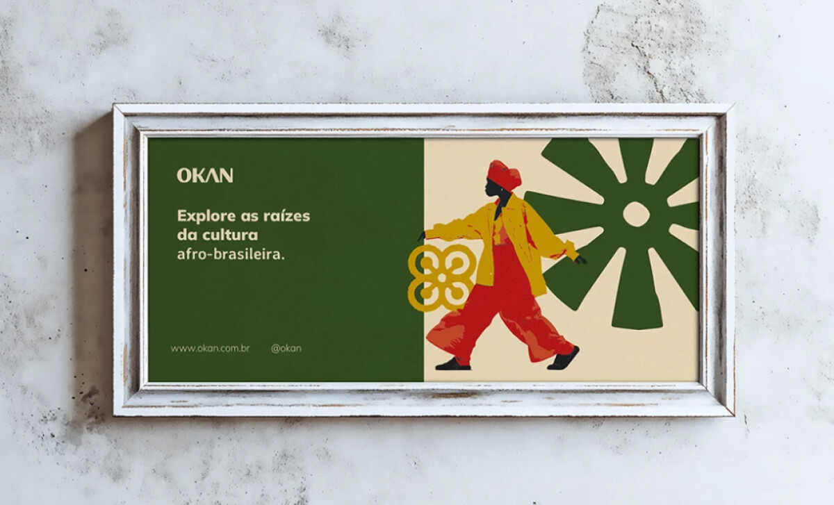
The strength of OKAN’s identity lies in its illustration system. Figures, hands, vessels, and ornamental motifs reference Afro-Brazilian traditions without slipping into cliché or pastiche.
Each one works as visual shorthand. Connection. Celebration. Education. Cultural continuity. The symbols speak to people who recognize them and invite others to learn what they mean.
Posters featuring silhouetted profiles and rhythmic movement scenes anchor the system. They create narrative entry points that invite viewers to see the culture as active and evolving rather than archived.
Warm Color Palette That Evokes Place and Tradition
The color choices are deliberate. Deep forest green for the landscapes of Brazil and West Africa. Terracotta red for energy and traditional textiles. Golden yellow for spiritual significance. Natural cream for breathing room.
Nothing feels synthetic. The palette reads as earthen, hand-mixed, intentional. When applied to posters, the combinations create contrast without losing warmth.
This also solves practical problems. High saturation ensures visibility in community centers and travel expos. The earthy undertones keep the brand feeling human-scale, not corporate. Okan positions itself as community-focused, and the color system backs that up.
"Not a classical piece by some standards, but strong and individual and relevant with powerful use of colour."
— Lee Selsick, DesignRush Awards Jury
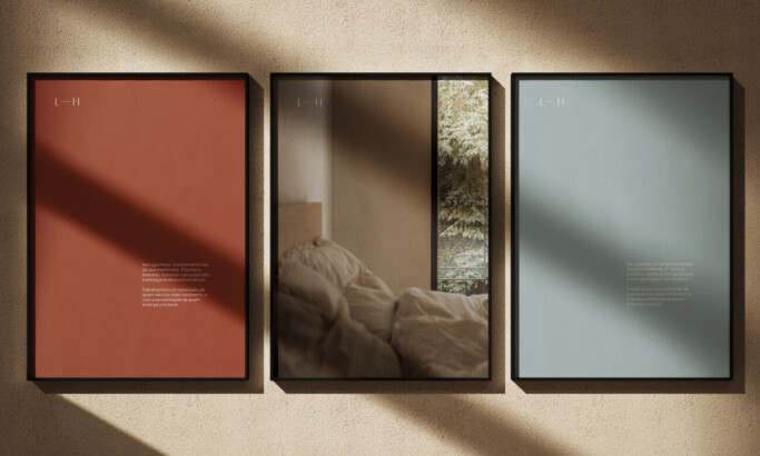
A Print System Designed for Real-World Interaction
Pang Brands approached OKAN as a fully realized print design system rather than a single visual mark.
Posters, envelopes, passes, and informational materials share the same visual DNA, making the brand recognizable whether encountered in a gallery, a cultural site, or a travel context.
Small-format items such as passes and bookmarks use the same illustration language and color logic as large posters.
This consistency turns everyday printed objects into extensions of the brand narrative. Each piece feels intentional and collectible, reinforcing the experiential aspect of OKAN’s offering.
The system also demonstrates production awareness. Colors remain legible on textured paper stocks, and illustrations maintain clarity at smaller scales.
This level of detail ensures the identity performs well outside mockups and in real environments where lighting, handling, and material variation matter.
Tactile Print Execution That Honors Craft
Pang Brands designed for physical materials. The posters use matte or uncoated stocks that absorb color in an organic way. Business cards are thick, substantial, with spot color printing that emphasizes craft over flash.
This aligns with the mission. Okan preserves cultural traditions through experiential tourism. The print design preserves traditional print craft. The materials feel made, not manufactured.
As cultural tourism expands to an estimated USD 1.2 trillion in 2025 and is projected to reach USD 2.6 trillion by 2035, brands operating in this space need design systems that communicate authenticity at scale.
73% of global travelers with children actively seek authentic, local experiences, reinforcing the market opportunity for heritage-driven brands like OKAN.
Choose the right paper stock to elevate print quality, brand perception, and tactile impact.
What Brands & Agencies Can Learn from Okan
1. Root Visual Identity in Cultural Truth, Not Generic Tourism Tropes
Pang Brands skipped the stock beach photos and generic travel imagery. They built the system around symbols with real meaning in Afro-Brazilian culture. This creates authenticity that can't be copied.
2. Use Color to Communicate Values and Create Emotional Resonance
The warm, earthy palette signals approachability, tradition, and connection to place. Color choices should reinforce what a brand stands for, not just follow trends.
3. Design Systems That Empower Non-Designers to Create On-Brand Work
A strong visual system gives teams the tools to produce new materials without constant designer oversight. Clear rules around layout, color use, and symbol application make consistency achievable at scale.
About DesignRush Featured Designs
At DesignRush, we feature design work that demonstrates cultural intelligence, strategic thinking, and visual craft.
Tourism agencies, cultural organizations, and heritage-focused brands can find more case studies like Okan in these collections:
- Best Print Designs
- Best Website Designs
- Best App Designs
- Best Logo Designs
- Best Packaging Designs
- Best Video Designs