-account-photo_listing.jpg)
-account-photo_listing.jpg)


Our Jury has worked with Prada, Nike, Chanel, Google, and Apple.
Best Animation Videography Designs of 2026
View the Top Animation Videos Below
Best Animation Videography Designs of 2026
View Design
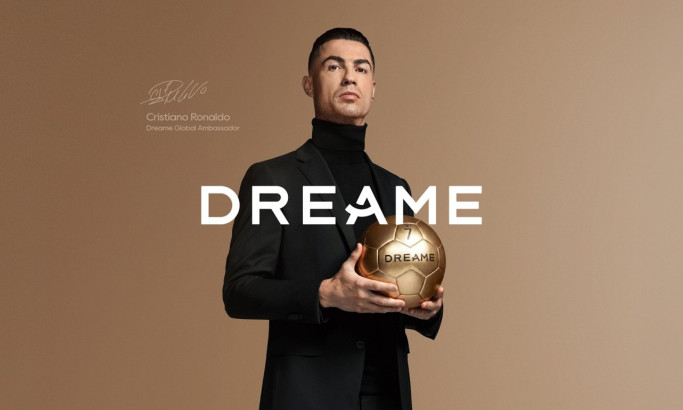
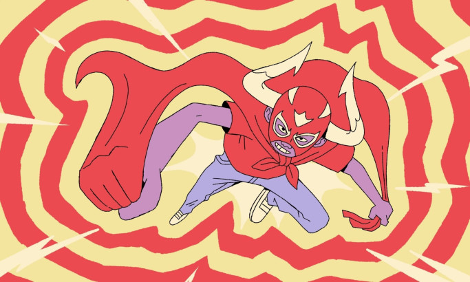
Dreame to Win Video Design
View Design
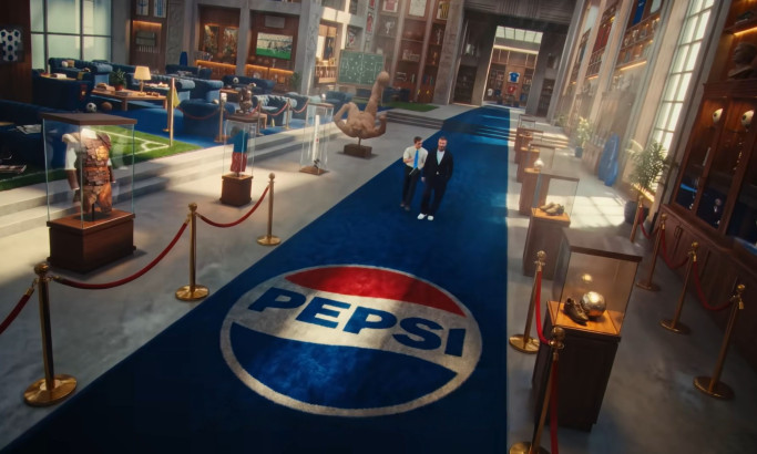
Pepsi MAX - Football Nation Video Design
View Design
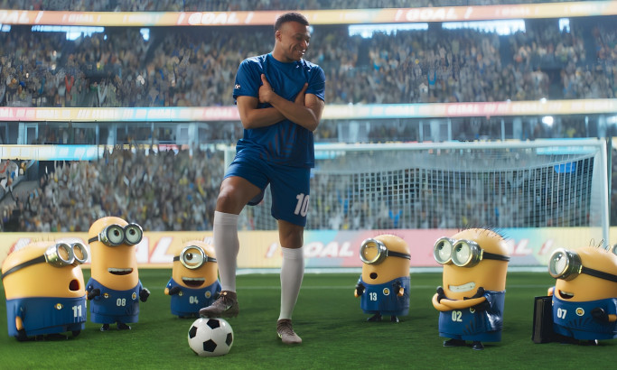
Minions & Monsters Video Design
View Design
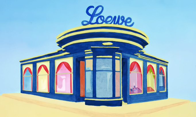
180 Years of LOEWE Video Design
byBlinkink
View Design
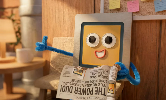
TPU Training Day for I/O ‘26
View Design
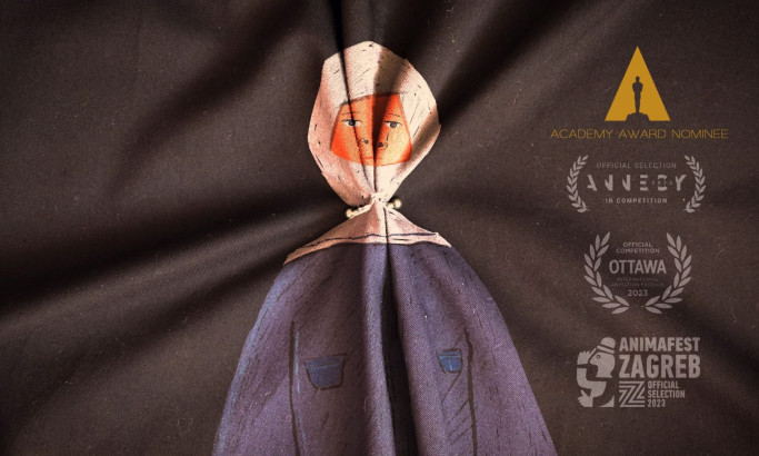
Our Uniform
View Design
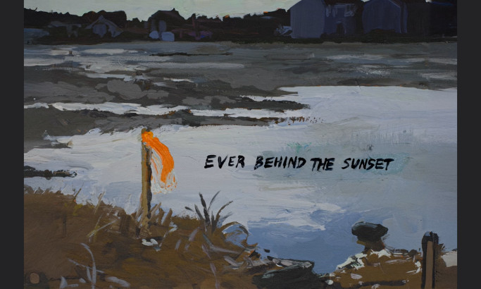
Ever Behind The Sunset
View Design
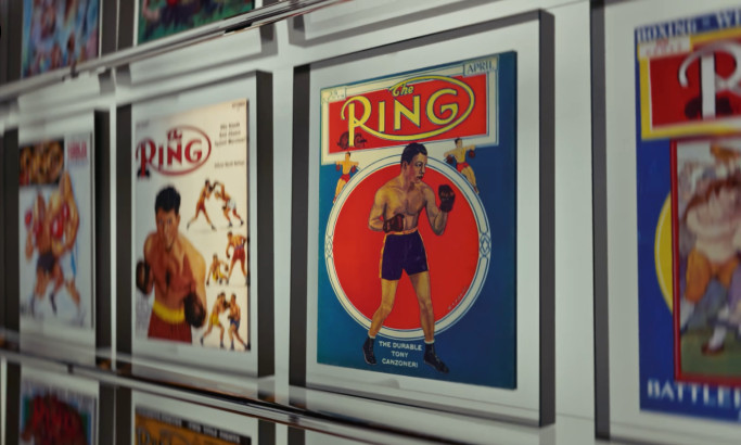
THE RING
byColossal
View Design
Everyone Wants a Piece | LEGO® FIFA World Cup™
Get Connected
With The Right Agency Partner
& Receive Proposals For FREE
View Design
Toros Neza
View Design
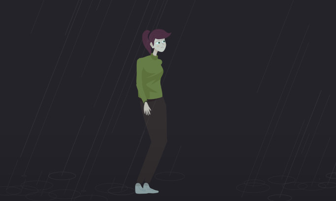
An Animated Intro About Changing Emotions
View Design
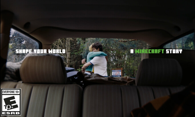
Minecraft - Shape Your World
View Design
New Skill Unlocked
View Design
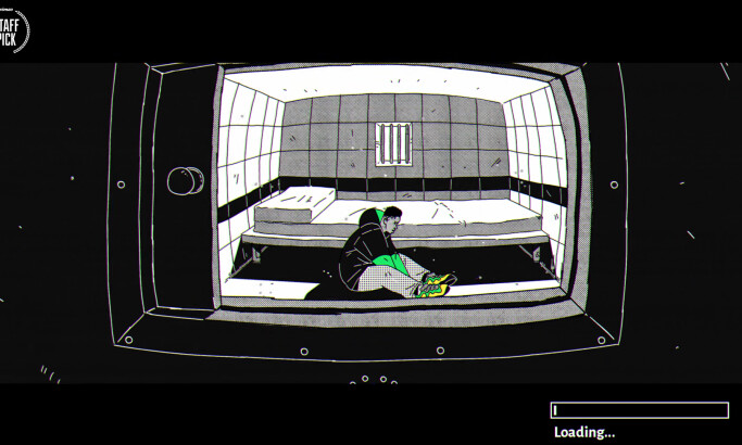
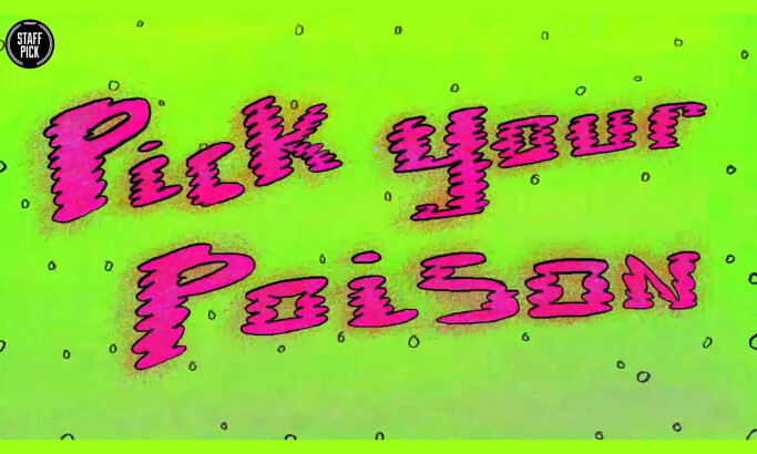
Pick Your Poison
View Design
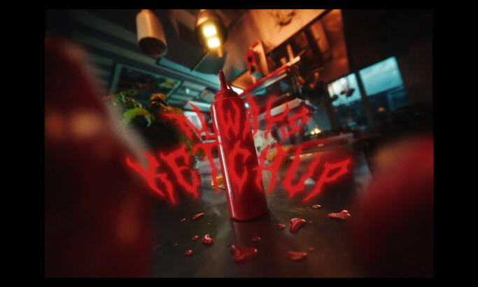
Always Ketchup
View Design
The Custom Chef - Trade Show Dir.Cut
-preview.jpg)
View Design
Kill Your Darlings
Ready to elevate your designs?