So much of human interaction occurs indoors: in office spaces and living rooms, inside apartments and garages, within shops and kitchens. Beauty is essential for human life, and no one couples the importance of indoor spaces with the value of beauty better than Klokhuis Interior. This Dutch interior design company works to craft creative indoor spaces that suit every human interaction and bring out the best in spaces of all sizes.
By using an interface filled with interactive capabilities and subtle thematic dimensions, the site brings the 3D quality of its creative services to life in vibrant ways. Users are greeted by a light home screen with reactive scroll features that present samples of their work. Lots of white accents fill the page, recreating the welcoming feeling of the open spaces the company designs. Simple touches—like curved lines and teardrop shapes from the company logo—are scattered in creative ways throughout the home page. This emphasizes the importance of detail in any indoor space; a slight wave in an overhead light fixture or a unique window trimming in a sunroom all add to the overall ambiance. This company is as attentive to the details as they are to the end goal, whether in a small or expansive space.

Dynamism is an essential component to Klokhuis Interior’s design philosophy. They use a variety of colors and layouts to achieve this in their indoor architecture and designs. The same can be said of their website. As users scroll past images and blocks of background color, visual diversity breaks up the monotony that’s typical of other interfaces.
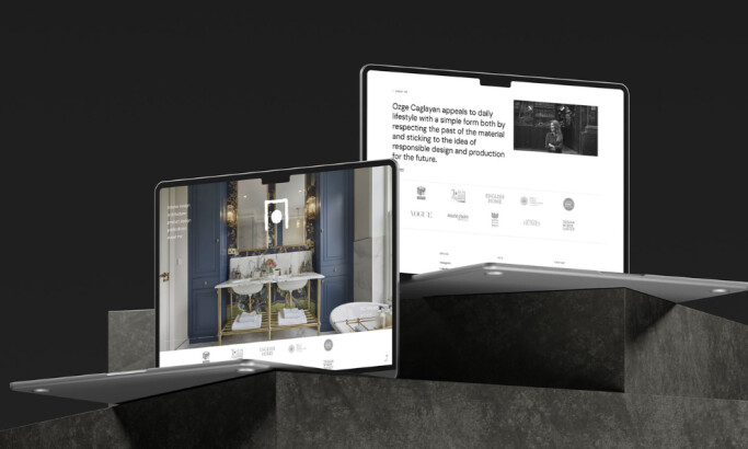
Klokhuis Interior’s site uses text that moves in a slightly different plane than background images to create an energetic effect. Here on the “About” section of their home page, color contrasts rotate between sections of pages where white space dominates, and white script overlays dark images. A small company logo drops down and remains on every page as users scroll. These design elements keep users engaged from the top of the page all the way to the bottom, creating a lively interaction.

Users experience no shortage of engaging opportunities when they click into Klokhuis Interior’s sample portfolio. Unlike sites that rely on vertical scroll features to guide users to different projects or samples, this site once again relies on details and interactivity to connect the user with the company’s services. A single image fills the background with a vertical white column on the left side, but when users hover over the page, the image warps into different samples from other projects. The feature is subtle and quick, but it lifts the experience beyond expectations to give it a three-dimensional essence.
Soft white lines and text stretch across the sample page in a rectangular grid. When users move over a sample in the grid, the rectangle fills with the familiar solid blue of the site’s design, and a simple illustration of the indoor space appears in the backdrop.
When users select any of the company’s interior design samples, they can view additional pages that hold more in-depth descriptions of each project. These pages also include interactive photograph elements, such as image zoom and photo slideshow options. The teardrop detail found in the logo becomes a functional design button for users to navigate through a photo slideshow. Klokhuis Interior’s entire site skillfully adopts dynamism, minimalism, color, and contrast to create an interactive interface that will intrigue anyone seeking a new indoor design.
Klokhuis Interior is a clean website design in the Architecture and Luxury industries.