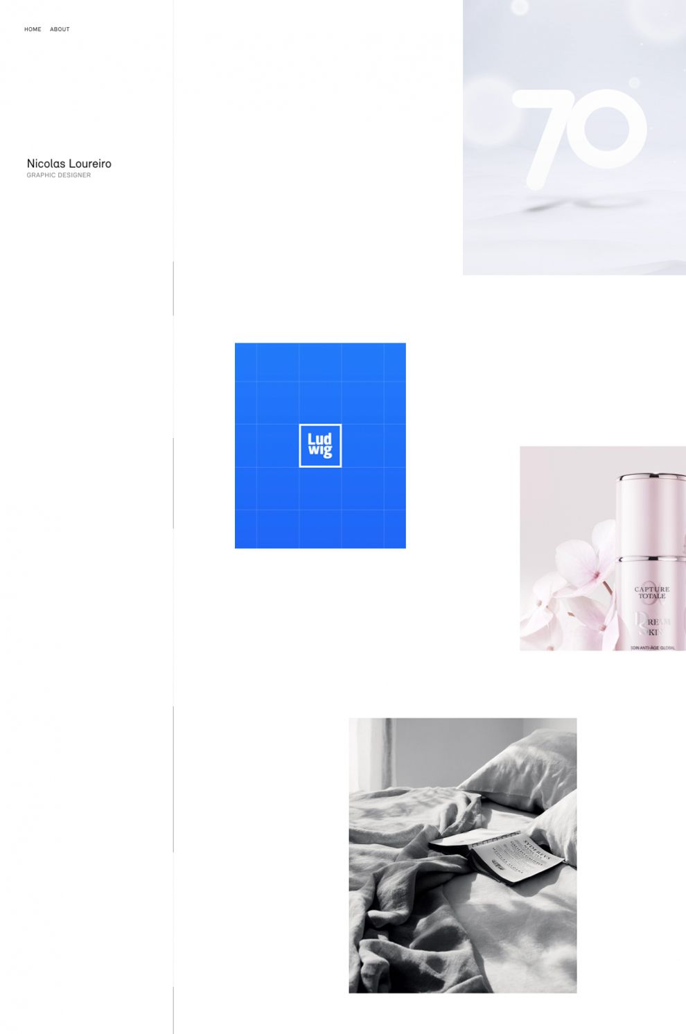
Nicolas Loureiro is a graphic designer who created a site which was intended to highlight his capabilities as a graphic artist. He clearly wanted to evoke a sense of simplicity and wanted to highlight the effect and prowess of his work, rather than oversaturate his site with complicated design elements. This home page, for example, is simple, clean, but unforgettable. When you enter a site as spatial as this, you feel like you have to move forward.
Users are intrigued by the empty beauty of the page, to the point that their curiosity forces them to proceed. This is an example of how, when it comes to UX, sometimes much less is better than even a little more.
Nicolas could’ve created a wild site meant to prove in of itself his capacity for design. But instead he created an understated page that showcases his work just enough to force users forward. This demonstrates intelligence, innovation, and understanding is more valuable than any technical skill, all of which help to sell Loureiro as a graphic designer.

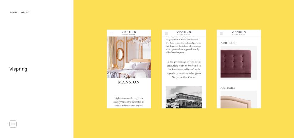
This portfolio page furthers the minimalistic user experience of the site. The blankness of the page accents the quality of the work and speaks to the idea that the work is also what the client values himself. The content of the portfolio is presented as several relatively small images, dwarfed by a massive field of yellow.
This continues the same simple charm demonstrated on the homepage, but modifies it with a subtle navigation mechanic. The encircled arrow on the bottom right moves with the motion of the user’s mouse. Users can then click anywhere on the page and be carried on to the next part of the portfolio. This develops the minimized experience one part forward while still maintaining the overall aesthetic. This creates an exponential UX that continually develops and complicates into something increasingly more engaging.

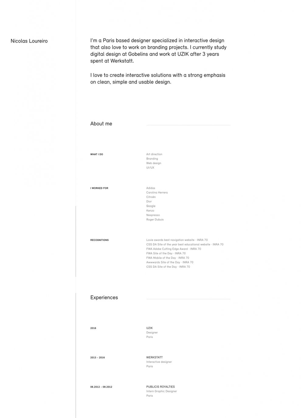
This bare bones “About” page might not appear to be any marvelous wonder of design. But its role in the overall UX of the site is critical and worthy of evaluation. Here, Loureiro speaks directly to the user and confirms their suspicions thus far. He states that he loves to create “interactive solutions with a strong emphasis on clean, simple, and usable design”. Upon reading this, users realize that they have in fact been experiencing a site just like that.
Users realize that Loureiro has constructed a curated space meant to reflect and prove his particular brand. Potential clients now realize his capabilities and how skilled he is at executing a vision. This page is critical to the UX of the site as it functions almost as a eureka moment. You realize that the experience of the site has been deliberately minimal and clean, and you understand the Loureiro is a master of this style.
Nicolas Loureiro is a clean website design in the Advertising and Professional Services industries.


