Stanford d.school is home to the university's creative minds, honing every learner's imaginative capacity. Its website clearly represents this vision — an interactive, engaging platform with artistic flair, featuring a clean layout, vibrant red accents, playful animations, and sleek typography. Combined with organized header and footer menus, these elements capture the school's focus on fostering design thinking and contemporary education.
Key Insights for Brands:
- Incorporating playful, interactive elements enhances user engagement and reflects your brand's creativity
- A minimalist design with organized menus and strategic accents elevates your website’s usability
- Consistent visual elements throughout your website build a cohesive online experience that reinforces brand identity
Stanford d.school's Website Mirrors the Institution's Innovative Education Through Interactive and Engaging Design
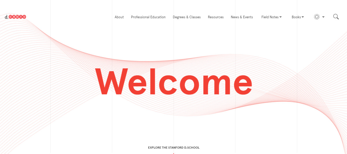
The Stanford d.school website brilliantly reflects the institution's focus on fostering creativity and design thinking. Its clean, open structure draws users in, beginning with a vast, white negative space and the school's signature red accent. It sets a modern yet approachable tone for visitors!
Professional web designers often utilize interactive animation on the homepage to make a memorable first impression. In this case, hovering over the red lines creates wave-like effects that move in response to the mouse. This playful interaction symbolizes the creativity that Stanford encourages in its students, making it a fun and memorable introduction to the site.
The Website Elevates Usability With an Organized Header and Footer Menu
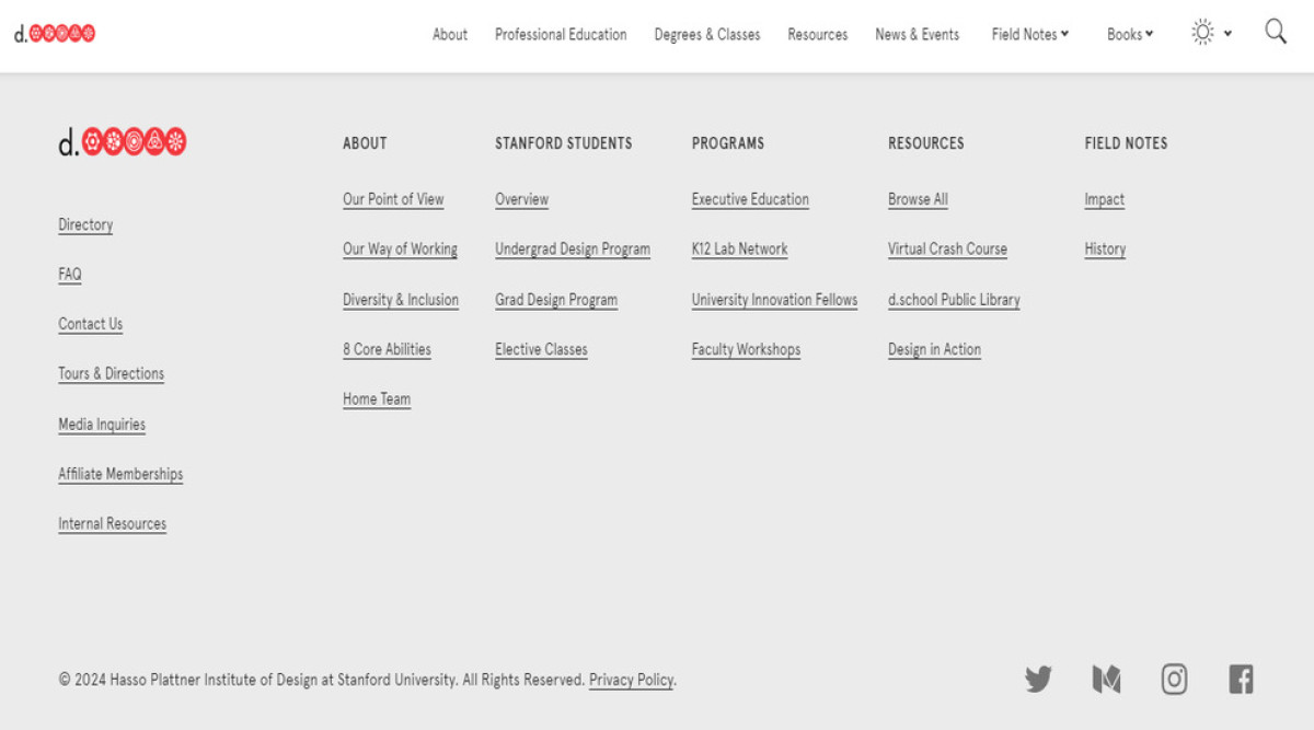
The header menu on the Stanford d.school website embraces simplicity with a minimalist aesthetic. Against the clean white background, a small black sans-serif font lists the page titles, each turning into a strikethrough when viewed. This thoughtful feature ensures easy navigation and offers users an intuitive browsing experience.
The footer design, presented on a pale gray background, balances functionality with aesthetics. Columns of page titles are neatly spaced, and each is underlined to indicate clickable hyperlinks.
Moreover, the black sans-serif text contrasts sharply with the gray, making the menu readable and accessible. This structured organization, often seen in outstanding website designs, allows users to explore other site areas easily.
The Stanford d.school Website Amplifies Brand Identity and User Engagement With Cohesive Design Elements

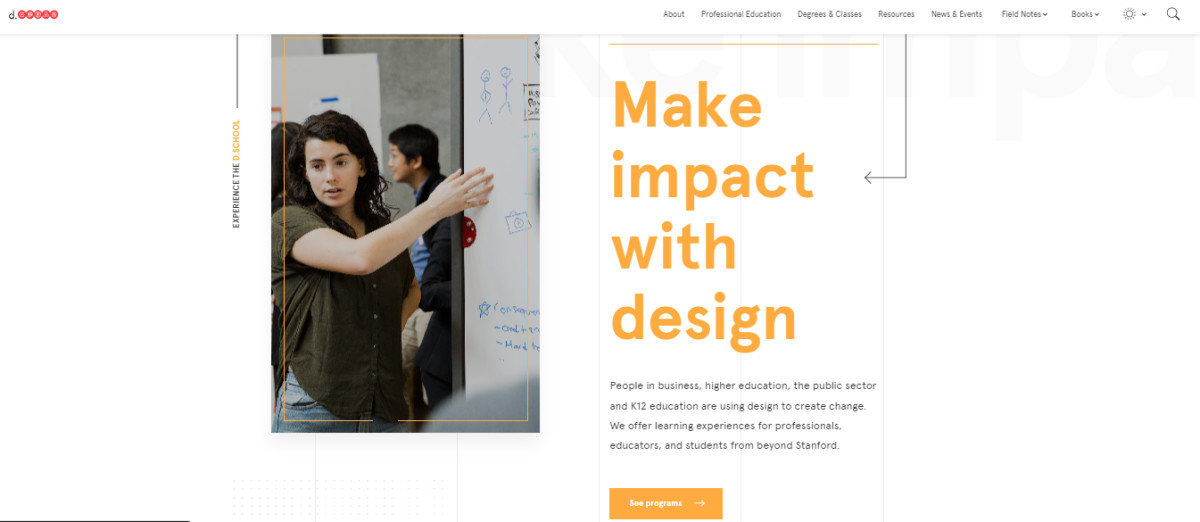
Exploring through the subpages is a seamless experience thanks to its cohesive design. The bold, orange headings stand out, paired with wave animations that add depth and maintain user interest. This visual consistency ties the site together, reinforcing the Stanford d.school brand identity as an interactive learning environment.
The website also integrates vibrant images of students and facilities to further emphasize the school's creative spirit and enhance the overall user experience. These authentic, high-resolution visuals bring the site to life. Plus, they evoke a sense of transparency, offering a look into the student experience at Stanford d.school.
Stanford d.school's Exudes Professionalism and Modernity Through Sleek and Vibrant UI
Stanford d.school's user interface is a testament to modern design, balancing professional elements with vibrant accents. The clean layout, marked by ample white space, provides a polished and professional look.
Subtle frames around images move in response to mouse movements, adding a sense of dynamism. Hover effects on call-to-action buttons also provide engaging user interaction, enhancing navigation.
Additionally, the website harmonizes minimalism and energy with modern sans-serif fonts and bright red accents. Its sleek UI reflects Stanford d.school's innovative nature, delivering a seamless, engaging user experience that captures the institution's ethos.
These elements, from interactive animations to the elegant header and footer, minimalist layout, vibrant accents, and captivating imagery, remarkably showcase Stanford d.school's quality education rooted in creativity and innovation.