- Agency: GoingClear
- Client: ReadSpeaker AI
- Category: Website – B2B Technology
- Location: United States
- Project Brief: Redesign ReadSpeaker AI’s website to establish stronger credibility, support long B2B buyer journeys, and improve conversion through UX research and structured content.
In evaluating AI website design, the challenge is balancing technical authority with approachability.
ReadSpeaker AI’s website handles this well, presenting advanced voice technology in a way that feels credible, clear, and easy to understand. I find the experience confident without becoming intimidating, which is critical for enterprise audiences.
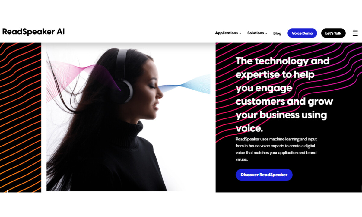
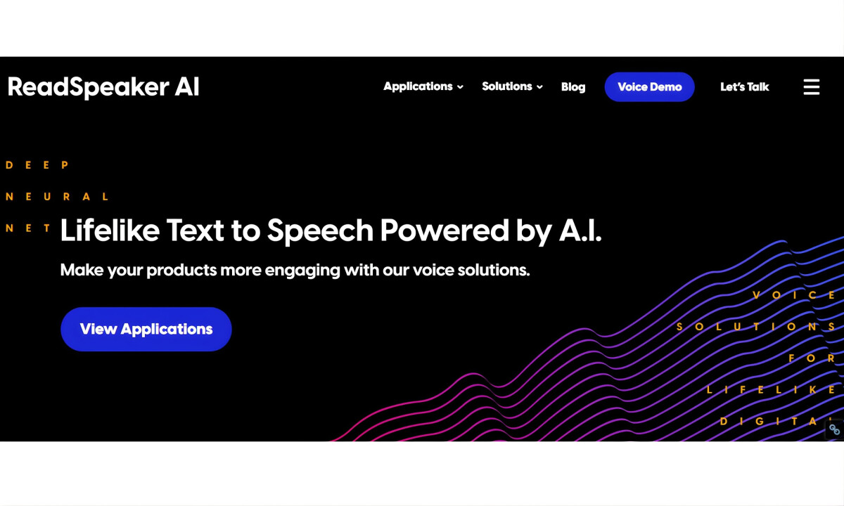
- Visual System: A dark interface sets a strong technological tone from the start. I like how neon accents are applied with restraint rather than decoration. Electric blues, magentas, and violets guide attention with energy while keeping the layout controlled and focused.
- Voice-Inspired Graphics: Waveform and signal-style line graphics are among the most effective elements. Instead of literal product visuals, abstraction is used to suggest sound, motion, and modulation. I appreciate how this adds rhythm to the layout while reinforcing the idea of digital voice.
- Typography & Hierarchy: Oversized headlines carry much of the authority. I find that the scale establishes credibility quickly, which matters for enterprise decision-makers. Supporting copy stays concise and well-paced, making longer scrolls feel intentional instead of heavy.
- Content Structure: A modular card system organizes a wide range of solutions cleanly. I like how content is broken into scannable units with clear calls to action, allowing different user types to navigate without friction.
- Product Interaction: The voice demo stands out as a defining moment. I appreciate being able to interact directly with the technology, since it builds trust faster than explanation alone. The controls feel technical yet accessible, striking the right balance for an AI product experience.
What Brands & Agencies Can Learn from ReadSpeaker AI
1. Start With UX, Not Screens
Clear structure comes from understanding users first. Mapping buyer journeys early leads to stronger messaging, smoother navigation, and better conversion outcomes in complex B2B spaces.
2. Use Abstraction to Explain Complexity
Visual metaphors like waveforms and motion cues can express advanced technology without relying on dense diagrams or technical language. This keeps experiences engaging without oversimplifying the product.
3. Put the Product in Users’ Hands
Interactive demos shorten trust gaps in long sales cycles. Letting people experience the technology early does more to build confidence than static explanations ever could.