From banks to tech startups, some of the best blue websites leverage their emotional range to create trust, calm, and confidence. Blue is versatile: light blue evokes optimism and clarity, while dark blue signals expertise and depth. This makes it the go-to choice for designers aiming for impact and balance.
The appeal of blue websites lies in how they make users feel. Bright, sky-like hues give off energy, friendliness, and peace, while cooler, deeper shades bring a sense of authority and focus. It’s no wonder many of the best website designs rely on blue to strike that perfect tone of fun, calm, and professionalism.
But here's the challenge: because blue is so popular, making a blue website that truly stands out takes creativity. The best blue websites blend trendy design with originality, turning this classic color into something fresh and bold.
Looking to use blue as your primary color? Get inspired by this curated list of the best blue websites that master the art of clear, cool, and captivating design.
1. GRINK by DVIGA
Standout Features:
- Dominant use of vibrant blue
- Bold, oversized typography
- Flavor-centric interactive visuals
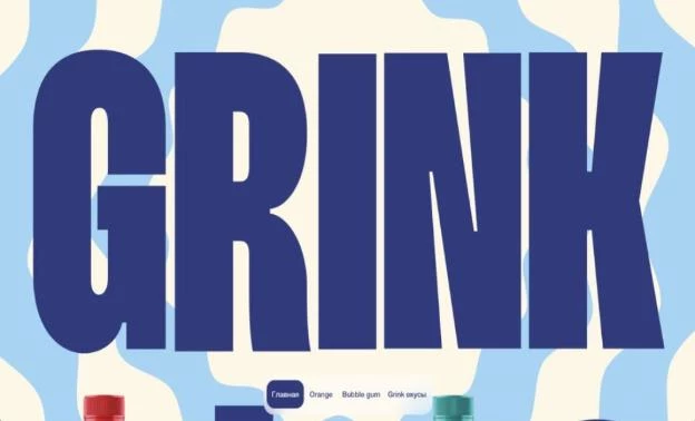
DVIGA’s GRINK website is a confident statement that leverages color, typography, and visual storytelling to create a digital space as bold as the beverages it promotes. Blue isn’t just a run-of-the-mill color choice here. It's used as a design strategy. The site leans heavily into vivid blue tones, which dominate the background and large textual elements.
This hue brings a dual purpose: it visually cools the page, aligning with the idea of refreshment, and it injects an unmistakable vibrancy that keeps users visually engaged. The blue also provides strong contrast with other color-coded sections, helping each product variant pop without losing cohesion.
Typography takes the spotlight with colossal, almost confrontational text blocks that spell out GRINK’s brand name across the screen. DVIGA’s use of thick sans-serif type not only grabs attention but guides navigation in a minimal, content-light environment. It emphasizes brand recognition over detailed storytelling, keeping the focus on identity and impact.
Each flavor gets its moment with interactive visuals that reflect its essence. From the bubble-gum pink backdrop to the zesty orange hues, the site switches themes dynamically. These visual shifts serve as navigation cues and reinforce the personality of each product while encouraging exploration without overwhelming the user.
2. Neon Rain Interactive
Standout Features:
- A well-branded design
- Problem-solution storytelling
- Interactive elements and consistent gradients across the website
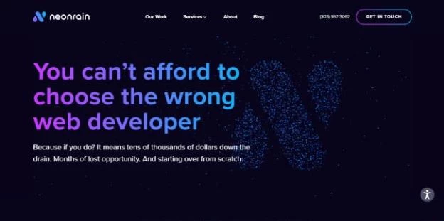
Neon Rain Interactive is a design agency with an impeccable web design that immerses any browser with its cool color palette and attention-grabbing interactive elements.
The homepage greets you with the purple-blue gradient hero text with millions of blue dots loosely forming the letter “N”. The hover effect lets you play around with it as the dots scatter while you hover over them.
The web design relies on awesome visuals to maintain your focus while it takes you through a casual problem-solution journey. Neon Rain Interactive shows you they are fully aware of the common issues with design agencies with six symmetrical content blocks, each talking about one.
This web design is exceptionally well-branded, as it remains consistent in interchanging “N”-like elements and gradient headlines. The CTAs are easily spotted as there’s a continual flowing effect, essentially emphasizing the buttons.
3. Silverstream Technologies by ID Studio Web Agency
Standout Features:
- Gradient-driven blue theme
- Futuristic micro-interactions
- Circular imagery and fluid motion
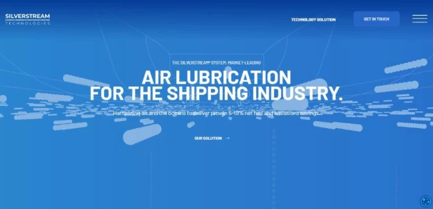
Silverstream Technologies delivers a product built on innovation and efficiency, and its website, designed by ID Studio Web Agency, echoes these values in every pixel. This is a digital environment that feels as fluid as the oceans it seeks to make more sustainable. Through a meticulous blend of design and functionality, the site sets a clear tone: this is the future of maritime tech.
The site’s foundation is its immersive blue gradient, mimicking the depths of the ocean while reinforcing the clean, tech-forward nature of the brand. This is a deliberate choice that connects the digital experience to Silverstream’s marine-focused solutions. The gradients shift subtly, adding depth and calm, while the consistent use of blue tones calls to mind trust, reliability, and innovation in equal measure.
Motion is used with purpose here. Small animations (such as data-inspired graphics and interactive elements) create a sense of technological sophistication. These microinteractions guide the user’s focus and break up static content, keeping the site dynamic without being overwhelming. It’s a nod to Silverstream’s focus on efficiency: movement with intent, design with direction.
Breaking away from rigid grid layouts, the site leans on circular motifs and smooth transitions that reflect the natural, flowing movement of water. These design choices feel organic and tie directly into the brand’s message of reducing friction, both in shipping and in user navigation. The soft edges and bubbles scattered across the interface enhance the underwater feel, bringing thematic consistency across the entire site.
4. Buzzworthy Studio
Standout Features:
- Deep, bold blue aesthetic
- Dynamic, oversized typography
- Smooth, interactive transitions
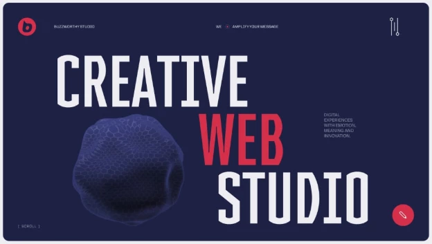
Buzzworthy Studio does more than build websites, it builds digital experiences with presence. Their own site is proof, doubling as a portfolio piece and a branding statement. The New York-based studio delivers a bold, self-assured design that communicates their confidence and creative power. It's a masterclass in using simplicity and strong visuals to engage.
The foundation of this site’s appeal is its striking use of deep navy blue. The color works as the canvas that lets every other element shine. This rich hue adds depth and professionalism, giving off a high-end feel while keeping the mood intense and focused. It also acts as a grounding element, allowing vibrant reds and stark whites to pop with purpose.
Typography on Buzzworthy Studio’s site is all about scale and intent. Large, punchy headlines like “Creative Web Studio" grab attention from the start, signaling boldness and clarity. The varying font weights and sizes create hierarchy, guiding visitors through the narrative of the site while maintaining a strong visual rhythm. It’s typography that speaks as loudly as the work itself.
Check out more examples of bold typography impacting website design.
And finally, what elevates this design is how it moves. Interactive transitions, from subtle scroll animations to floating elements, inject life into the site. They enhance user flow, keeping engagement high without distracting from the message. Every section change feels intentional, designed to keep the user intrigued and connected to the brand story.
5. Roger Junior Portfolio
Standout Features:
- Striking electric blue backdrop
- Playful, animated illustrations
- Interactive, self-aware typography
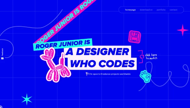
Roger Junior doesn’t just present himself as a designer who codes, he also lives it through every inch of his website. This blue portfolio website stands out for the interactive playground that it is while merging bold visuals with a clear personality. Packed with energy and technical wit, Roger’s site balances creativity and competence, offering a memorable introduction that’s hard to forget.
The first thing you notice? That punchy, electric blue that dominates the page. It’s a design choice that reflects confidence and vibrancy, setting a high-energy tone that carries through the entire experience. Against this backdrop, every other element, from neon graphics to dynamic text, pops with purpose. The blue creates cohesion while giving Roger’s personal brand a striking visual identity.
Balloon animals, floppy disk icons, and quirky game controllers: this site doesn’t shy away from being fun. The illustrations reinforce Roger’s approachable, hands-on design style. And the visuals, coupled with subtle motion, create a sense of ongoing discovery. It feels like the website’s inviting you to interact, scroll, and explore ... all while highlighting Roger’s dual skill set of design and code.
Finally, text here does more than deliver information. It also becomes part of the show. Words are scratched out, replaced, animated, and creatively styled to reflect Roger’s personality. It’s self-aware, direct, and humorous, giving potential clients or collaborators a real sense of who they’re working with. This isn’t sterile or polished to the point of blandness. It’s human, and it works.
Explore the most creative website designs pushing boundaries and breaking the mold
6. Bradford Marine by Savage Global Marketing
Standout Features:
- Immersive video
- High-resolution photography
- Well-branded
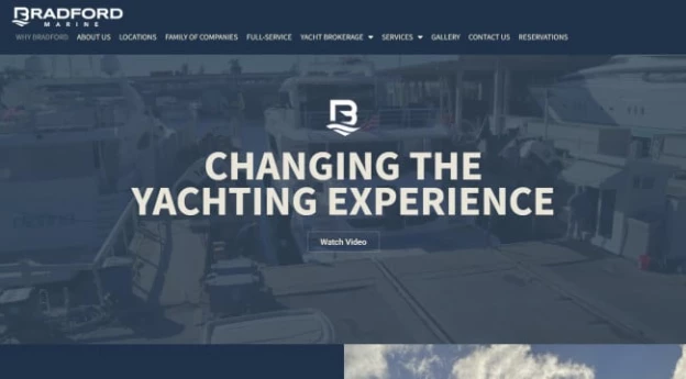
Bradford Marine is a long-running family-owned business that’s grown into a trusted leader in the local yachting community. Savage Global Marketing ensured that they developed a web design that reflects the brand’s successful history in providing various yacht maintenance services.
The homepage invites you to enjoy a 90-second pop-up video showcasing life in a day of the business, with their team working together to improve the yachting experience. But the visuals don’t end there. Each content block is accompanied by high-resolution photography of the vehicles and the beautiful docks.
Rather than cluttering a single page with tons of content and scrolling, the website design ensures that you are not overwhelmed with text at any given stage. Instead, its soothing color palette that reflects all the sea colors prompts you to seamlessly “swim” through the pages.
7. Baylor College of Medicine by Glide Design
Standout Features:
- A subtle warm welcome message
- A drop-down category segmentation
- An all-blue color palette
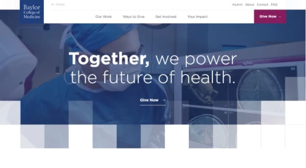
Baylor College of Medicine’s website design is professional and soothing. Glide Design developed a solution that presents the college as a place of humility and humanity, working together to help those in need.
The homepage greets you with an effective yet subtle warm welcome message positioned at the very top of the layout, above the menu. The fixed navbar menu is well-structured, with various vital pages easily accessible.
Below the menu is a tagline hero text on top of a translucent video showing you all the work done by people at Baylor College, followed by a strong call to action inviting you to join their charitable cause.
The website immediately introduces you to this community’s goal and purpose, and once you’re well-informed, you are presented with a simple modern category division. A meaningful photo accompanies each category name, and your mouse triggers a hovering effect that immediately provides more textual info about these categories.
The website design encompasses various relaxing shades of blue, inspiring you to trust society’s confidence and help build a better future together.
8. Agilant Solutions by Lounge Lizard
Standout Features:
- Futuristic blue gradient theme
- Speed and technology symbolism
- Professional, structured layout
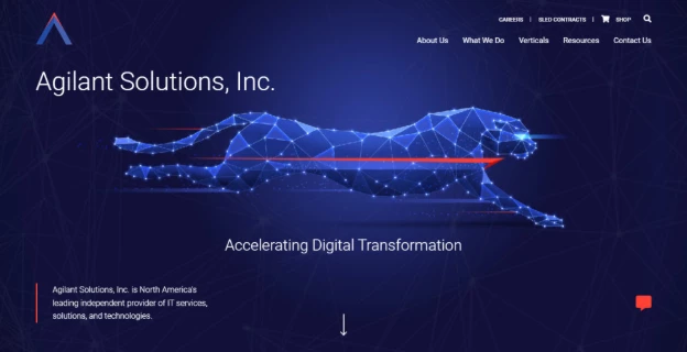
Agilant Solutions, crafted by Lounge Lizard, stands as a bold testament to how digital design can communicate precision, speed, and innovation in the IT services space. This is not a flashy website but a sleek, strategic, and efficient, just like the services Agilant provides.
The site thrives on a deep, gradient-heavy blue palette. This choice grounds the website in a tech-forward atmosphere, symbolizing trust, professionalism, and clarity. The darker hues give weight and authority, while lighter blues provide contrast and energy, making call-to-actions and content blocks pop.
The digital cheetah, which is a central visual element, is a direct nod to Agilant’s focus on speed, efficiency, and cutting-edge solutions. This symbolic design adds a narrative layer, turning abstract values into something tangible. The site reinforces this theme with network-inspired visuals and clean, linear elements that speak to structure and momentum.
Navigation on the Agilant site is sharp and user-centric. Lounge Lizard designed it with clarity in mind: well-defined sections, accessible menus, and actionable buttons.
The typography is clean, straightforward, and confident, allowing the content to breathe while maintaining a polished corporate tone. Visuals like infographics and highlight cards balance the text, guiding users effortlessly through complex service offerings.
9. Helical Research by Hop Creative
Standout Features:
- Simple and straight to the point
- Lets the customers do the talking
- Comprehensive elaboration on provided services
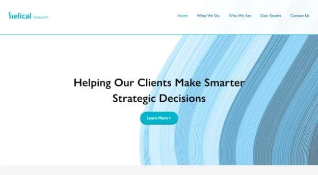
Helical Research presents a decade-long heritage in the market research business. Their website design, built by Hop Creative, proves that you can rest assured that your brand will benefit from their services – as it’s simple and direct, just like data research results need to be.
The website design makes excellent use of positive space. The few visual elements add a stylish touch to it, but the primary goal is to showcase the level of expertise of the browser. With only three options, the homepage answers three key questions: what they can expect from the brand, who is on the team and what their portfolio is like.
Each of these provides a short yet concrete answer with several rounded icons accompanying the content blocks. The “about” section provides extensive feedback from past customers, thus letting you engage in an honest word-of-mouth review section.
10. Broad Institute by WDB Agency
Standout Features:
- Highly immersive POV video introduction
- Clearly divided sections
- A thorough menu options description
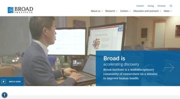
Broad Institute is a research organization aiming to pave the way toward further understanding and analyzing genomics. WDB Agency did an impeccable job with their web design, providing an online forum for researchers that an average Joe easily understands.
It's not easy to simulate a wide variety of the institute's activities in a short video. Still, the introductory video encapsulates all the crucial aspects of the research work. The video intrigues you to learn more, and you're a click away from getting extensive information on the procedures.
The sections are clearly divided, with relevant latest news followed by the community and research sections.
When you hover over the menu, you'll be pleasantly surprised with a thorough description of each clickable option, once more showcasing the integrity and seriousness of the institute.
11. Jeune Chambre de commerce de Québec by Uroboro
Standout Features:
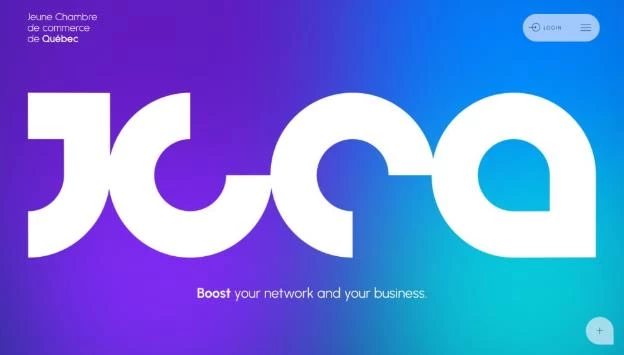
- Vibrant blue-to-purple gradient
- Large, geometric logo and typography
- Fluid event-focused interface
The Jeune Chambre de commerce de Québec (JCCQ) redefines what a business network platform can look like. Designed by Uroboro, this site balances professionalism with energy, using a bold palette and sleek interface to engage young professionals and entrepreneurs. From its dynamic visuals to its seamless UX, this site is all about boosting connection and growth.
The first thing that grabs attention is the radiant gradient background, shifting smoothly between blue and purple hues. This choice adds vibrancy and depth, aligning with JCCQ’s mission to energize the local business scene. The gradient feels fresh, dynamic, and modern; pushing beyond traditional corporate colors to attract a younger, more tech-savvy audience.
The oversized JCCQ logo on the homepage is a design anchor. Geometric, abstract, and unmistakably bold, it sets the tone for a brand unafraid to stand out. The typography follows suit: clean, rounded fonts that offer readability while complementing the bold logo style. The visual identity is both strong and approachable, perfect for fostering business relationships.
One of the site’s strongest functional elements is how it handles events. From preview cards to intuitive navigation, Uroboro designed an interface that puts networking opportunities front and center.
Each event is visually distinct, with smooth transitions and detailed views that encourage participation. The design is responsive and user-friendly, ensuring the experience is as seamless on mobile as it is on desktop.
Best Blue Websites: The Bottom Line
Blue is more than a color. It’s a strategic tool that signals credibility, calmness, and confidence. The best blue website designs of 2026 demonstrate how blue can be effectively used to convey trust, professionalism, and serenity. These top sites prove that when blue is used with intention, it transforms user experience and elevates brand presence across industries.
Best Blue Websites: FAQs
1. Why is blue a popular color in web design?
Blue is associated with trust, reliability, and professionalism, making it a preferred choice for brands aiming to establish credibility.
2. What industries commonly use blue in their website designs?
Industries like healthcare, finance, technology, and education often use blue to convey stability and trustworthiness.
3. How can I effectively use blue in my website design?
Use blue to highlight key elements, create a calming atmosphere, and guide user attention. Combine different shades for depth and contrast, ensuring accessibility and readability.
-preview-webp.webp)
