Unity Environmental University’s website, designed by Digital Silk, bridges sustainability and accessibility through a mission-aligned platform built for modern learners.
From comprehensive content and solid social proof to real-time support, it equips prospective students with everything they need to take the next step. And feel confident doing so.
Industry Insight: A Zendesk study found that 85% of users feel satisfied after using live chat support. Unity taps into this by offering instant assistance that strengthens confidence from the start.
Let’s explore how the web design brings that user-first approach to life.
Key Findings for Brands:
- Use interactive hero banners to engage users from the first scroll
- Build trust with clear numbers, campus culture, and visual storytelling
- Balance functional UX with a strong brand message for long-term impact
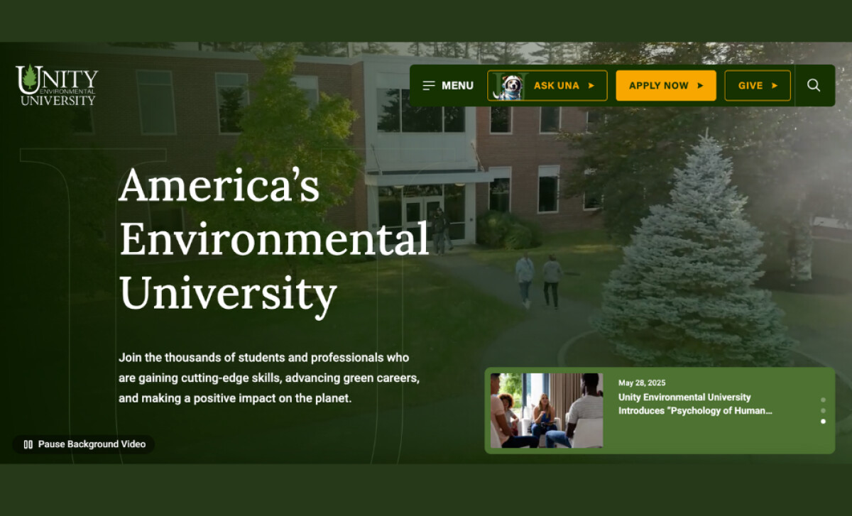
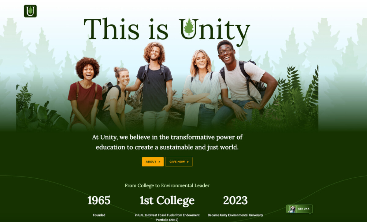
Interactive Hero Banner Establishes a Unified User Journey
Unity’s homepage opens with a dynamic hero banner designed to engage, inform, and convert — all within seconds.
A user-controlled background video adds movement without overwhelming the content. It offers a real-world glimpse into campus life.
Key CTAs like “Apply Now,” “Ask Una,” and “Give” are placed directly in the header and hero module, ensuring immediate action pathways for users with different goals.
The hero also includes an update card for university news, making the page feel current and community-driven. Sticky headers and persistent navigation cues keep everything within reach, no matter where users scroll.
It’s a clear example of how higher education website designs can balance visual storytelling with strategic functionality.
Card-Based Layout Builds Trust Through Storytelling
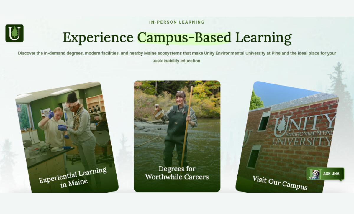
Unity’s layout design ensures that the first impression is both visually engaging and action-oriented.
To communicate credibility at a glance, the site leans on smart visual communication and fact-driven storytelling:
- A card-based layout presents key information like employment rates, enrollment stats, and graduate success in bite-sized visuals.
- Each number is paired with a meaningful takeaway to reinforce Unity’s value proposition.
- Lightweight animations and hover effects guide user flow without visual noise.
- Lifestyle photos reinforce the university’s hands-on, nature-connected learning approach.
This allows visitors to clearly understand Unity’s mission, results, and culture without needing to dig too deep.
Plus, it improves site visibility. According to Search Engine Journal, visuals are more likely to appear in personalized, dynamic search results, especially now that search surfaces are increasingly visual across multiple verticals.
So, Unity’s rich visual presentation not only supports users; it also boosts discoverability.
Smart UI Features Improve Access and Conversion
Beyond aesthetics, Unity’s website stands out for how it supports user action at every step.
Whether it’s a first-time visitor or a returning student, the interface is designed to anticipate needs, reduce friction, and keep pathways clear.
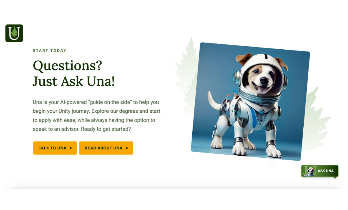
One of the most helpful features is “Ask Una,” the site’s AI-powered assistant. Always visible through sticky buttons and friendly prompts, Una offers real-time support while maintaining a light, approachable tone.
Other smart UX elements reinforce this sense of ease:
- Sticky headers and floating CTAs ensure that navigation and key actions are never more than a scroll away.
- Program pages present course details and degree tracks in self-contained layouts to reduce unnecessary clicking and backtracking.
- Clearly labeled actions and prompts guide users smoothly from exploration to application.
This design isn’t simply about accessibility or a user-first approach. It actively demonstrates it, with thoughtful interactions that make every step empowering.
Green Branding Elements Reinforce Environmental Commitment
Every element of the website’s visual language reinforces Unity’s identity as America’s Environmental University.
From the rich forest green palette to the subtle tree icons, the color and branding choices are deeply tied to the institution’s sustainability-first value.
In fact, green is widely recognized for evoking calmness and signaling environmental values (Burlington Press). Unity’s use of this color throughout the site reinforces trust while visually anchoring its mission.
Moreover, typography combines traditional academic fonts with approachable, rounded styles to balance authority and accessibility.
The backgrounds and dividers also feature leaf silhouettes and organic shapes that keep the experience soft and natural without losing polish.
Even the clear segmentation between in-person and distance learning paths is presented with brand-aligned color blocks. This makes navigation intuitive and on-message.
What Agencies Can Learn from Unity
Digital Silk’s work for Unity Environmental University shows that educational websites can break away from the typical mold. With the right strategy, they can feel personal, purposeful, and built to drive action.
Designers looking to create more website impact can learn from the following:
- Use multifunctional modules to serve various personas at once
- Integrate storytelling by letting stats, visuals, and structure do the talking
- Design for user pace by supporting quick actions while inviting exploration
When professional website designers pair performance UX with brand authenticity, the result is equally valuable and memorable.
Urbanna Landscaping’s website redefines what a service-based digital presence can be: refined, functional, and grounded in real impact.
If you're aiming to create a website that connects, converts, and inspires just like this, explore our vetted list of top web design partners in our Agency Directory. You’ll also find specialized experts in:
Want more examples of digital design done right? Visit our Design Awards, your source for the most compelling design inspirations across industries.