This article is your source of great email design inspiration with fifteen examples segmented into five different categories so you can find those that best suit your niche and objectives.
You will learn and find:
- What are some of the most popular types of email campaigns
- The platforms for email design inspiration
- What makes great responsive email design + best examples of it
Types Of Email Campaigns
According to the type of marketing and email purposes, email campaigns can be divided into a number of categories.
Although there is no clear consensus on how many of these types of email campaigns there are, these are the most popular:
- Welcome emails
- Product promo
- Retargeting
- Cart Abandonment
- Corporate Newsletter
- Product Update
- Seasonal Promo
- The Post-Purchase Drip
- Re-engagement
- Upselling
In this article, we will focus on five types of email campaigns that marketers in all industries use most often:
- Product promotion
- Upselling
- Cart abandonment
- Product updates
- General newsletters
1. Product Promo Email Campaign Examples
Along with newsletters, the most common email marketing campaign type is product promotion.
Businesses and brands send these emails to their recipients when they launch a new product or service.

1.1 Apple AirPod Pro
Apple’s email product campaign for AirPods Pro earphones is in line with the brand’s style and visual characteristics: it is simple, predominantly monochrome with a large, high-quality photo of a product dominating the main screen.
This email campaign has a defined character set and table roles which helps readers with interpreting the table.
It also has well-structured headings which helps readers navigate the content.
Contrasting images pop against the dark background and numerous calls-to-action such as “Learn more”, “Buy”, “Compare models” and “Find a store” lead readers to different stages of sales funnel, depending on how much more info they need to make a purchase.

1.2 Great Jones’ Salt & Pepper
Great Jones specializes in home products such as kitchen appliances and inventory. Their Salt & Pepper product launch campaign relies on simplicity and attention-grabbing animation.
A very simple email consists of dancing animation that shifts between the white and black pots - “salt” and “pepper” - a to-the-point declaration of new product arrival and a “Shop now” CTA.
Great Jones’ email campaign sells one product and it takes users’ short attention spans into consideration.
This makes their email strikingly concise and direct.
Because the campaign is all about the product, the item in question has nothing to compete against.
1.3 Frame.io
Another exercise in simplicity and direct marketing, Frame.io’s email campaign is about a product launch during a conference. The users are invited to reserve their seat with a simple CTA.
A solid black background is a backdrop for a neon blue ring of circles that emphasizes the message of invitation to the Final Cut Pro X Creative Summit.

2. Upselling Email Campaign Examples
When their customer buys a product, businesses usually send upselling email campaigns that steer the buyer’s attention to more products that they might like and buy.
These are usually the items that are related in some way to what they already bought.
2.1 Dollar Shave Club
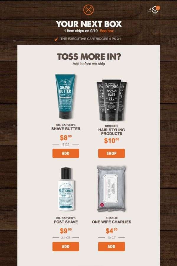
This beauty and personal care brand upsells its products with a carefully executed and beautifully designed email campaign.
“Dollar Shave Club” campaign entices a customer to add more products - or, “toss more in”, as the pitch goes - into their shopping cart before hitting the “buy” button.
The products are, of course, related to those that the customer has in their cart.
The email campaign showcases potential purchases in two columns, with a very striking contrast between the product and background. Vibrant orange CTAs are very visible for a user to click on them without giving any second thought.
2.2 WeTransfer
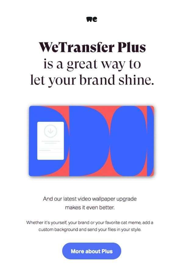
File transfer services, WeTransfer, upsells its bandwidth package through a uniquely designed email campaign that markets WeTransfer Plus package.
They throw in a little extra - a video wallpaper - to sweeten the deal which they opted to market with a magazine-style email campaign, with a lot of white space and a few vibrant colors to make everything else stand out.
A single call-to-action button invites readers to learn more about the package and make a well-informed purchase.
2.3 Grammarly
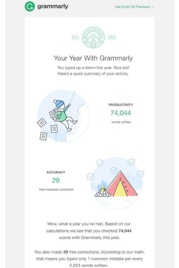
Grammarly’s upselling strategy is very personable and attractive: their “Highlights of Your year” newsletter send users their yearly writing stats, creating an immediate effect of familiarity and reliability a personalized email marketing can achieve.
The email campaign follows this brand’s style guidelines with clean white space and gentle, pastel colors.
Its structure leads a reader down the list of their own ‘achievements’ with the app to a CTA button which invites them to upgrade to the Premium account.
3. Cart Abandonment Recovery Email Design Examples
When eCommerce customers visit an eStore, add an item or a few in their cart and then leave without completing the purchase, you have a case of cart abandonment.
We will now see the best examples of mail marketing campaigns that remind customers of the items they have abandoned.

3.1 BluDot
Home decor and furniture brand Blu Dot reminds their visitors of items they have looked in their eCommerce store by sending them a very concise cart abandonment recovery email campaign.
It consists of a piece of furniture in a neutral color as a background along with simple lines “Taking another look? We saved your items.” along with a “Complete my order” CTA.
The email campaign goes the extra mile by actually reminding the reader of the items they looked and abandoned in their carts.
Just below the CTA, the email shows the items with a direct Checkout button next to them.
3.2 Moschino
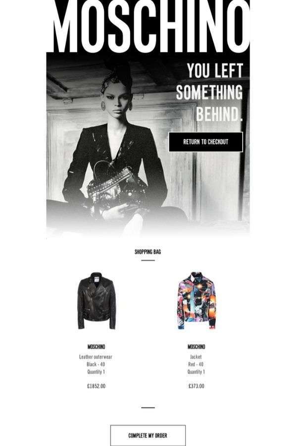
Moschino is a fashion and apparel brand with a very discerning image which reflects in their cart abandonment recovery email campaign.
It features a black and white photo of a model with a caption “You left something behind” and a “Return to checkout” call-to-action.
Right under this large central part of an email is a list of items the user has left in their shopping cars, along with pricing info and a “Complete my order” button, incentivizing them to return and complete the purchase
3.3 ASICS
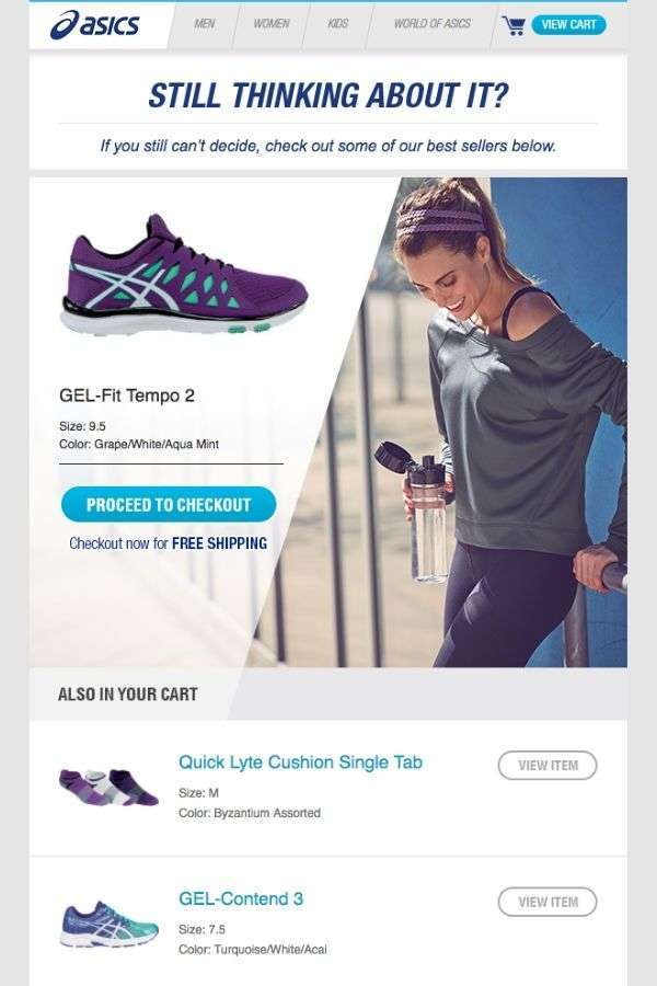
Exercise and fitness brand ASICS reminds its visitors who have looked at items in their store, placed them in a shopping cart and abandoned them of these planned purchases with a brightly illuminated design and compelling copy.
“Still thinking about it?”, asks ASICS’ cart abandonment recovery email campaign and highlights the product the recipient was looking for, along with CTAs that encourage them to complete the purchase.
Just under it is the selection of eStore’s bestsellers that the brand highlights as suitable replacements.
4. Product Update Marketing Campaign Examples
Updates to your products or services keep customers satisfied and help generate more interest for said products.
Product update marketing campaigns let your subscribers know about this and usually contain a lot of details, both in copy and design.
4.1 BluDot’s Stack’em Up
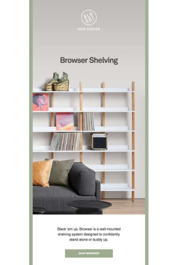
Home and decor brand Blu Dot’s “Stack ‘em up” product update email campaign is storytelling excellence that incorporates design into the narrative of their upgraded product.
The email campaign begins with a high-quality image of the product and a brief description followed by a call-to-action to buy it.
Muted colors provide a breathing space for the images of details and various angles of a product.
A story of the product follows, including more good imagery and a copy that provides a background about the product that informs the reader of its qualities.

4.2 Bose
Bose’s rose gold QC35 headphones are the subject of this product upgrade email campaign that markets a limited edition of the product by presenting high-quality photography as soon as the recipient opens their email.
Google Assistant and Amazon Alexa optimization and pre-order CTAs are all vital parts of the copy that follows.
All of this is packaged into a streamlined, one-column design, centered around two photos and a little bit of copy - all framed by a dark background.
Mobile, responsive version of the email campaign lacks nothing the desktop version has and is a great example of design successfully translated to portable devices.
4.3 Dosh
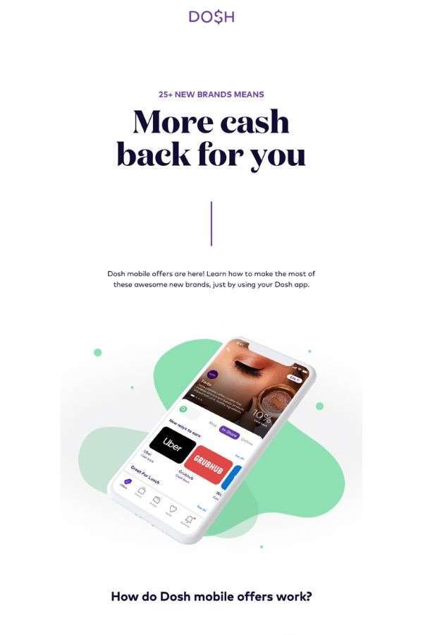
Dosh’s expansion of brands withing their retail offer came with an email campaign informing their customers that they are entitled to a cashback.
They did this by presenting a message in a long-form email with a lot of white space and vibrant colors.
The introductory image is followed by a visual explanation of how their mobile offers work and a list of stores where customers can get their cashback.
The email closes with “Open the App” and “Refer a Friend” CTAs.
5. Newsletter Email Campaign Examples
Newsletters are probably the most popular email marketing campaign and a great ground for email design inspiration.
They cover all the content your website is publishing and make sure your less frequent visitors see what they are missing, potentially bringing them back to your website.
5.1 Great Western Railway
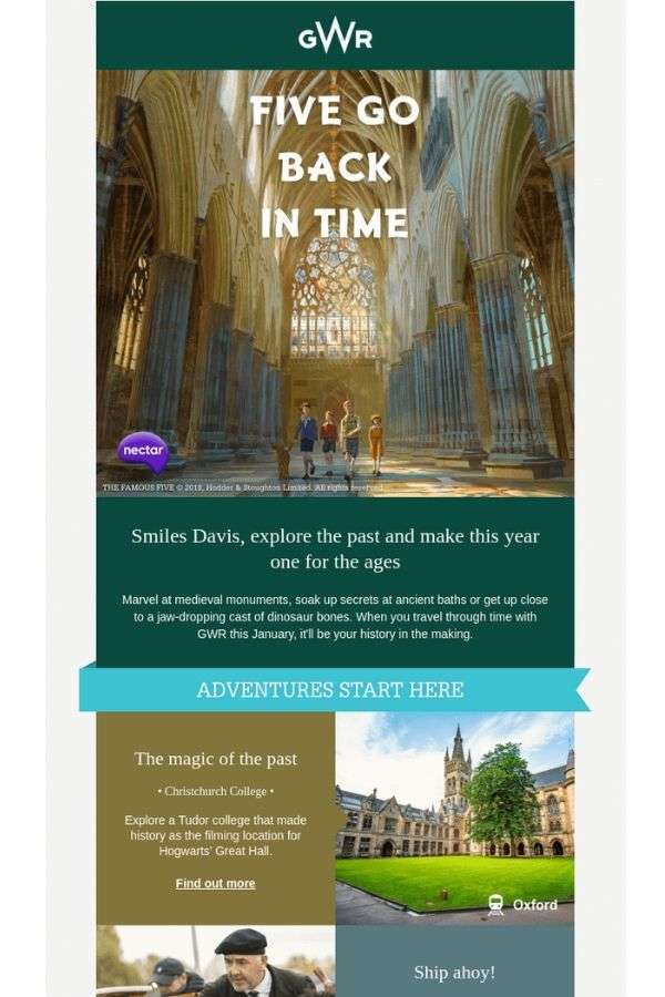
GWR’s lengthy email about their special train route that takes travelers across historic routes is a journey in itself.
A lot of content is condensed into a single newsletter that features photos of sights and a description of the adventure from start to finish.
Interchangeably using a single and two-column layout, the newsletter uses different imagery and complementary colors, quotes, CTA links and prices for different bookings.
Despite being very comprehensive, the newsletter manages not to overwhelm or feel crammed. It takes time to tell its story and the layout serves this objective.
5.2 Suitcase
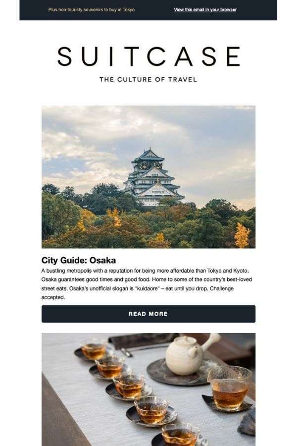
A wholly different approach to a traveling newsletter is Suitcase’s “The New Japanese Capital of Cool” campaign.
It markets the sights and splendors of Osaka in a concise, single-column layout with large images and tidbits of text, with an invitation to read more.
The design is more reserved and based on the space created by white background for the elements to come into fore.
The newsletter ends with a contrasting “Discover More” call-to-action for the brand’s new cities issue.
5.3 Litmus
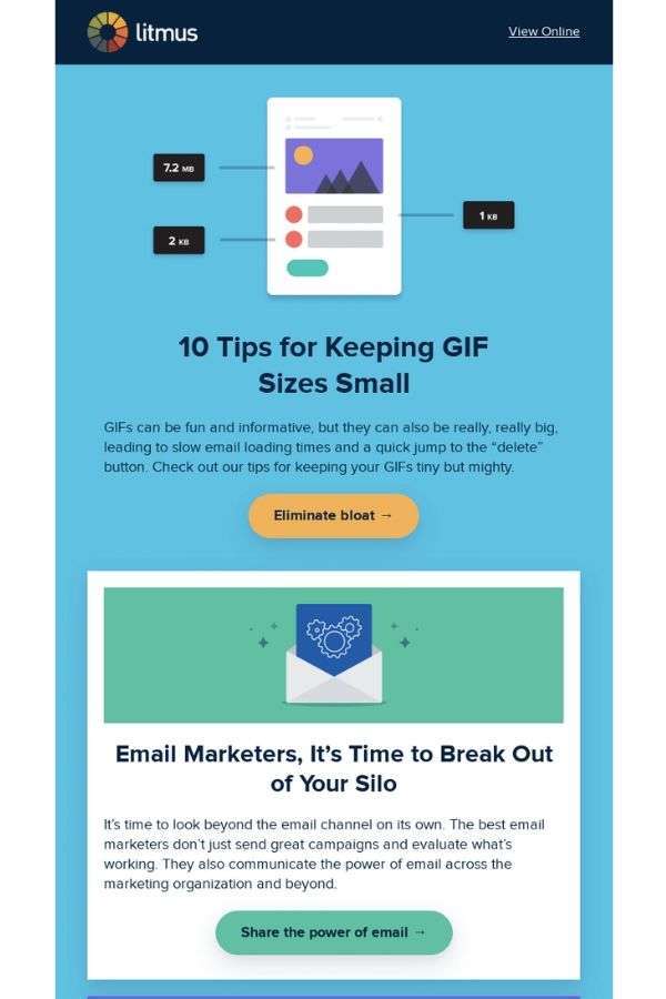
Litmus’ “Slim down your GIFs” newsletter is a handy how-to manual that explores the subjects such as reducing GIF weight, email marketing, prediction of industry trends and markets the very product the brand is selling.
All of this is contained in a lengthy newsletter that uses vector graphics and pastel colors to differentiate between various content.
Near the bottom of the email, readers are invited to try out their webinars and podcasts, making this space pop in terms of design as it is reserved for services Litmus offers.
4 Platforms To Turn To For Email Design Inspiration
The places where you can find great email campaign examples aren’t necessarily websites dedicated to email marketing.
These five websites are our email design inspiration sources of choice:

1. Pinterest
This social advertising platform is great for finding creative design solutions in general.
It can also serve as a generator of inspiration for email design.
There are plenty of boards dedicated exclusively to this; To find them, you only need to type your keywords in a search bar or browse themed boards curated by pinners and official brand pages.

2. Canva Blog
Online design platform Canva has its own set of daily resources and design inspiration.
There you’ll find the best design practices and tutorials of all kinds, along with useful tips for email marketers and a selection of favorite email examples.
Here you will also find useful info on how to understand email design and apply what you learn in practice.
3. Really Good Emails
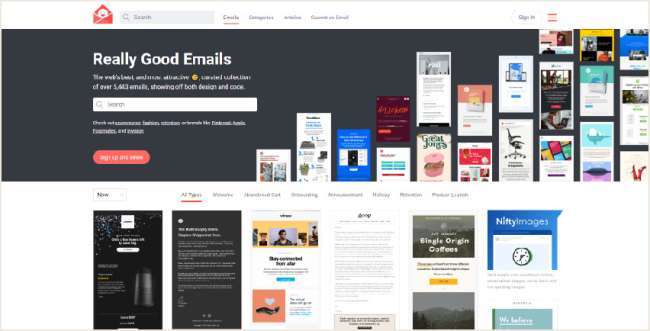
As the name suggests, this platform is all about showcasing the best email design there is.
Featuring dozens of categories such as Retention, Customer Appreciation or Abandoned Carts, there is a massive diversity of email campaigns that users can find easily thanks to handy filters and result sorting options.
4. Email Gallery
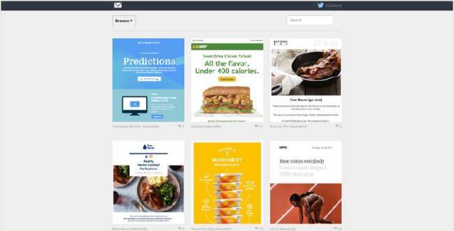
Made for email marketers in mind, Email Gallery is a resource of email newsletters and campaigns from various industries, sorted by different categories according to the type of campaign.
A variety of sources makes this platform an almost infinite well of design inspiration. The ability to search for particular email features and colors makes this gallery a standout.

Bonus: Responsive Email Design
Creating responsive email campaigns for optimal mobile UX is important today because:
- 69% of web customers are influenced by a company’s emails to make a purchase from their smartphone. (Source: Disruptive Advertising)
- Up to 60% of email opens are on mobile, depending on the industry. (Source: Campaign Monitor)
- 42.3% of consumers will delete an email if it isn’t optimized for mobile. (Source: Sale Cycle)
Responsive email designs provide content that is customized for the user’s chosen device.
With responsive design, businesses can send email templates which can change depending on what screen size the recipient is viewing them.
Some of responsive email design best practices include:
- Big CTAs above the fold
- No hyperlinks
- A single-column layout
- A 14pt to 20pt font size
- Smaller, responsive images with alt tags
Takeaways On Email Design Inspiration
Businesses can find great email design inspiration on a variety of platforms and apply this insight to their own campaigns, no matter the vertical.
Great email design relies on these best practices, in 2020 and beyond:
- High-quality images
- Bold CTAs
- White or negative space and contrasting colors of elements
- A minimum amount of copy with short sentences.
- Easy to read fonts
Following these guidelines within your brand’s stylebook for consistency will ensure your emails get a good clickthrough rate and remain relevant in the sea of email campaigns users receive daily.
Email Design Inspiration FAQs
1. How do I make my email more appealing?
To make your email more appealing, focus on a clear and engaging subject line, concise and relevant content, a friendly tone, a well-organized structure, and visually pleasing formatting with images or bullet points if appropriate. You can always source email marketing design inspiration from the examples we talked about above.
2. What makes a perfect email?
A perfect email is concise, relevant, and engaging. It has a clear and compelling subject line, a personalized greeting, well-structured content with a single focused message, and a concise call to action. It's free of grammatical errors, maintains a professional yet friendly tone, and respects the recipient's time. Including relevant visuals and using formatting to enhance readability can further improve its effectiveness.

