Subliminal advertising plays in the background of how we notice, remember, and feel about brands. It refers to subtle cues embedded in marketing that people don’t consciously register but may still process at a psychological level.
These could be brief visuals, understated design elements, or other signals that aren’t front-and-center but still aim to nudge our perception.
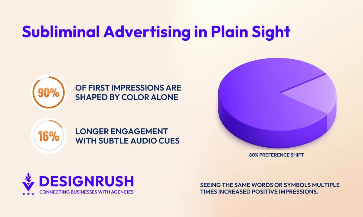
Subliminal Advertising: Key Findings
- Color influences first impressions faster than copy, accounting for up to 90% of initial judgment within the first 90 seconds.
- Subliminal cues work best when they align with an existing goal, with effects that remain small and short-lived.
- Subtle audio cues can change behavior without direct messaging, with slow background music increasing dining time by 16%.
To Be or Not To Be Subliminal?
Does subliminal advertising actually work? And more importantly, is it ethical?
A 2024 review by Boise State University found that subliminal cues influence behavior only in narrow, goal-dependent situations, such as when people are already thirsty and exposed to a related brand.
Even then, the effects were small and short-lived, while discomfort around hidden influence was still present.
In the U.S., the Federal Trade Commission (FCC) has not explicitly banned subliminal advertising but addresses it under broader rules against deceptive practices. These require advertising to be:
- Truthful
- Supported by evidence
- Clear enough for consumers to evaluate
Other markets have gone further. The UK and Australia explicitly reference subliminal or below-threshold stimuli in advertising laws or self-regulatory codes. As a result, most major brands avoid true subliminal messaging and crossing ethical or legal lines.
Subliminal Advertising You May Have Missed
Many examples show up in everyday advertising through packaging, placement, color, or context.
Their influence comes from repetition and familiarity, which is why people often recognize them only after taking a second look.
- Honey Nut Cheerios: A Buzz-Worthy Campaign
- Samsung at the Oscars: The Selfie Everyone Remembered
- Pepsi vs. Coke: The Costume That Kept the Rivalry Alive
- McDonald’s Use of Red and Yellow in Advertising
- FedEx and the Hidden Arrow
1. Honey Nut Cheerios: A Buzz-Worthy Campaign
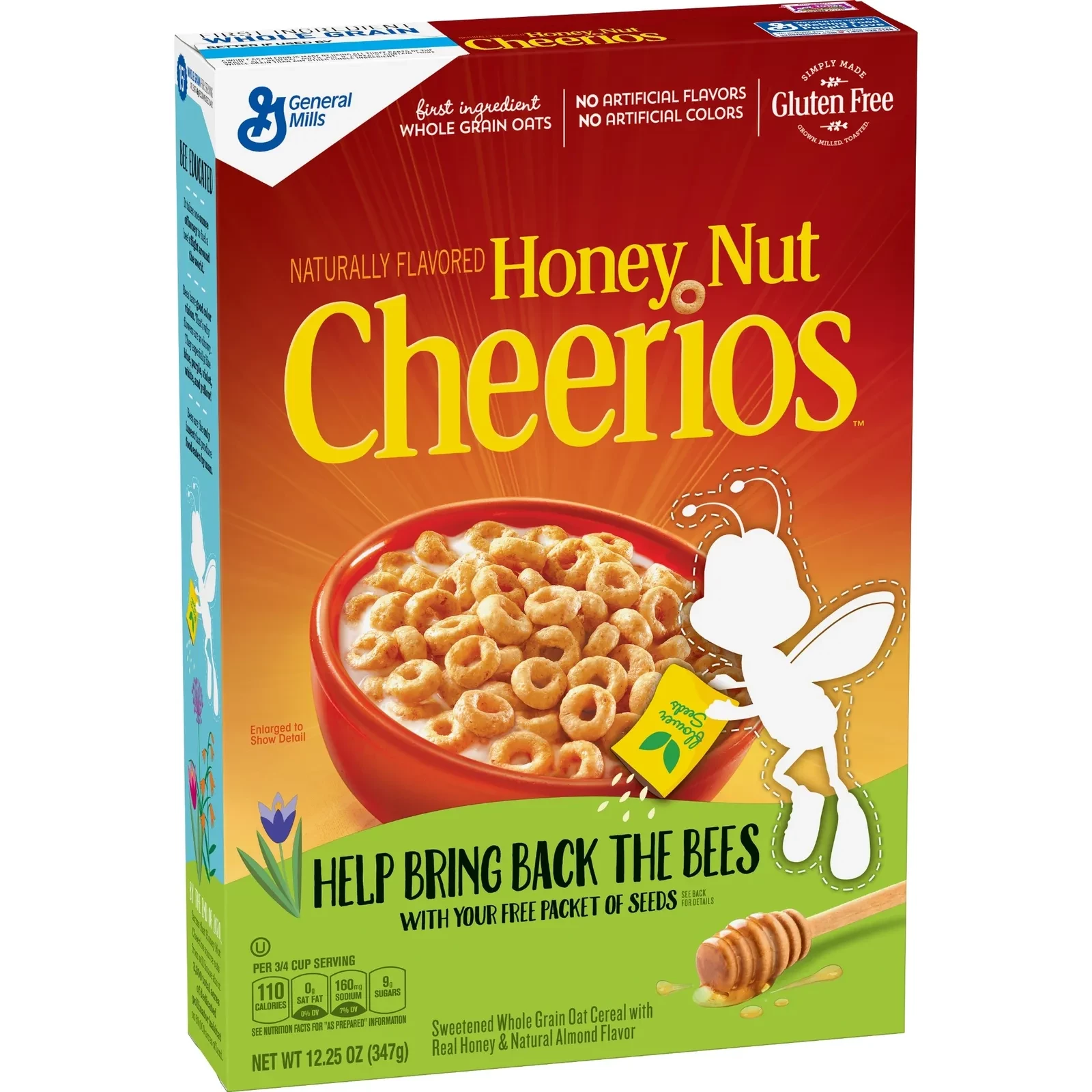
Honey Nut Cheerios took a bold step by removing its mascot, BuzzBee, from cereal boxes. The bee’s absence signaled concern about the alarming decline in bee populations.
Without saying a word, Cheerios sparked curiosity, drawing attention to a cause that impacts us all: saving the bees.
Their Bring Back the Bees campaign moved beyond awareness by distributing wildflower seeds and encouraging consumers to plant bee-friendly flowers.
By linking their product to the natural world, they reminded us that honey and the ingredients we enjoy depend on thriving bee populations.
Why It Works
- Made the change noticeable through familiar packaging
- Created curiosity that encouraged a second look
- Reinforced the brand’s connection to nature and sustainability
How You Can Apply It
- Use subtle changes: Temporarily remove or alter a familiar brand element to spark curiosity.
- Tie to a cause: Connect your brand with a meaningful cause that resonates with your audience.
- Inspire participation: Encourage your audience to take action and make your campaign more impactful.
2. Samsung at the Oscars: The Selfie Everyone Remembered
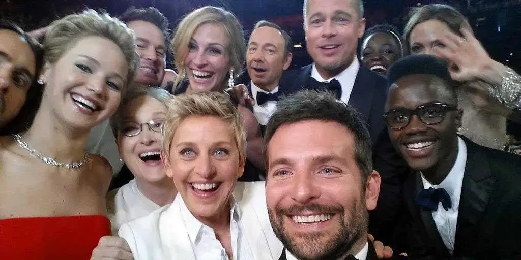
When Ellen DeGeneres snapped a star-studded selfie at the Oscars, it quickly became one of the most shared images in social media history.
Samsung was an official sponsor of the event, and the photo was taken on its smartphone during a moment that felt spontaneous. It became part of a shared cultural moment tied to humor and celebrity, leaving viewers to make the connection on their own.
Why It Works
- Placed the product inside a moment people already cared about
- Felt natural within a live event
- Linked the brand to relevance and social attention
How You Can Apply It
- Use contextual placement: Integrate products into moments people already care about
- Match the Context: Let placement feel natural to the event and audience
- Design for sharing: Create situations audiences want to pass along organically
3. Pepsi vs. Coke: The Costume That Kept the Rivalry Alive
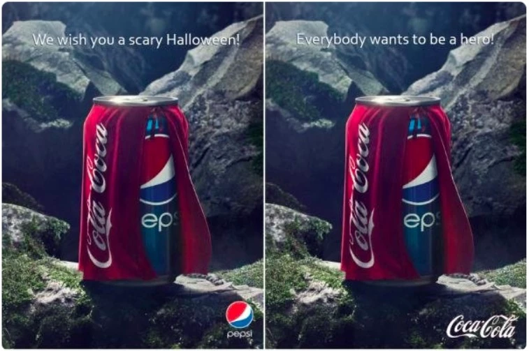
Pepsi’s Halloween ad leaned into a familiar fear for loyal fans: ending up with a Coke when you really wanted a Pepsi. The visual showed a Pepsi can wearing a Coca-Cola cape, framed as a tongue-in-cheek horror moment.
Coca-Cola’s response flipped the narrative. Using the same costume idea, the brand reframed the cape as a superhero symbol, positioning Coke as the hero of the story.
Together, the ads turned a long-standing rivalry into a shared visual language grounded in humor, identity, and cultural familiarity.
@asiandadhooper The best ads of all time: Pepsi vs Coke #marketing#advertising♬ original sound - Aiden Chan
The influence here sits in emotional framing.
Viewers were nudged to feel allegiance, amusement, or superiority without being told how to interpret the message. The meaning landed through association rather than explanation.
Why It Works
- Tapped into an existing rivalry people already understood
- Used humor and visual metaphor to shape emotional response
- Triggered brand loyalty through identity and preference cues
How You Can Apply It
- Lean on shared context: Build on cultural knowledge your audience already has
- Use visual metaphor: Let imagery carry meaning without spelling it out
- Frame emotion first: Shape how people feel before they think about the product
4. McDonald’s Use of Red and Yellow in Advertising
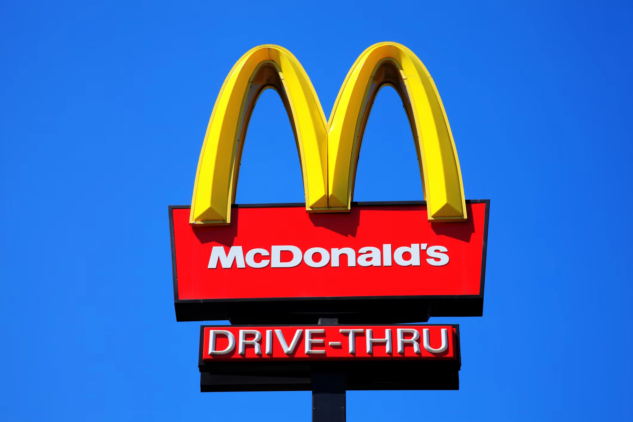
McDonald’s has spent decades pairing red and yellow across its restaurants and ads. The colors feel familiar enough that most people recognize the brand before reading a single word.
Red tends to heighten appetite and energy, while yellow is commonly associated with warmth and optimism.
This way, they create a visual signal that matches the pace and promise of fast food, quick, upbeat, and easy to decide on.
View this post on Instagram
The golden arches reinforce that feeling through repetition, building comfort and recognition over time.
This kind of subliminal influence works because the cues appear consistently, shaping mood and expectations long before someone places an order.
Why It Works
- Used color to shape appetite and urgency
- Built familiarity through repetition across touchpoints
- Reinforced quick, positive decision-making
How You Can Apply It
- Choose emotionally aligned colors: Match palette choices to the feeling you want to evoke
- Stay consistent: Repeat visual cues across ads, packaging, and environments
- Let design lead: Allow color and form to do the signaling before copy appears
5. FedEx and the Hidden Arrow
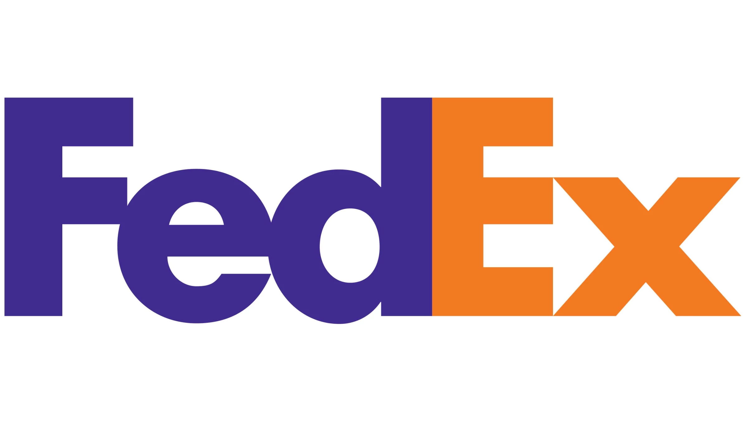
The FedEx logo looks straightforward at first glance, just clean typography in bold colors. Look a little closer, though, and the white space between the “E” and the “X” forms a right-pointing arrow.
View this post on Instagram
That small detail does a lot of quiet work. The arrow suggests movement and direction, reinforcing ideas of speed and efficiency without a single word of copy.
Many people don’t notice it right away, but once they do, it sticks, adding another layer of meaning to a logo they’ve already seen hundreds of times.
Why It Works
- Embedded meaning directly into a familiar visual
- Suggested speed and precision without explicit claims
- Rewarded attention once the detail was noticed
How You Can Apply It
- Use negative space: Let shapes and gaps carry meaning
- Keep it subtle: Allow discovery to happen over time
- Align form with function: Match visual cues to what the brand promises
Use Subliminal Advertising Without Crossing the Line
If a client wants subliminal, they usually mean subtle. Cues that shape attention, memory, and emotion without feeling sneaky.
These techniques stay on the ethical side because the message is still there, just delivered through psychology and craft.
- Color Priming Through Consistency
- Familiarity Bias Through Repetition
- Contextual Product Placement
- Meaning Embedded in Design
- Subtle Audio Cues To Nudge Spending
1. Color Priming Through Consistency
Color is one of the fastest signals the brain processes, often before copy or imagery.
Research shows consumers form their first impression within 90 seconds, and color alone accounts for as much as 90% of that judgment.
How brands use it:
They repeat emotionally aligned colors across packaging and ads to shape expectations before conscious evaluation begins.
2. Familiarity Bias Through Repetition
Repeated exposure increases comfort, even when people don’t consciously notice the repetition.
Psychological research on the mere exposure effect shows that repeated exposure to a stimulus increases preference, even without conscious recall. This effect has been replicated across branding, logos, and visual cues.
How brands use it:
They repeat visual elements (logos, layouts, shapes) across touchpoints so the brand feels familiar and trustworthy before a decision is made.
As Becca Collinson and Jenna Bratcher, the Co-Founders of Peanut Butter Creative, put it, consistency in visual systems plays a quiet but lasting role in how brands stay memorable:
"Utilizing your brand colors, fonts, textures, and general layouts improves brand memorability and allows you to stay top of mind when your ideal clients need your offerings or know someone who does."
3. Contextual Product Placement
Subliminal influence is stronger when a brand appears inside a moment people already care about.
Studies on priming show subliminal cues influence behavior only when they match an existing goal, such as thirst, hunger, or attention. Outside of that context, the effect disappears.
How brands use it:
They place products inside culturally relevant moments where the audience is already emotionally engaged, allowing association to do the work.
4. Meaning Embedded in Design
Negative space relies on figure-ground perception, a visual processing principle that explains how people instinctively separate foreground elements from their background and mentally complete implied shapes.
Design research shows that when viewers recognize a hidden form after initial exposure, recall increases because the brain actively participates in interpretation.
That moment of discovery is what makes embedded symbols linger longer than overt visuals.
How brands use it:
As seen in the FedEx example, they embed subtle symbols into logos, design visuals that reveal meaning, and guide interpretation using spacing and contrast.
5. Subtle Audio Cues To Nudge Spending
Sound often shapes how people feel before they notice what they are seeing.
Soft background audio, quiet rhythms, or familiar ambient sounds can influence mood and attention without becoming the focus of the message.
A 2024 field experiment published in Behavioral Sciences found that slow background music increased dining time by 16% compared to a control group, showing how audio cues can quietly influence behavior without direct messaging.
How brands use it:
They layer low-volume audio cues beneath music or dialogue, use familiar sounds tied to seasonal or emotional associations, and keep those cues rhythmic and integrated into the main track.
Final Thoughts on Subliminal Advertising
What stands out after looking at all these examples is how rarely subliminal advertising feels sneaky when it’s done well.
It usually shows up in choices we already recognize, the colors, placements, sounds, and small design decisions that quietly shape how a brand feels before we ever stop to think about it.
![]()
Searching for ideas beyond subliminal messages? Check out our Design Awards, featuring winners known for incredible storytelling and creative work, such as the latest winners of best video design.
Our team ranks agencies worldwide to help you find a qualified partner. Visit our Agency Directory for the top advertising agencies, as well as:
- Top Content Marketing Agencies
- Top Graphic Design Companies
- Top Video Marketing Agencies
- Top Social Media Marketing Companies
- Top Instagram Marketing Agencies
FAQs: Subliminal Advertising
1. Does subliminal advertising work?
Research shows it can influence behavior in narrow, goal-dependent situations.
A 2024 Boise State review found effects tend to be small and short-lived, especially when the cue aligns with an existing need like thirst or hunger.
2. Is subliminal advertising legal?
In the U.S., subliminal advertising is not explicitly banned but falls under broader rules against deceptive practices.
However, the UK and Australia are more explicit, with advertising standards that directly address and restrict the use of subliminal messaging.
3. How can you spot subliminal advertising?
Look for repeated cues that shape feeling or familiarity. Color, placement, rhythm, and subtle design choices often do the signaling before copy appears.