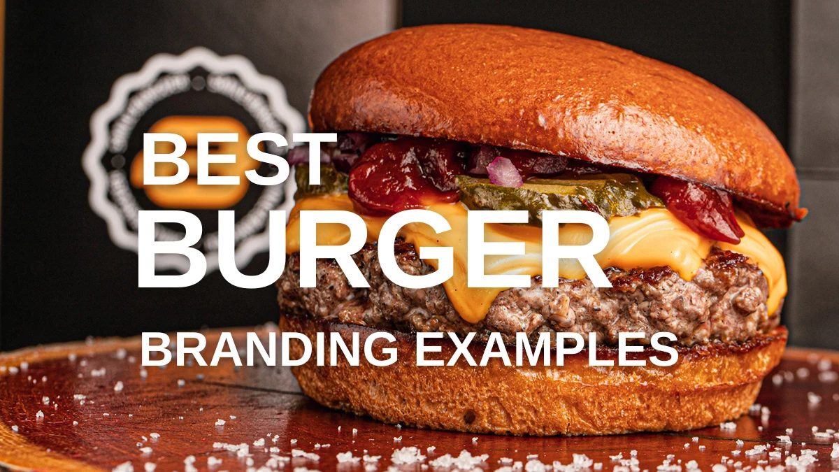
Appropriate branding can make any type of food memorable and irresistible. Burgers are a staple in American cuisine, and with so many options out there, it can take a lot of work for burger logo ideas and brands to stand out.
Here, we list the best burger branding examples that have nailed their identity and are sure to inspire your own branding efforts. Our experts also discuss the key elements of an effective branding strategy for burger restaurants and how to create one.
1. Haka Burger by Gabriel Albrecht
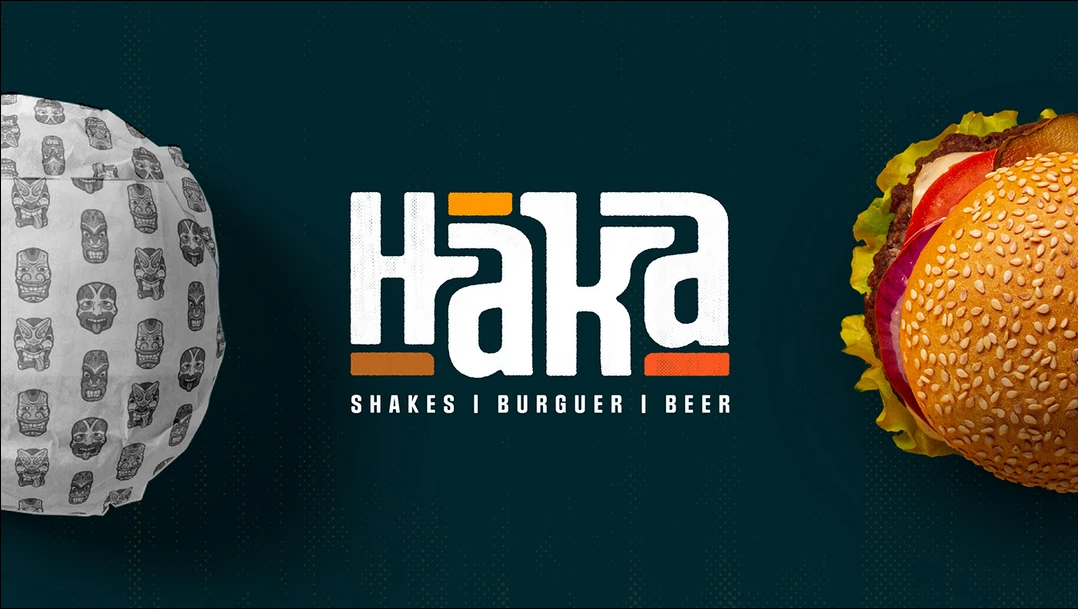
Standout Features:
- Maori-themed branding
- Expressive typeface
- Vibrant color story
Introducing global themes in any restaurant can be challenging because you don’t want to misrepresent the culture. New Zealand-based restaurant chain Haka Burger succeeds at this task by featuring Maori-inspired illustrations, typefaces, and colors. The result is an eye-catching identity that feels familiar yet unique.
Haka Burger’s branding strategy is well thought out, to put it simply. Branding expert Gabriel Albrecht did an excellent job of not crossing the line into cultural appropriation. Moreover, the bold typography and colors create a harmonious tone throughout. This is an excellent example of infusing culture into a business brand while maintaining a focus on aesthetics.
2. Enburguiza by Lunder
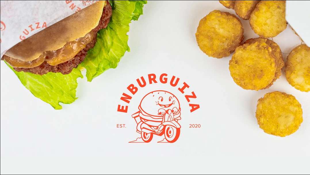
Standout Features:
- Refreshing visuals
- Cartoon logo
- Minimalist approach
We always associate burgers with American-style diners, and Enburguiza’s burger branding is a perfect example. Lunder utilized the concept of old American-style diners to evoke nostalgia, which is a very influential trend in branding these days. The cartoon logo of a burger riding a bike is a fun nod to the classic diner that complements the fresh and playful visuals.
The minimalist approach keeps their branding streamlined and effective by avoiding cliches like red-and-white checkerboard patterns or overused fonts. The branding is on point, and you can immediately tell Enburguiza is a great place to get a burger.
3. Brazzante by Virgo Design
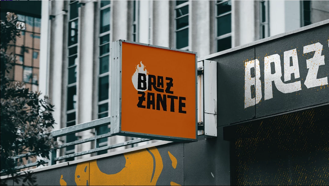
Standout Features:
- Flame-inspired visuals
- Expressive design
- Monogram logo
A true mark of a successful branding strategy is when your assets create a memorable first impression on your customers, and Brazzante achieves this perfectly.
Virgo Design emphasizes the restaurant’s focus on grilled burgers by incorporating it into its branding. The flame-inspired visuals in bright orange create a nice contrast with the charcoal text.
The monogram logo also adds an expressive touch, conveying that the restaurant isn’t just any other regular burger joint. Meanwhile, the bold typeface and stylized flames around the letter B are a nice touch to emphasize the brand’s identity. Overall, Brazzante’s visual branding is consistent and attractive, setting them apart from the competition.
4. Smile Burguer by GLV BRANDS
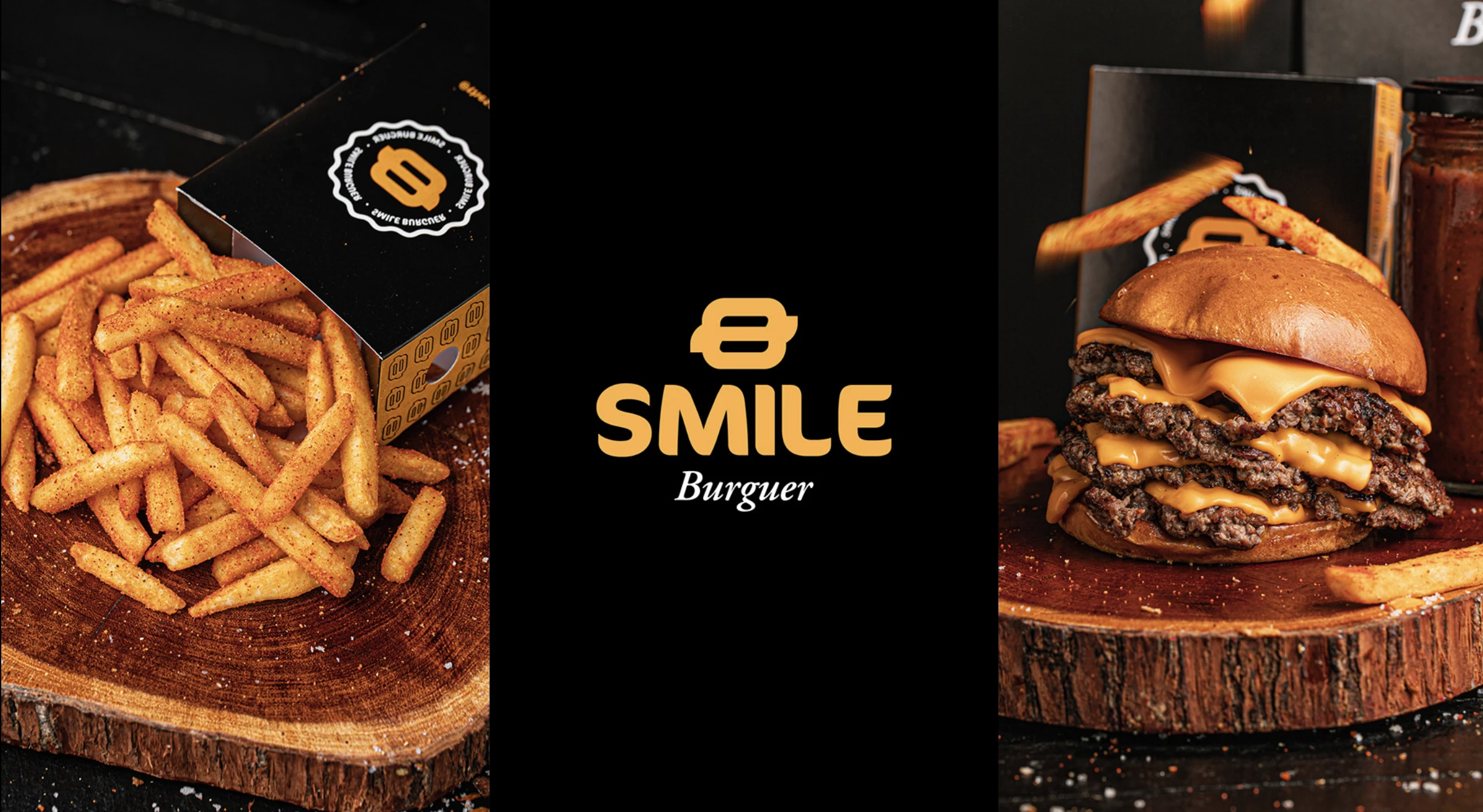
Standout Features:
- Customer-focused branding
- A warm and inviting color story
- Company values included
Brazilian restaurant Smile Burguer delights customers with delicious food and exceptional customer-focused branding. GLV BRANDS uses playful and inviting colors to portray the enjoyable atmosphere in the restaurant. Yellow and orange are mainstays in most restaurant branding due to their association with delicious food, and Smile Burguer employs this combination really well.
The rounded-edge font adds warmth to the overall aesthetic, enhancing the food branding. The agency ensures that the branding emphasizes customer satisfaction, earning Smile Burguer a spot on our list.
5. Ohmami Street Food by Uniq Creative
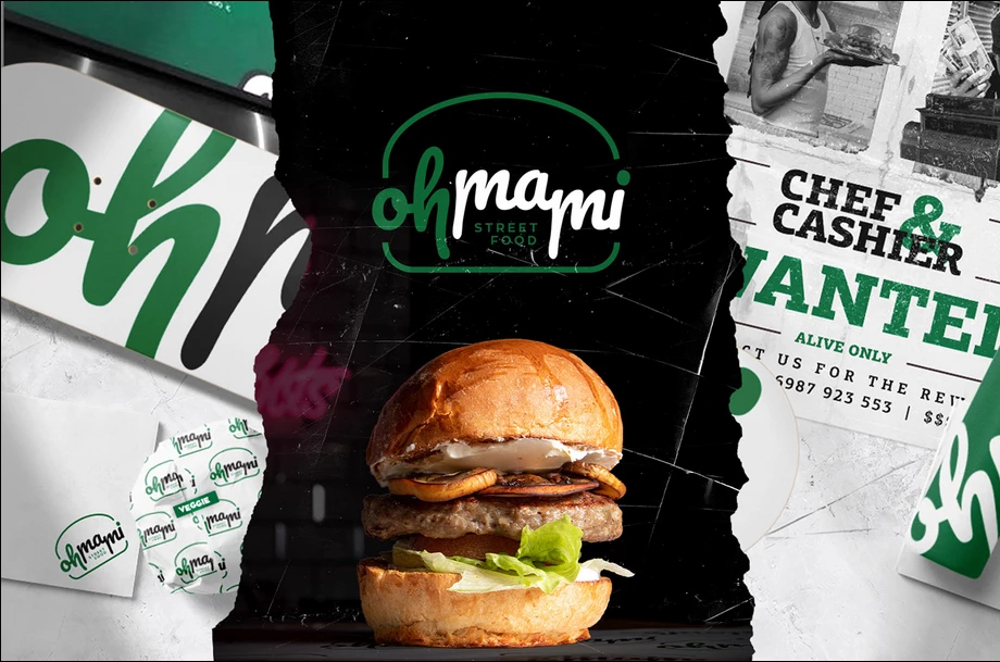
Standout Features:
- Contemporary
- Minimalist color story
- Clean and polished vibe
Sometimes, combining polish and personality can be challenging, but Ohmami Street Food does it successfully. Uniq Creative incorporates traditional elements of street food in their design. The color story is minimal, featuring white, black, and pine green. While this palette can be seen in many similar brands like Shake Shack and Subway, the designers use it to their advantage to achieve a clean and polished look.
Burger logo ideas that center on the brand name can be very effective. Ohmami’s logo features a rounded-edge font, adding to the modern feel of the overall branding, while the handwritten font brings personality to the table. This combination creates an inviting atmosphere, encouraging customers to return for more.
6. Moriarte by Matheus Felipe Flores
Standout Features:
- Negative space logo
- Warm and earthy colors
- Artisanal
Burgers might be the last food item to be perceived as artisanal, but this excellent branding example achieves just that. Matheus Felipe Flores uses negative space to create a brand symbol featuring an outline of a burger in stark white or black, depending on the background. Negative space logos add personality without too much complexity.
The restaurant’s color palette is warm and earthy, adding to its artisanal vibe and evoking the cozy feeling you get from homestyle burgers. This is one of the best restaurant branding examples that perfectly blends homemade comforts with artisanal expertise, combining class and sass.
7. Caliburger by OD
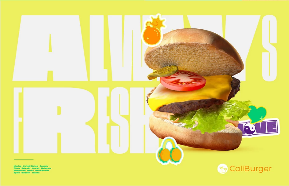
Standout Features:
- Youth-centered branding
- A harmonious blend of fonts and colors
- Simple and effortless
The young generation loves burgers, which is why companies try to tap into this demographic, and Caliburger is no different.
OD creates a harmonious blend of fonts and colors that projects fun and youthfulness. The combination of big, light typography with pops of bright colors gives off a fun, relaxed vibe, making it perfect for millennials and Gen Z. The logo also incorporates emojis in the signature Caliburger way, adding to the youthful feel.
Caliburger has a very inviting aesthetic for those looking for a fast and easy bite.
8. JOTA by Questtono Manyone
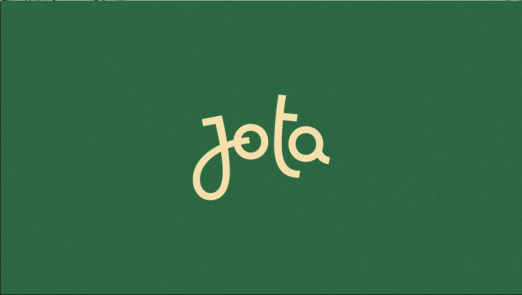
Standout Features:
- Classic approach
- No-frills branding assets
- A simple and casual vibe
Burgers are considered casual food, so simple and no-frills branding can still be very effective. JOTA by Questtono Manyone had a minimalist approach to burger branding strategy. The agency used a typeface that’s easy on the eyes and instantly recognizable, which also serves as the logo. See more examples of minimal logo designs here.
Green and white portray freshness and simplicity, which is what this example of burger branding is all about. A simple, classic font paired with vibrant colors presents an inviting, casual invitation for burger enthusiasts. After all, there's no need to complicate comfort food.
9. MANEIRISTA by Mau Maria
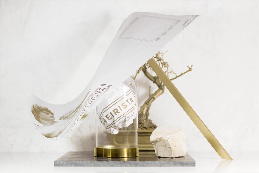
Standout Features:
- Strong Mannerist style
- Cosmopolitan feel
- Striking branding strategy
Small businesses need to make their mark in whatever way they can, and Manerista by Mau Maria did just that with this burger branding example. (Check out other best branding examples for small businesses.)
Inspired by the Mannerist movement from the 16th century, the restaurant’s unique branding identity ties into this theme seamlessly, making it look intentional and modern.
The restaurant’s color palette is a mix of warm beiges, oranges, and blues. This combination creates a cosmopolitan vibe that’s inviting to customers who want something different from classic burger joints. This example of burger branding hits all the right notes.
10. Tio Burgers 'n Fritas by Bodega Design Studio
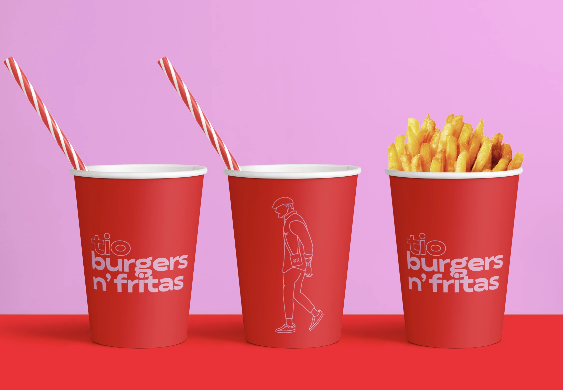
Standout Features:
- A fresh and classic approach
- Comfortable visuals
- Fiery color story
With so many restaurants going for experimental ingredients and fusion techniques, nothing beats the charm of a simple burger without the sparkles and other shenanigans.
Bodega Design Studio embraces simplicity in creating a visual identity that suits the brand. The red and white color scheme is comforting and reminiscent of America’s classic burger joints. These visuals make customers feel comfortable and welcome in the restaurant, adding to its charm.
Indeed, you can get a taste of home from their burger selections.
11. Juicy Burgers by Get Noticed Media
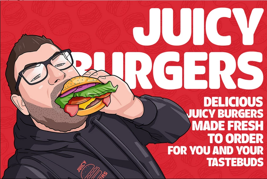
Standout Features:
- Focus on homemade vibes
- Expressive cartoon sketches
- Straightforward tagline
Juicy Burgers has become a favorite among food truck enthusiasts for its fresh and juicy burgers. Proud of their homemade roots, they want to embody that spirit in their burger branding strategy.
Get Noticed Media crafts a visual identity for Juicy Burgers that emphasizes simplicity and relatability. The cartoon sketches of this burger branding are expressive and eye-catching, and the bright colors reinforce their message. The tagline, "Delicious juicy burgers made to order for you and your tastebuds," is concise and straightforward, perfectly capturing the brand’s essence.
12. Fat Cat's Burger by Pau Suarez
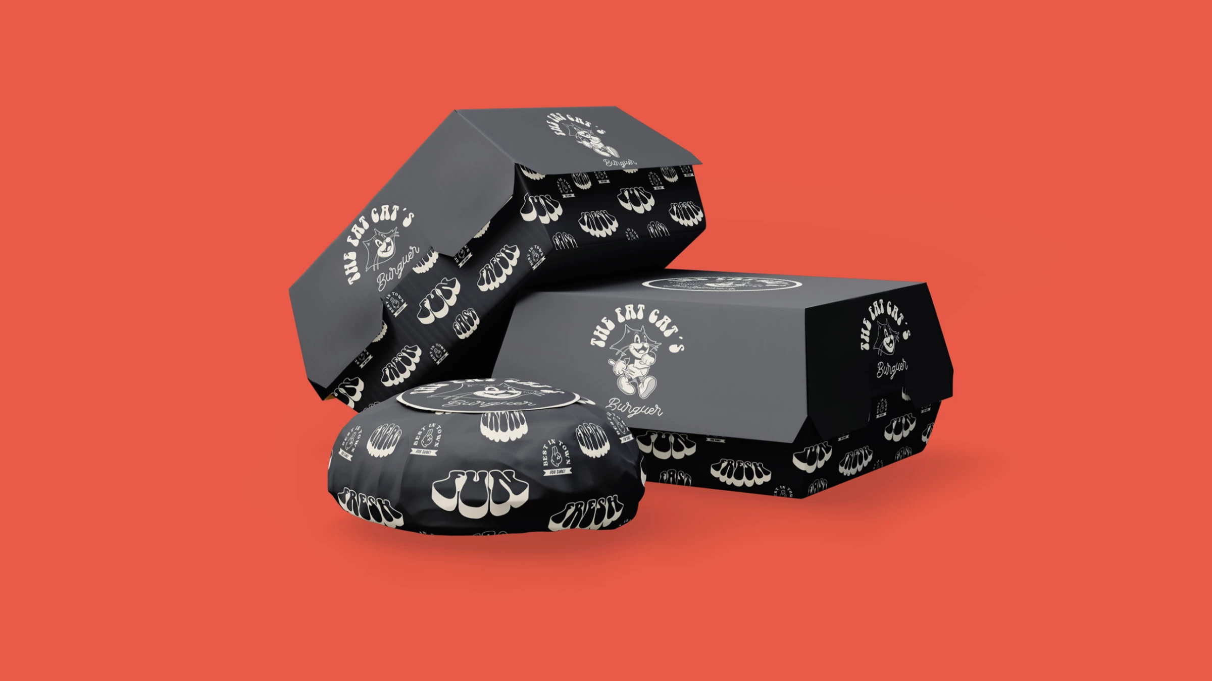
Standout Features:
- Looney Tunes-inspired logo
- Use of neutral colors
- Fonts with personality
Fat Cat's Burger has ticked all the boxes in portraying a brand with personality, thanks to branding professional Pau Suarez. In Fat Cat’s Burger logo, he taps into the joyous and fun vibes that burgers bring to any table.
Burgers are comforting and provide a feel-good experience for many. To communicate this, the designer creates an instant classic logo inspired by the Looney Tunes universe. The cartoonish design and bold font choices are inviting, which perfectly match the black and white color palette to reinforce that they mean business in burgers.
13. Villa Texas by Andre Casco
Standout Features:
- Use of Texas symbols
- Wild West vibes
- Excellent references
Texas is a haven for burger joints, and Villa Texas decided to go big with its branding efforts to reinforce its roots. Andre Casco's Texas-inspired design captures the Wild West vibes with the lone star perched on the center, woody textures, and earthy tones of brown and beige.
What Is Burger Branding?
Burger branding involves many different strategies to set your offerings apart in a highly crowded food and beverage industry. You must present your brand voice, create unique visuals, and showcase your value proposition to entice your target audience to choose your burgers instead of the competition and keep coming back for more.
Partnering with branding agencies can help you create a memorable burger brand that resonates with your customers.
How To Create a Burger Branding Strategy in 7 Steps
- Set SMART Goals
- Choose Your Audience
- Perform Competitive Analysis
- Establish a Brand Story
- Create Buyer Personas
- Design Visual Elements
- Measure Branding Performance
1. Set SMART Goals
Establish SMART (Specific, Measurable, Attainable, Relevant, Time-bound) goals to provide clear endpoints for your burger branding strategy. When you know exactly what you want to achieve, you can ensure the following steps will be in service to those objectives. This focused, streamlined approach will help you maximize your resources.
2. Choose Your Audience
While people across demographics enjoy burgers, which is an advantage for your restaurant, your branding and marketing initiatives should zero in on a specific sector. For example, if you offer homestyle burgers, it's best to target families, college students, and other groups that prefer casual dining experiences.
3. Perform Competitive Analysis
With over 83,000 burger restaurants in the United States, it’s proof that burgers are an incredibly popular food item. This means your business faces a lot of competition. Analyze other burger restaurants, food trucks, and even carts to identify what sets your business apart and create a branding strategy around these aspects.
You must also understand and track constantly evolving food industry trends. To stay top-of-mind for burger enthusiasts, you need highly engaging and timely marketing strategies they won’t find boring or dated.
4. Establish a Brand Story
Craft an authentic and relatable brand story that resonates with your target audience to create an emotional connection with them. To do this, consider the question: What is your brand’s purpose? What compels you to pursue a restaurant business and make burgers for a living?
From here, you can outline your brand’s purpose, mission, vision, and overall values. Your brand voice and personality will stem from these elements and guide all your branding strategies and activities in the long run.
5. Create Buyer Personas
Buyer personas are representations of an ideal customer based on thorough market research, profiles of past customers, and competitor analysis. Burger logo ideas and strategies are tailored to capture and engage these personas through marketing campaigns and product offerings.
You can create a buyer persona by analyzing your target audience’s:
- Demographics (age, location, gender, education, income)
- Behavior (purchasing habits, pain points, goals)
- Psychographic details (lifestyle, interests, values)
For example, an upscale casual burger restaurant that uses locally sourced ingredients and prioritizes sustainability will likely find success if it centers its branding strategies on customers in their 20s to 30s living in urban areas. This demographic is most likely single or has no kids, with an average income of $60,000 or higher. They are active on social media, closely follow food and restaurant trends, and are eager to try the newest and most delicious offerings they can find in their city.
Creating and leveraging these specific personas ensures that all branding activities resonate with their preferences and needs. This will lead to more sales, higher engagement, and better customer experience.
6. Design Visual Elements
Logo design, color palettes, and typography encompass your business’s visual identity. A cohesive and memorable aesthetic effectively conveys the essence of your offerings.
Maintaining visual consistency across all customer touchpoints — whether physical (restaurant design, signage, menu design, posters/flyers, vehicles) or digital (website, social media, newsletters, online delivery platform) — demonstrates your dedication to quality and ensures quick recall.
7. Measure Branding Performance
Track critical key performance indicators — such as website traffic, social media engagement, brand recognition, net promoter score, average order value, return on investment, and more — to measure the success of your branding strategies. This data-centric approach will provide actionable insights that lead to long-term success for your burger joint.
5 Key Elements of a Successful Burger Branding Identity
Effective burger branding involves several key elements, as demonstrated by the 13 examples in this article:
1. Logo
All other branding elements center around your burger logo ideas. It is the first touchpoint for most potential customers, so it must encompass your business’s unique value proposition, values, and personality. Your logo should also stand out from your competitors and make a strong impression.
When you establish a strong branding strategy, your logo will become a symbol associated with fantastic burgers and other delicious offerings in the long run.
2. Color Palette
Consumers associate colors with certain emotions. In food marketing, red and orange stimulate appetites (making them popular choices for many brands), green represents freshness, and black exudes luxury. Your brand’s color palette will affect customer perception in person and online. This is why it’s important to choose shades that will capture the right audience and evoke your intended feelings.
3. Typography
Like colors, typography conveys specific messages: serifs are traditional options associated with class, sans serifs are sleek and minimalist, scripts are elegant, and handwritten fonts are very casual and down-to-earth.
Font choice, size, color, and spacing heavily influence how your burger restaurant is perceived. You will use them across all physical and digital brand assets, so you must choose them carefully.
4. Menu Design
Combine all brand visuals and inject your voice and personality into your burger menu design. This is a critical touchpoint that significantly affects customer experience and is another opportunity to make a good impression.
Lay out menu items sensibly: appetizers first, then entrees, drinks, and desserts. Include easy-to-read food descriptions and prices along with high-quality photos that present your offerings in the best light.
5. Ambiance
Your restaurant ambiance will be one of the biggest reasons why customers will be compelled to come back and recommend your burgers to their friends, family members, and social circles. The perfect burger experience transcends taste; it also involves interior design, customer service, and good vibes.
![]()
Our team ranks agencies worldwide to help you find a qualified partner. Visit our Agency Directory for the Top Branding Agencies, as well as:
- Top Food and Beverage Branding Agencies
- Top Food and Beverage Marketing Agencies
- Top Restaurant Digital Marketing Agencies
- Top Small Business Branding Agencies
- Top Cincinnati Branding Agencies
And don’t miss our Awards section, where we showcase the top agencies recognized for exceptional creativity and impact.


-preview-webp.webp)