Every great tech company needs branding as strong as its engineering. Technology branding isn’t just the public persona of a company; it also demonstrates the power, innovation, and reliability behind its products and services. And let’s be honest — many of us have picked up a shiny new gadget thanks to the efforts of specialized branding agencies.
We’ll explore the best technology branding examples from startups, AI brands, and industry giants.
4 Top AI Tech Company Branding Examples
AI tech companies are setting themselves apart with innovative branding that mirrors their cutting-edge technology. Here are examples that seamlessly blend futuristic design with strategic storytelling to capture the imagination of tech enthusiasts and industry.
1. OpenAI

Standout features:
- Forward-thinking brand identity
- Custom ‘OpenAI Sans’ typeface
- Refined ‘blossom’ logo
In February 2025, OpenAI unveiled a comprehensive rebranding initiative that underscores its commitment to a human-centric approach to artificial intelligence. Central to this transformation is 'OpenAI Sans,' a custom typeface designed for clarity and consistency across platforms. This bespoke typography enhances readability while strengthening brand recognition in the tech industry.
The iconic ‘blossom’ logo has been subtly refined to reflect OpenAI’s evolution, symbolizing growth and innovation while maintaining its recognizable essence. Complementing these updates is a minimalist color palette of greys and blues, projecting professionalism and trust.
Beyond aesthetics, OpenAI's rebranding sharpens its market positioning and differentiation. By adopting a more approachable and humanized visual identity, OpenAI aims to demystify AI and make it more accessible to a broader audience. This approach positions the company as a leader in AI innovation that prioritizes ethical and user-centric innovation.
Branding impact:
The strategic rebranding has yielded measurable impacts. Following the launch of ChatGPT, OpenAI experienced rapid user growth, acquiring 100 million users within two months. This surge in adoption is indicative of successful customer acquisition strategies and has positioned the company on a trajectory toward significant revenue milestones.
2. Inflection AI

Standout features:
- Human-centric branding approach
- Empathetic AI assistant 'Pi'
- Enterprise-focused AI solutions
Inflection AI has built a brand identity centered on human-centric artificial intelligence, positioning itself as a leader in developing AI that is not only intelligent but also empathetic and user-friendly. This distinct approach sets Inflection AI apart in a competitive market, appealing to users seeking more natural and meaningful interactions with technology.
Central to Inflection AI's offerings is 'Pi,' an empathetic AI assistant designed to engage users in personalized, emotionally intelligent conversations. Pi’s ability to tailor responses based on individual interactions enhances engagement, differentiating Inflection AI from traditional AI models. This focus on empathy and personalization reflects the company's commitment to aligning AI values with human needs, fostering deeper connections between users and technology.
In a strategic shift, Inflection AI has expanded its focus to include enterprise-grade AI solutions, catering to the unique needs of large organizations. This shift enables the company to leverage its existing technology to carve out a niche market, further differentiating itself from competitors.
Branding impact:
The impact of Inflection AI's branding and strategic initiatives is evident in its user engagement metrics. Pi now boasts 6 million monthly active users and over 4 billion messages exchanged, indicating strong adoption and satisfaction. Additionally, Inflection AI has secured $1.3 billion in funding in 2023, primarily from Microsoft, underscoring investor confidence in its vision and market potential.
3. Scale AI
Standout features:
- Data-centric brand identity
- Dynamic and modern wordmark
- Customizable graphic design platform
Scale AI's branding reflects its commitment to accelerating AI applications, particularly in data-driven industries like supply chains. With a data-centric approach, the company emphasizes precision and efficiency, positioning itself as a leader in delivering high-quality training data for AI applications. This focus appeals to organizations seeking reliable, scalable data solutions.
Scale AI's dynamic and contemporary logo features a smooth, rounded sans-serif typeface with a vibrant gradient transitioning from warm orange to deep purple. This fluid design conveys scalability, adaptability, and innovation in AI-driven solutions. The softened letterforms and gradient effect create a futuristic yet approachable brand presence.
The branding extends to a customizable graphic design platform, utilizing the scale bar to create flexible, dynamic grids for various touchpoints. By focusing on delivering high-quality, scalable data solutions, Scale AI sets itself apart from competitors, appealing to businesses that demand precision and efficiency in data management.
Branding impact:
The impact of Scale AI's branding and strategic initiatives is evident in its impressive growth metrics. As of 2023, the company achieved a revenue of $760 million and served over 1,000 customers, reflecting strong market adoption and customer trust. Additionally, Scale AI's valuation reached $13.8 billion in 2023, underscoring investor confidence in its business model and market potential.
4. Perplexity AI

Standout features:
- Distinctive owl icon
- Minimalistic user interface
- Conversational search approach
Perplexity AI positions itself as an AI-powered search engine that prioritizes accuracy, clarity, and conversational interaction. A key element of its visual brand identity is the distinctive owl icon, which symbolizes wisdom and insight. By incorporating the owl across its platform, Perplexity AI strengthens brand recognition while evoking trust and expertise.
The brand’s minimalistic user interface enhances its positioning as a sleek, no-frills alternative to traditional search engines. A clean layout, ample white space, and simple typography create an intuitive browsing experience, free from distractions. This design approach aligns with the company’s value proposition — delivering fast, relevant, and easily digestible answers without cluttered advertisements or excessive information.
What truly differentiates Perplexity AI is its conversational search approach. Unlike standard search engines that generate a list of links, Perplexity AI provides direct, context-aware responses. This strategy positions the brand as an AI-driven knowledge assistant rather than just a search tool, appealing to users who prioritize efficiency and clarity. Additionally, the brand emphasizes transparency by citing its sources, further enhancing credibility.
Branding impact:
Perplexity AI’s branding efforts have translated into strong market traction. In 2023, the company raised $25.6 million in Series A funding, led by NEA, signaling investor confidence in its unique positioning. It has also gained a loyal user base, processing millions of queries each month. By combining a clean design, a recognizable mascot, and an AI-first approach, Perplexity AI is carving out a niche in the competitive search industry, directly challenging traditional players like Google and Bing.
3 Top Startup Tech Company Branding Examples
Startups in the tech arena must make bold impressions with limited resources. Here, we explore high-end examples of startup tech companies whose agile and inventive branding strategies convey their unique vision, resonating deeply with modern audiences, and fueling rapid growth and market disruption.
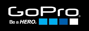
1. GoPro
Standout features:
- Action-packed visual identity
- Bold, adventurous messaging
- Community-driven brand strategy
GoPro’s branding thrives on a dynamic and bold visual identity that perfectly reflects its core values: adventure, action, and exploration. The use of clean, modern typography and a strong, minimalist logo signals reliability while enhancing recognition in diverse settings.
The brand’s color palette, dominated by black, white, and vibrant accent tones, evokes energy and excitement, while imagery of athletes and outdoor enthusiasts reinforces its lifestyle association with thrill-seeking and adventure.
GoPro’s branding strategy is community-driven. The brand doesn’t just sell cameras — it sells experiences, empowering users to capture and share their own action-packed moments. This is reflected in its messaging, which emphasizes personal empowerment and the strength of its user community. The slogan, “Be a Hero,” taps into aspirational storytelling, positioning GoPro as a tool and a way of life.
In recent years, GoPro has strategically pivoted towards a subscription-based model. This shift reflects a broader industry trend towards subscription services, offering consumers added value through exclusive content and features.
Branding impact:
This approach and similar GoPro’s branding initiatives have yielded measurable results. In the fourth quarter of 2024, the company reported a 9% year-over-year increase in subscription and service revenue, reaching $27 million.
In summary, GoPro's branding transcends visual elements, encompassing strategic initiatives that foster community engagement, adapt to market trends, and drive financial performance. This has solidified GoPro's position as a leader in the action camera market, continually resonating with consumers and achieving measurable business success.
2. Celonis
Standout features:
- Sleek yet approachable identity
- Interactive digital presence
- Data-centric visual identity
Celonis, a leader in process mining software, strategically positions itself as a provider of process intelligence solutions that enhance operational efficiency.
The company collaborates with top-tier firms across industries, demonstrating the versatility and effectiveness of its technology. For instance, Vodafone utilized Celonis to optimize customer service operations, achieving a 20% improvement in response times and significantly boosting customer satisfaction metrics.
Its visual identity features the Celonis logo, with its clean lines and modern typography, conveys professionalism and clarity, ensuring versatility across various platforms. Meanwhile, the brand's imagery combines photographs and illustrations, bridging the abstract nature of data analysis with tangible business impact.
Celonis’s website exemplifies its user-centric design philosophy. A clear layout and intuitive navigation enhance usability, while interactive elements, such as data visualizations and product demos, invite engagement and provide visitors with a hands-on experience of the brand’s solutions. The responsive design ensures optimal functionality across all devices, catering to a diverse user base.
Branding impact:
Financially, Celonis has demonstrated significant growth, with its process mining solutions being adopted by numerous Fortune 500 companies and global enterprises. The company's innovative approach has positioned it as a leader in the Gartner Magic Quadrant for Process Mining, reflecting its substantial impact on businesses seeking to enhance efficiency and sustainability.
3. PsiQuantum

Standout features:
- Photonics-centric visual identity
- Minimalist design approach
- Engaging digital presence
PsiQuantum, a trailblazer in photonic quantum computing, has carefully crafted a visual identity that underscores its forward-thinking approach to technology. The brand uses sleek, minimalist design elements, focusing on simplicity and precision to reflect its cutting-edge innovations in the quantum computing space.
Their branding is marked by the trident symbol, which represents quantum mechanics. This symbol is paired with a restrained color palette of blacks, whites, and grays, reinforcing a sophisticated and serious tone. Meanwhile, the website features interactive elements that invite users to explore PsiQuantum’s work in a highly engaging way.
By targeting industries seeking robust, scalable solutions for next-gen computing, PsiQuantum has positioned itself as a leader in photonic quantum computing. Their "Blueprint" section on the website highlights their path to building a practical quantum computer, while "Applications" shows real-world uses, solidifying their role as an industry innovator.
Branding impact:
This branding strategy enabled PsiQuantum to grow rapidly, with investments from leading firms like BlackRock and Temasek. It has helped position the company as an attractive investment in the quantum computing space, signaling that it is on the cutting edge of this revolutionary technology.
3 Top Established Tech Company Branding Examples
Even the giants of the tech industry continuously evolve their brand identities to maintain market leadership. We’ll showcase tech companies that have mastered the art of consistent and impactful branding, combining rich heritage with innovative design to stay relevant in an ever-changing digital landscape.
1. Salesforce
Standout features:
- Customer-centric branding
- AI integration with an ethical focus
- Commitment to social responsibility
Salesforce, a global leader in cloud-based software, has cultivated a branding strategy that harmoniously blends customer-centric values, innovative technology, and social responsibility. Salesforce's visual identity is characterized by a clean and modern aesthetic, utilizing a color palette that conveys trust and professionalism. Additionally, the consistent use of imagery depicting diverse professionals and communities reinforces the company's commitment to inclusivity and customer success.
Moreover, the company has been lauded for its responsible approach to AI, emphasizing data privacy and ethical considerations. This balance between innovation and trust has been pivotal in maintaining customer confidence and satisfaction.
Salesforce's commitment extends beyond business objectives. The company actively participates in advocating for equality, sustainability, and community empowerment. Initiatives such as the #TeamEarth campaign and the planting of one trillion trees underscore Salesforce's dedication to combating climate change. These efforts resonate with consumers who value corporate responsibility, enhancing brand loyalty and reputation.
Branding impact:
In Q3 2024, Salesforce reported an 8% year-over-year revenue increase, reaching $9.44 billion. This growth is partly attributed to the successful integration of AI products like Agentforce, an AI platform designed to enhance business operations across sales, marketing, and customer support.
Additionally, by intertwining its brand with core values of customer success, innovation, equality, and sustainability, Salesforce has distinguished itself in the competitive CRM market. This strategic positioning has not only attracted a diverse clientele but has also fostered a community of "Trailblazers" — innovative individuals who drive change within their organizations.
2. Spotify

Standout features:
- Personalized user experience
- Innovative marketing strategies
- Strategic creator partnerships
Spotify, a dominant force in the music streaming industry, has meticulously crafted a brand that resonates with users worldwide. Central to its branding is a personalized user experience, achieved through sophisticated algorithms that curate individualized playlists and recommendations. This focus on personalization not only enhances user engagement but also fosters a deeper emotional connection with the platform.
The company's marketing approach is both innovative and impactful. Spotify's "Wrapped" campaign, an annual feature that showcases users' most-streamed songs and artists, has become a cultural phenomenon, sparking widespread social media discussions and increasing brand visibility.
Spotify's commitment to collaboration extends to its partnerships with creators. By offering tools and platforms for artists to connect with their audience, such as the Spotify Partner program, the company empowers creators, enriching the content ecosystem and enhancing user experience. These collaborations not only diversify the platform's offerings but also strengthen its position as a hub for musical discovery and engagement.
Branding impact:
Spotify's branding efforts have yielded impressive financial results. In the third quarter, the company reported a gross margin of 31.1%, surpassing expectations, and projected to exceed 30% for the full year.
Additionally, Spotify gained six million new premium subscribers and nine million ad-supported users, both figures exceeding analyst expectations. These metrics underscore the effectiveness of Spotify's brand strategy in driving growth and solidifying its market position.
3. Apple
Standout features:
- Iconic brand identity
- Retail experience excellence
- Attitude branding strategy
Apple's branding transcends product marketing, establishing a cultural phenomenon that resonates globally. Its brand embodies innovation, simplicity, and sophistication. This identity positions Apple as more than a technology provider; it's a symbol of personal expression and belonging.
Apple’s minimalist store design, characterized by clean lines and uncluttered spaces, creates a modern and sophisticated atmosphere. The tactile experience of interacting with Apple products reinforces quality and innovation, while the curated background music enhances the auditory environment, making the shopping experience more immersive and memorable.
Apple’s branding follows attitude branding principles, embodying a lifestyle and values that extend beyond its products. This strategy positions Apple as an iconic brand, enabling consumer self-expression and personal identity.
Branding impact:
The Apple Store concept revolutionized retail by offering immersive, hands-on experiences that invite customers to engage directly with products. Despite initial skepticism, Apple Stores achieved remarkable success, reaching $1 billion in annual sales faster than any retailer in history. In 2011, each U.S. store averaged $473,000 in revenue per employee, underscoring the effectiveness of this approach.
In summary, Apple's branding strategy integrates iconic logo and visual identity, exceptional retail experiences, and attitude branding to cultivate deep consumer loyalty and drive business success. The brand's ability to evoke such loyalty is evident in consumer behaviors, including long lines at product launches and widespread brand advocacy.
Branding Trends in Tech for 2025 & Beyond
As the tech landscape rapidly evolves, so do branding strategies. This section explores emerging trends shaping tech branding in 2025, offering a glimpse into its future.
- AI-generated branding
- Hyper-personalization
- Sustainability-driven identities
- Inclusivity and diversity as core values
- Immersive branding
1. AI-Generated Branding
Advanced AI algorithms are now capable of creating dynamic visual and textual content in real time, enabling brands to tailor their identity to audience behavior and market trends instantly. This shift toward automation not only streamlines creative processes but also opens the door to hyper-personalization, where every customer interaction is uniquely curated based on data-driven insights.
2. Hyper-Personalization
With an increasing volume of consumer data at their disposal, companies can deliver experiences and messaging that resonate on an individual level, fostering deeper engagement and loyalty. This trend is critical in an era where consumers expect brands to understand and reflect their personal preferences.
3. Sustainability-Driven Identities
As environmental and social concerns become ever more pressing, tech companies are rethinking their brand narratives to emphasize eco-friendly practices and corporate responsibility. By integrating sustainability into their core values, these brands not only enhance their market appeal but also contribute positively to societal well-being.
4. Inclusivity and Diversity as Core Values
Global audiences expect brands to reflect a broad spectrum of cultures and perspectives. Tech companies are prioritizing inclusivity and diversity in their visual and verbal communications. By showcasing diverse voices and embracing varied cultural narratives, brands not only broaden their appeal but also build stronger, trust-based relationships with their audiences.
5. Immersive Branding
With virtual and augmented reality technologies becoming more accessible, immersive brand experiences are set to redefine consumer interactions. Tech companies are developing interactive environments — such as VR showrooms and AR product demos — that merge physical and digital experiences. These initiatives create memorable, engaging encounters that foster deeper emotional connections with the brand.
Technology Branding Examples: The Bottom Line
These top technology branding examples highlight how innovative design and strategic insight can redefine an industry. They demonstrate that impactful branding goes beyond aesthetics — it’s about crafting a compelling narrative that resonates with audiences on a personal level.
From pioneering digital experiences and strategic market positioning to user-friendly packaging and bold visual identities, each example underscores the importance of aligning brand values with consumer expectations. As the tech industry continues to push the boundaries of innovation, these case studies provide valuable lessons on leveraging creativity and technology to drive customer engagement, build brand equity, and accelerate growth.
![]()
Our team ranks agencies worldwide to help you find a qualified partner to implement the latest AI solutions. Visit our Agency Directory for the Top Branding Agencies, as well as:
- Top Brand Positioning Firms
- Top Corporate Branding Agencies
- Top Small Business Branding Agencies
- Top Product Marketing Agencies
- Top Cincinnati Branding Agencies
And don’t miss our Awards section, where we showcase the top agencies recognized for exceptional creativity and impact.


-preview-webp.webp)