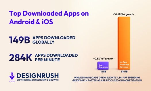
Video streaming apps are amazing, am I right?
Seriously, we live in a world where we have thousands of tv shows, movies and viral video content at the tip of our fingertips! All we need is a computer screen, a tv screen and accompanying device like Apple TV, Roku or Amazon Fire Stick.
And then — boom!
There are apps on apps on apps that can open the door to new worlds, new experiences, and new stories. Or, if you’re like me, old stories about a vampire slayer that I’ve seen over a hundred times before. But hey, I just can’t get enough!
With video-streaming apps like Netflix, Hulu, YouTube, Amazon Prime Video and HBO Now, the binging possibilities are endless.
More than 67 percent of TV viewers say they get their content through video streaming apps and services as opposed to through live TV viewing. And while mobile is definitely a trend that will continue to grow, reports show that 82 percent of users actually view video streaming services on a television as opposed to a computer, smartphone or tablet.
But what makes the experience so seamless? It’s the impeccable app designs that make up these video-streaming services. If the interfaces weren’t so intuitive, and if the navigation wasn’t so flawless, we might not enjoy the experience as much as we do.
That means that your app design has got to be flawless.
But when it comes to integrated and effortless app design, there are a lot of moving parts.
What Features Make For A Great Video Streaming App Design?
User Experience
Of course, UX design is key when it comes to creating an app that excels. You need your users to feel comfortable and happy with the app itself. You need them to feel like the app is working for them and not the other way around.
You want users to be able to engage with the app, its content and its services. And when it comes to video streaming apps, that user experience needs to be able to effortlessly guide them to their next binge.
A video streaming app with a killer user experience includes one-click functionality, continuous playback, easy search capabilities and cross-platform viewing just to name a few.
The app needs to answer all the questions a user could have. It needs to offer as many easy-to-find options when it comes to high-quality video content types — TV shows or movies — video categories — horror, comedy, drama, etc. — and any other subcategories.
It needs to easily layout the content available. You don’t want viewers having to search for hours to find the show they want to watch. It needs to offer capabilities like watchlists and the ability to favorite or like something for later viewing. It needs to offer a smooth process for in-app purchases, on-demand video access, and a carefully crafted home screen.
Essentially, a good user experience on a video streaming app will take the thinking out of watching videos — which is exactly what we want, right?
Personalization
When it comes to the video streaming experience, we know what we like. We know what genres make us smile, make us cry and makes us want to go on a new TV binge. But we also want our apps to know too.
That’s why personalization is a key feature in video streaming apps.
For a video streaming app design to be successful, it needs to learn from our behaviors through advanced technologies. It needs to understand our habits and make suggestions or assumptions based on them.
If I watch 50 hours of Buffy The Vampire Slayer a week, my video streaming app should be able to recommend similar shows — shows like Charmed, Angel and The Vampire Diaries.
And before you even think it, yes — I’ve watched them all.
Like I’ve previously stated, when we sit down to binge with our big ol’ plate of pizza, we don’t want to spend time trying to find a show we might like. We’ve got pizza to eat! So a good app with an intuitive design is vital for keeping us engaged and watching.
If my video streaming app doesn’t offer new TV recommendations or doesn’t remind me to jump back into old shows, I’ll turn to one that will.
Playback
One of the most vital, if not the most vital aspect of a good video streaming app is playback. I mean, think about it. If a video doesn’t play smoothly, what’s the point?
No one likes a video that buffers every five minutes — or buffers for five minutes. Users don’t want grainy video quality, a video that can’t fit a specific screen size, or video that doesn’t immediately play.
Us millennials want to click something once and be done with it.
Whether watching on mobile devices, tablets, computer screens or TV sets, video quality has to be pristine. We don’t have time to waste waiting for a video to load, waiting for a video to unfreeze, or waiting for a video to catch-up after scrubbing.
While user experience is important and personalization is cool, playback is an essential feature that designers should spend a fair share of their time fine-tuning and improving. Otherwise, no one is going to be looking to your video streaming app to get their next sitcom fix.
Top Video Streaming Apps Of 2018
YouTube And Its Latest Redesign For Apple TV
Big changes happened last week when YouTube unveiled a completely new redesign of its Apple TV app.
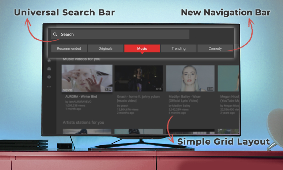
The viewing experience doesn’t necessarily change, but the whole interface got a major update — now resembling its iOS counterpart. In this new redesign, the YouTube app itself on the Apple TV looks and feels more like a third-party app as opposed to a slightly confusing desktop extension.
At the top of the screen, you notice your first difference. Instead of a bar that lists general navigation tasks to choose from, users now have access to a universal search bar, as well as a list of recommended, and popular video categories. This streamlines the UX and makes viewing even easier.
To the left of the screen comes another navigation bar running down the side. This gives you quick and easy access to your account details including history, settings, subscriptions and library.
One thing the new app does not support is 4k video which leaves many users disappointed. You’d think if YouTube was going to completely redesign its app, it’d give users the content they really wanted.
And the new redesign, which brought YouTube more in line with its brand across all other video streaming platforms, was met with backlash. Users complained about less than stellar playback, extreme lagging, slow loading and a confusing set up design-wise.
So YouTube rolled out an update, fixing the grid layout screen, smoothing out video scrubbing capabilities and better search functionality.
Too Little, Too Late?
The recent redesign might have seemed like a good idea at the time for YouTube, but it’s been met with little to no support. Might it have something to do with YouTube announcing its new availability on Apple’s tvOS platform, allowing itself to be natively available on the Apple TV for viewers to stream live? Possibly.
But what’s more likely is that it just took YouTube too long to fall in line with the trends.
YouTube has been available as an app on the Apple TV for years, but it has never truly felt intuitive. The navigation was shaky, the design was outdated and the experience left much to be desired. Just because they recently decided to shape things up and become more in-line with its look on other video streaming apps doesn’t mean it gets a pass.
For too long, the YouTube app on Apple TV looked too much like its desktop counterpart that it didn’t feel right to use on the Apple TV — especially when the sensitive remote of the Apple TV made search, scrolling and scrubbing nearly an impossible feat.
So what are other video streaming app designs doing right?
Hulu
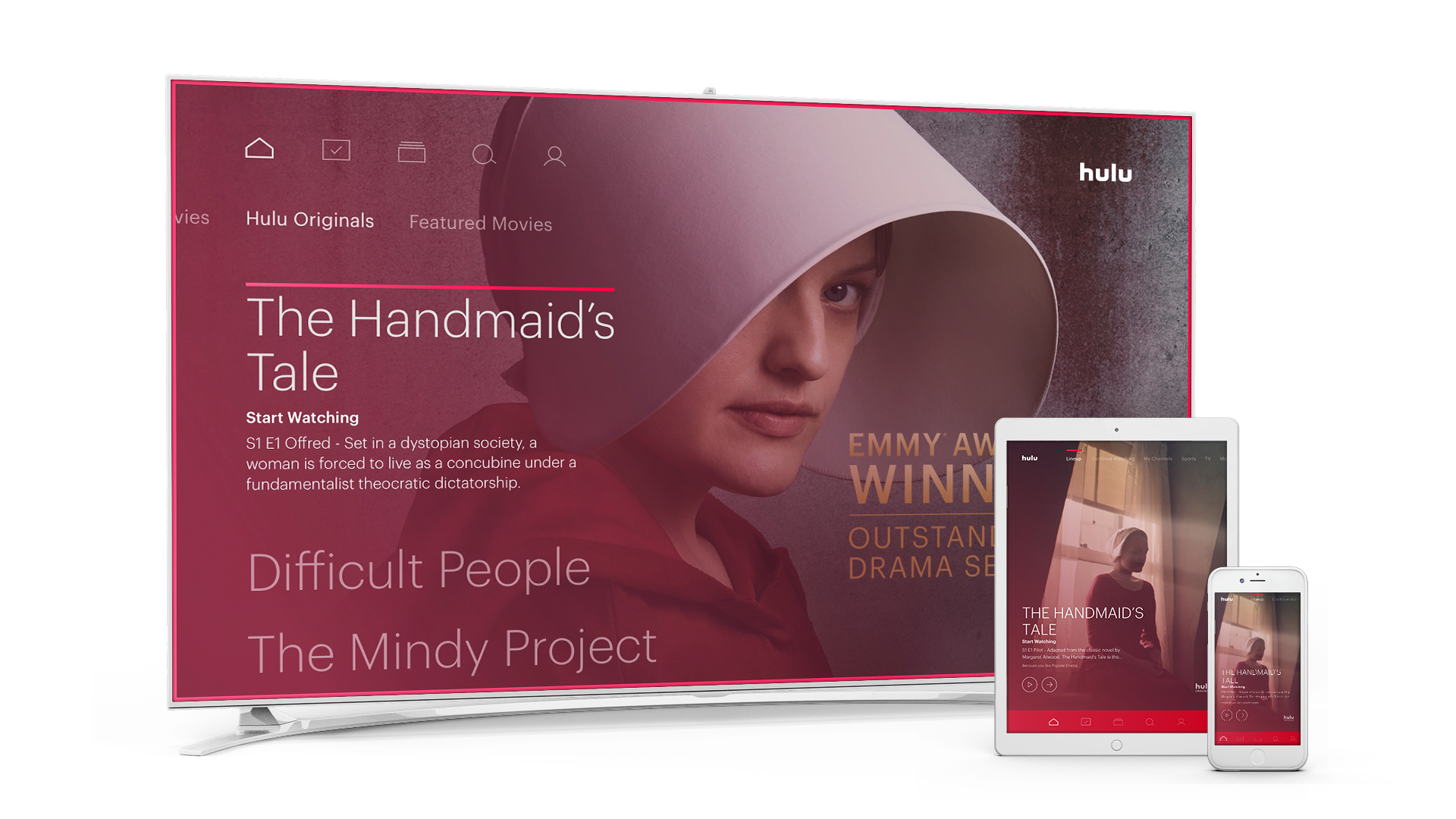
A new redesign hit Hulu iOS devices this summer including its video streaming app designs on TV. They also launched live video streaming capabilities that are now merging with the iOS apps themselves.
The new design saw a change to the app store page, integrating the signature seafoam green color across all platforms. And to stand out from the competition, Hulu got rid of the grid style set up of showing viewers its shows. Now, it shows users a personalized selection.
This selection is based on past viewing experiences, but also on a set of preferences the user sets up when they first launch the app. This intuitive, machine-learning algorithm offers ideal personalization.
After onboarding, a completely personalized homepage is offered to users. It’s fun. It’s fresh. It’s engaging. You can then move across the screen to find additional categories including recently watched, live video streaming options, and genre-specific categories.
The colors used throughout are light and immersive. Shows are easy to find, words are easy to read, and looking up past favorites is seamless. Plus, the algorithm never stops! It’s constantly scouring your history and creating new viewing experiences for you to choose from.
The smooth navigation and clean interface make scrolling through this app on your television and Android or iPhone devices a breeze — an instant success in the video streaming app world.
Netflix
Ah, Netflix. Ye ol’ faithful.
Netflix was one of the first video streaming apps to hit the scene, and it’s one that doesn’t disappoint — for the most part.
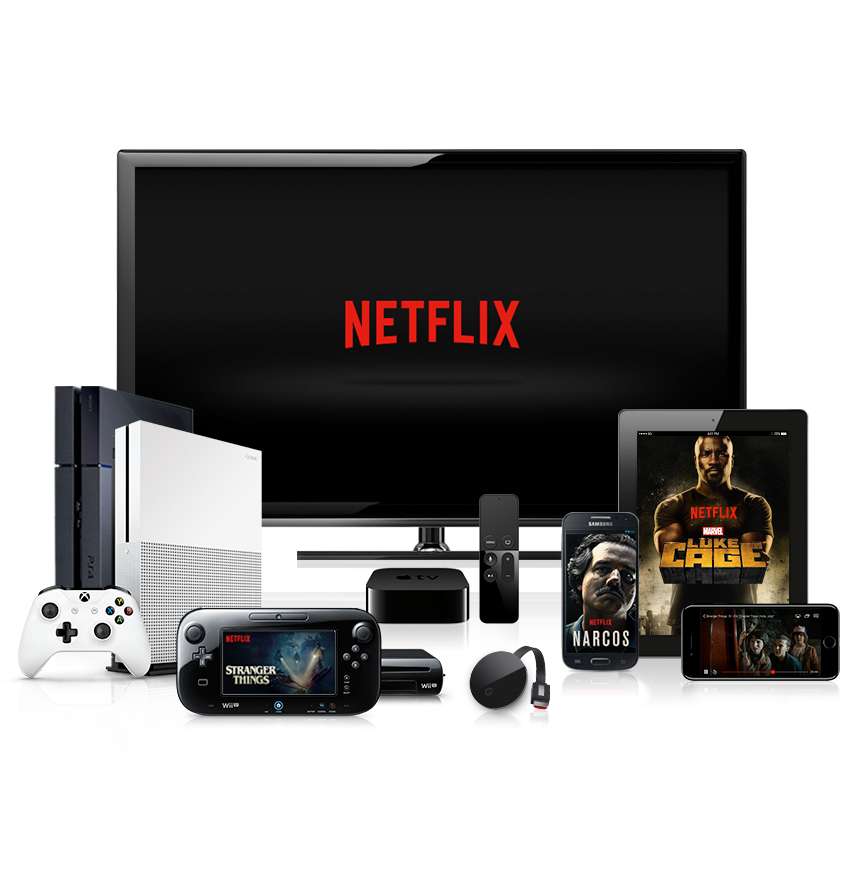
This dark, sleek and exciting app design gives off a dim glow on the television screen — with its black background and bright red text. It’s simple and seamless as it loads.
And then you hear the “dun dun” and you know it’s time to party.
When the main screen opens up, you are shown a grid-style of television and movie offerings. At the top, you have a preview for an upcoming movie or show by Netflix which plays automatically and can take away slightly from the overall experience., but it’s easily fixed by scrolling down.
You’re then given an array of options which include jumping back into shows you’ve watched, shows recommended for you based on past viewing, and genres for you to choose from. Each show or movie gets its own little square, and you can learn more by hovering or clicking.
Once it comes to choosing the video you want to see, you’re brought to a screen that allows you to choose seasons, episodes, watch a trailer, read the description and more. Netflix wants to make sure you’ve got all the information necessary before you dive in.
Sometimes load times are a bit laggy with the Netflix app, but it’s easy to get over. And the automatic playback when an episode finishes is great.
Overall, the Netflix app is simple and effective. It gives users exactly what they want, exactly where they want it.
The user experience is mighty flawless with this one.
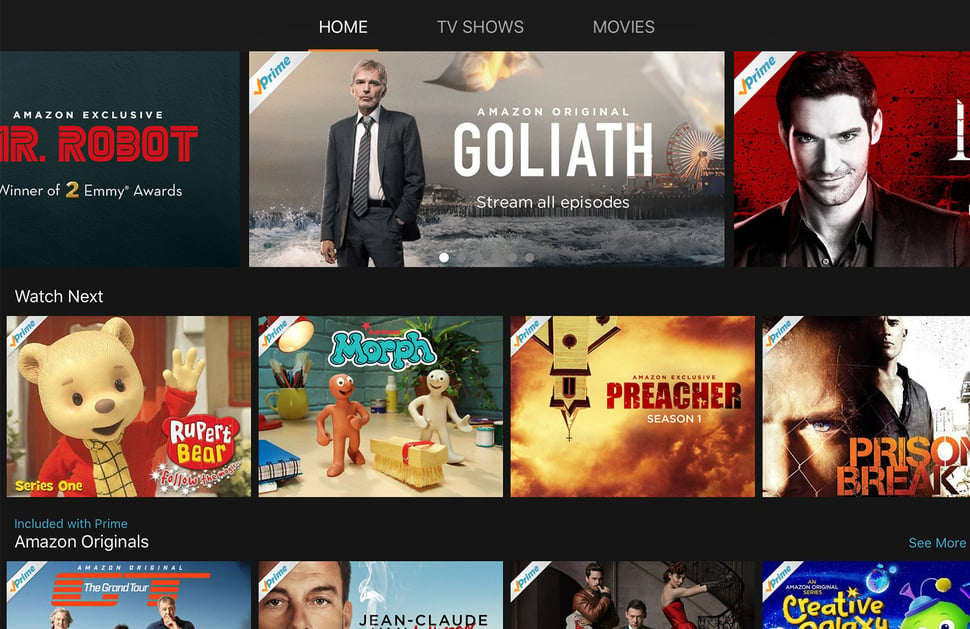
Amazon Prime Video
Hulu has boomed in recent months, but Amazon Prime Video is also a hearty contender in the race for best video streaming service.
Much like Netflix, it utilizes a lot of dark colors and a grid layout to showcase its content. And it simplifies the options users can choose from, dividing its content easily into the “Home” screen, “TV Shows” screen and “Movies” screen.
This interface is extremely intuitive and easy to navigate. Simply scroll through the big blocks of content and pick what’s right for you. It is one of the easier to understand interfaces on this list, and therefore has a high likability rating.
In December when it went live on Apple TV, it became the most downloaded app in its first week of launching.
If that doesn’t prove its a design that sells, I don’t know what will.
Video Streaming App Designs — Is The Future Of TV Really In Apps?
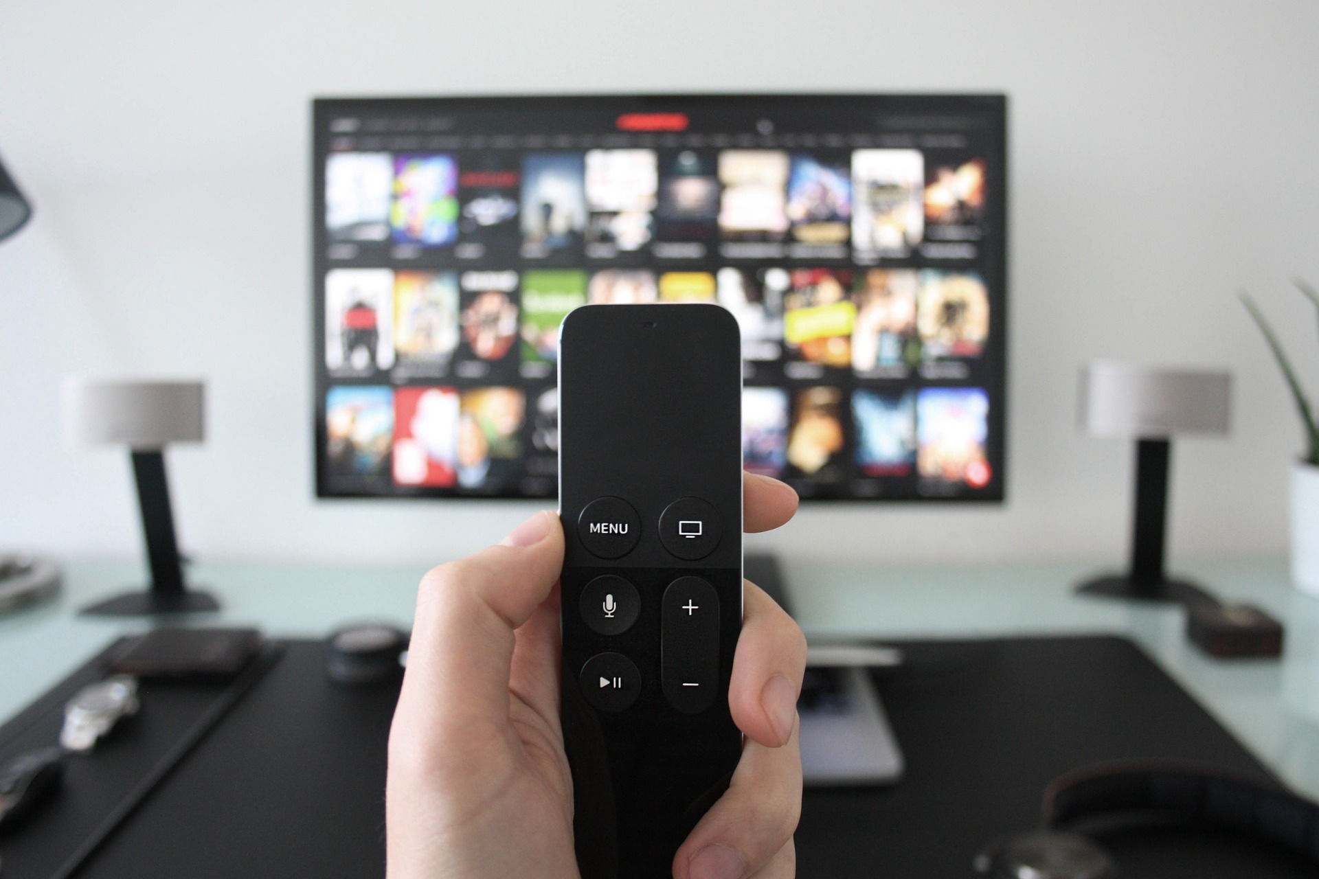
In short? Yes. Apple CEO Tim Cook got it right in 2016 when he said the future of TV was in apps. That’s how the majority of us absorb content these days. Very few users watch cable TV, and younger generations certainly favor the cheaper, video streaming options like Netflix and Hulu to get their content fix.
But they wouldn’t be half as successful if their designs weren’t as modern, intuitive and engaging as they are. But what goes into a good video streaming app design?
- A well-thought-out and engaging user experience
- Personalization capabilities that take the thinking out of watching TV
- Seamless playback that keeps users in front of the screen
There are a number of popular video streaming services out there like Hulu, Netflix and Amazon Prime Video. These services offer a fully-integrated design that is sophisticated, smart and sharp. But others have been slow to update their designs for the 2018 audience.
YouTube is a prime example of a video streaming app that took too long to give users the design they deserved — even if it was just on Apple TV. This jumbled, outdated and disorganized mess of an interface led to backlash that proved users were ready to drop their loyalty if designs weren’t up to par.
In the future, video streaming app designers will need to continue listening to users and getting feedback. Technologies are evolving and this tech needs to evolve along with it. If you're investing time and money in a multimedia app for your consumers, make like Netflix and Amazon and stay ahead of the design curve to bring the best possible product to your users.

Our team ranks agencies worldwide to help you find a qualified partner. Visit our Agency Directory for the top app development companies, as well as:
- Top App Design Companies
- Top Enterprise Mobile App Development Companies
- Top Android App Development Companies
- Top AI App Development Companies
- Top App Developers In San Francisco
Our team also highlights award-winning work on the Design Awards page, so be sure to check it out for the best and latest in app design.

