More than 90 percent of people start their search for a new house to buy or rent online. But what makes them commit to one real estate platform and help them find their forever home? An intuitive real estate website design.
What's more, of that 90 percent of consumers who search for a new home online, 30 percent make that search on their mobile devices. Mobile apps for property searching are used by approximately 70 percent of people looking to buy or rent.
Let’s take a look at the United States real estate marketing. According to the National Association of Realtors (NAR), more than six million homes were sold in 2017. There are approximately 86,000 real estate brokerage firms in the US, meaning that there are thousands of websites catering to every firm and general consumer search out there, too.
Because the competition is stiff, intuitive real estate websites that make a search, selection and information gathering easy are the key to high conversions. After all, 100 percent (yes, that number is right!) of real estate consumers will use the Internet at some point during the home buying process.
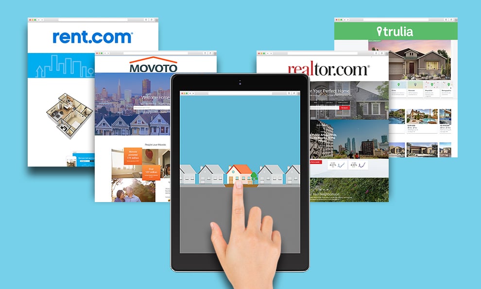
So with this high market demand, how do real estate companies, startups and agencies captivate users and encourage them to stay loyal to their platform and information? Through a clean layout, beautiful design, ease of use, and provided value.
At the end of the day, a user-friendly website design that conveys information quickly and easily will always win out -- and these 10 intuitive real estate web designs showcase these elements done right.
10 Best Real Estate Web Designs That Demonstrate High Conversions
1. Trulia
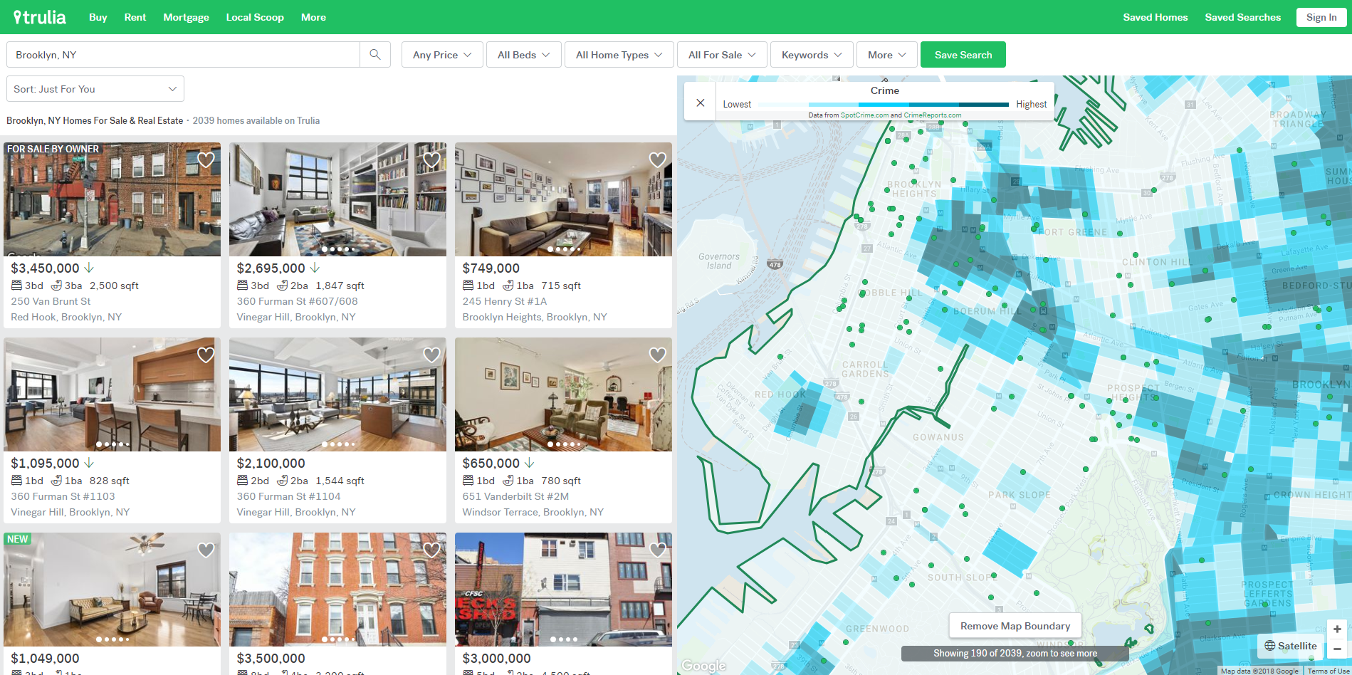
Trulia is one of the top three websites where realtors post their listings, according to NAR, and rightfully so. It is one of the most intuitive real estate websites out there that really employs a user-centric approach to website design and user experience, whether the user is a buyer, renter or a real estate professional.
When analyzing the home page, we see that Trulia's retargeting skills are very strong -- which is a good way to go, because buying a home isn’t a simple or quick process. In real life, a buyer’s journey is much longer, naturally, and there’s a lot of research involved. According to Market Leader, home buyer’s journey now lasts from 11 to 27 months! And it's easy to get distracted with such a long and drawn-out process.
Bur Trulia remembers a user's searches and views and uses that information to make each visit to the site simple. If you entered the area of interest just once on their website, next time the home page will greet you with the listings you’ve already seen, the listings that are new on the market that you haven’t seen yet, and the more specifically bundled listings by added value, like properties with pools and safest neighborhoods.
Trulia gets it right, as most of the following websites do, too. They understand that people don’t just buy or rent properties alone – they are interested in the environment they will live in, and the community surrounding them. These added values are what captivates the user’s attention and make them commit to that particular website.
Trulia’s added values are represented by smart filters and heat maps, and a clever use of icons on property listings. For example, they have the "Pet-Friendly" sticker on some properties, even before people apply "pet" as a search filter. It’s a logical choice because it provides information in multiple areas and at several points throughout the web experience. (Plus, Trulia understands the value of this filter, so they even conducted a research about best and worst cities to rent a property with pets.)
Trulia also has a clear “sponsored post” sticker plastered on some properties. It’s nice to know that some properties are sponsored – it builds the trust between the website visitor and Trulia, showing their transparency. Trulia also shares its data about previously sold properties. This information is important for the agents and future home buyers so that they can understand the market dynamics, housing demands for certain areas, and affordability.
Trulia’s main forte is the heat maps – they are elaborate, intuitive, clear and informative. Some heat maps include school vicinity with school ratings, crime reports, commute time (including walking, cycling, transit and car rides), restaurants, entertainment places, supermarkets, and many more. They understand that people don’t just buy or rent properties alone – they are interested in the environment surrounding them, landmarks, vicinity of shops and so on. They even include the slope level of the street that the property is on. It’s all added value.
2. Zillow
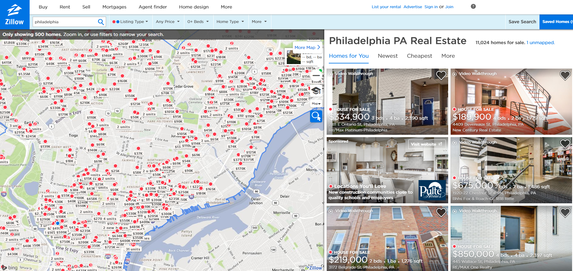
Although Zillow doesn’t have as strong a retargeting game as Trulia, their homepage is simple, and Zillow shines on the search listing page and filters. Great user-experience can be seen right on the map. When zoomed in, the map shows property locations, prices and even the number of units within a complex.
Home buyers can use the elaborate property filter options and choose from properties for sale that are being sold by "we buy houses" companies or homeowners, newly constructed, coming soon to the market or even the properties that are foreclosed. If we take into consideration that 88 percent of buyers use an agent and 67 percent use an agent frequently, this filter is an important added value to the user. Zillow also has plenty of tooltips which makes the website usability much easier, and the design simple and unencumbered by unnecessary text.
Property listings open in a large popup, which is a good idea because you are still on the same map with all other listings, and one click takes you back to the map view. This makes browsing much easier. The pictures of the property are listed in a gallery above the fold because naturally, people want to see the pictures first. But Zillow has made it easy to scroll through many pictures at once, by employing a gallery in gallery approach. You can easily scroll through pictures, bundled eight at the time, and then choose from them the ones you want to see in full preview mode.
Zillow includes information like visual floorplans, easy request a tour contact form on the side and clickable phone number. Some features are presented with icons, some are in lists and accordions, which makes scrolling easier, and information really pops out.
3. Realtor.com
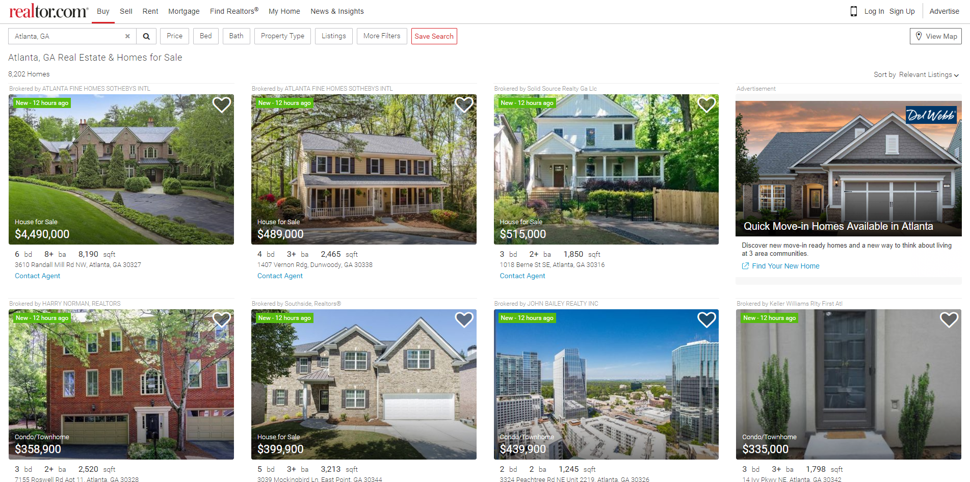
As much as Trulia and Zillow are the same in some design and functionality aspects, and infinitely different in others, Realtor takes a different approach altogether. Its property listings aren’t map-based, but list-based, with large property pictures dominating the page, and simple information on the side.
Realtor conveniently places ads and interlinking blog posts among the property listings. Every listing has its own standalone page, and multi-unit properties have multiple floor plans. Some features are presented with icons, but mostly are list based. These standalone pages have the map and some heat map filters but those aren’t as comprehensive as Trulia. Another added value is the moving cost calculator with estimates.
While Realtor.com has multiple filtering options in the header, its forte is the displayed information about the neighborhood and community. According to NAR’s 2013 Community Preference Survey, more than 78 percent of property buyers have stated that neighborhood quality is more important than the size of the home, and 57 percent are willing to sacrifice yard space if it means that the commute time to points of interest like school and work will be shorter.
One might think that Realtor.com is purposefully keeping a bit of retro website design and functionalities so that it might appeal to older users who maybe aren’t adept at technology like millennials. But even without flashy details, Realtor.com is one of the most used sites for property hunting according to NAR, due to its functionality and easy-to-navigate site.
4. Rent.com
Intended solely for renters, this website hasn’t taken the “one size fits all” approach to buying and renting like other sites. On the contrary, by offering property listings just for rent, Rent.com made sure that the functionality and design are absolutely fitted for this task.
The homepage is oriented towards captivating the visitors by highlighting the additional values of the website, which is only logical because it’s hard to get through on the market with giants like Zillow, Trulia and Realtor.com. They understand that in order to reach visitors, they just have to offer better service, and they are slowly winning the market and users through their top real estate web design.
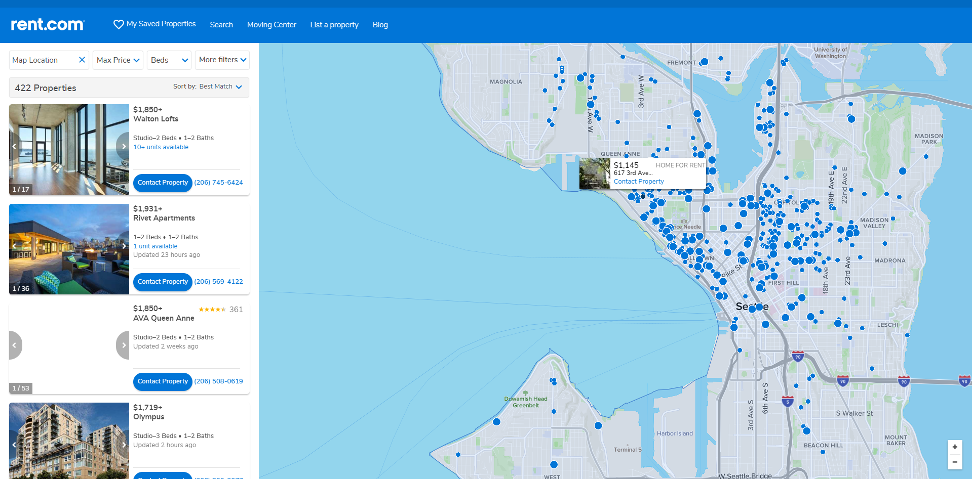
If we analyze the reading patterns, the objects on the left will always be noticed before the objects on the right. We do read from left to right and our brain is wired that way. So, by placing property lists on the left, and map on the right, Rent.com has made the user interface much more intuitive.
Properties also have user ratings and prominent CTA buttons for contacting property managers right in the list view. Once on the standalone property page, Rent.com offers 3D and HD floor plans, virtual tours and full-screen pictures. User ratings have several criteria and written reviews from certified tenants, which is a great added value because it builds trust and is a good property filter. Rent.com also has an entire portion of the website dedicated to moving, including estimates and a moving calculator, complete with moving tips
5. Movoto
According to Movoto, the website powered more than 175 million home searches in 2017. Movoto comes with dedicated agents, and this is one of the added values that users opt for online. There's no need to search for the agents or properties they offer – everything is under one roof with Movoto and that is the very definition of functionality. Just like Rent.com is only for renting, Movoto is just for buying properties.
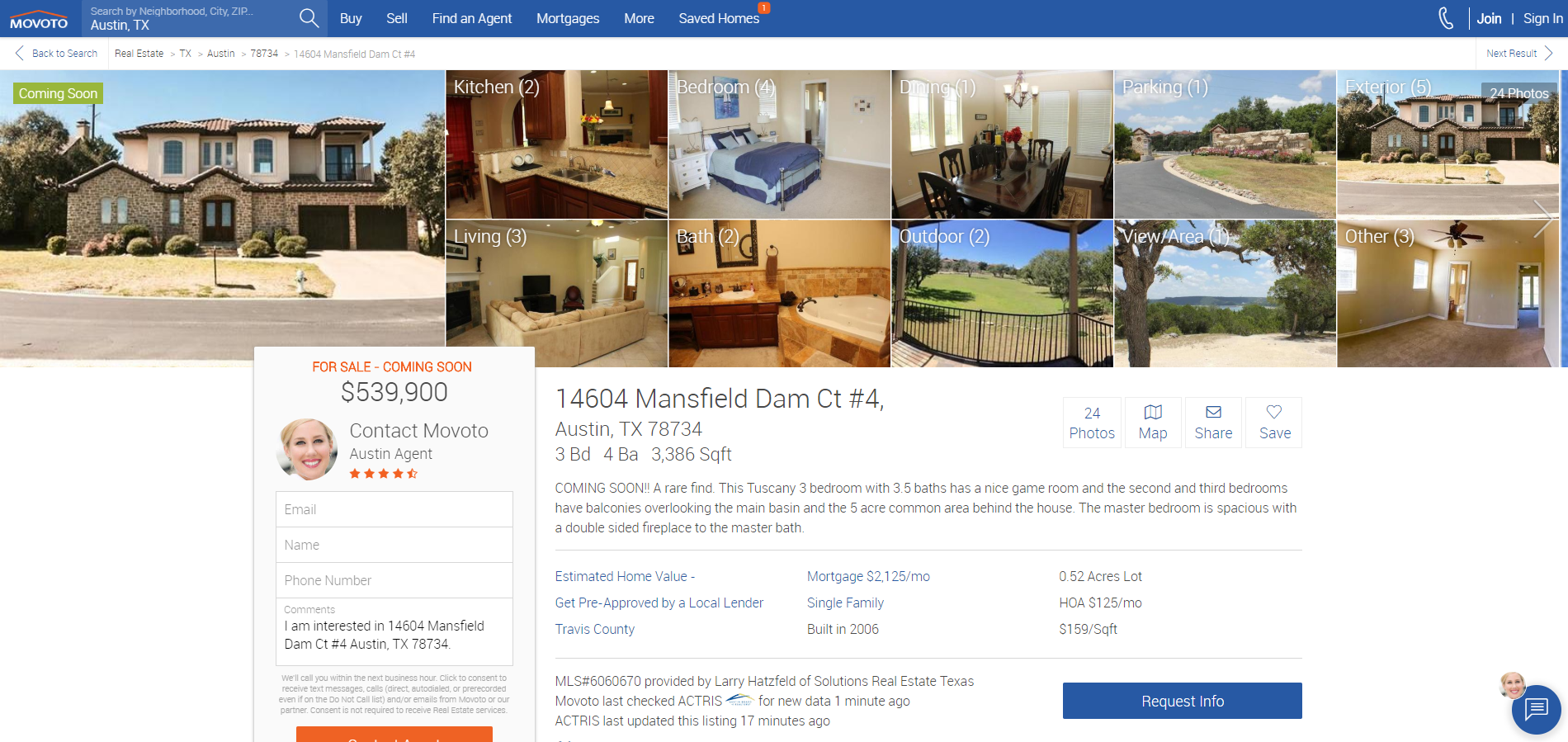
In regards to intuitive web designs, Movoto really grasps the concept of unencumbered design and plenty of white negative space on their site. Once you enter the property listing standalone page, you can easily understand the home and neighborhood overview. Information is presented with plenty of icons, accordion menus, and plenty of call to action buttons on the site. Clearly, the user experience is their top priority.
Strong textual description enables sellers to captivate the buyers without burdening the site. The gallery is multidirectional, and pictures are all full-screen so that you don’t miss any detail. The gallery is also organized by categories, and users can view the pictures both one below the other, or scrolling with arrows left and right. At all times, there is always a contact button, which makes conversions easier. Movoto has a viewing scheduler, a map with icons for important locations, points of interest and schools, and even easy to use share buttons.
6. Homes.com
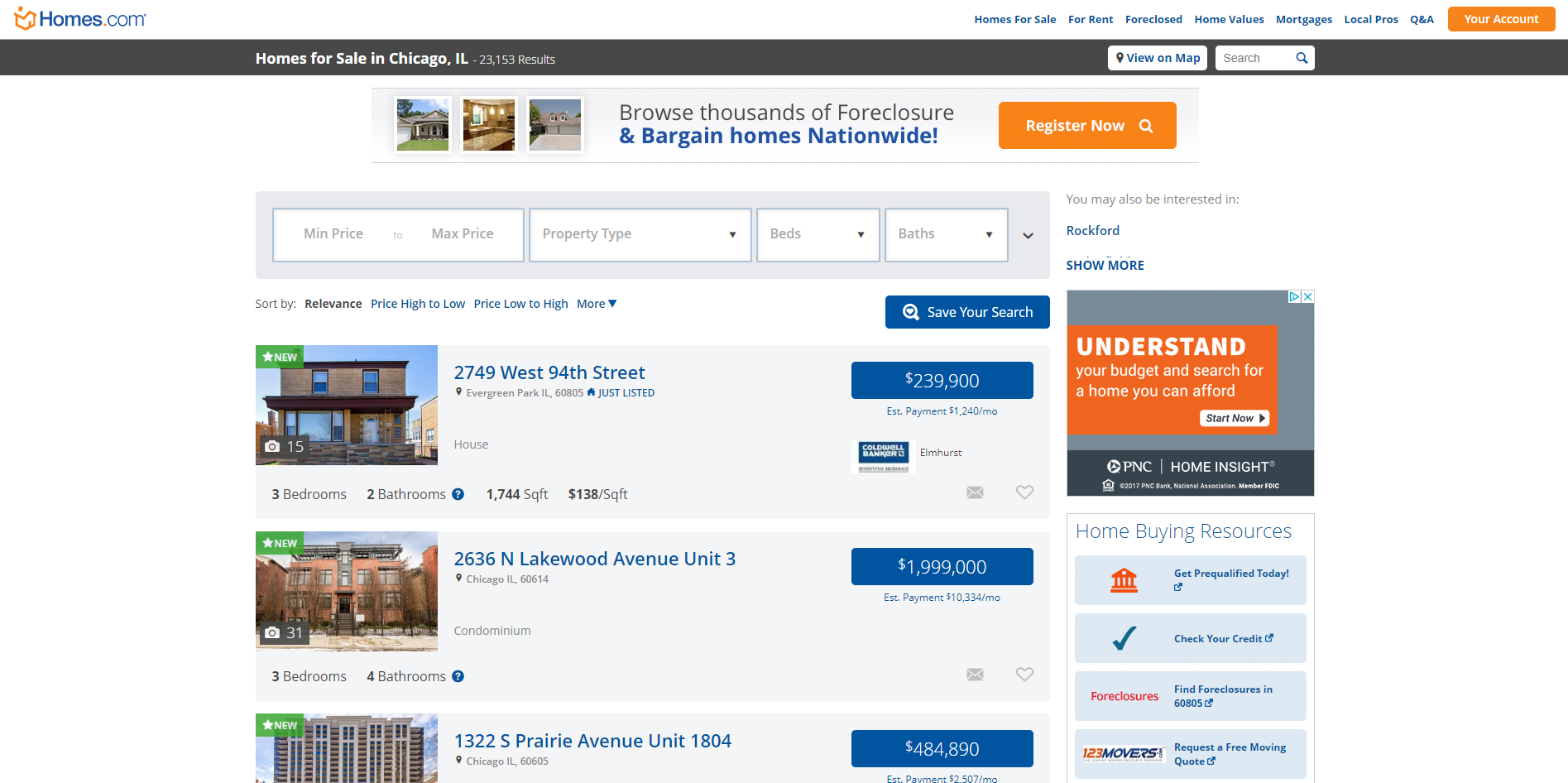
Homes.com is a website that has a lovely property listing overview, with plenty of negative space so that the listings don’t look crowded and small. The entire area of the listing is clickable, which is a great feature – people don’t have to hunt down for the buttons. But even if they did, the buttons on this website are very prominent and inviting. In fact, the buttons alone are one of the main reasons we included this site on our list. According to Crazy Egg’s guide to high-converting buttons, Homes.com’s buttons have good placement, optimal size, persuasive copy and good color scheme that stands out on the website -- all of which improve a business's online presence.
Homes.com lacks superior filtering options, which is the main downside of this website, but some elements are worth mentioning. On the right side, there is a Q&A section provided by the users and responses are answered by Homes.com community. Recommended listings below the viewed property are a nice way to extend the time spent on the website.
7. Apartment Guide
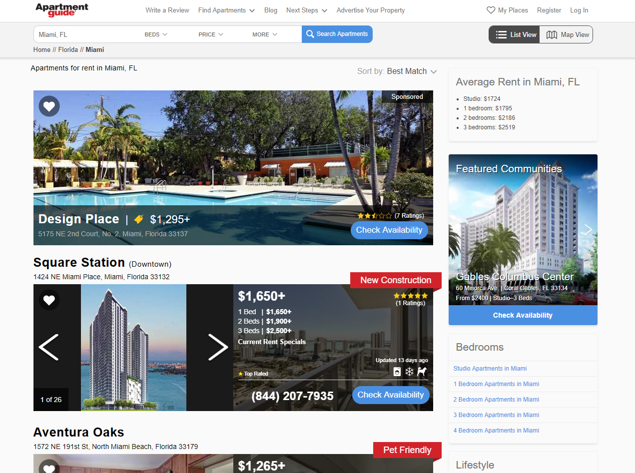
Apartment Guide has a very similar layout like Homes.com -- only better. Here’s why: The property list is very user-friendly and self-explanatory. Most websites use just one main photo for the listing, that’s supposed to captivate users enough so that they would look at the listing’s standalone page. However, Apartment Guide cleverly uses a gallery on the main picture, and even a second one covered with a dark transparent layer where you can find more information about the property.
This is a good tactic to show more pictures at the same time and avoid boring background, all the while achieving the unified layout. Each listing shows a rating if it’s available, and self-explanatory icons for amenities and pet policy. Users can easily save the properties they liked by pressing a heart-shaped icon. Inside the property listing, most information is presented through icons.
8. Redfin
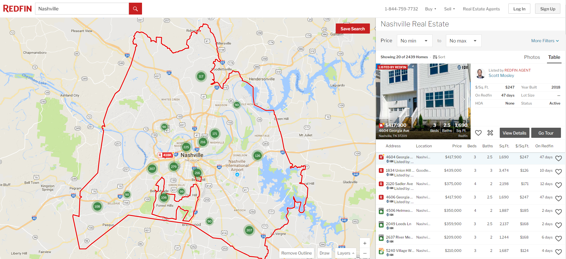
Redfin is one of the well-known real estate platforms due to the famous Redfin agents and their intuitive real estate website design. Redfin has one of the most elaborate property listings filled with additional information right from the dashboard, which increases customer satisfaction and browsing experience. Even though there is so much information, Redfin’s design still remains simple and light.
All important, conversion actions can be done from the dashboard – even the tour schedule. Apart from the functional layout, Redfin’s detailed view of properties adds value to the users. A picture gallery is very prominent, and pictures are professional. Listings come with a 3D virtual tours, which makes the property viewing more interactive. It’s definitely more fun than clicking and scrolling on static photos. And statistics back these claims – Aerial MG confessed that homes listed with 3D tours sell much faster than properties without them and that social media engagement has increased by a staggering 700 percent.
Redfin doesn’t encumber the listing page with too much information and leaves the website breathing by employing white negative spaces. A fixed sidebar on the right with a flashy red button is always captivating your attention, wherever you scroll, which makes conversions greater and scheduling easier.
Redfin also provides a payment calculator that at a first glance looks just informational, but it offers plenty of customization options that make the estimate more on point. Partnering with bank loans, Redfin lets users start the pre-qualification process and help them further with buying the property of their dreams.
9. Hotpads
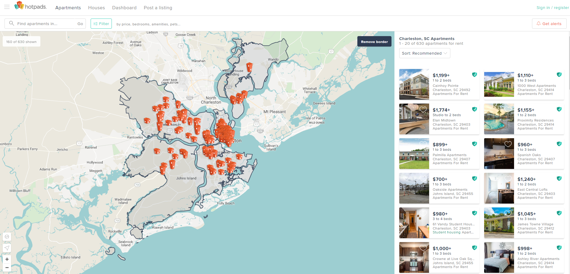
Hotpads offers similar search solutions like many of the competitors, including the interactive map and comprehensive listing layout. However, Hotpads also offers filters that are bundled by the property’s function. You can choose to view listings intended for seniors, students, military housing, corporate, and even see sublet properties and rooms for rent. There are even additional filters like bicycle and transit overlay.
Hotpads has a cool feature that lets you see the properties on the right while still remaining on the map view. When it comes to usability and design, this website has the best, and most visually appealing typeface on this list. The amenities are presented in a list form, where icons could have been more intuitive.
Another added value on Hotpads website are the estimated utility costs by using the UtilityScore. When we are talking about smart moves to drive more traffic to the website, Hotpads uses a cleverly placed and prominent share button under the property’s gallery. Today people want to hear opinions from friends and family, and this one-click solution makes this functionality easy to use.
10. Jason O'Beirne
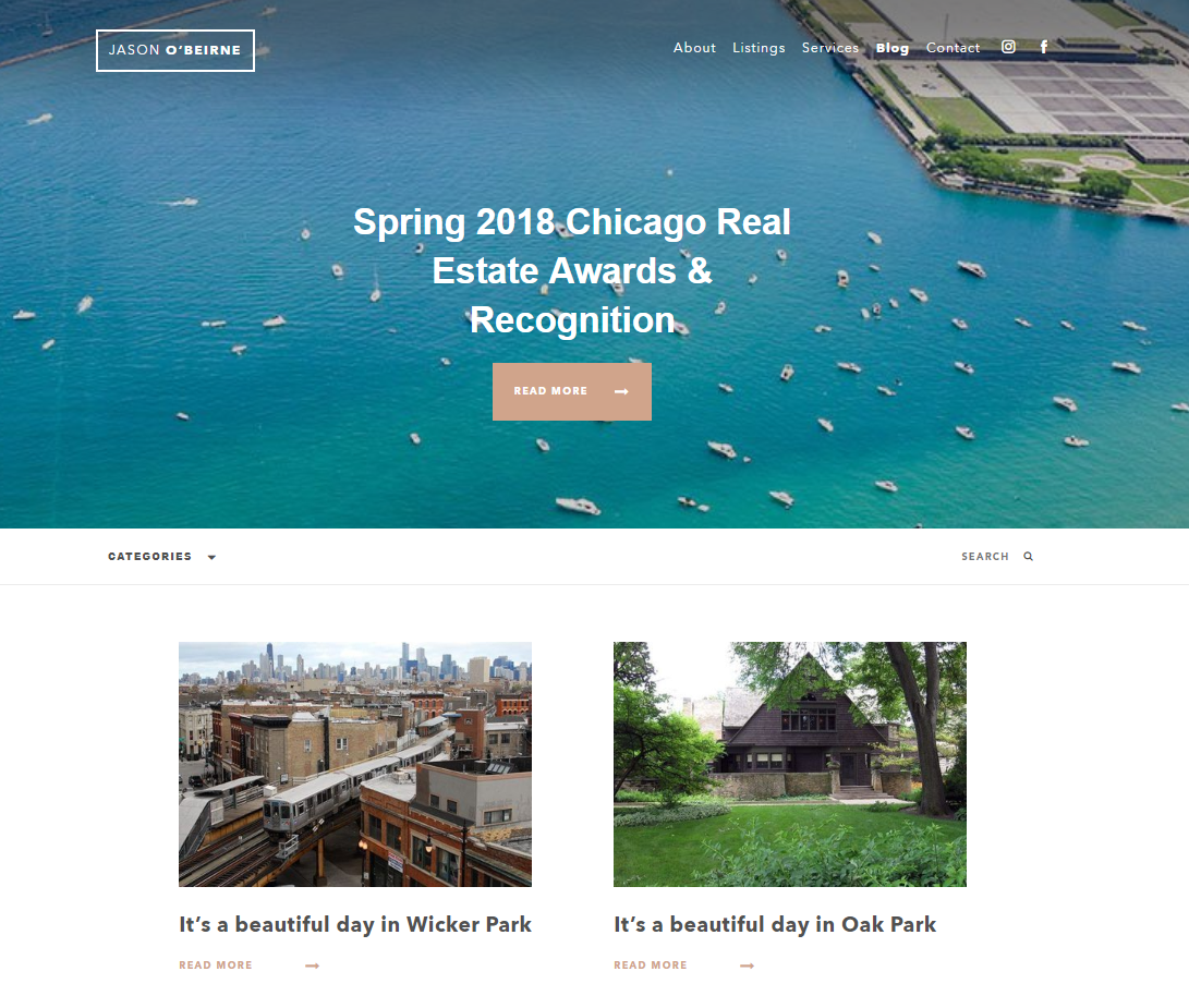
Giants aren't the only ones who get to play on the market! We have included a specific realtor’s website among the real estate search engines and platforms because the design is so captivating and fitted perfectly to the business model. The sleek color scheme of brown and gold adds prestige and looks nice in contrast to the white typeface. Bold website copy attracts attention, but the optimal length makes sure that visitors aren’t bored. Jason O'Beirne’s landing page has simple and effective business goals – lead nurturing, authority building and conversion.
That is while featured listings are so prominent and alluring. It is clear from the start that this website is custom made. When we observe the functionality, all property listings have information presented in tabs which is a relief from all others who use almost endless scrolling. An interactive map has plenty of filters and information embedded into it. Probably the most important tabs here would be the mortgage calculator and cost estimator. However, we have observed that the scheduler and contact info sit at the top of the property listing, and aren’t prominent enough, which may decrease the conversions.
The site also uses content marketing to generate more leads through Jason O'Beirne's blog. This digital marketing tactic shows business acumen, too -- real estate websites who blog get 55 percent more leads than those who don’t.
Websites, such as Jason's, should also be optimized for mobile search. Google’s 2015 update made mobile-responsiveness a viable SEO signal. A mobile-friendly website will now rank better than the website who isn’t optimized for mobile devices, even if you are conducting this search on a desktop device. Is your website friendly? Just paste the URL into Google’s console HERE to find out.
What Top Real Estate Websites Can Teach Other Industries About User-Friendly Design
So, what can we learn from this roundup? Ultimately, the best practices that top real estate search websites employ can be translated into the digital destinations of any industry to generate leads and increase conversions. Bu following the tips below, you'll be sure to design a user-friendly site that easy simple to navigate and pleasant to look at.
- Interactive maps -- such as overlays and heap maps -- both look great and improve website functionality.
- Optimize your site for mobile. One-third of all users use mobile devices to access real estate websites and browse listings -- and numbers for other industries can be much higher.
- Add interactive but personalized estimates, like the moving costs, mortgage estimates with bank offers and pre-qualification process, utility costs, and other tidbits that top real estate sites include.
- Don’t encumber your intuitive website with lengthy text. Present all viable information in a more graphic, visual way.
- Don’t skim on the filtering options – help people search for their dream purchase. Plus, a lack of filters (or ineffective ones) will only frustrate website visitors.
- Add big call buttons and clickable numbers. Google likes it, clients like it, and they bring more conversions.
- If applicable, add a scheduling page. Create an elaborate page for search results or a simple contact form, but make it visible and prominent.
- Offer similar search results to increase the overall time spent on the website and provide people with more options.
- Use social media, blogs, high-quality pictures and technology advancements like 3D tours to captivate your users and generate leads.
- At the end of the day, it's all about the added value. Many websites provide the same basic service, so the little details matter and will help you stand out from the crowd.

Our team ranks agencies worldwide to help you find a qualified partner. Visit our Agency Directory for the Top Web Development Companies, as well as:
- Top Real Estate Web Design Companies
- Real Estate SEO Services
- Front End Web Development Companies
- WordPress Development Companies
- Top Dallas Web Development Agencies
Our design experts also recognize the most innovative design projects across the globe. Visit our Awards section to see the best in web design.

