Jason Marc Wood is a talented designer and art director. Jason designs out of Australia and specializes in print, publication, packaging, typography, brand development, and application development.
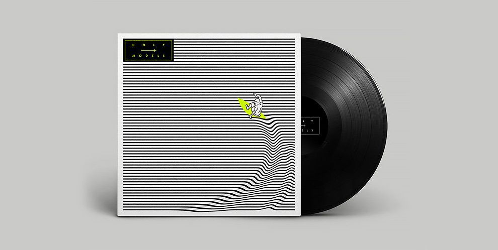
The following images are examples of best print design. The above image is an awesome vinyl record cover. The cover features horizontal black stripes on a white background. Rippling through the stripes is a surfer. This is a phenomenal visual illusion effect that makes the print look three dimensional. The highlighter yellow surfboard really stands out against the black and white background.
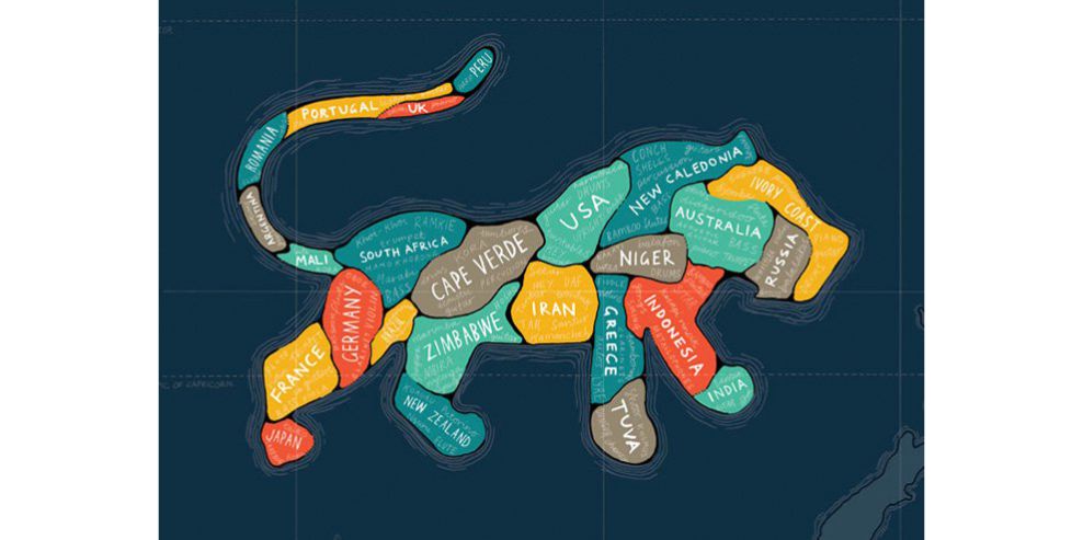
Next is a poster for sounds of the planet 2008 music festival. Jason chose a lion which is present in many of the countries where the festival toured and infused the shapes of the countries into the lion’s body. The blue ocean background shows a compass and represents the idea that music transcends all lands and oceans.
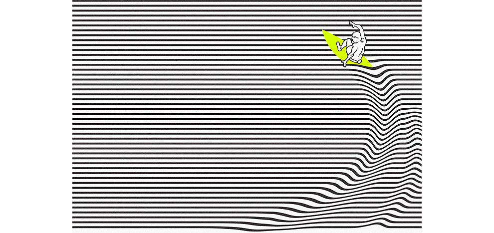
This is a close-up view of the stunning visual and abstract illusion of the above vinyl record album art. If the viewer stares at the ripple, the entire design moves and plays a trick on the eyes. It represents the movement of sound and the movement of the surfer. This is a mind-boggling and awesome use of print design mastery.
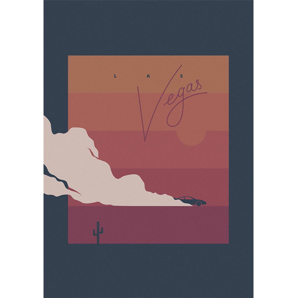
Here is a very mellow print design poster for Las Vegas. A classic Las Vegas-style font is used and very minimal. The rectangle is split up into horizontal squares depicting different shades of red and orange for the Las Vegas heat.
A fast car speeds away in the desert past a lonesome cactus as the cloud of sand and dust leaves a trail in its wake. The dark background blends into the cactus and car and is a wonderful use of minimal artistic elements. The smoke clearing the scene gives the poster a three-dimensional feel that adds to the uniqueness.
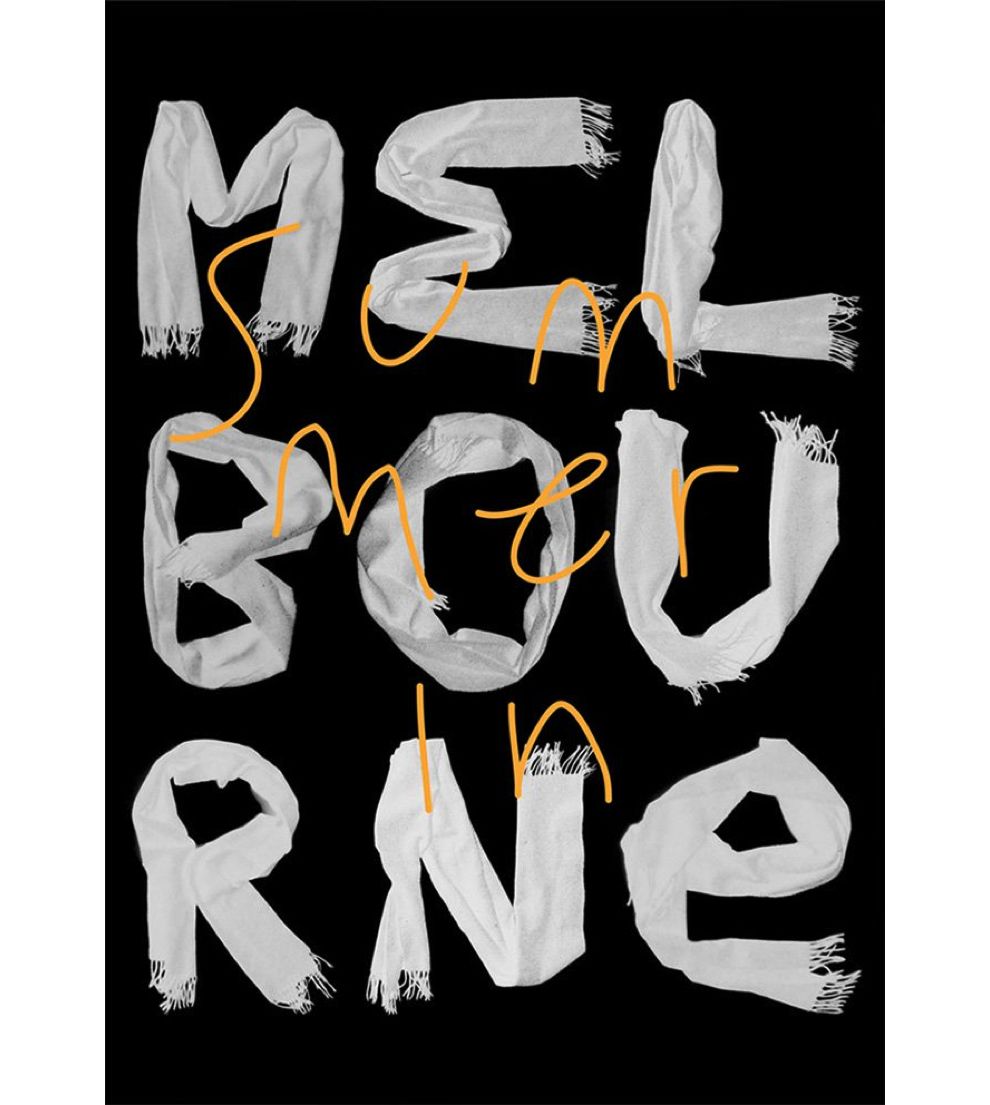
Jason creates a brash poster for the city of Melbourne. The word Melbourne is spelled out in cloth on a black background. The white letters pop out and the use of the towels provide a creative and unique aesthetic. The words “summer” are drawn in a font that resembles handwriting and bright yellow. This is a great example of color contrasting and it makes the poster indistinguishable from any that came before it. This poster will create an imprint in the memory of the viewer. It looks gorgeous.
Jason’s portfolio demonstrates his wide-reaching creative design talent. The above print designs showcase his outside of the box thinking, color contrasting, and mastery of print design. The best print designs are pieces of art. They stand alone amongst the thousands of prints that follow or precede them.
The only way to accomplish this is through outside of the box thinking. One must study this craft and the only way to do so is by continuous learning and analysis of the best print designs that exist.
For that we have you covered. Head on over to our best print design section here to continue your design journey and accelerate your creativity through inspiration.
Art Direction is an iconic print design in the Arts & Recreation and Entertainment industries.


