La Fine Dei Social's Print Design Stands Out With a Solid, Bold Cover Layout
The La Fine Dei Social book design, crafted by Blueorange, seizes the viewer's attention with a cover that is as thought-provoking as its content.
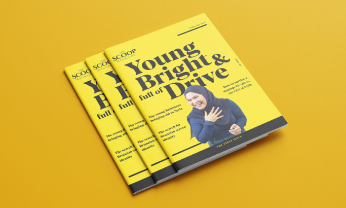
The book's exterior is vividly yellow, immediately setting a critical tone for the exploration within its pages.
This singular color ensures the book demands notice and perfectly echoes its disruptive insights on social media. (Know how to choose the right brand colors.)
The significant, uppercase title reinforces the book's presence and calls to scrutinize the digital world closely. One particularly compelling element is the strikethrough effect on the word "fine." It's a creative nod to the book's intent to dissect and discuss the complexities of social networking.
This design element cleverly conveys the message that all is not well in the online realm. It invites readers to delve into meaningful questioning and potential change.

The Print Design Communicates the Book's Bleak Panorama Through Stark, Angular Graphics
Within the pages of "La Fine Dei Social," graphics sharply illustrate the book's critique of social media's darker facets. With their clear-cut angles and geometric forms, these visuals craft a narrative of discomfort and disorientation.
The design choices extend to the typography, where words overlap in deliberate chaos. They perfectly symbolize the cacophony of voices on social media platforms – each clamoring to be heard, yet seldom listening.
This overlap effectively represents the communication breakdown among users and the conflict often resulting from online interactions.
The slanted paragraphs and angular lines underscore the book's central thesis. For all its potential to connect, social media equally harbors the capacity to divide. The book's reliance on stark, unsettling imagery also reflects a world destabilized by the very tools designed to bring users closer.
The print offers an intellectually rigorous and visually arresting experience through this bold fusion of text and visual design.
Explore some of the most impactful print designs to get inspired.

La Fine Dei Social's Print Design Strikes Readers With High-Impact Yet Legible Typography
The design's typographic approach highlights the book's intent to provoke thought without sacrificing the reader's ability to easily navigate and understand the content.
The wide spacing between paragraphs and the varying font sizes ensure readers can comfortably reflect on the provocative content. Larger and bolder fonts emphasize critical insights in the text. They draw the reader's focus to the core messages and facilitate an intuitive reading experience. (Learn more about brand typography here.)
Additionally, the design includes enlarged page numbers. These design touches add to the book's aesthetic and serve as helpful navigational tools.
Many seasoned print designers treat typography as an art form and a communication tool, showing how typefaces can be manipulated to send powerful messages. Evidently, La Fine Dei Social leverages typography's potential to enhance print media's aesthetic and functional aspects.

La Fine Dei Social's Book Layout Enhances Reading Comprehension Through Subtle Design Breaks
The best print designs don't just guide the eye; they also stimulate the mind. The book thoughtfully incorporates design pauses through full-page graphics that act as visual and cognitive breaks. They give readers enough space to contemplate the book's unsettling yet essential messages.
Clear pagination throughout the book also offers subtle, practical guidance. This design technique helps readers navigate the intricate discussions inside. When a layout effectively enhances engagement, the content's critical insights are fully comprehended and pondered upon.
Every design element here is meticulously engineered to support the central theme – from the impactful yellow cover to the strikingly clear typography. Deliberate and thoughtful print designs like this can render complex information accessible and profound.
This attention-grabbing and reader-centric design approach makes La Fine Dei Social deserving of the Best Designs Award for April.