Eat.che is the mobile extension of a nutritional supplement brand, offering users AI-enhanced food tracking to optimize their wellness journey. To bring this vision to life, Ukraine-based agency Pocolo crafted an elegant, responsive app experience that’s as intelligent as it is inviting.
Industry Insight: With 58% of smartphone users preferring apps that remember preferences and behaviors, Eat.che’s personalized UX strategy enhances engagement and brand loyalty.
Key Insights for Brands:
- Integrate AI with UX to create intuitive, context-aware tracking experiences.
- Use color psychology to enhance user interaction and perceived product efficacy.
- Apply minimalist interfaces to reduce cognitive load and improve data clarity.
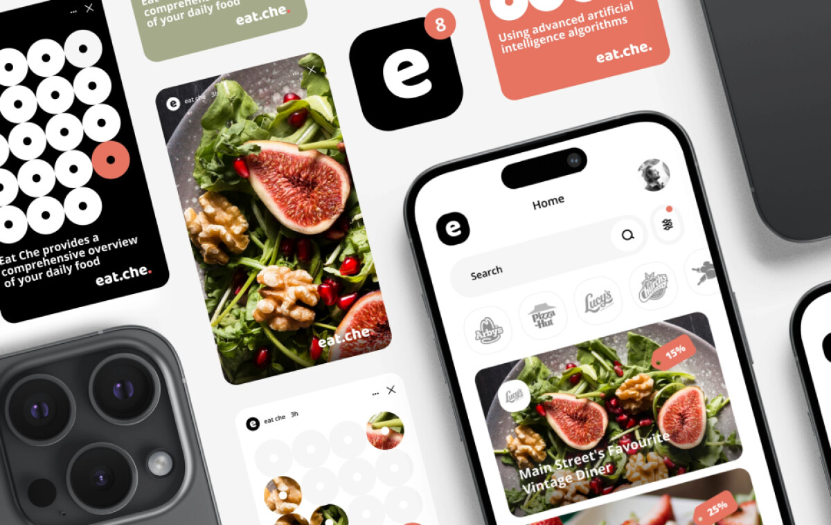
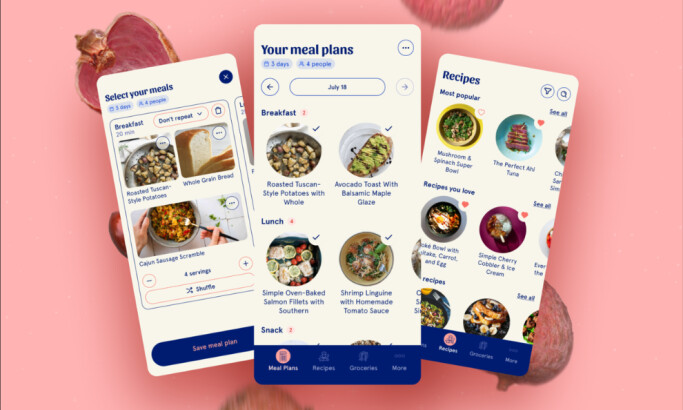
Clean Interface Design That Simplifies Complex Data
Eat.che’s interface, a hallmark of the best app design, keeps things simple so users feel comfortable right away.
The clean white background works with strong black text and coral-orange accents, giving the page warmth without clutter. Nutritional details, including calories, proteins, fats, and carbs, sit inside clear modules so the layout feels structured and easy to read.
Generous whitespace and a steady grid help the eye move naturally, reducing friction as users check their daily stats. This clear rhythm between filled and open space helps information register faster. Through this balance, Eat.che encourages steady use without draining attention.
"Creative conceptual execution of design using elements to reinforce the brand."
- DesignRush Awards Jury Panel
This aligns with research from Lazard et al. (2014), which found that users generally have a preference for designs with low visual complexity, especially for effective online health communication, making the app feel approachable.
Pocolo’s App Design Includes Multi-Device Integration
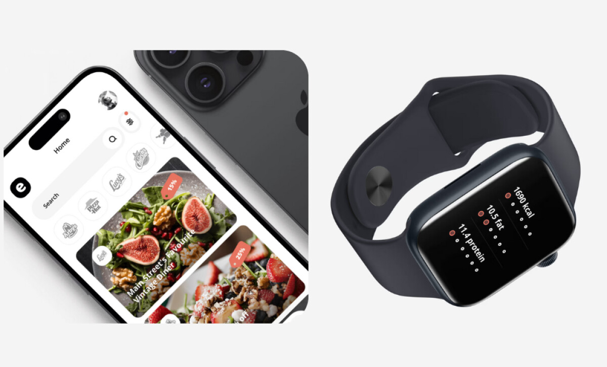
Designed for a connected lifestyle, the app moves seamlessly between phone and smartwatch.
The watch version keeps the same visual rhythm as the mobile app but trims the layout for quick access.
Users can check calorie intake or burned macros while staying active, with data updating instantly across every device.
Consistent colors, typography, icons, and motion patterns tie the experience together. This shared design language reduces the learning curve and builds familiarity. Whether checking stats during a run or logging a meal, the interface feels stable and predictable across all screens.
Learn more about strengthening consumer trust by being consistent.
The App Features Intelligent Personalization That Motivates
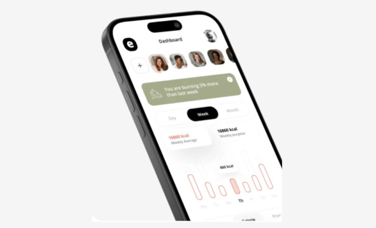
Central to Eat.che’s success is its smart use of artificial intelligence It studies patterns like how often meals are logged, preferred nutrients, and activity levels, then turns that data into simple visuals.
Progress bars, color-coded charts, and banners such as “Burning 5% more than last week” make feedback quick to grasp and motivating to act on.
Instead of flooding users with numbers, the system focuses on clear insights that guide better choices day by day. Its tone stays warm and encouraging, helping people form lasting habits through positive reinforcement. Every suggestion feels personal because it grows from each user’s own behavior.
This thoughtful use of AI creates a feeling of connection. People sense that the app understands their rhythm, which keeps them engaged and committed over time.
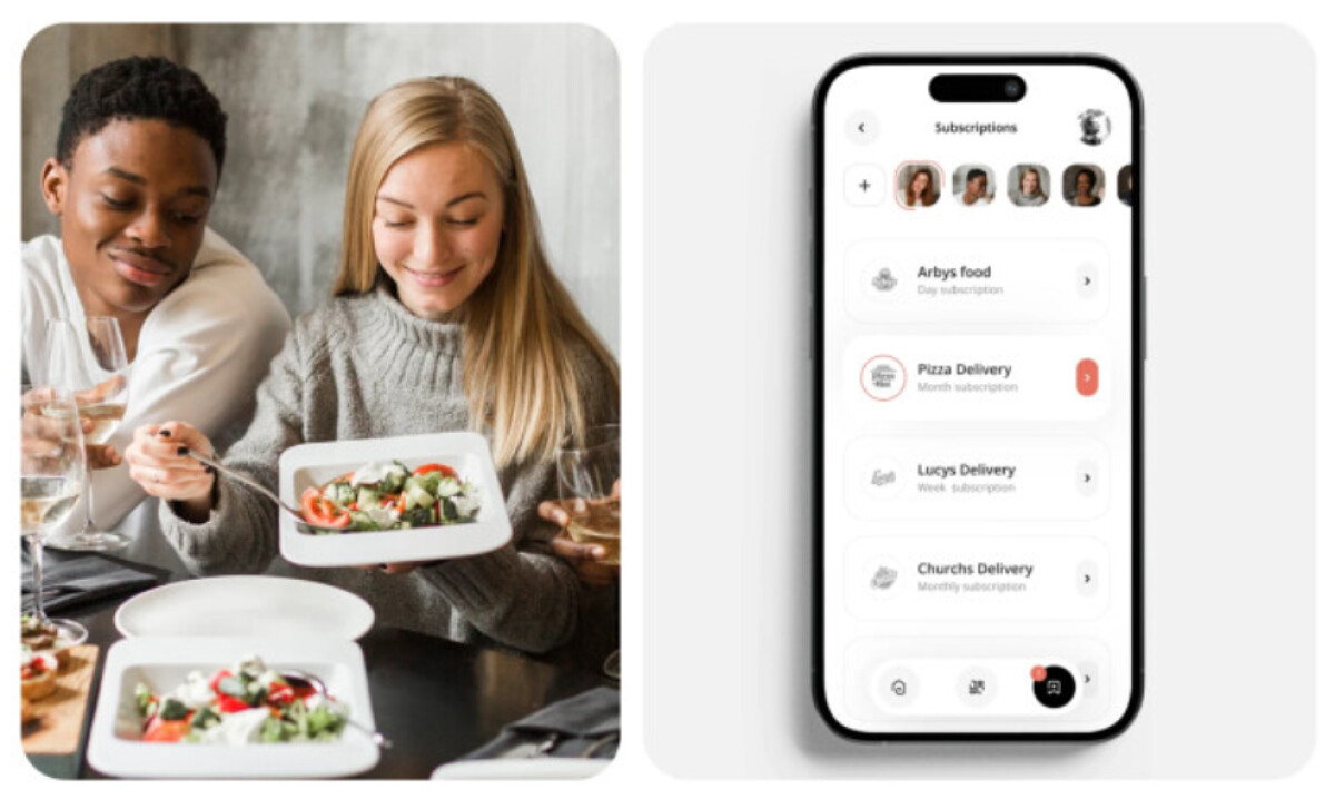
Visual Storytelling That Connects Health to Life
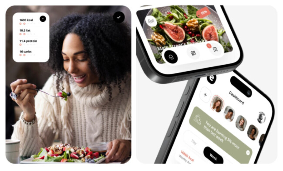
Pocolo, demonstrating the holistic strategy of top app design agencies, builds on the app’s presence through lifestyle-focused visuals in its marketing.
Instead of polished mockups, the creative team shows real people sharing meals, with subtle UI overlays that hint at how the app fits into daily moments. This approach connects digital tracking to real experiences.
Each scene helps viewers picture themselves using the app naturally. Soft, diffused lighting and a diverse range of people make the imagery feel warm and genuine. The tone stays approachable, showing that nutrition tracking can belong to a joyful and balanced life rather than a strict routine.
Blending the interface with everyday photography turns the app into a familiar companion. It reframes wellness tracking as something empowering and human, not clinical or distant.
What Brands & Agencies Can Learn from Eat.che
Pocolo’s work on Eat.che shows how simplicity, intelligence, and ecosystem thinking can transform a functional app into an engaging lifestyle tool.
Here’s what creative teams can take away:
1. Design Data to Feel Human
Complex information becomes approachable when visualized clearly and with empathy. By using clean grids, soft accents, and readable typography, brands can turn analytics into insight that feels encouraging rather than clinical.
2. Build Seamless Ecosystems
Consistent design language across devices enhances trust and usability. Pocolo’s cross-platform coherence ensures that whether users log meals on a phone or check calories on a smartwatch, the experience feels unified and dependable.
3. Balance Intelligence with Emotion
AI integration should empower users, not intimidate them. Pairing smart feedback with a relatable tone and intuitive visuals helps brands create technology that feels both advanced and emotionally supportive, encouraging lasting engagement.
About DesignRush Featured Designs
At DesignRush, we review hundreds of agency projects each month. The featured works highlight creativity, brand coherence, and craftsmanship across categories.
The most compelling designs advance to be recognized as Monthly Design Awards winners, earning distinction for originality and execution.
Discover more inspiring projects:
- Best App Designs
- Best Packaging Designs
- Best Website Designs
- Best Logo Designs
- Best Print Designs
- Best Video Designs
For a full list of design agencies and related services, visit our Agency Directory.


-preview.jpg)

-preview.jpg)

-preview.jpg)

-preview.jpg)

-preview.jpg)
-preview.jpg)
-preview.jpg)