
Israel Railways App Design Is All About The (User) Journey
Israel Railways (IR) is a government-owned company responsible for transporting passengers and cargo all over the country. It aims to make connections, not only between cities and communities but also through its digital tracks.
To help them reach this destination, they worked with UXpert agency to launch a brand-new app that allows users to plan their journey quickly, efficiently and conveniently.
Israel Railways' app design doesn’t rely on innovation per se but rather on implementing the latest UI/UX practices that the best mobile app development companies employ. These help the rail transport system become more accessible to the general public.
The union of digital commodities and large-scale rail infrastructure helps reduce travel distances and makes every ride easier, safer and faster.
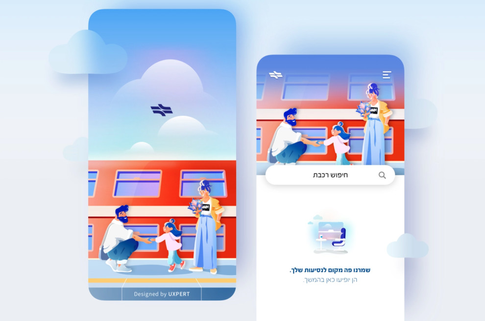
The app sports a responsive interface that offers users concise instructions when traveling with the bonus of considering their search history and active location to display the nearest stations.

The Israel Railways App Simplifies Travel with a Multitude of Advantageous Features
Prospective travelers are not actually looking for an authoritative digital guide pointing them in the “right” direction but rather a full-service compass offering a slew of attractive choices such as:
- Nearby stations: When planning a new ride, users usually want to travel from the nearest station, so the app provides a quick list of nearby stops, sorted by distance from the user’s location.
- Time selection: The majority of travelers usually plan a ride on the same day or just the day before. Israel Railways app doesn’t try to “punish” this pattern but finds the best and most convenient options as quickly as possible.
- Route details: Users can tap to see all stations and train swaps along the way.
- Important updates: In case of delays, platform changes and the like, updates are displayed automatically when relevant to the selected journey.
Other features users will likely appreciate include:
- Syncing selected train rides with the calendar
- Trip-fare calculator
- Reminders of getting off the train at the desired station
- Ride-sharing
- Viewing station information
- And more
Additionally, the app coordinates references to the following services:
- Contact customer service
- Coordinating accessible travel
- Request for compensation
- Lost and found
- Appealing for a payment requirement
- Payment of debt

On-Brand Color Palette and Whimsical Illustrations Add Zest to the Israel Railways App
Although Israel Railways app design is purpose-oriented, the “getting the job done” approach is not the only “train in the station,” if you will.
Getting the passengers from point A to point B, no matter how efficiently, wouldn’t exactly turn heads. UXpert’s creative team infused more life into the app with on-brand colors and friendly visuals.
As is customary for these types of apps, white is the primary background color. It also acts as a blank canvas or negative space that improves readability.
Like most branding agencies, the designers used color to create a cohesive visual identity while maintaining fluid user navigation. On-brand navy blue and yellow complement the prevalent whiteness in the app’s upper and bottom frame, while red accents (the color of IR’s trains) highlight important elements such as buttons and CTAs.
UXpert also added the delightful, albeit ubiquitous, SaaS illustration style that is very fitting for the app’s introductory header, backdrops and icons. It’s precisely these recognizable characters that let users identify and invest themselves in the onboarding process and start their journey, in every meaning of the word.
The Israel Railways App Is Organized, Clean and Straight to the Point
Tight, bright and focused – Israel Railways app design is a textbook example of good orientation and layout.
Luckily, a wide array of features doesn’t translate to a slew of subpages. With a menu bar that’s always visible, users have no problem jumping from page to page.
The app makes use of clean space, simple typography and destination-focused copy to provide users with the information they need right when and where they need it.
This simplistic navigation, combined with custom-made transitions and micro animations further emphasizes Israel Railways’s dedication to creating a unified and streamlined UX that puts users at ease while making them engaged and excited.
Israel Railways App Design Is a Masterclass in Practicality and Convenience
The Israel Railways app is a result of fully understanding the target audience and its main pain points. If you are their frequent rider, this is probably the most important application you can choose to install on your smartphone.
If you’re a tourist, this app puts the whole of Israel accessible from the palm of your hand, especially if you want to find your way around in an easy, enjoyable and cost-effective way, at any place and any time.
Developers worked carefully on UI and UX design, backend solutions and QA testing to keep it running buttery-smooth, regardless of the mobile platform.
Somehow, the app design balances scores of fancy features and still be straight-to-the-point, offering multiple convenient options without feeling cluttered. This achievement alone makes it a worthy winner of our Best Design Award for March 2022.


-preview.jpg)
