Sleepiest Mobile App Design Showcases a New Brand Character With Modern Visual Elements
Rebranding can make or break your business. It could lead your consumers to fully embrace your new character, react negatively to changes, or lose interest. There is no middle ground.
Cuberto's work for Sleepiest App design is an excellent example of a rebranding project done right! And it's no easy feat – considering the app has amassed over four million users. Expert branding design agencies work hand in hand with developers to create an on-brand platform like this.
The agency's proficient mobile app developers aimed to elevate the app's visual identity and refine its functionality for a more intuitive user experience. After testing dozens of design concepts, the right one clicked!
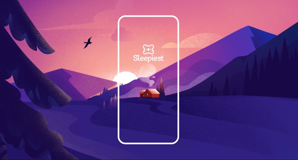
Sleepiest now sports a modern and vibrant brand character infused with that gentle and soothing aura. The new visual language offers a fresh yet familiar interaction from the clean and cutesy app icon to the spruced-up and streamlined lettering.
Learn the importance of a strong branding.
A mix of illustrations and icons, bright hues and micro-animated functional elements are all woven together to set the mood and submerge the user in the app's comforting space.
Let's break those design elements down, shall we?
Icons, Illustrations and Animations Bring Comfort and Relaxation in Sleepiest’s Mobile App Design
App designs loaded with visual elements can easily overwhelm a user. And for an app that aims to help people sleep better, that could be your biggest nightmare!
However, the designers for Sleepiest's mobile app managed to turn this ensemble into a visual masterpiece that is both striking and comforting.
How, exactly?
The colorful illustrations of beautiful sceneries and landscapes create an atmosphere that effectively induces relaxation. Mobile app developers that work on wellbeing-focused projects like this would agree that being close to nature always brings a rush of comfort and solace, thus, looking at these digital paintings gives you that same experience!
But that's not all – 3D animations populate the app, too! Animated scenes of mountain ranges, bodies of water and cute animals interacting with nature snatch attention and spark joy among users (See the best animated videos).
The soft and faded transition between controls, buttons and other app functionalities adds a layer of comfort to the overall browsing experience.
Sleepiest App’s Features and Customization Options Offer a Seamless User Interaction
When trying to commit to a healthy sleeping lifestyle, you want an app that guides you through the process. Even with a basket of options designed for sleep configuration and habit creation, Sleepiest delivers smooth and intuitive app interactions.
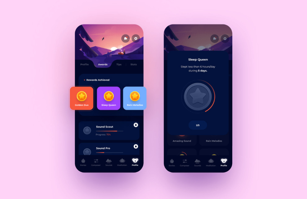
The main dashboard contains all users' daily sleeping schedules and lifestyle essentials. It includes sections for content recommendations, sleep habit trackers, saved items, inboxes and more.
It even offers a tailor-made sleeping habit that new users can start with!
The library section is filled with an extensive collection of sleep-inducing content such as meditations, soundscapes, stories, etc. The selections are neatly contained in boxes, each one dressed with a unique cover that matches the vibe.
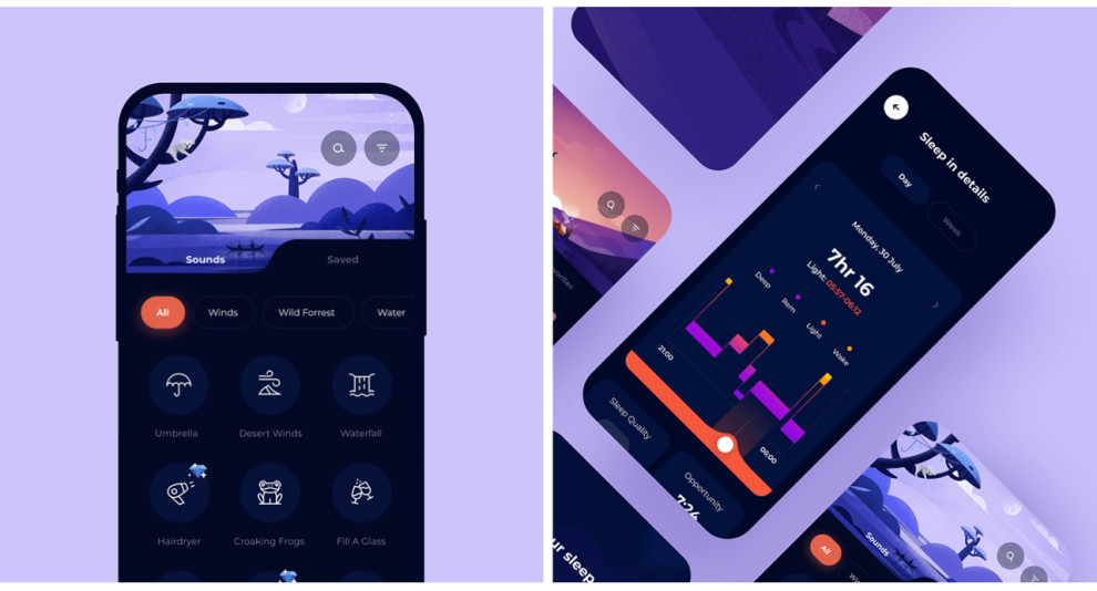
On the Create section, users are free to configure their own sleep-inducing sounds like Rain on the Window, Crackling Fire, Leafy Breeze... and the list goes on! The options are appropriately categorized into sections for easy access. They are also displayed in flat icons, which makes the design look clean and organized.

Sleepiest App Design by Cuberto Marries a Dynamic and Vibrant Identity With a Dark-Themed UI
Many apps dress their interface in night mode to modernize and streamline the design. After all, being easy on the eyes is a MUST for app designs, especially for sleep-inducing tools like Sleepiest.
However, the app designers at Cuberto didn't just settle for a dark theme. They added several pops of color by incorporating bright hues and vibrant objects into the design.
Using a deep, dark purple as the main background for the app interface was a perfect choice – neutral yet warm and alluring. Then, the designers painted the buttons and app sections in lighter shades of violet, complementing the dark theme! (Here are dark-themed web designs to inspire you)
The agency infused vivid colors such as yellow, blue, red and green into the design for that extra visual flavor. They don't clash with the leading brand theme, making the design cohesive in color. These shades were only used as enhancers in minor visual elements like icons and small illustrations.
It's a risk that clearly paid off!


