Every outlet covering this rollout is telling the same tidy story: Google shipped fresher icons, they look more modern, and you can finally tell your apps apart.
All true. All beside the point.
The story worth telling is not the new icons. It is what they confess about the old ones, and what it says that the world's most resourced design organization spent six years insisting a broken system worked fine.
What Actually Changed
Starting May 18, 2026, Google began swapping in a new gradient-based icon system across Workspace, first in the web app launcher and Chrome's New Tab page, then across iOS and Android over the following weeks.
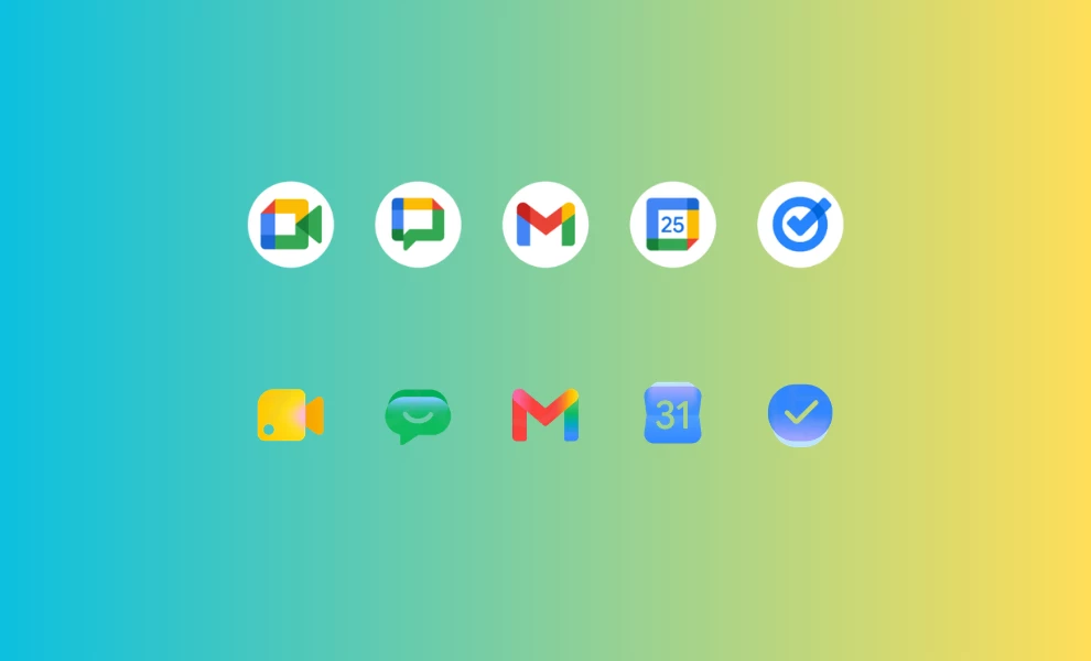
The redesign covers Gmail, Drive, Docs, Sheets, Slides, Calendar, Chat, Meet, Vids, Forms, Keep, Voice and Tasks. There is no toggle and no admin control. The new look simply arrives.
The mechanics matter more than the gloss. Google dropped the rule that defined the last era: the requirement that nearly every icon carry all four brand colors, blue, red, yellow and green.
In its place are dominant single colors, soft gradientsgradients, and rounder geometry. Chat and Meet now lean on one primary color instead of the old multicolor jumble. Sheets and Slides shifted to a landscape orientation. The Workspace container came off so each mark can run larger and read as its own thing.
The look carries a real risk, one design critics have already flagged: the gradient wave can curdle into its own kind of sameness, a prettier uniformity that sands down the distinctiveness the redesign set out to restore.
But the structural change underneath, shape and color sharing the identification work instead of color carrying all of it, is the part that fixes something real.
What the 2020 Icons Got Wrong
The standard complaint about the 2020 set was that the icons "looked the same." That is the symptom, not the cause.
The real failure broke a basic principle. Strong icon systems use redundant coding, where shape, color and form each carry part of the recognition signal, so the mark holds up when conditions get rough.
The 2020 system put nearly all of that weight on color. At 16x16 pixels, the size of a browser favicon, a notification glyph or an entry in a crowded mobile app drawer, color stops doing the job.
Drop the gradients and the fine detail at that size and Gmail, Meet and Chat collapsed into near-identical chips of the same four hues.
This was never a question of taste. It was a measurable miss for a system serving roughly 3 billion people, plenty of them color-blind, most of them scanning fast while doing something else.
An icon has one job, instant recognition, and the 2020 set made you stop and read. Rules of logo design put recognizability and simplicity at the top of the list for exactly this reason.
The Tell: Users Did Google's Work for Free
Here is the detail that should have closed the internal debate years ago. Within weeks of the 2020 launch, designer Claudio Postinghel built a Chrome extension called "Restore old Google icons" to revert Gmail, Calendar and Meet to their older, distinguishable forms.
It spread fast, because people could not tell their tabs apart mid-call, and the design press piled on at the time.
Sit with what that represents. Unpaid users performed corrective design labor on a product used by billions, because the company that owned it would not.
That is not a vocal minority registering a preference. It is the loudest usability signal there is, people building tools to undo your decision, and it sat in plain view for six years.
So the question stands: how does a design organization this talented and this funded ship something that fails at the floor of its function, then defend it for six years?
The answer is institutional, not creative.
Large design systems can wall a decision off from feedback. Brand consistency becomes the target, the four-color rule hardens into doctrine, and "part of the same family" starts to count for more than "I can find the app."
The process protects the decision until the evidence gets too loud to override. In 2026 it finally did.
The best logo redesigns tend to answer a clear "why" before a single pixel moves. This one answered it late.
The AI Reframe
Now the strategic gloss. The new gradients do not just resemble Gemini, they come from the same well.
At Google I/O on May 19, one day after the icons started showing up, Google introduced Neural Expressive, a design language built for Gemini around fluid motion, vibrant color and gradients meant to suggest, in the team's words, the movement of energy behind the glass.
The icon refresh and the AI rebrand rhyme on purpose.
As product strategy the logic is plain: unify the productivity suite and the AI products under one identity so every Google surface reads as part of the same intelligent system.
As honest accounting it is a stretch. The icons needed fixing on usability grounds that have nothing to do with AI.
Pinning the repair to an AI story lets a correction pass for a vision. It also gets ahead of adoption, tying Docs, Sheets and Keep to an AI look before most people have picked up the AI features those gradients are supposed to signal.
This is happening even as a parallel design conversation pushes the other way, toward hand-made, deliberately imperfect work that signals a human made it.
Tidy for the boardroom. A little presumptuous for the app drawer.
The Human Cost of a 60-Pixel Failure
Icon design is some of the most intimate visual communication there is.
You touch these marks dozens of times a day, every day, for years, on the device in your pocket.
When one fails, the frustration runs far past the size of the object. A 60-pixel mistake feels enormous at 9 a.m. when you are trying to join a call and you tap Chat instead of Meet for the third time.
That is the part the surface coverage skips.
The 2020 icons did not only look uniform. They taxed millions of small moments, quietly, every day, for years. The fix does not feel exciting because it gives back something we should never have lost.
The Public Verdict
Reaction has split.
Plenty of users welcome the change as cleaner and easier to scan, glad Google finally moved. But a loud group on Reddit and social, especially long-time Workspace users, argues the softer gradients and lower contrast make Sheets, Keep and Drive harder to spot rather than easier, and that muscle memory built on the old flat colors now misfires.
Both can hold. Here is where I land. The new system is a real improvement, because shape and color finally share the load, and that is the right structural call.
But Google traded one legibility risk for another. Heavy gradients and reduced contrast carry their own small-size hazard, and "modern" is not a synonym for "recognizable."
The redesign passes for fixing the architecture. It loses points for chasing the AI-era glow hard enough to reintroduce the contrast problem it spent six years learning to fear.
Google did not arrive here on inspiration. It arrived on evidence it could no longer outvote.
The takeaway has little to do with gradients. The priciest design failures are the ones an organization is built to keep defending.
For anyone studying how brand identities should evolve, that is the lesson worth keeping. 
Our team ranks agencies worldwide to help you find a qualified partner. Visit our Agency Directory for the Top UI/UX Design Companies as well as:
- Top App Design Companies
- Top Branding Companies
- Top Graphic Design Companies
- Top Product Design Companies