Archetype Aesthetics isn’t just another wellness brand. Based in Sunrise, Florida, they came in with a clear ambition: to embody modern luxury without slipping into cliché.
And when they teamed up with Second Society, the challenge wasn’t to simply make something elegant; it was to give elegance a bold, contemporary pulse.
The logo that emerged doesn’t sit on the surface as decoration. It's a logo that works harder, acting as a brand anchor with real presence and utility.
Industry Insight: According to recent studies, 60% of Fortune 500 companies use combination logos, blending text and imagery to boost brand recall and memorability. Archetype follows suit with a system designed for real-world impact.
Key Insights for Brands
- Custom letterforms build a bold personality while improving readability across media.
- Geometric submark design turns initials into a scalable, modular brand system.
- Elegant color palette enhances emotional engagement and brand trust.
Archetype Sports Typography That’s Both Strong and Considered
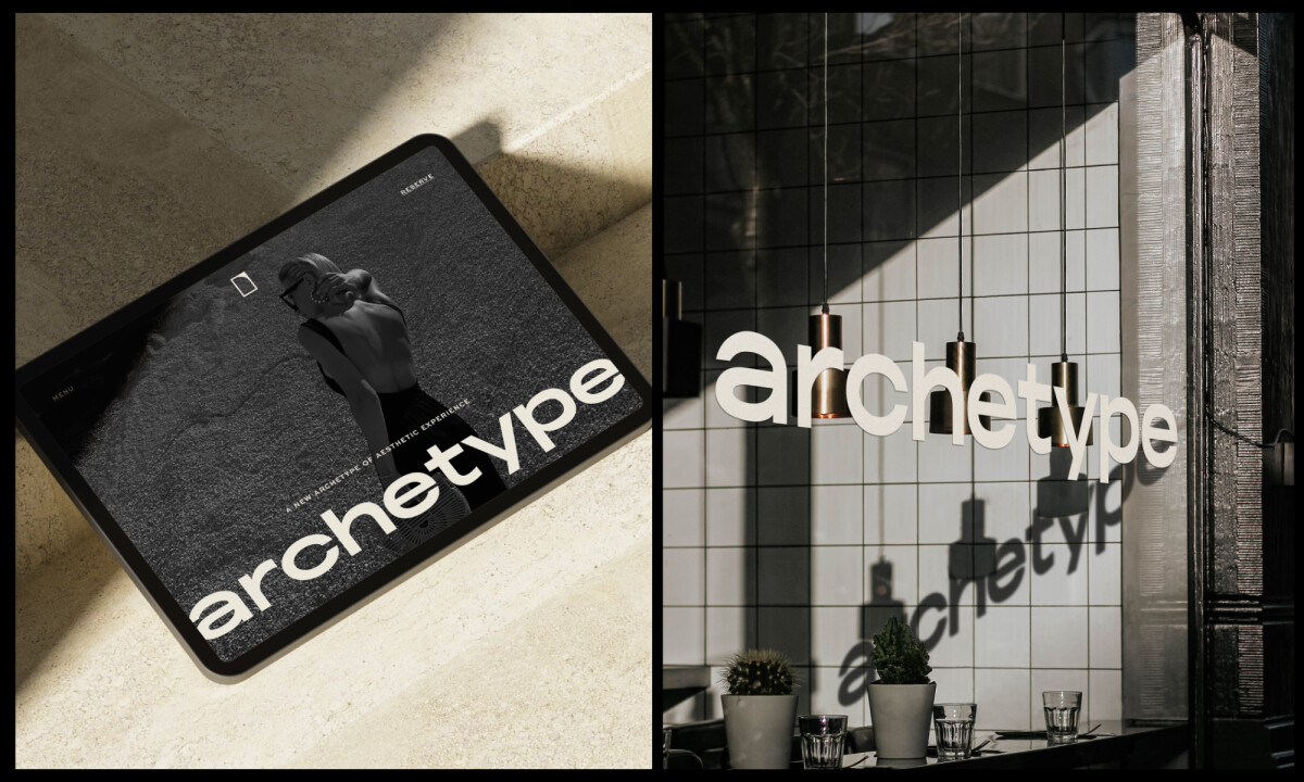
As someone who analyzes logos for their strategic function, not just their style, I tend to turn my attention to typographic systems first. And in this case, I found that what I appreciate most in Archetype’s logo is the precision.
The lowercase wordmark goes a step above clean typography so that it’s a fully customized design built for distinction.
Letters like "a," "c," and "p" have been subtly modified to appear rounder, fuller, and more balanced, which gives the entire identity a unique, editorial voice.
The shortened ascenders and descenders are also a smart move.
Visually, they ground the brand. Strategically, they make the logo more usable across narrow-height formats like product labels and packaging. That’s expertise that takes the design beyond the canvas.
Archetype’s Geometric Submark Anchors Brand Flexibility
Let’s talk submarks. Too often, these secondary elements are an afterthought. Not here.
The Archetypesymbol is built from the brand’s initials, two mirrored and rotated “A” shapes, and it lands with visual weight.
It’s architectural in its symmetry and unmistakably modern in its execution.
This submark more than aesthetically pleasing; it also works. One can see it scaling from social icons to embossed packaging without losing clarity.
That’s a huge plus in today's omnichannel environment, where brand consistency across formats is non-negotiable.
The right logo type can make or break a brand. Learn which style syncs with your identity now.
Color Strategy Rooted in Emotional Intelligence
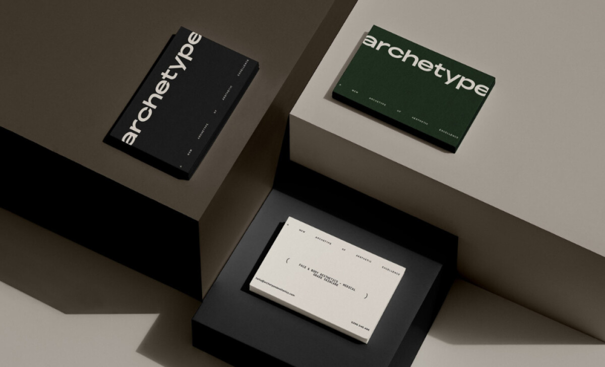
The palette, rich greens, calming neutrals, and deep blacks, carries a lot of strategic weight. These choices do more than just pick up what's trending.
They reflect the brand’s mission: to create an atmosphere of sophistication without being clinical.
Green, used as the primary color, communicates restoration and a sense of premium value.
Research on luxury branding shows that green can heighten perceptions of exclusivity and status, making it a powerful signal for brands in the wellness and aesthetics space.
The neutral base ensures balance and timelessness, while the depth of black reinforces authority, long recognized as a core color in luxury brand advertising for its association with prestige and glamour.
As a branding professional, I often see brands lean too hard into either minimalism or maximalism. Archetype hits that rare middle ground: elegant, intentional, and mature.
Colors say more than words. Learn how to use color psychology to define your brand.
A Combination Logo With Real Business Value
Here’s where this identity system really earns its award-winning status. It’s a combination logo: a typographic wordmark paired with a symbolic monogram.
There's a stylistic flourish, but it’s supported by brand science. Studies show that symbolic branding deepens identity and loyalty, as consumers form stronger emotional bonds when visuals reinforce brand meaning.
In parallel, research on symbolic logos highlights how dual elements improve recall and functional perception, making the brand feel more memorable and trustworthy.
Archetype leans into this logic effortlessly. The monogram brings compact elegance, while the wordmark anchors the brand’s voice.
Together, they create a system that is both versatile and resonant: a dual structure with singular impact.Explore 35 iconic brand emblems and discover the secrets behind their staying power.
What Agencies Can Learn from Second Society
When I review Second Society’s identity for Archetype Aesthetics, I see more than an elegant logo.
I see a blueprint that other agencies can learn from, especially when it comes to designing for high-end, emotionally driven brands:
1. Build systems, not just logosWhat impresses me here is how the logo doesn’t exist in isolation. It’s part of a flexible identity system.
The combination mark, monogram, and wordmark each serve different roles across brand touchpoints, from digital headers to packaging to social icons.
2. Use restraint as a branding strategyThere’s a quiet confidence in the design that doesn’t rely on trends or visual noise.
The muted palette, custom typography, and symmetrical monogram all signal intentionality: a design that speaks without shouting.
It’s a reminder: great branding often comes down to what you leave out, not what you add in.
3. Let form follow the brand’s valuesSecond Society clearly built this identity around the client’s brand personality: mature, bold, subtly feminine. Every design choice, from the letterform tweaks to the geometric submark, maps back to those values.
Too often, agencies start with aesthetics. Second Society starts with the brand. That’s the real lesson here.
As someone who’s evaluated identity systems across industries, I see this project as a standout example of design discipline. Second Society’s work proves that minimal doesn’t mean “simple” it means smart.
In luxury branding, elegance isn’t about excess. It’s about control, clarity, and presence. The strongest identities speak softly but leave a lasting mark.
Explore more top design projects here:
- Best Logo Designs
- Best Website Designs
- Best App Designs
- Best Print Designs
- Best Packaging Designs
- Best Video Designs
For a full list of design agencies and related services, see our Agency Directory.