Team Behind the Design
Logo Design Analysis
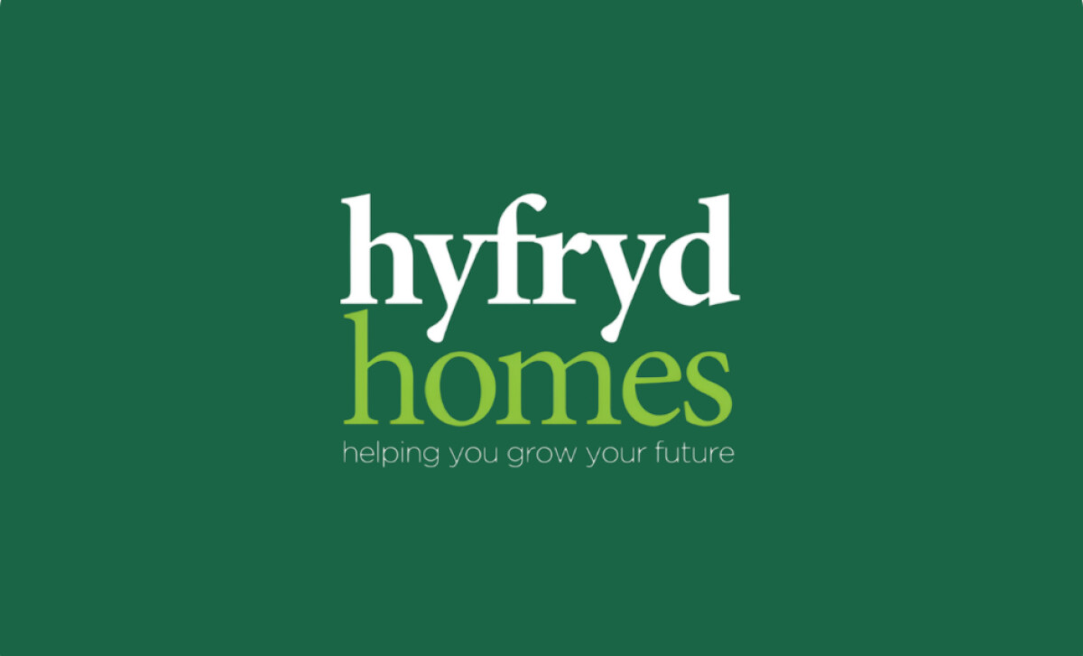
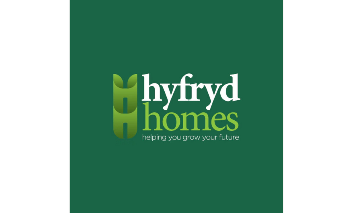
What caught my attention about the Hyfryd Homes logo is how naturally it balances warmth and professionalism. The design feels personal yet structured, which is ideal for a real estate brand.
- Symbol and Meaning: The monogram “H” doubles as a sprouting form, symbolizing growth and renewal. It’s simple but carries a sense of life and progress that fits the tagline “helping you grow your future.”
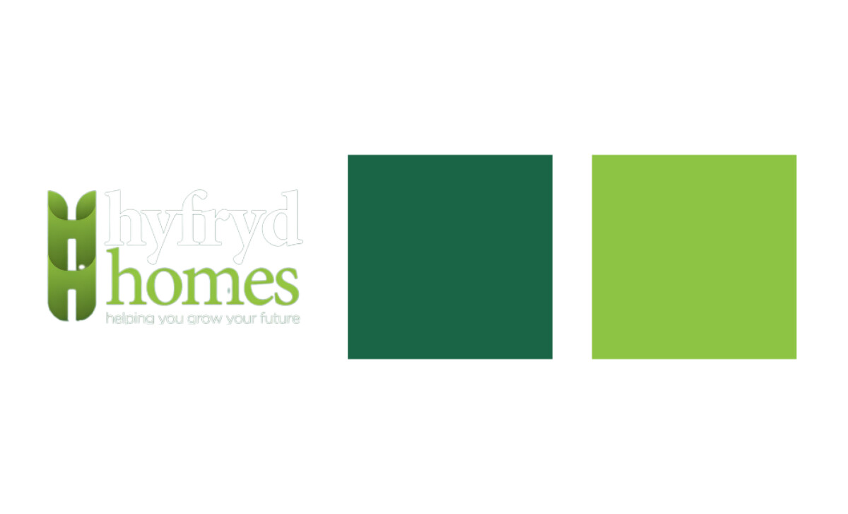
- Color and Tone: The dual greens create harmony between earthiness and freshness. The palette feels organic, suggesting both environmental awareness and reliability.
- Typography: The mix of serif and sans-serif fonts conveys tradition and approachability. The contrast between “hyfryd” and “homes” creates a pleasing rhythm while highlighting the brand’s friendly tone.
- Scalability and Application: Whether used on signage, digital assets, or printed materials, the logo remains legible and consistent. Its vertical emblem makes it adaptable to various layouts without losing clarity or impact.
What Brands & Agencies Can Learn from Hyfryd Homes
Treefrog Designs shows how a housing brand can express trust and optimism through simplicity. The Hyfryd Homes logo proves that visual warmth can coexist with professional integrity when form and meaning align.
1. Let Symbolism Grow Naturally
A well-crafted symbol should feel effortless. The sprouting “H” embodies growth without overexplaining it, allowing the mark to stay clean and memorable.
2. Use Color to Evoke Emotion
Natural tones like green can do more than suggest sustainability. When paired with thoughtful gradients, they communicate calmness, stability, and care.
3. Balance Familiarity with Freshness
Blending serif and sans-serif typography bridges tradition and modernity. This mix builds trust while signaling that the brand understands evolving expectations.
About DesignRush Featured Designs
At DesignRush, we review hundreds of agency projects each month. The featured designs stand out for creativity, relevance, and execution.
Many go on to be recognized as winners of our Monthly Design Awards.
Discover more examples here:
- Best Logo Designs
- Best Website Designs
- Best App Designs
- Best Print Designs
- Best Packaging Designs
- Best Video Designs
For a full list of design agencies and related services, see our Agency Directory.