The Bose Logo Utilizes Simple, Strong Design Elements
The Bose brand is a brand dedicated to creating quality audio products like speakers and headphones — and it’s a brand with a legacy that goes back more than 50 years. This logo has similarly stood that same test of time.
Similar is the trend shared between top-rated logo design companies specializing in the tech industry, the Bose logo is made up of a contemporary wordmark. But it’s not a boring, outdated or static design. In fact, it’s quite the opposite.
The Bose logo is a slightly italicized logo, slanting to the right to give off the feeling of movement. The Bose brand name is made up of block-like lettering. It’s big and bold and bubbly but also carries with it a very edgy, angular, and geometric vibe that calls back to the brand’s technical roots.
The bottom left corner of the B and the top right corner of the E also stand out in this design, stretching it out across all design materials and products it sits on. These two letters extend out in a very strict, sharp, and prominent way. It adds depth to the design. It adds movement. It makes the logo seem dynamic and fluid, bringing movement to an otherwise static design.
And this wordmark doesn’t need anything else to make it stand out. It doesn’t need an accompanying symbol or explanation — though it is sometimes seen with the tagline: Better sound through research.
The Bose logo transcends the traditional. It takes an otherwise simple concept — a wordmark — and adds a twist. It’s a sophisticated and stunning logo that is perfect for the modern era. And it’s a wordmark that has, for years, been known for its science-backed history.
The Bose logo stands strong because it kicks its simple and minimalistic nature up a notch, but it doesn’t forget its humble roots.

The Bose Brand: A History
Bose is an American corporation that produces audio equipment. Founded in 1964 and headquartered in Framingham, Massachusetts, Bose has established itself as a leader in the world of wireless speakers and headphones.
An idea became an obsession. And that became who we are. Sure, you could say we’re best known for our audio products. But our true passion? Discovering new and better solutions than anything that’s come before. We “always dream of things that are better, and think of ways to reach those things.” From the first noise cancelling headphones for consumers to a revolutionary seat suspension system for long-haul drivers, we invite you to experience the first 50 years of innovation of Bose.The Bose brand began with a dream — when the founder Amar Bose used his passion and fascination for electronics to transform an industry. As a teenager, he opened his own radio repair service which grew to be popular in his neighborhood.
And from here, his passion and ambitions grew.
While at college at MIT, Bose accumulated a number of patents that set him on the path to industry domination. And in 1964, with the help of a small, dedicated and innovative team, Bose was born — though there was a hiccup when it came to the name at first.
As the company was being formed, there was much discussion about what to call it. Finally, in his typical ‘2+2’ fashion, Y. W. Lee, one of Dr. Bose’s mentors from MIT, said, ‘Well, let’s think about the characteristics we want in the name. We don’t want to be tied to a specific technology or industry because we don’t know what we’ll do in the future. The name should be pronounceable in many different languages and easy to trademark. And ideally, it’s one syllable.’ Everyone laughed because they knew what he was suggesting without saying it: ‘Bose.’What makes the Bose brand so successful is the team’s dedication to understanding psychoacoustics — the study of how sound is perceived. Bose realized that other speakers only analyzed how they made the music sound, but not how people heard it— so with this in mind, he created a speaker system that was built with the overall auditory experience in mind.
And ever since, Bose has stood as an authority in the realm of auditory experiences.
This excellence has stayed with the brand ever since its conception. And similarly, so has its stand-out logo design.

The Power Of A Wordmark Logo Design
Going with simplicity and minimalism in design has become a growing trend in the industry. More and more branding agencies are opting for subtle and eye-catching symbols in their projects in order for client brands to stand out and be seen as modern and fresh innovators.
Others have similarly kept with the prestigious wordmark design. They use these words to capture the essence of their brand in a very traditional and sophisticated way, showing off their excellence and experience through their name which obviously makes an impact.
The Bose logo goes with the latter but does so in a more modern and edgy way through its dynamic and geometric nature. It not only gives off an air of prestige and power but also lets viewers know where exactly the brand came from and what its background is. It’s a brand that works in electronics and tech, and that's clearly evident in its slanted, block-like nature.
Wordmarks have a way of grabbing attention with ease. They clearly embody a brand in a simple way — it’s their name, after all. So the second you see the Bose logo, you know the kind of brand you're getting involved with.
Many brands get lazy when they go with a wordmark, but brands can actually get a lot out of choosing a wordmark design over a symbol or in addition to an image.
The wordmark can’t work if you don’t make it revolutionary and transcendent. It has to be innovative and edgy. It has to be modern and cool. It has to stand out and make a statement.
Use Bose as an example — it doesn’t let the wordmark tie the brand down or age it.

How The Bose Logo Is Used In Product Design
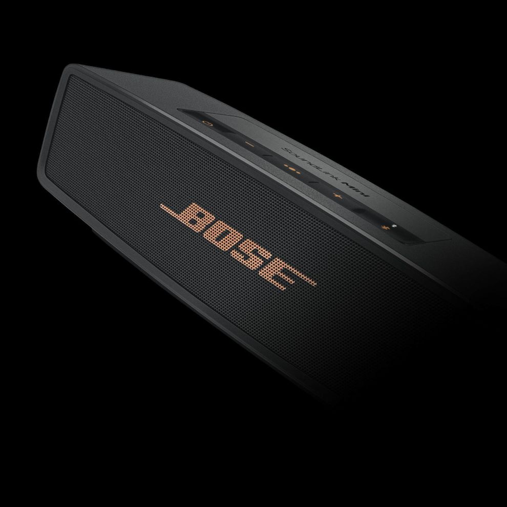
Much like the Bose logo itself, the Bose products are strong, sleek and angular. They are made up of clean line, sharp corners and geometric shapes. And the Bose logo sits elegantly on these shapes in a way that elevates both designs.
In most instances, the Bose logo is the only design that sits on these products which are otherwise minimal and clean. The Bose logo sits in a variety of colors and sizes — white, black gold and beyond. It sits as the focal point of the design, drawing the eyes before the music starts playing and captivates your other senses.
Oftentimes, the logo is used to tie the rest of the design together. With color, the logo and the accompanying icons match and add a cohesiveness to the product and its look.
Not many brands choose to include their logo design on their products. They might choose to include it on their packaging, but their products are reserved for other designs and elements. Bose is unique in this way, using its logo at every step of the way to solidify its prominence and prestige as a leader in the auditory industry.
This goes to show the power of branding, and the success of Bose as a brand in general. It knows how to keep branding consistent and cohesive to ensure that consumers are always getting the same experience, and are always looking at the brand in a positive light.
Bose goes a step beyond with its logo design, incorporating it in its packaging, its product creation, its app design, its website and beyond.

The Bose Logo Design Has Stood The Test Of Time
The Bose logo beautifully captures the brand and its identity. It harkens back to the brand’s humble roots and its founders love for all things electronics. And it’s one that has stood with the brand since the beginning.
Bose is a technological brand with products that are known for their excellence and prominence. And the logo emulates that in its strong standing and powerful design elements.
This captivating wordmark is more than just a boring, years-old symbol of tradition and stuffiness. It’s actually an embodiment of the brand, where it came from and where it plans on going.
It cares about music. It cares about the auditory experience. And it wants users to get the most out of its products.
But it’s a brand that also understands the power of identity and image so it infuses this logo design into every aspect of its visual identity. It’s a smart move, and it certainly makes an impact. Bose is a name most people recognize, and its a name that most people understand means business. And that’s thanks to its compelling logo.


-preview.jpg)


-preview.jpg)