The best marathon logos represent endurance, determination, and community, standing out in the crowded field of athletic events. These logos are more than just symbols — they inspire runners, engage audiences, and contribute significantly to the identity of their respective marathons.
To show you exactly what we mean by that, we’ve listed the 10 best marathon logo designs developed by top-notch logo designers. These designs showcase exceptional creativity, aesthetics, and symbolism. Explore these standout designs and see how they capture the spirit of the marathon.
1. Boston Marathon: The Top Historical Marathon Logo
The iconic Boston Athletic Association's race is the oldest annual marathon in the world, and that history is reflected in its elegant crest-like logo design. The dark blue base symbolizes trust and confidence, which is joined perfectly with the yellow accent color, which symbolizes illumination, courage, and passion.
The design infuses a strong unicorn illustration and colors that encapsulate the process of braving 26.2 miles. The main symbol — the unicorn — represents the constant pursuit of greatness and excellence, however elusive.
2. Portland Marathon: The Top Colorful Marathon Logo
Often touted as the "best people's marathon in the West," Portland, Oregon's signature road race stays true to the low-key nature of the Pacific North West with its airs of relaxation and inclusion. This is reflected in the colorful seal.
Portland's blocked yellow skyline is seen in the background, followed by horizontal stripes of green and blue that remind us of the area's beauty. A globe of multiple international flags is topped with a rounded "stick-figure" runner. The entire design of this marathon emblem is bold, bright, progressive, and totally PNW.
3. Schneider Electric Marathon de Paris: The Top Whimsical Marathon Logo
The Schneider Electric Marathon de Paris's logo design embraces a deep green color palette covering the simple sans-serif script and simple illustration of a runner crossing the finish line, with the Eiffel Tower represented as his shadow.
The word “Paris” and the drawing of the tower are painted with a lighter hue of green, highlighting the location of the marathon. On the other hand, the runner's chest splitting the finish ribbon is decorated with Schneider Electric’s “S” symbol, serving as a playful branding element.
4. Walt Disney World Marathon: The Top Nostalgic Marathon Logo
If the playful Paris Marathon logo didn't bring you back to your childhood, Walt Disney is sure to do the trick. After all, who can resist Mickey, Minnie, and the whole gang? Held every January, this race is another adolescent take on country pride with a new spin.
Bold borders of red and blue and an athletic Mickey in motion give this marathon logo a vintage 1970s Wheaties box flavor. Meanwhile, the simple sans serif typeface is a far cry from Walt Disney's signature script, ensuring the marathon has its own identity.
5. Tokyo Marathon: The Top Minimalist Marathon Logo
In 2017, Tokyo unveiled a new design concept, "New Way, New Tokyo." The logo is showcased within a simple circle, reminiscent of Japan's National flag, complemented by various straight lines in all directions and many hues.
With this new concept, the Tokyo Marathon displayed the individuality of all runners, walkers, volunteers, and spectators, celebrated and unified by the event.
6. Honolulu Marathon: The Top Tropical Marathon Logo
The cool colors and thin, sans-serif font of the Honolulu Marathon logo transport us to the most heavenly place in America: Hawaii. Varying shades of blue represent the area's beautiful waters, while a spring green speaks to the lush foliage.
An orange flower accents the custom illustration of a Hawaiian woman, while a slightly thicker font on Honolulu emphasizes the unique location. With no time limit, the Honolulu Marathon — and its visuals — prioritizes vacation time over marathon time.
7. Rio de Janeiro Marathon: The Top Inspiring Marathon Logo
There's only one word to describe Rio de Janeiro's marathon logo design: resolute. Its bold type and warm colors scream South America and encapsulate the solid personalities and hot sun that come with it. But what makes this design even more exciting is the runner crossing the finish line victoriously, displaying the joy, relief, determination, and passion of completing a marathon. What's better? He pulls double duty as the "I" in "Rio."
8. Bank of America Chicago Marathon: The Top Corporate Marathon Logo
The (very clearly sponsored) Chicago Marathon‘s logo design manages to sidestep boring while still kowtowing to corporate America. A charcoal gray skyline — accented by the iconic Willis Tower (or Sears Tower, for us oldies) — lines the background on a fisheye-like curve.
A light gray street follows the lower portion of the skyline, finalized by an abstract symbol that resembles the American flag, infusing this marathon emblem with a strong American heritage.
9. Great Wall Marathon: The Top Adventurous Marathon Logo
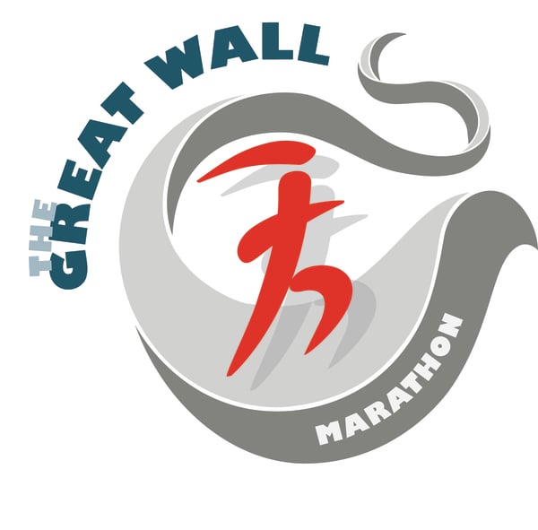
The Great Wall Marathon is a newer race (1999, to be exact), but that doesn't make it any less of a challenge. This particular venture may be tougher as runners dash through the peaks and valleys of one of the world's greatest wonders.
This marathon logo skillfully illustrates the 5,164 steps that runners take into history with its two-toned winding gray wall and abstract red runner, which ever so faintly resembles Chinese type. The seafoam and emerald-green type complement the illustration without overpowering the whimsical imagery and trial competitors face.
10. TCS New York City Marathon: The Top Iconic Marathon Logo
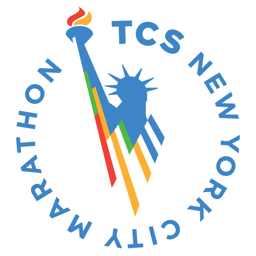
New York City is a melting pot of people from all over the world, and the TCS New York City Marathon perfectly showcases this diversity. The logo design combines a stylized “TCS” ligature, covered in an orange-to-purple gradient, with modern sans-serif lettering and a bold orange illustration of the Statue of Liberty.
The ligature represents the event's inclusiveness, unity, and belongingness among the participants. At the same time, the Statue of Liberty illustration ties the marathon to its iconic location and highlights the welcoming nature of the event, attracting runners from around the globe.


-preview.jpg)

-preview.jpg)



-preview.jpg)