Standout Features:
- Minimalist
- White background with a pop of color
- Bold typography
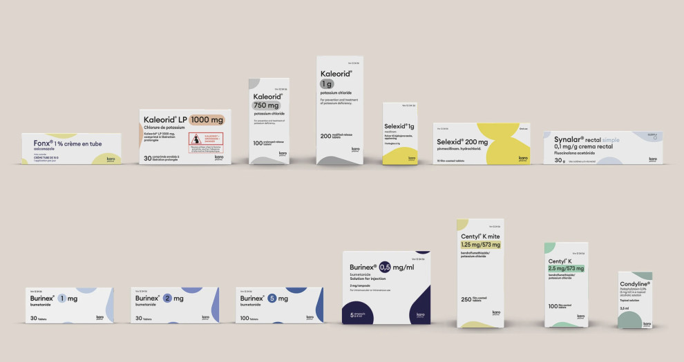
Karo Pharma's packaging design is a portfolio of prescription drugs inspired by the company’s visual identity. Designed by Sabina Džananović Design, it is defined by a clean, polished white background that ensures the informational content takes center stage, yet has a friendly look using rounded colored shapes and typeface.
Essential details on the packaging, from drug names to dosages, are presented precisely, ensuring essential information is instantly noticeable and legible. This focus on communication enhances user safety and reflects Karo Pharma's dedication to customer care.
Bold typography is a standout feature, making vital information pop against the white canvas. The strong font choices establish a visual hierarchy, efficiently leading the user through the most critical details. The color palette has been carefully picked to keep brand recognition and clearly highlight different strengths. This approach not only aids legibility but also solidifies Karo Pharma's image as trustworthy and user-centric.