
Standout features:
- Industrial-chic design featuring steam engine motifs
- Vintage color palette of earthy tones
- Chalkboard illustration style
Gawatt's packaging design by Backbone Branding blends nostalgic elements with an industrial aesthetic. It showcases craftsmanship and authenticity, echoing the spirit of James Watt's groundbreaking invention: the steam engine.
This inspiration comes through the unique symbols of engine components that adorn the coffee cups. Each icon transforms the packaging into vessels of energy and productivity, a "tune-up in a cup."
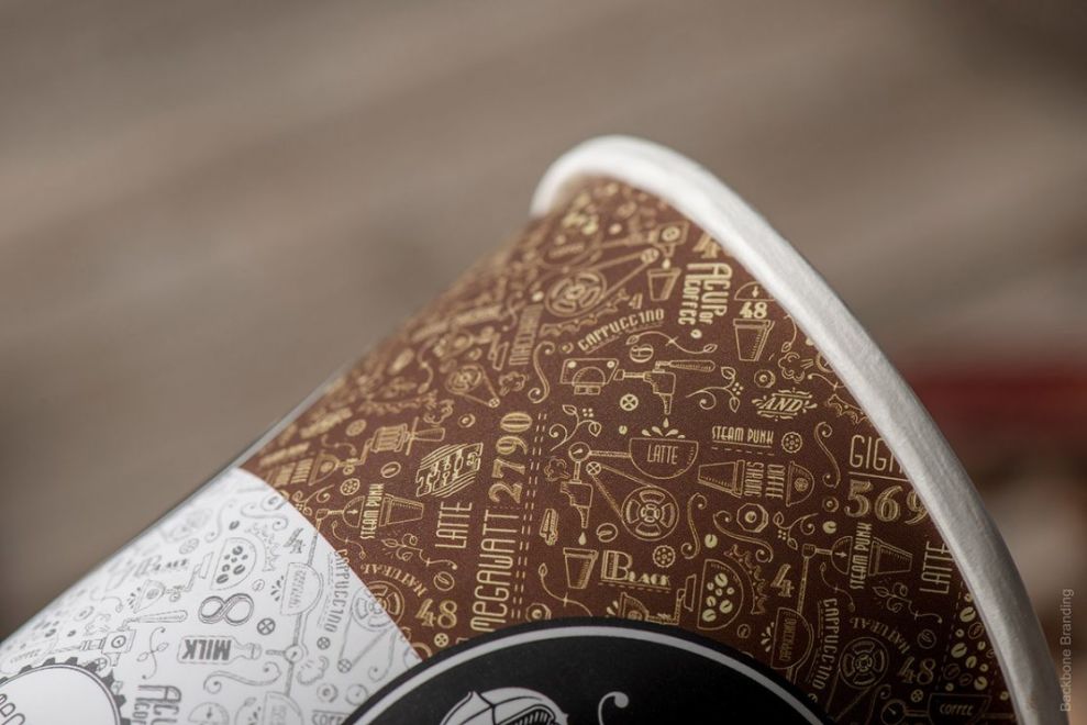
Each coffee cup shines with simplicity and elegance. The paper material features a bold black band that prominently showcases the brand's logo. The logo, encircled by a vintage-inspired frame, exudes a sense of heritage. Rendered in a bold serif font, the brand name further reinforces this impression of established quality.

A vintage color palette, dominated by earthy browns and muted greens, further reinforces the nostalgic feel.
Hand-drawn illustrations of engine parts and words like "organic" and "microwatt" tie perfectly into the industrial branding. These visual elements, reminiscent of chalk drawings on a blackboard, transport consumers to a time when artisanal quality reigned supreme.

Overall, Gawatt's branding is a masterclass in storytelling. Seamlessly blending historical references with modern design creates a unique and memorable identity. This distinct packaging technique resonates with consumers seeking authenticity and a connection to the past.

-preview.jpg)

-preview.jpg)