Team Behind the Design
Packaging Design Analysis
Great fashion and beauty packaging often succeeds by balancing science and emotion without leaning too far in either direction.
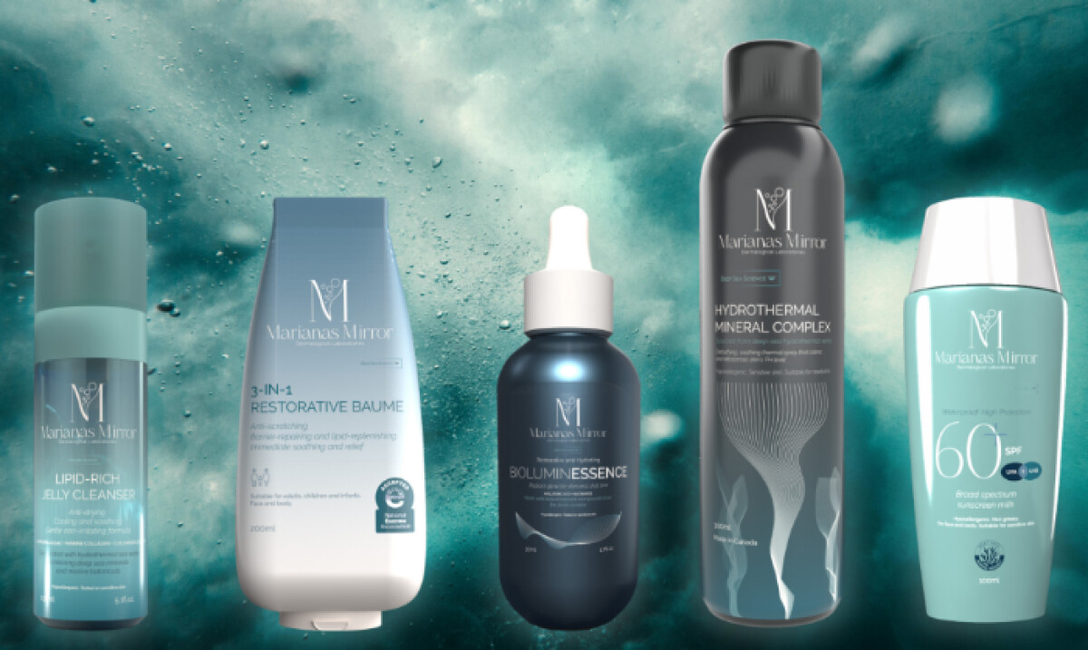
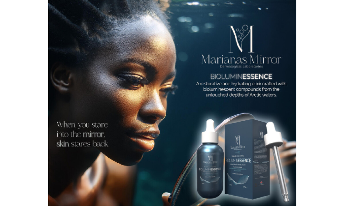
Marianas Mirror packaging works because it translates deep-sea innovation into a calm, clinical visual language that feels protective, precise, and quietly premium.
- Visual Tone & Restraint: I like how the packaging avoids overt “ocean” clichés. Soft neutrals, controlled contrast, and minimal graphics help the products feel dermatologically credible rather than cosmetic or decorative.
- Brand Storytelling: The identity supports the brand’s hydrothermal focus without explaining it literally on pack. This restraint allows the science to feel advanced and considered, which suits sensitive-skin positioning.
- Material & Sustainability Cues: The packaging choices suggest responsibility through simplicity. Clean surfaces and limited finishes imply reduced impact while still maintaining a refined, high-quality feel.
- System Cohesion: Across serums, sprays, cleansers, and balms, the visual system holds together consistently. I appreciate how scale, spacing, and hierarchy adapt across formats without fragmenting the identity.
What Brands and Agencies Can Learn from Marianas Mirror
1. Let Clinical Calm Signal Trust
In sensitive-skin and dermo-cosmetic categories, visual restraint can communicate safety and efficacy more effectively than expressive graphics.
2. Translate Innovation Through Tone, Not Illustration
Advanced formulas don’t need literal visuals to feel credible. White space, flat color, and controlled contrast let typography carry meaning without diagrams or decorative cues.
3. Build Packaging Systems for Product Expansion
Consistent hierarchy and proportion allow new SKUs to integrate seamlessly without redesigning the brand each time.
About DesignRush Featured Designs
At DesignRush, we spotlight agency projects that push creative boundaries. The designs we feature reflect expert execution and highlight the trends shaping branding today.
Some of these standout projects later earn recognition in the Monthly Design Awards.
Explore more creative work here:
- Best Packaging Designs
- Best Website Designs
- Best App Designs
- Best Logo Designs
- Best Print Designs
- Best Video Designs
For a full list of design agencies and related services, see our Agency Directory.


-preview.jpg)


