
The Turtle Story Packaging Design Manifests Rumi’s Brand Philosophy
The Turtle Story is a Mumbai-based multidisciplinary design studio that helps organizations innovate through design. Their main focus is branding and packaging that elevates design principles to new levels.
The studio enjoys undertaking all kinds of creative assignments that motivate them to push the limits of design conventions.
This approach is best illustrated with Turtle Story’s packaging design for Rumi — a company that sells organic skincare products.
The Turtle Story packaging design leans heavily on the company’s brand messaging, which is that beauty is more than skin deep — it resides on the inside.
In Rumi’s words, the company “stands in celebration of self-love, this care for yourself. It is from your strength and courage that we emerge and your strength and courage that we add to. Rumi is a celebration of beauty by giving, by adding to its most natural form. It is a celebration of you.”
Faced with this philosophy, the Turtle Story’s packaging plays with the concept as it not only reflects that inner beauty but suggests a mystical nature of the product itself.
How?
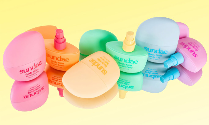
By using three specific design elements: pastel colors, minimalism and sharp typography. The combination of these elements oozes with the feeling Rumi’s aiming to convey.

Minimalism And A Pastel Color Palette Showcase The Rumi Brand As Sophisticated And Elegant
Whether there’s the intention behind it or not, Rumi’s branding evokes the works of its famous namesake, the 13th-century Persian poet Rumi, who’s often regarded as being the greatest mystical lyrist in world literature.
Rumi’s poetry speaks of love, hidden from plain sight, that quietly infuses the world.
The Turtle Story’s design seemingly draws from his poetics, unifying it behind a pastel palette and sharp, minimal aesthetics.
These three constituents define and showcase the packaging of Rumi, which is straightforward, simplistic, sophisticated and easy to understand in its objective. The packaging perfectly embodies the true essence of the brand — comfort, elegance, strength and beauty.
While poetic tradition might have been invoked with tendency, minimalism undoubtedly appeals to modern, millennial audiences. Packaging designers skillfully implement this youthful design trend that creatively captures all the attributes mentioned above, streamlining them to homogeneous perfection.
The Rumi brand makes use of minimal and chic aesthetics to create a product that simply jumps from the shelves and demands attention.
From the soft pink pastels to natural green matted creams, these products magnetically draw the looks of the beholder.

Rumi’s Typography Evokes A Sense Of Retro Quality, Wealth And Delicacy
The Turtle Story’s packaging design managed to bottle the aura of the tenderness and natural beauty that surrounds the brand. The “seal of quality,” if you will, is illustrated through Rumi’s typography.
It’s a variant of the Royal Castle font, which has recently begun to grow in popularity. It combines the modern luxury sans serif feel with a touch of a vintage feel.
The logo is instantly captivating as its minimal background fosters a sense of wonder and curiosity.
When it comes to fashion, especially in cosmetics, people use their own imagination to picture and identify themselves, and Rumi’s aura of prestige presents it with the potential of achieving a timeless, evergreen, yet natural beauty.

Rumi’s Brand Leans On Desirability And The Organic Aspect Of Its Skincare Products
“Beauty begins the moment you decide to be yourself” — Coco Chanel
Rumi lives and breathes this credo and the Turtle Story’s packaging design certainly delivers.
Rumi’s targeted consumers will actively seek its products as they naturally unify an exclusivity outlook and approachable identity.
The moment prospective consumers decide to be true to who they are, they convert with Rumi.
The added bonus is the organic origin of Rumi’s product. It is subtly highlighted throughout different products. Rumi doesn’t brag about it, nor does it market the brand with any social agenda. It simply states the fact that the products complement customers’ “natural beauty” perfectly.
This is how branding experts adeptly balance authenticity and promotion. They subtly weave in the brand's organic qualities throughout the product narrative, allowing the value to speak for itself rather than resorting to overt marketing tactics.

The Turtle Story Packaging Design’s Sleek Minimalism And Seductive Hues Make Usual Shapes Unusual
At very first glance you might think that the shapes that contain Rumi’s cosmetics are very different than what you’d normally see in makeup packaging.
Rumi doesn’t try to invent the wheel. Its calming coloration emphasizes the curvature of every product making it effortlessly atypical.
Alas, the quality, same as beauty, is often hidden in plain sight.

-preview.jpg)
