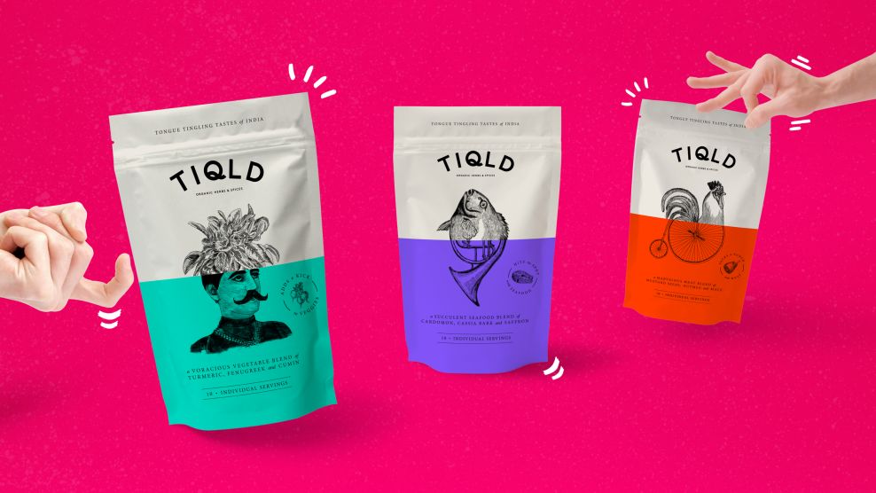
Born from a love of home cooking and bold flavors, Tiqld is a touted as tongue-tingling tastes of India, and is a unique range of indian spice blends. As the product takes the taster on a culinary adventure through natural flavors and cultures, the packaging brings that journey to life through quirky branding, playful packaging, and witty marketing.
Bold colors are used on the bottom half of the packaging; the idea behind this split was to showcase an unexpected combination that occurs when the user creates more exciting meals with adventurous spices.
The illustration on each package is custom, and focuses on the base ingredient that the particular spice works with -- meat, fish, or vegetables. The bottom half of this custom illustration is the juxtaposition of an unexpected abstract element that tells a story to compliment the spices.
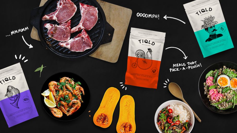
The product photography is shot from overhead and resembles the point of view of a chef preparing a meal. The images also add visual interested and showcase the versatility of the product throughout various food groups.
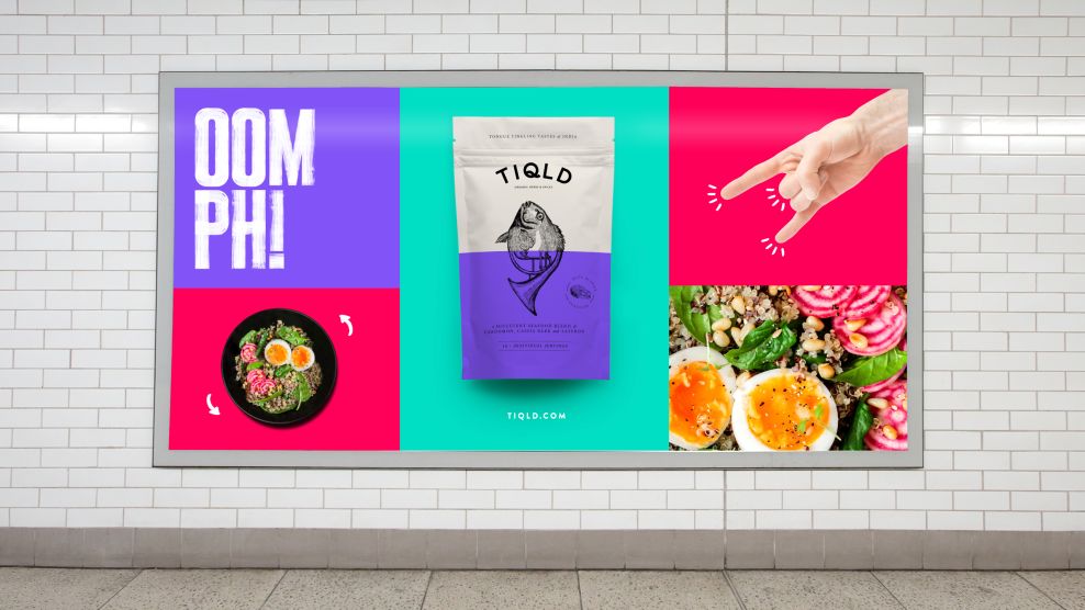
A custom typeface creates an even bolder product packaging, and works well with the modular grid system in modern advertising. The end result is a brand that grabs users' attention and is very recognizable.
TIQLD is a bold packaging design in the Food & Beverage industry.
-preview.jpg)