Casper’s Playful Ads Utilize Whimsical Illustration, Making Product Promotion Secondary To Brand Identity
Casper is a brand known for quality sleep products including mattresses, sheets and other bedding essentials.
Its solid brand identity -- from its elaborate illustrations to its energetic storytelling techniques -- ensures the company is highly recognizable.
Thanks to its effective marketing campaigns and ad agency work, Casper has established itself as a leader in its industry in no time flat.
Similarly, all of its accompanying brand materials infuse that passion and prominence.
Casper’s print ads tell a delightful and enchanting story — regardless of the medium or platform they’re presented on. Clever and crafty illustrations make up the majority of these designs — standing at center stage.
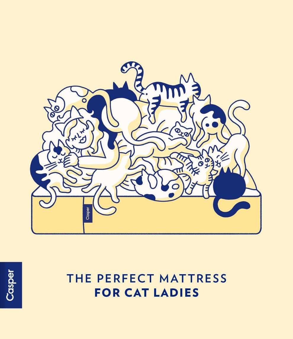
Some depict a cute and clever scenario that adds context to the delightful play on words included in the design. For example, one ad depicts a bed with a woman in it — and the bed is full of cats. The tagline at the bottom falls in line with the traditional Casper slogan: The Perfect Mattress For Cat Ladies.
It’s a humor-filled design that instantly engages thanks to its storytelling capabilities. While it is not a general rule, established graphic design companies often infuse their work with zany, amusing, and on-brand illustrations and messaging to immediately grab onlookers' attention.
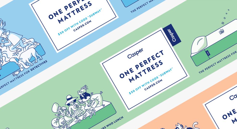
If you’re on the subway and you see these ads, you’ll notice a meters-long illustration — kind of like a “Where’s Waldo” page. There that the ad encourages you to interact with.
These intricate design details created from the clever illustrations give the brand a personality, a happy, friendly and approachable persona that consumers are happy to engage with.
It puts branding above product promotion — of course, these ads are promoting the Casper mattresses, but that’s really just secondary to the promotion of the brand, its authenticity and its experience as a trustworthy leader in the industry.
The Soft And Sophisticated Colors Used In These Casper Designs Bring Branding Full Circle
These illustrations are instantly captivating, but the softness that comes from the round edges, smooth lines and soothing colors are what really make this print design true winner.
This is a brand selling mattresses — so shouldn’t the ads aim to put users at ease? The answer is yes, and this brand does so with color and subtle softness that’s incorporated at every stage of the design.
Smooth, soft pastels make up the background to these print designs. They are serene, with a tranquility that is palpable. One look and viewers are instantly relaxed, ready to jump into bed — all they need is a Casper mattress to round out the experience.
The juxtaposition of these bright, airy colors against the grungy subway walls is relaxing, making users want to buy these products to get that same feeling throughout the night.
Similarly, print designers maintained this softness in the typography. It’s rounded and bubbly, with an almost three-dimensional quality that floats from the page. It’s lightweight and captivating in a soft and sophisticated way.

Casper’s Innovative Print Ad Placements Connect People From All Walks Of Life
These posters and billboards, on their own, are masterful pieces of design. But an element of the marketing process that really makes them stand out is their placement.
The team at Casper know who their audience was, and promoted these products and their brand exactly where they knew they’d be.
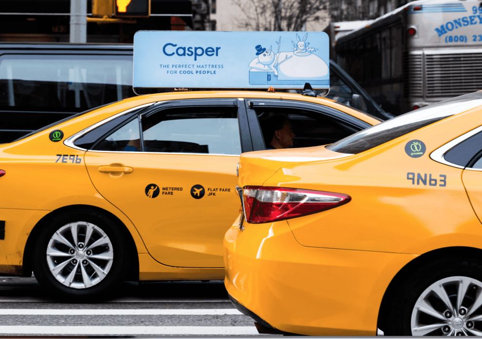
Most of these ads and billboards are in popular, metropolitan cities like New York and Los Angeles where they have a foothold. And you can see these prints lining stations, trains and cabs. That was an innovative and deliberate choice by Casper because they knew they wanted to reach a wide audience from all walks of life.
Because everyone can be connected through sleep — it’s an integral part of life and something everyone can agree should be a priority. A good mattress is something everyone can agree is a good inve
stment, and this ad campaign aims to inspire, enchant and connect with people from all walks of life to promote that message. These ads are open, honest and friendly. And they appeal to everyone on a personal level.
The Casper Mattress Brand — A History
Casper is an online e-commerce brand that sells sleep products — from mattresses and sheets to dog beds and beyond. It’s headquartered in New York City with showrooms in Manhattan, San Francisco and Los Angeles.
The private e-commerce company was founded in 2014 by Philip Krim, Neil Parikh, T. Luke Sherwin, Jeff Chapin ND Gabe Flateman.
After a few rounds of funding, the company was on its feet, selling $1 million worth of mattress products in the first month after it was launched.
The brand initially opened up shop in the U.S. market, but in late 2014 the brand expanded its reach and began delivering its quality mattresses in Canada.
This brand turned heads quickly and was famous for its heavy-hitting investors whose names are known the world over. These investors include Adam Levine, Leonardo DiCaprio and Tobey Maguire. Many other investment groups jumped onboard after this initial success, helping the company grow to the prominent place it sits today.
The first products this brand offered were quality mattresses. They were so popular due to the four types of foam used. By 2015, the brand expanded its product offering to include pillows and sheets. And in 2016, Casper started selling dog beds.
In subsequent years, Casper has come out with new mattress models that have become popular staples in the homes of young adults and families.
Casper made its start online, but in February of 2018, the mattress brand opens its first permanent storefront in New York City. There are plans in the world to open up more stores in Canada.
The brand has grown exponentially in the four years it’s been around, and it’s not going anywhere anytime soon it seems. It has become such a phenomenon, with a presence and a name that is instantly recognizable. You’d be hard-pressed to get on a subway in New York City and not be mesmerized by the print ads you see hanging up above.
And these designs are thanks to agency Red Antler.
Prominent creative agency Red Antler was tasked with creating the whimsical and fresh brand identity for the Casper brand, and had this to say about the project:
These days, it seems like every podcast is advertising an online mattress company. But before Casper, the idea of selling a mattress outside the showroom was unheard of. The company set out to shift people’s behavior to make that big ticket purchase online—and we helped them from the very beginning. We focused on the benefits of truly great sleep (and just how easy it was to have), instead of the technical details and jargon that consumed the industry. Through a unique visual and verbal language, we developed a quirky and lovable personality with which customers were eager to engage. Casper became the new leader in sleep, rising above a crowded, commodified space to create a deep connection.The resulting identity and design concepts were stunning, sophisticated and fun — the perfect image to captivate audiences and promote the brand and its bubbly, down-to-earth nature.

How Casper’s Branding Ties Its Print Design Into Other Collateral And Visual Presentations
These print designs stand out on their own. They’re bright, soothing and smooth. But there’s something to be said for how cohesive and clear the overall branding is, thanks to the overlapping elements that are seen throughout the brand and its print ads.
Color increases brand awareness by up to 80 percent, and Casper does a phenomenal job at keeping color consistent — in its print designs, in its web design and in its overall visual presentation. These light and airy pastels are intricately infused into the brand and its identity — you can’t picture the brand without them.
Casper capitalizes on the value found in consistency. When a brand is visually consistent across mediums and collateral, revenue can increase by up to 23 percent. That’s because this consistency makes the brand seem more widespread and far-reaching than maybe it is. It also instills within users a sense of trust in the brand. Therefore, they’re more enticed to buy.
You can see this consistency in the typography and color choice used on the Casper packaging. And this same playful and approachable tone is experienced on social media as well -- just look at the tweet above for reference.

Casper’s Whimsical Print Designs Are On Brand, Striking An Emotional Chord In Viewers
Each Casper print design is instantly compelling — whether they’re viewed on the subway, on a taxi car or on billboards. Their effervescence can’t be ignored, making the designs jump from the page.
A bubbly and happy vibe radiates from Casper across all collateral. It shows a passion and a personality. It gives off an air of authority, too, thanks to the seamless integration of peaceful design elements that bring the identity full circle.
The soothing pastels put users at ease immediately. Their brightness excites and fills viewers with joy, but they are equally peaceful and pacifying. They put the viewer at ease and lull them into tranquility — much like the Casper sleep products do.
Using nostalgic and simplistic illustrations to add a playful and enthusiastic professionalism to a design -- and to a brand as a whole -- is a growing trend in design. Plus, it’s an identity that is highly revered and mimicked across the mattress industry.
Casper's campaign has a soft, subtle simplicity to this design that warms your heart and puts your mind at ease. And that’s exactly what you want from your mattress.
Plus, does your business need some design help? Check out DesignRush's curated list of top graphic design companies!