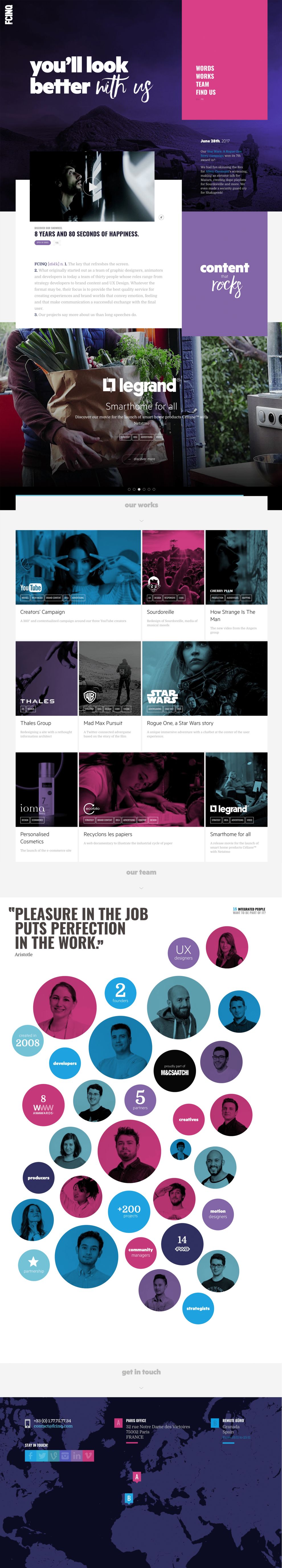
“You’ll look better with us.” It’s a bold statement from FCINQ, a creative studio that produces exciting brand content. However, if the initial impression of their website is any indication, they aren’t wrong. Bold, white text is laid on top of a dark purple background to immediately grab the attention of visitors. A menu is provided in a bright pink rectangle but using that menu is completely optional on this single page website. With so much exciting content from beginning to end; this website is made for scrolling.
Immediately, the typography begins to tell the story of FCINQ. The white letters stand out at the top of the page. “With us” is written in a more artistic style. This is in clear contrast to the bold, simple font that states, without reservation, “You’ll look better.” Put the two pieces together and you get a sense of the confidence that FCINQ has in their work.

Scrolling down reveals a short “About” sort of page cleverly designed as a faux dictionary definition. The first point reveals where the inspiration for the FCINQ name came from while the second point gives a brief history of the company. Like many good websites, FCINQ doesn’t overwhelm visitors with mountains of text. Again, there is another bold rectangle with eye-catching white text using the same typography strategy seen previously. The statement begins with a simple, bold word and ends with an artistic emphasis.
However, probably most noticeable on this portion of the site is the slideshow of FCINQ’s marquee projects. The Star Wars logo is iconic and the name immediately demands attention. This serves notice that FCINQ is not just some casual group of wannabes. Rather, they are professional, world-renowned designers, content creators, and UX developers. Along with Star Wars, the large slideshow shows off other huge projects for major clients like Lego Batman and YouTube.
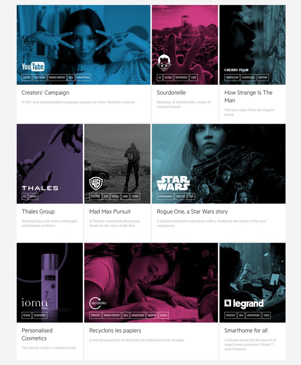
FCINQ’s portfolio is also a part of their single page design. The layout continues to utilize the same bright blues and purples as much of the rest of the website. Each individual campaign stands out on the off-white background. FCINQ is also careful to ensure the logos of the companies they have worked with are clear and recognizable immediately. This is a very clean, stylish, and well-designed portfolio. Each piece serves a purpose in helping build the brand of FCINQ as a trusted partner for companies of all sizes.
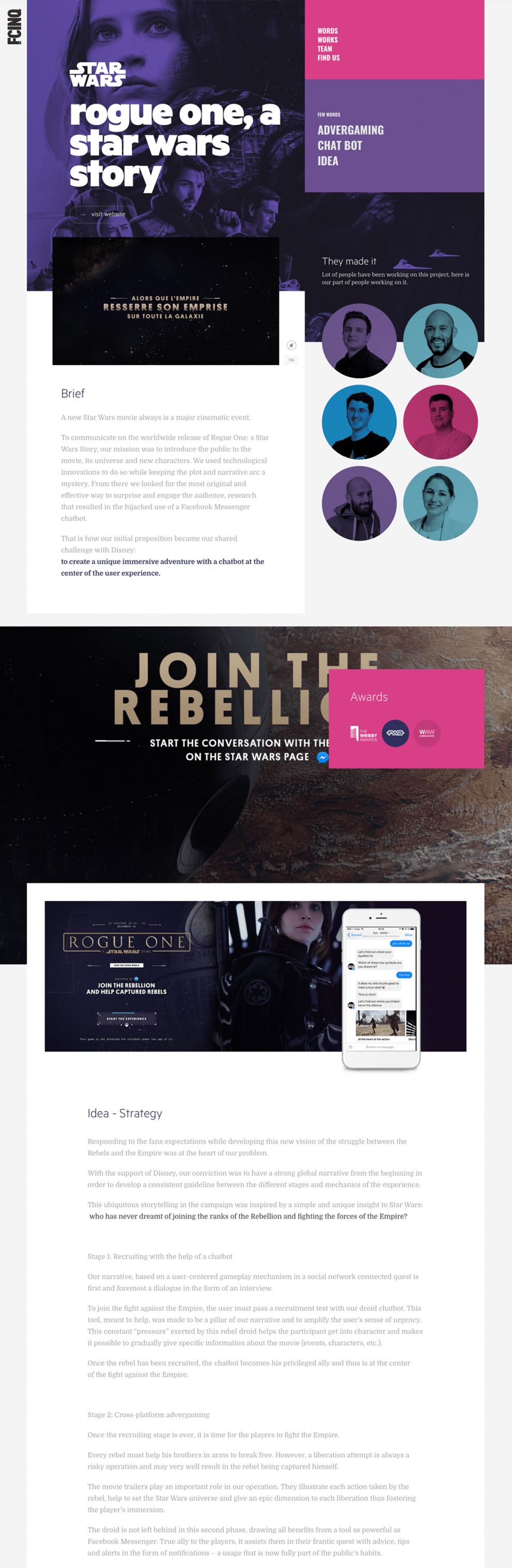
Clicking on one of the projects in the FCINQ portfolio opens up a page like the one above for Star Wars. Visitors can read the creative brief, watch an embedded video, and see the staff that worked on the project.
The theme from the rest of the site is maintained with bold, colorful choices. The typography doesn’t aim to steal the show from the actual creative that FCINQ is known for. It’s easy for visitors to navigate the page, see the information they need to see, and find out where to learn more about the people behind FCINQ. Each piece is more intuitive than the last.
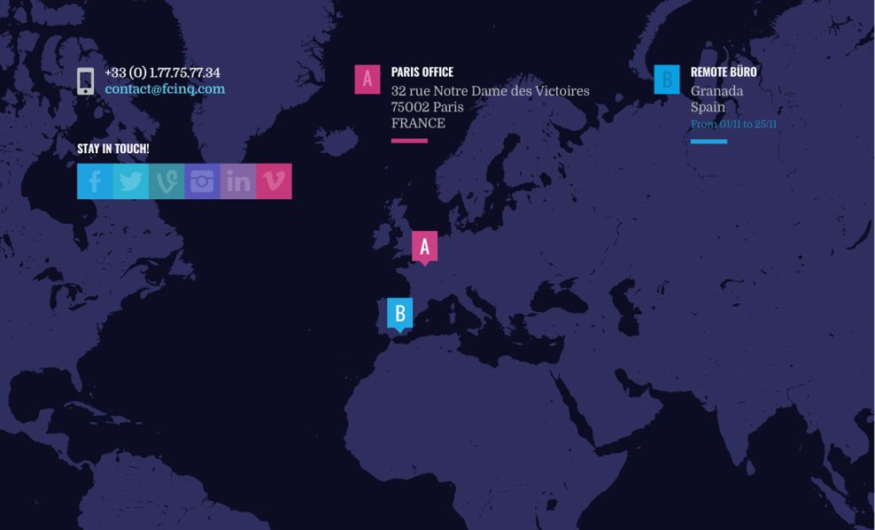
Finally, at the very bottom of the site is the contact page. This is what finishing strong looks like. No boring contact form on a white background. Again, FCINQ uses their bold color scheme, sharp shapes, and eye-catching typeface to complete the page. Who said contact pages can’t be sexy?
FCINQ is a beautiful website design in the Advertising and Professional Services industries.