Brave the Skies is a digital marketing firm that offers assistance in building and maintaining a Shopify account on behalf of their clients. Their site showcases what services they offer and the work they have done in a witty, thematic manner, taking on the playful image of being the “mission control” for your Shopify business. This is achieved through gritty and old school image design in a clean format.
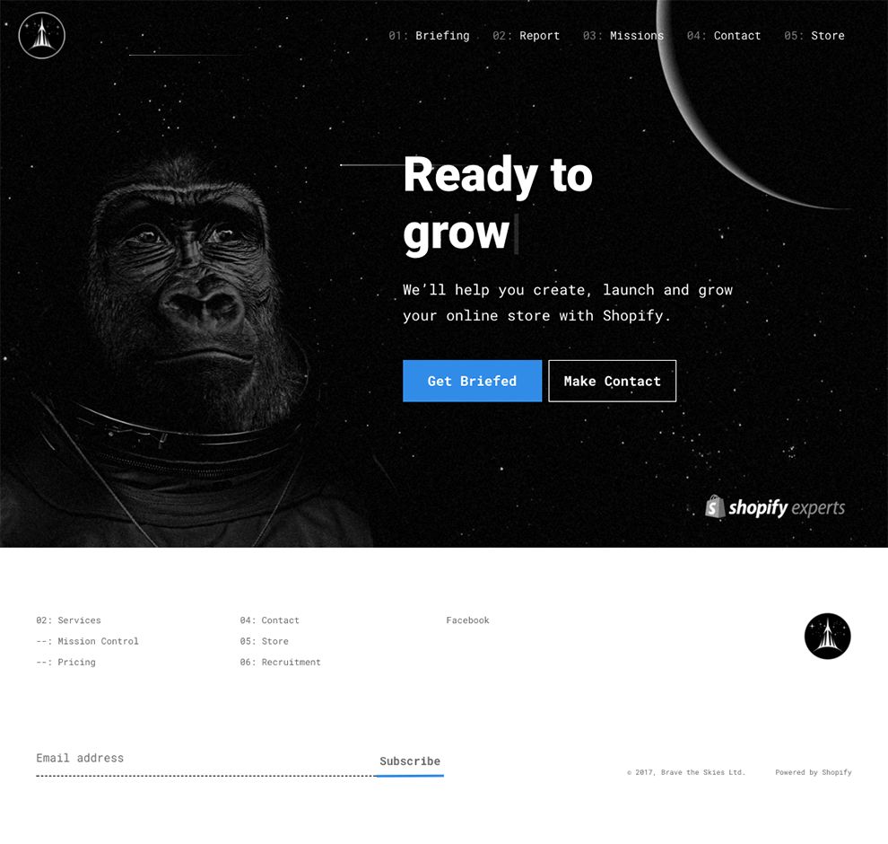
The site opens with a characteristic landing page that briefly introduces consumers to what Brave the Skies does and allows for two directions of navigation: the ability to browse or go straight for contacting the company.
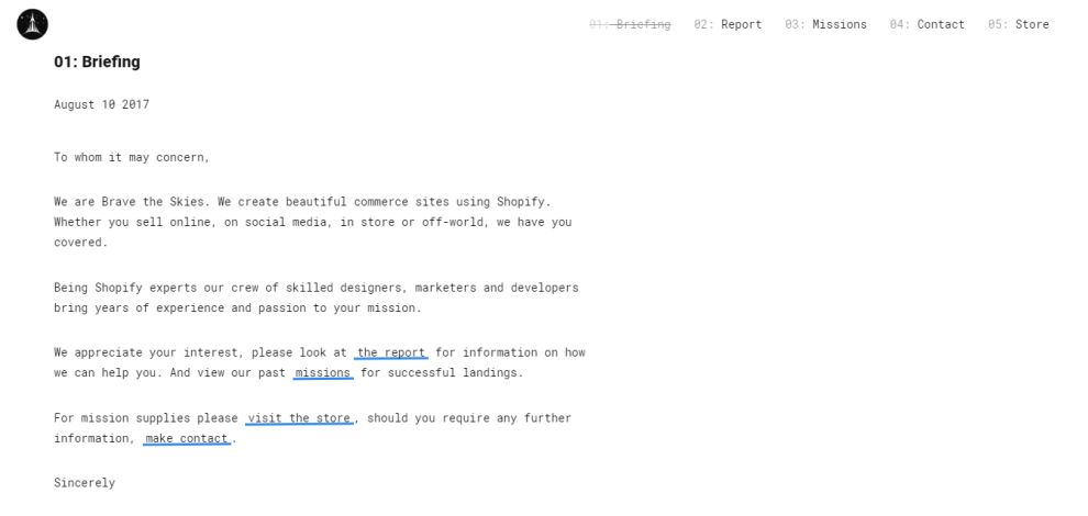
Brave the Skies offers not only a creative menu option, but also the option of using hyperlinks within their content to guide consumers around their website. Consumers can choose between the two possibilities, depending on how quickly they want to navigate to the information they want to find.
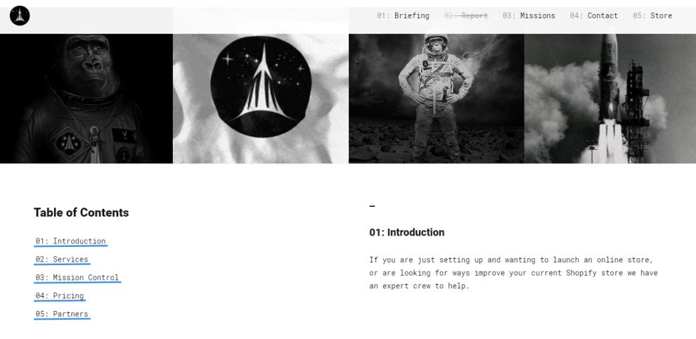
Continuing with the ease of the use for the consumer, Brave the Skies doubles the scrolling with a menu option. Users can scroll through the page to view the content in its entirety, or they can use menu options to be quickly redirected to the exact information they are seeking out.
Brave the Skies utilizes a heavy amount of negative space to draw the consumer’s attention to the content on the page, rather than offering up a distraction of colors. The crisp black and white layout uses a flat design to keep with the simplistic layout.
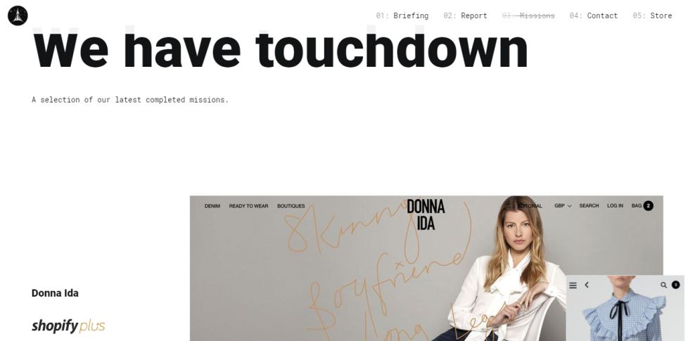
The only opposition to the steady, clean trend is when Brave the Skies displays a variety of shop mock-ups they have created, debuting these prime examples in bright color that’s meant to stand out against the rest of their site. The sudden contrast in color effectively and efficiently draws in the eye of the consumer.
These final sets of pages allow for Brave the Skies to support the growth of consumers, as well as for the consumer to support the growth of the company.
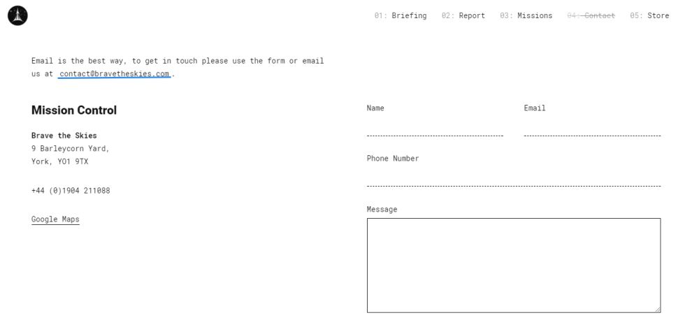
The contact page utilizes an input form to grant the consumer the ease of asking their questions directly on the website, rather than offering a space that only allows users to input their email address and hope for a response.
The last page—a store—displays a variety of products consumers can buy to support the company, from t-shirts to bags and pictures. The store uses a step-by-step checkout process, which requires a viewer to use an already established account or to create an account with the website. The information provided by the consumer can be used as leads for business or promotional needs for the company.
Brave the Skies is a clean website design in the Professional Services industry.