JCCQ's Website Design Offers a Smooth Browsing Experience With a Compelling Narrative
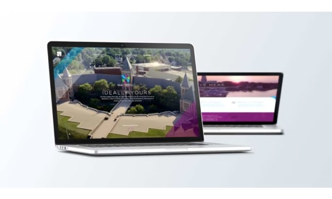
Filled with cool color gradients that create a welcoming and relaxing atmosphere for the users, JCCQ's website design relies on these colors to communicate with the audience through a blend of communal photography and white typography.
Uroboro ensures the branding is on point from the get-go. The homepage greets you with the large, bold white initials across a horizontal gradient that ranges from passionate purple to reliable and trustworthy blue.
The design adopts this vibrant color scheme and employs it in multiple ways. The initials are customized, hinting at the inclusivity and creativity within the organization.
Find other vibrant website designs here.
In the bottom right corner, there's a gray cloud with a plus inside. It's also the root of the image of the members' gathering that slowly grows as you start scrolling, prompting you to wonder about the photo's origin. As it takes up the screen, it's accompanied by a powerful CTA that invites the users to explore their possibilities with the organization.

JCCQ's Website Design Relies on Rounded Visuals With a "Clear Angle" To Communicate With the Site Visitors
The described image presents an example of the majority of the frames spread across the website design. Mimicking the cloud in the corner, it features rounded edges and a sharp one in the bottom right corner.
This can be seen in the carousel showcasing the organization's events, the partners' and the featured members' sections, and other informational or representative visual content.
This shape conveys two messages simultaneously. It primarily refers to the communication cloud, inviting you to share your thoughts and make yourself heard. However, it can also symbolize the organization's openness to different ideas (rounded edges) while retaining a clear agenda and preserving conciseness (the acute angle).
Check out more fantastic community website designs here.
Additionally, it's also a reminder of the brand's logo design, reinforcing the branding aspect once more.
While prevalent, the design also entails fully rounded imagery that emphasizes accessibility and friendliness towards new interested parties, representing the communal viewpoints of the organization.

The Minimal Navigation System in JCCQ's Website Design Boosts the User Experience
No matter how complex the brand's services and/or offerings may be, leading web design companies tend to morph it into a streamlined user journey. Such is the case with JCCQ's neat and sticky hamburger menu.
The new, straightforward navigation on this redesign is simply stunning.
Clicking on the hamburger menu opens a full-screen catalog of options that promotes the four most essential pages through a scaled-up typeface. The layout doesn't leave out other sections, as they're written in a smaller font below the main four. So, the menu provides a hierarchical navigation focusing on the members' needs.
One of the four pillar categories leads you to a newly created online hub. As a large organization with many members, the Ecosystem provides a yearbook-like database with the members' pictures, names, titles, and contact details.
The Ecosystem also entails a simple filter to help you narrow your search and start networking with other members of the Chambers community in a few clicks.

JCCQ Website Design Is a Home to Highly Legible, Well-Balanced Typography
With images serving as the primary communication tool on the website, the written content is sparse. It's predominantly used to send a concrete message or point to a carefully placed CTA in bold headlines.
Check out our website typography guide to figure out how to match the typeface to the tone of your website design.
The typeface uses a slightly rounded, friendly sans serif type font in the headline and the body text. The font style is easily readable and complements the design's approachable atmosphere. While friendly and accessible, it's also a compelling and inviting choice that helps the headlines stand out.


-preview.jpg)


