From traffic congestion to commuter car accidents, civil engineers have a lot to think about when creating transportation systems. As populations grow, their jobs become even more important for managing the growth, efficiency, and mobility within cities. District Mobility is a collaborative project between Washington D.C.’s local government and city partners to construct a more effective transport system in the region.
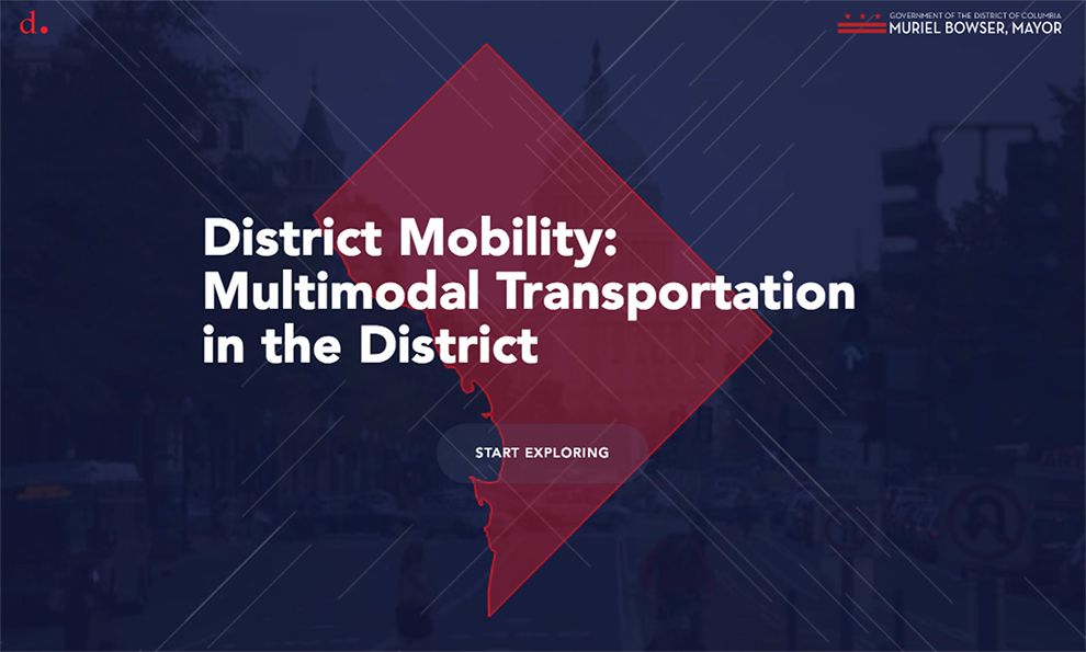
The website outlines the project through a creative, clean design that plays off of themes from the project. Broken, moving blue lines cross in the center of the home page and give the impression of stop and go traffic at a city traffic light. An image of an intersection is just visible beneath an opaque blue film that fills the backdrop, and a nearly transparent red shape of the district dominates the center of the home screen. White and red fonts, logos, and buttons accent features of the page and direct users to more information. The theme intends to reflect the city: patriotic and always stuck just between chaos and order.
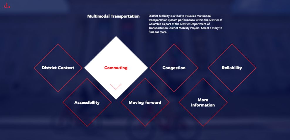
The main navigation page welcomes users to an interactive experience that continues to creatively celebrate the D.C. area. Squares, tipped on one end, form a subtle “W” across the center of the page and suggest site options. Each square is dynamically outlined in red with a white internal font when the page loads. When users hover, each option inverts the color scheme to fill the square with a white color and a red font.
As users click on a given site selection, the rest of the squares float out of the top of the page, and the page fills with a heading, description, and background image to introduce that specific section of the project. Like the city, the experience remains active and engaging.

Even with the busy nature of District Mobility’s site, most color schemes and response features remain consistent across the pages. This gives a sense of continuity and keeps the user focused on interacting with the project.
When users land on a page like the “Commuting” page, some features change to make navigation easier, while the overall schematic remains the same. The side navigation bar is lit up white, and it uses a vertical scroll and pop-out bar to direct users through pages. Users can zoom, click, and drag different sections of maps or other content, and fonts brighten when users hover.
By the time users reach the end of each page, they will have thoroughly explored the content and material before being redirecting to another section. From beginning to end, District Mobility’s site design reflects the creative quality that city designers, local councils, and civil engineers want to see in their new transportation and commuter systems.
District Mobility is a clean website design in the Engineering and Government industries.