MA&LO is a high-end women’s shoe company based in Italy. With a focus on their available products, MA&LO employs their shoes to speak volumes on their website. On the company’s home page, high-resolution product photographs in a varying grid format showcase their modern shoe line.
The photographs are vibrant, and they pop off the page due to the use of a wide, white negative space. The company uses a sans serif font in black against the background to make each statement stand out on its own. As users scroll down the page, a series of effects are activated to load photographs and text boxes in varying manners. The effects create an immersive platform to kick-start users’ involvement with the company.
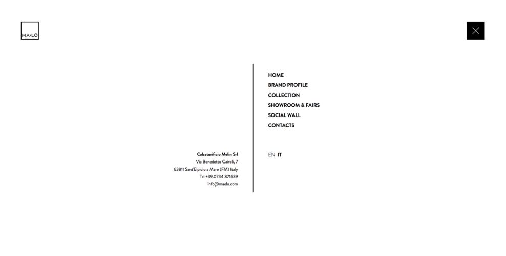
Through the home page, MA&LO employs a hamburger menu in the upper right corner of the page. The hamburger icon is presented in black, acting as a stark contrast to the white negative space on the page. Activating the menu causes a sliding screen to emerge from the side, covering the page entirely. The simple menu divides itself down the center of the page with a gray line. A black sans serif font is used to create a monochromatic color scheme.
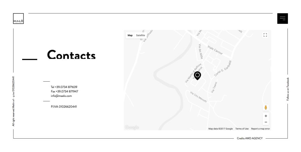
Put together in the same minimalistic style of the rest of the site, MA&LO’s contact page uses a left-aligned header in coordination with the menu. Contact information is in a clean and organized format for easy reading. Additionally, the contact page comes with a map embedded into the right half of the screen for users to interact with. The multi-purpose design heightens consumer interaction and involvement with the company.
Step into a new pair of high-fashion shoes with the help of MA&LO! Their high-resolution product photographs and an easy-to-navigate platform create a dynamic way to introduce users to the pair of shoes that are just right for them.
MA&LO is a minimal website design in the E-commerce & Retail and Fashion & Beauty industries.